Good Bones

Design by First Fruit Collection | Story by Terri Glazer | Photography by Sélavie Photography

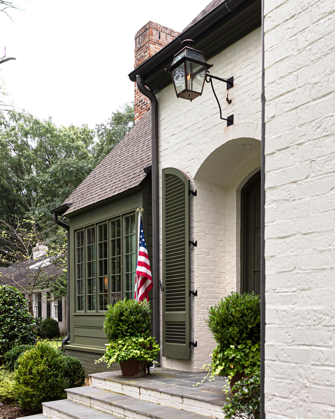
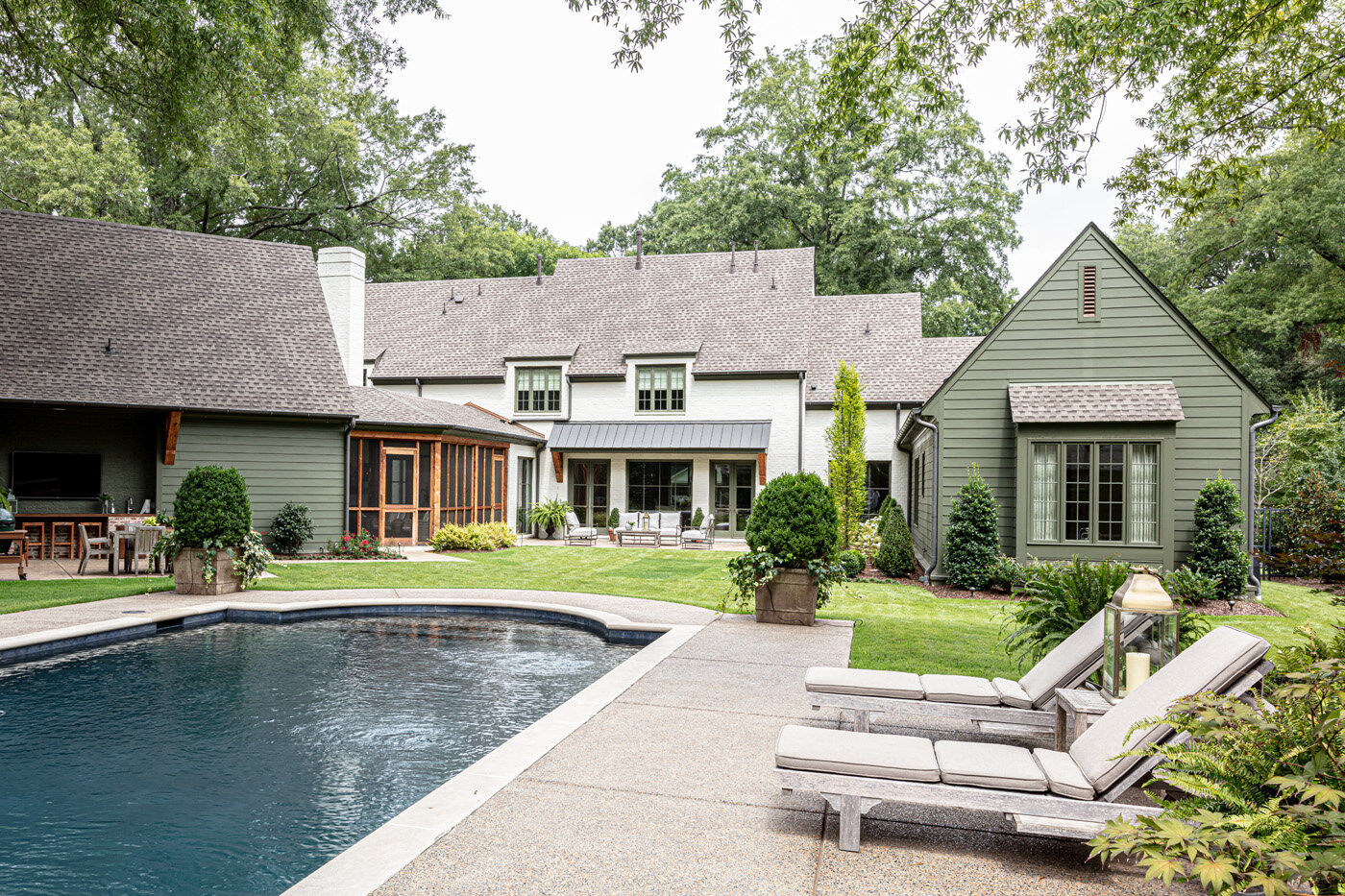
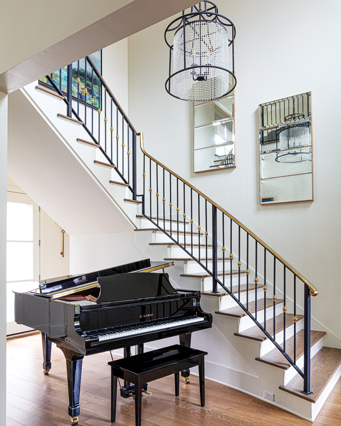
A house with good bones, enthusiastic owners, and designers with vision added up to produce a stunning renovation in this 90s-era home in Germantown. Stunning, but approachable, says designer Patty Michaelis, and that’s just the way it’s supposed to be.

“What I love about this house is that it absolutely feels like somebody lives here. It feels so comfortable versus a show house. We always want our clients to feel like their home is totally livable,” says Michaelis, store manager and designer at First Fruit Collection in Collierville. She spearheaded the project along with Ashley Toney, First Fruit’s owner.

The pair of designers and the homeowners, Angela and Jon Straub, have developed a longstanding relationship; this is the third house Toney and Michaelis have outfitted for the family that includes the couple and their two teenage children. This project had a decidedly different slant than the others, however. Says the homeowner, “The other homes we had weren’t like this one. They were more rustic, but I like the term Ashley uses for this house and the design—dressy.”


Toney says the description fits perfectly. Nothing about the home is formal or stuffy. The design is fresh yet timeless with a gracious, inviting appeal.

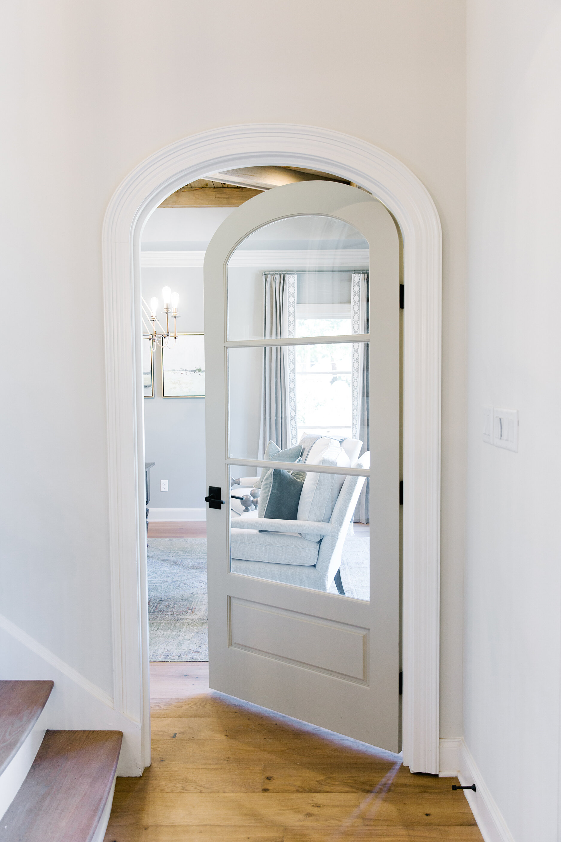
Though the home’s colors and decor needed a fresh look, the classic architecture had stood the test of time and was well suited to the casual elegance Toney envisioned for the decor. “The builders of this house constructed a very traditional plantation-style house. I feel like when you create something more traditional it’s timeless. Yes, the colors and the cabinets were dated, but the layout and the flow weren’t because they are traditional and that never goes out of style,” says Toney.

The owner agrees, adding that the fact that the home needed cosmetic work rather than a total redo played heavily into the decision to purchase it in 2019. After a couple of months while the entire house was painted and the floors were redone, the family settled into the five-bedroom home set on a picturesque two-acre lot.

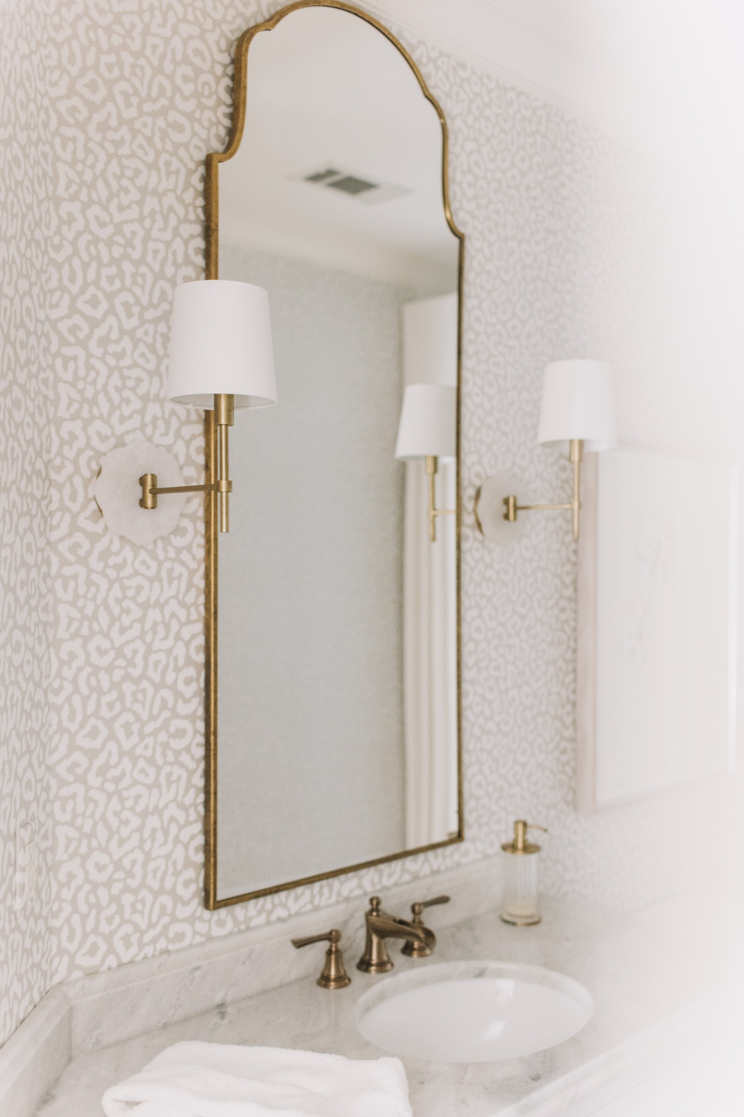
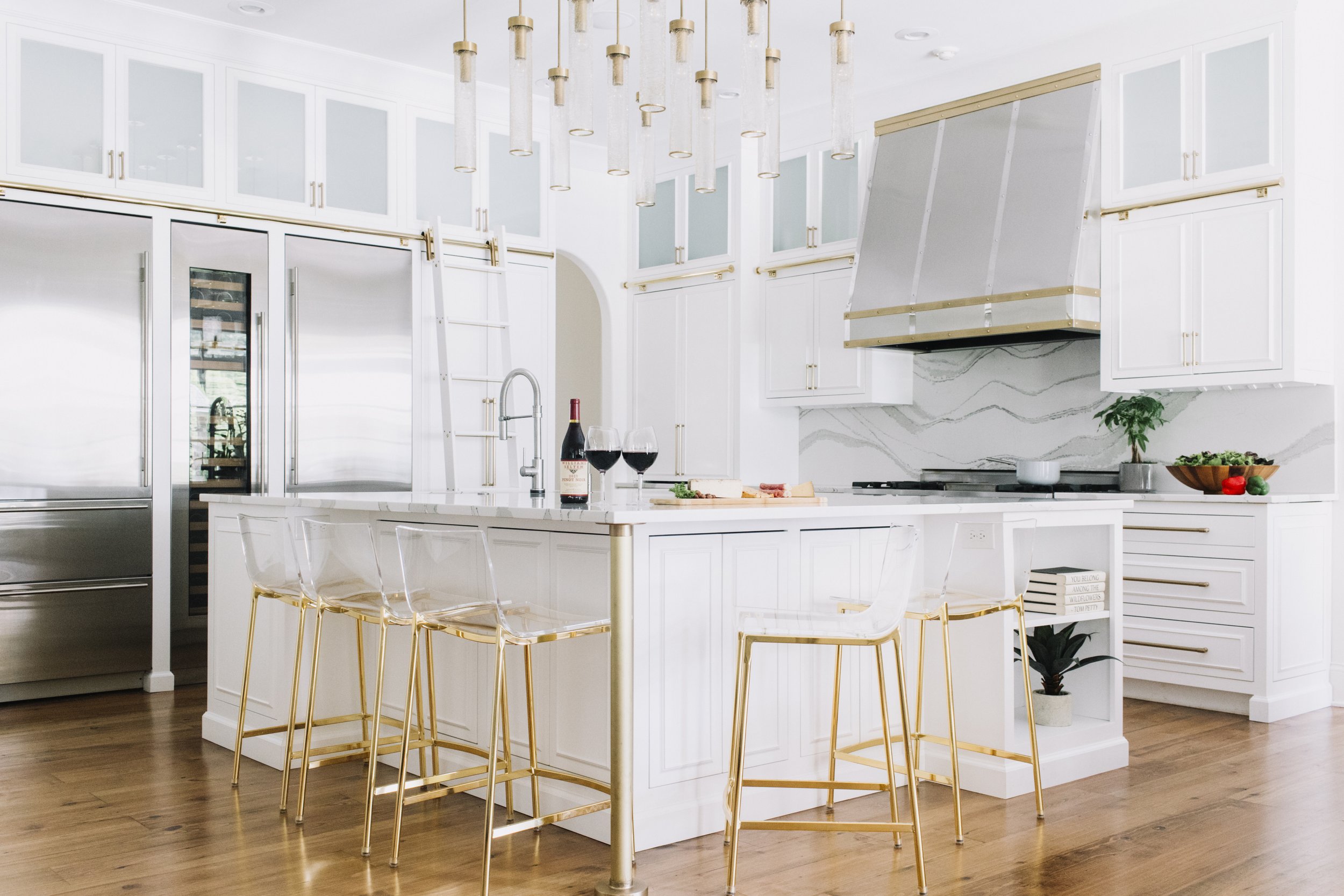
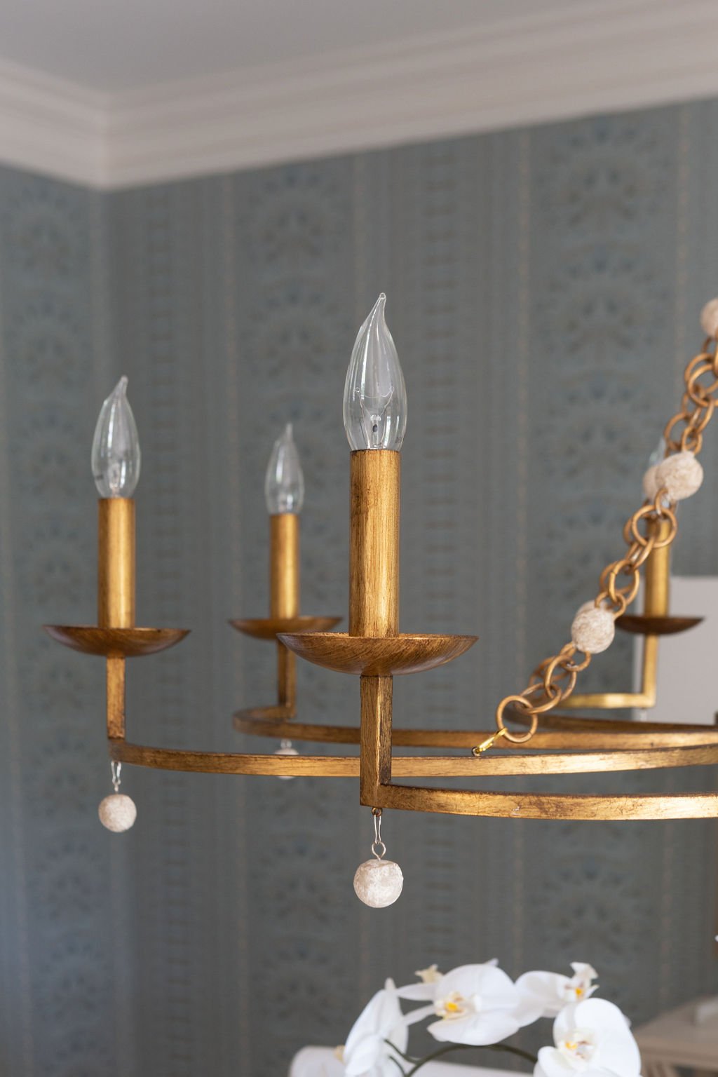
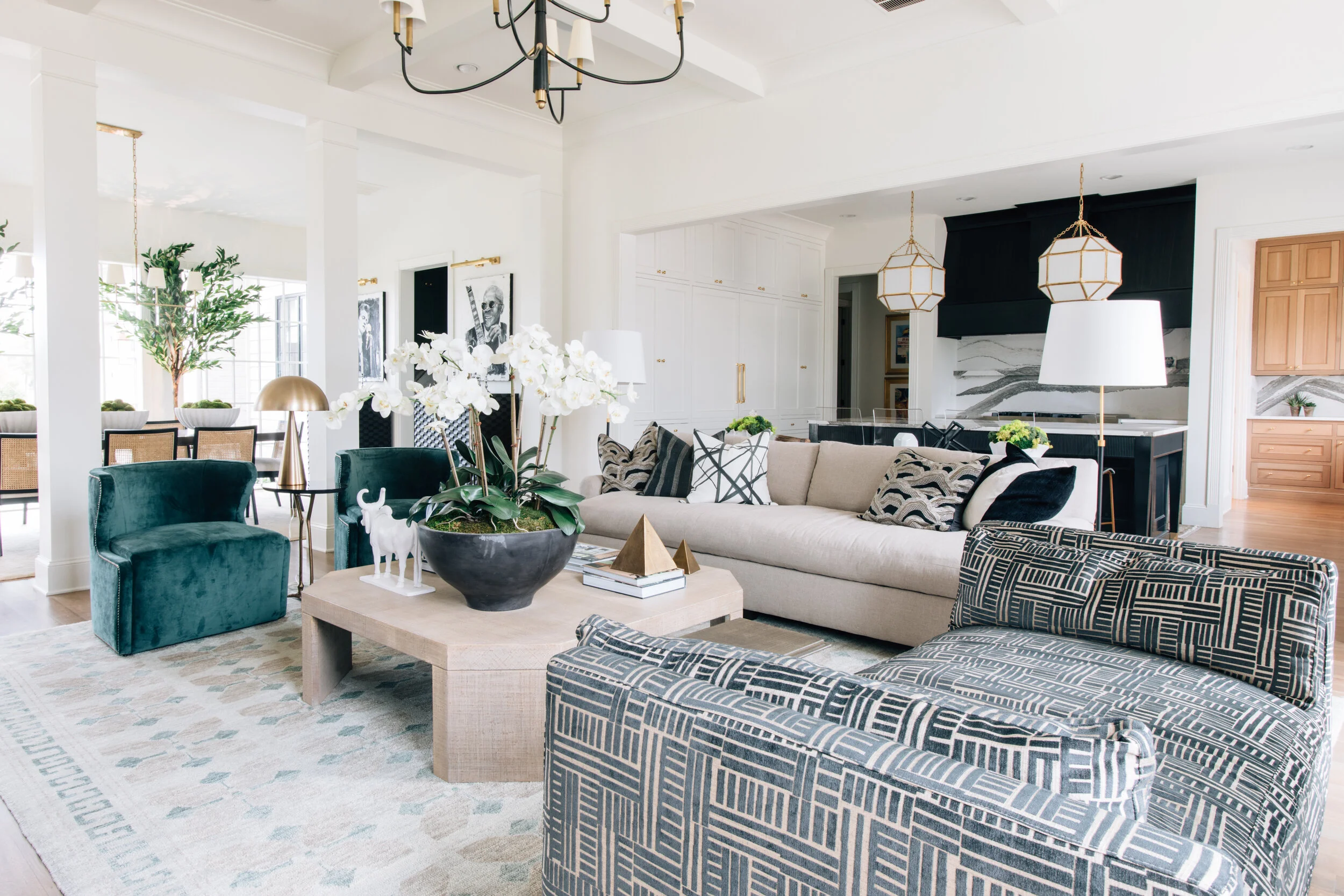
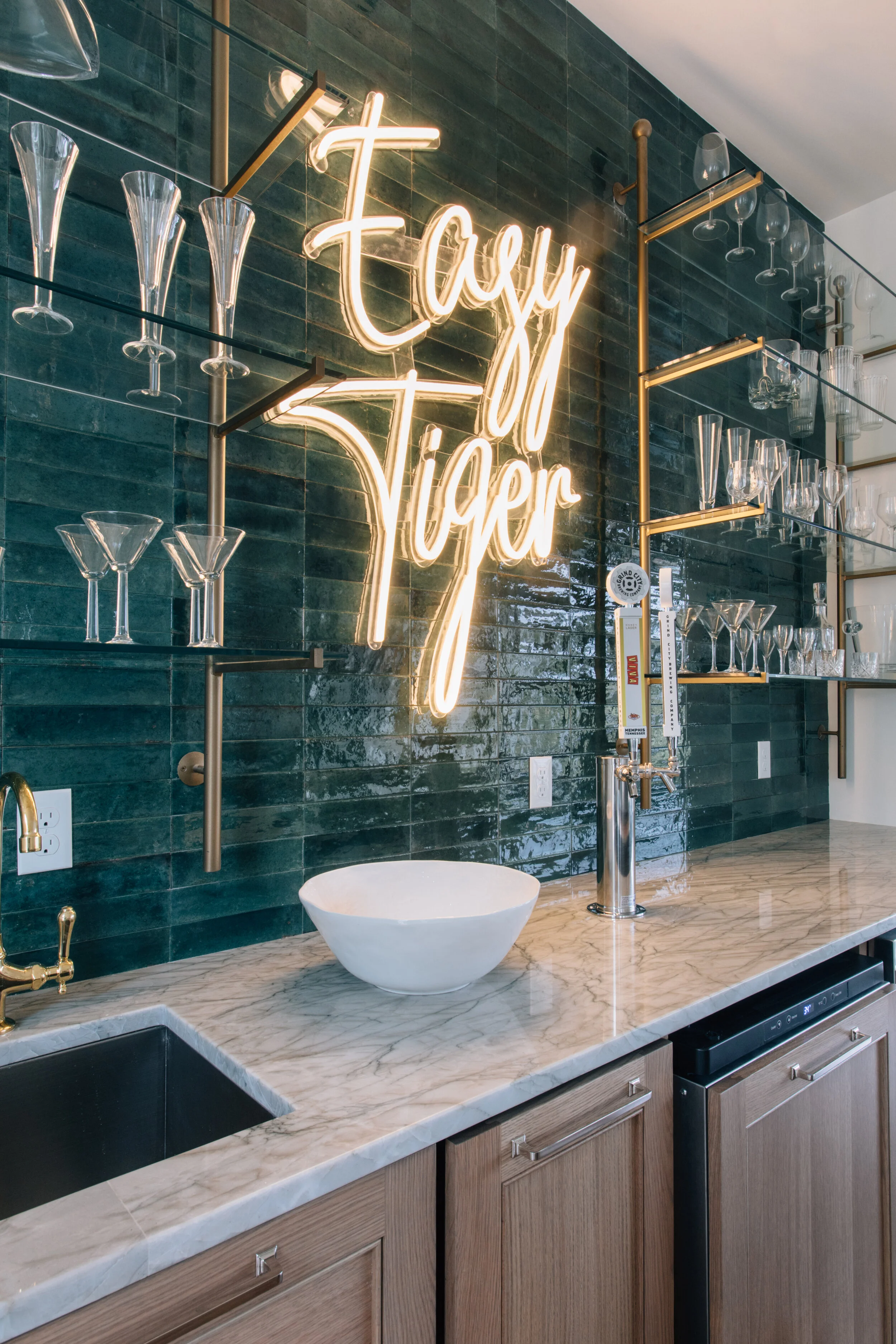
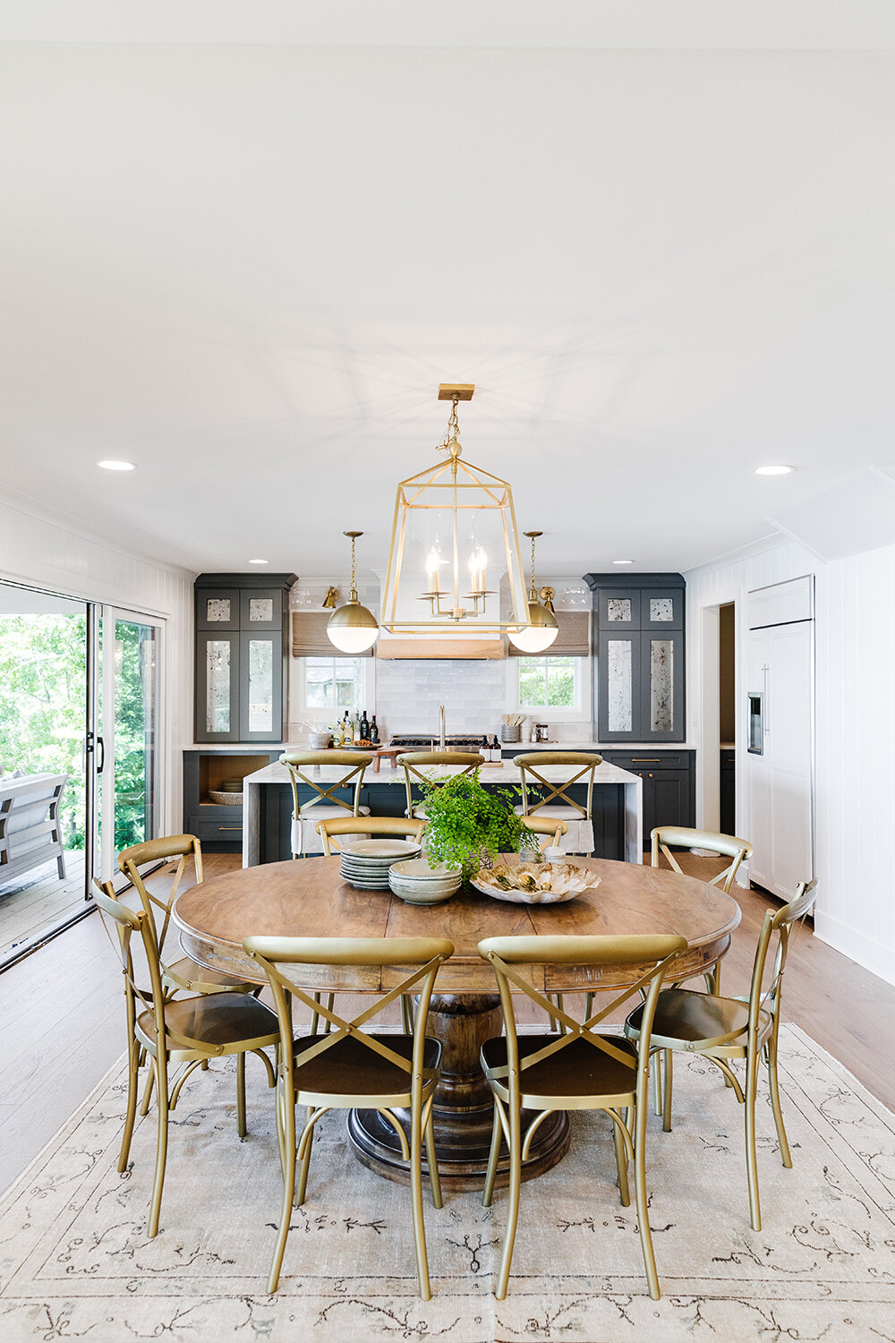
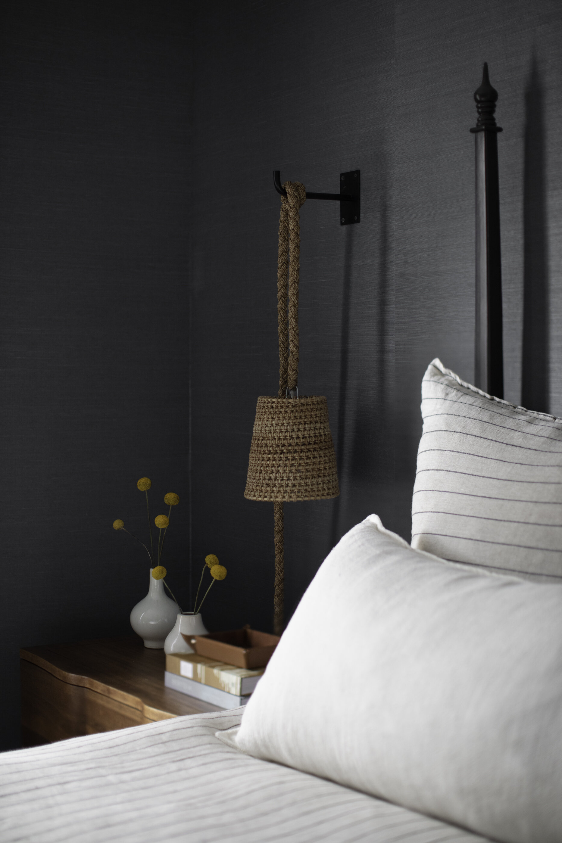
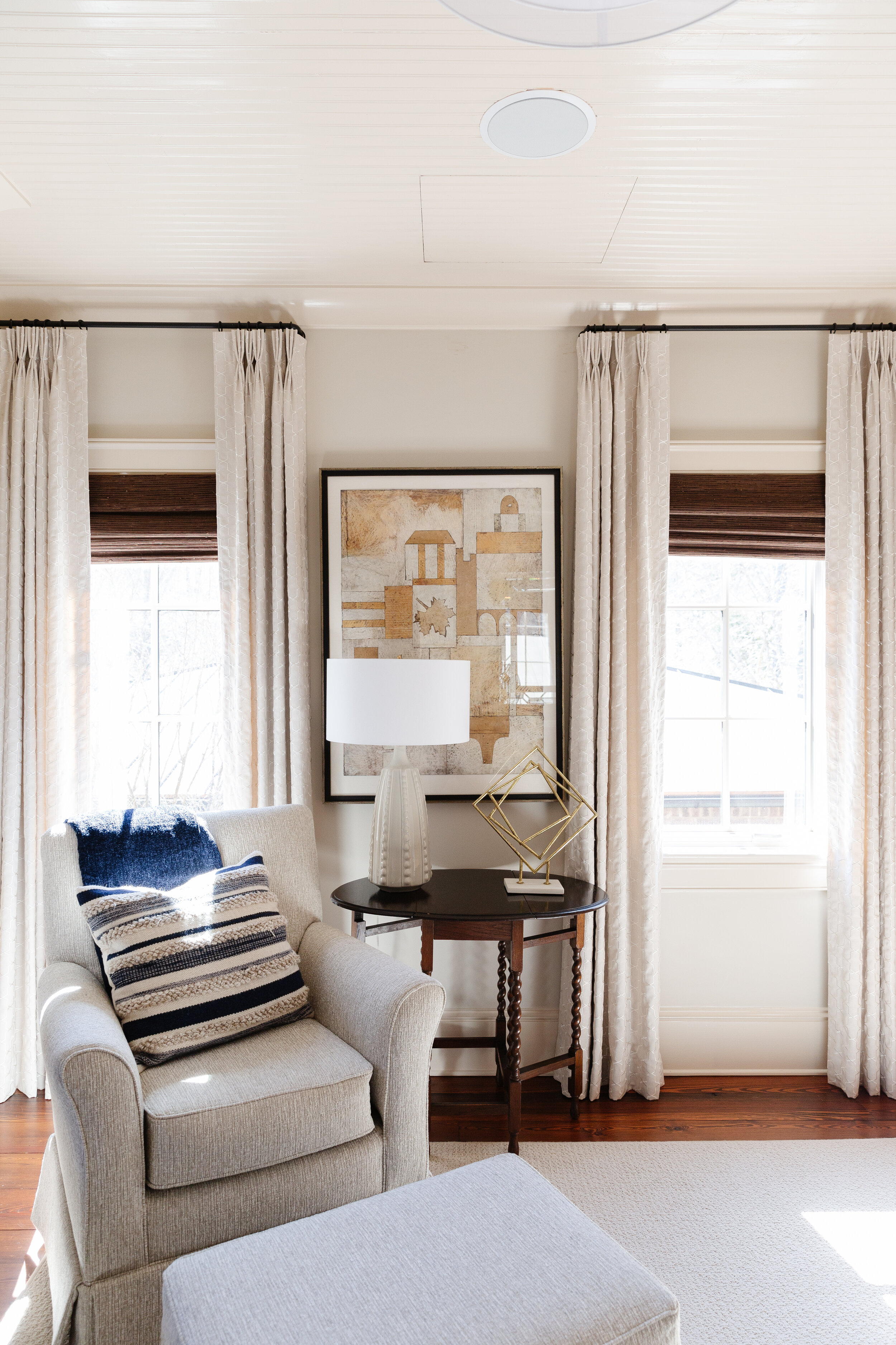
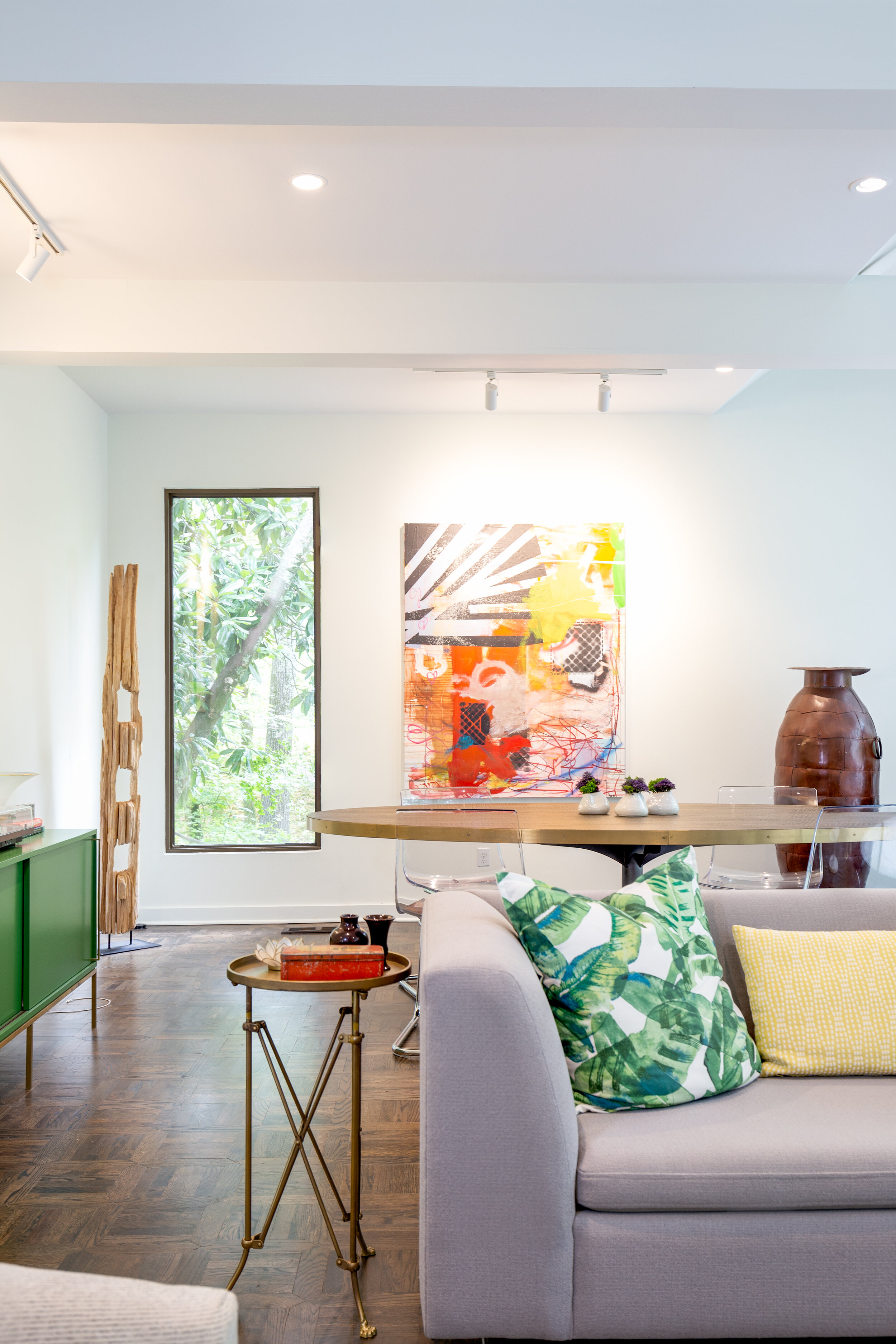
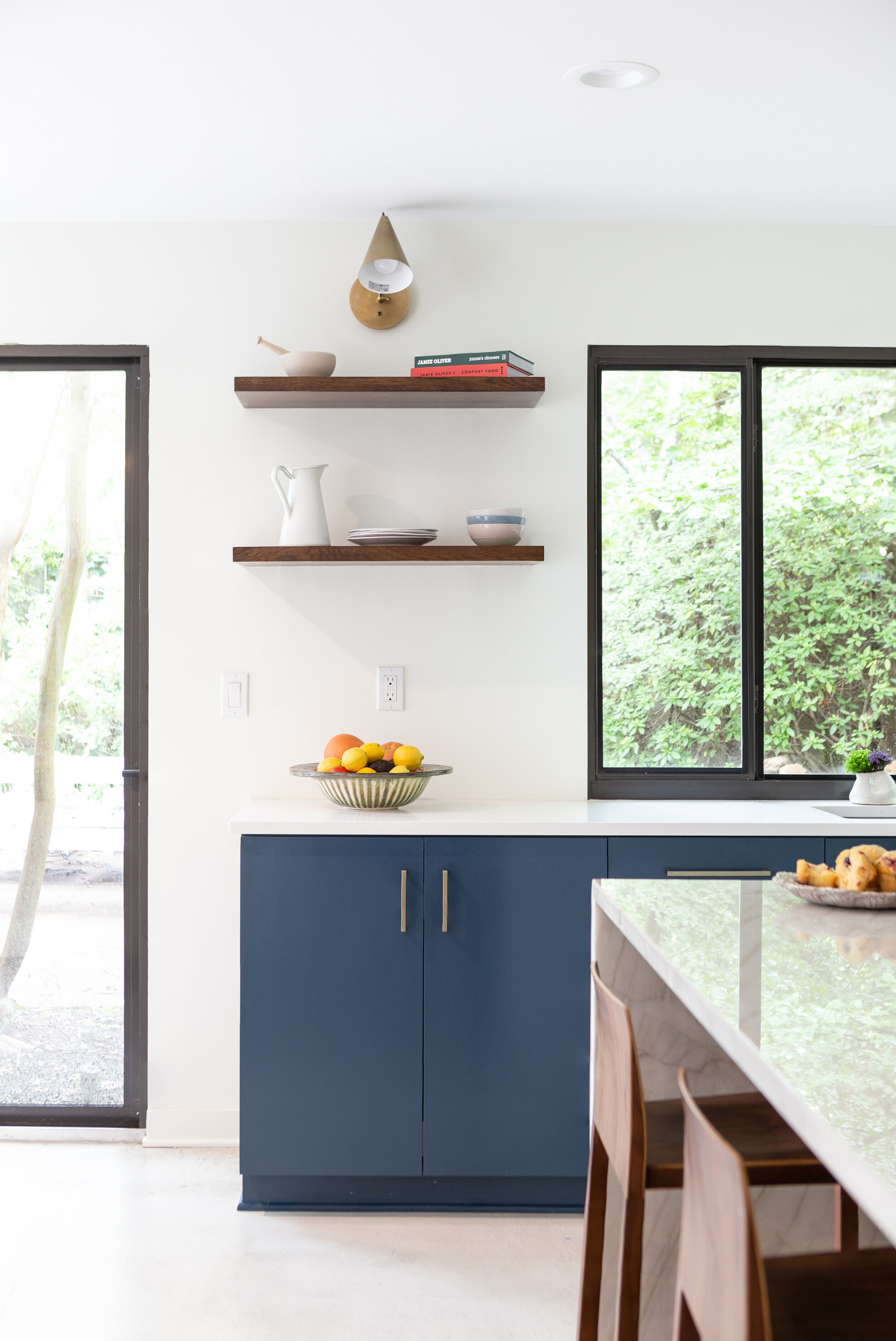
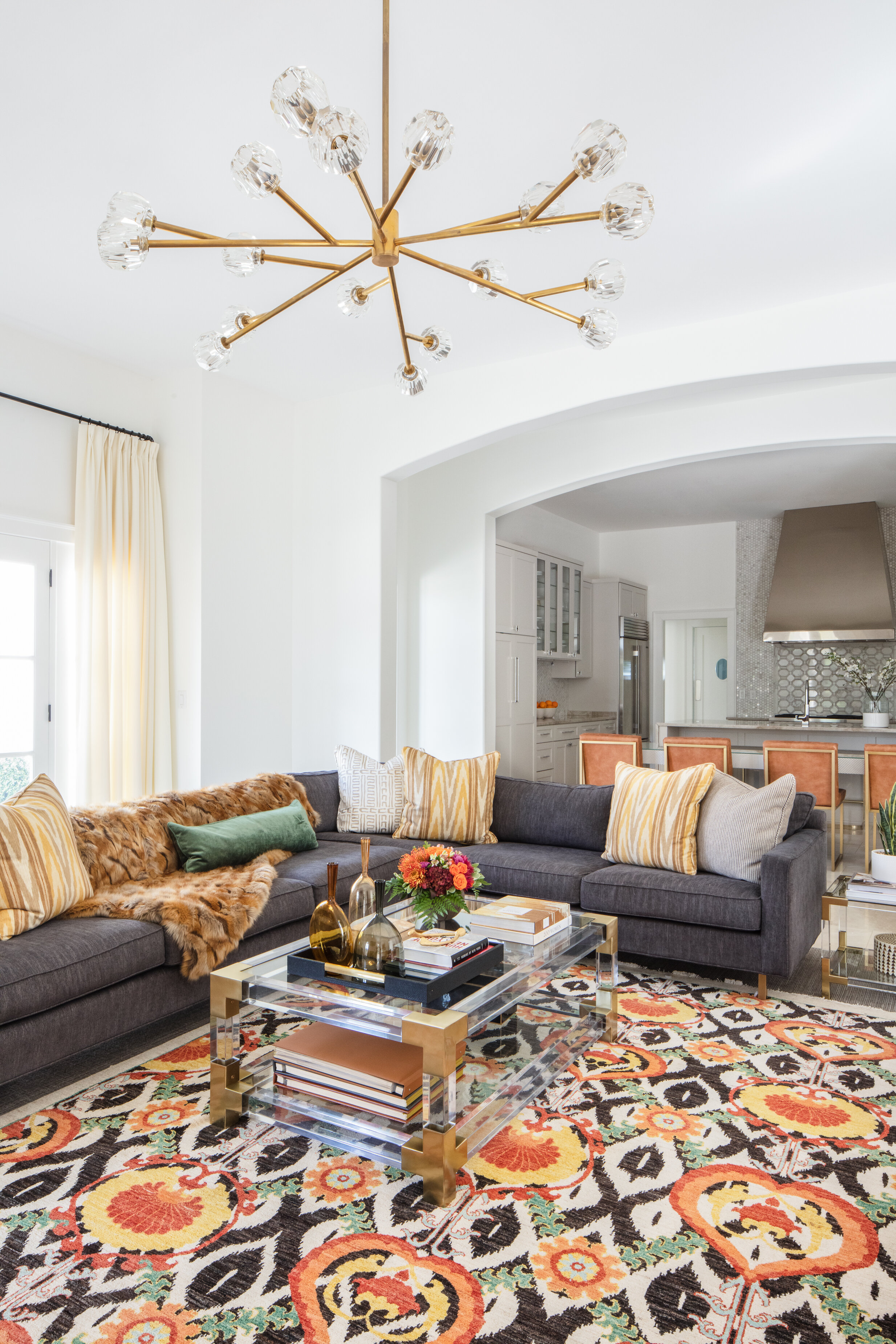
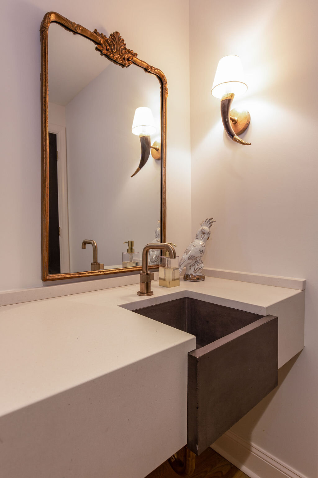
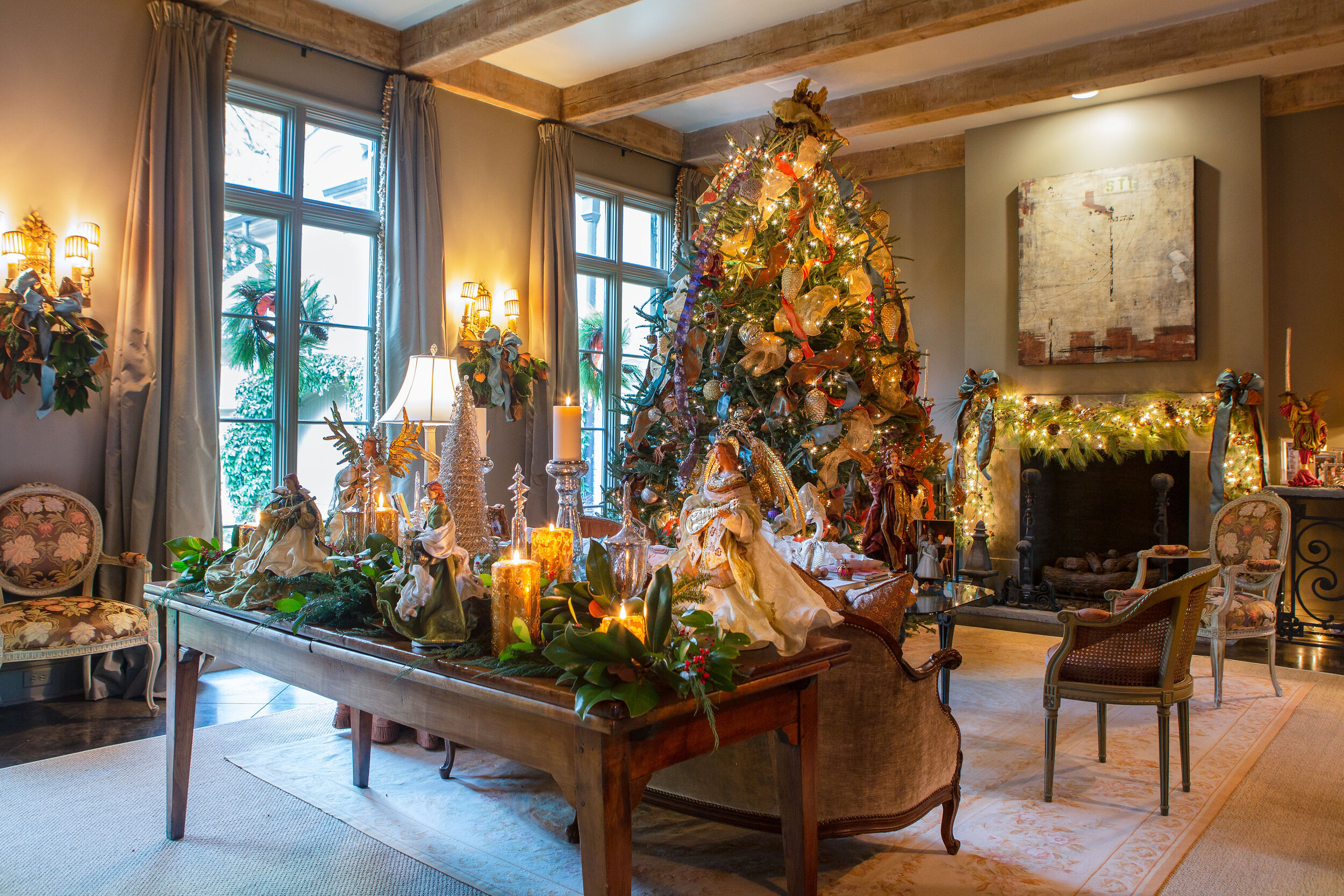
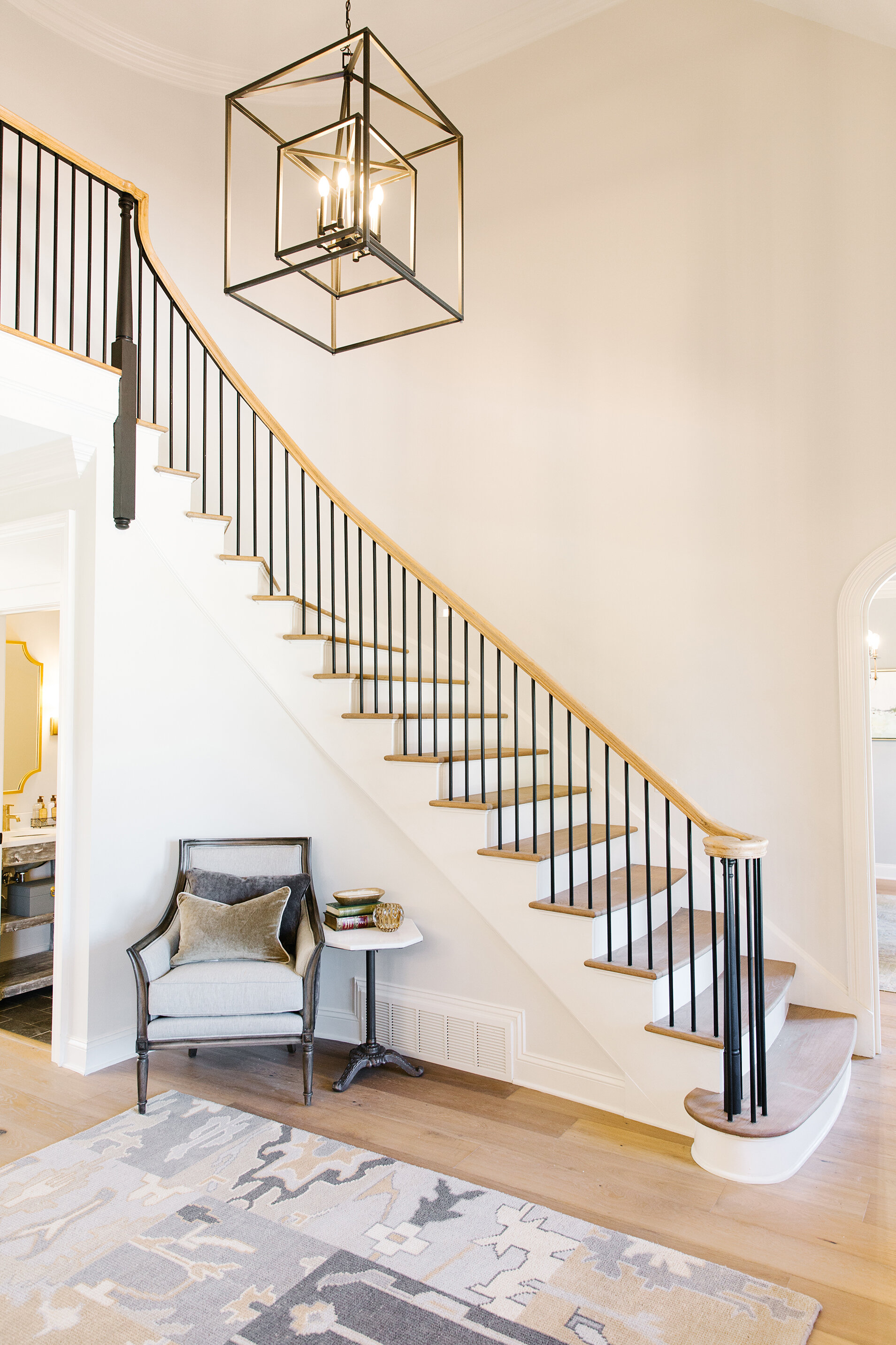
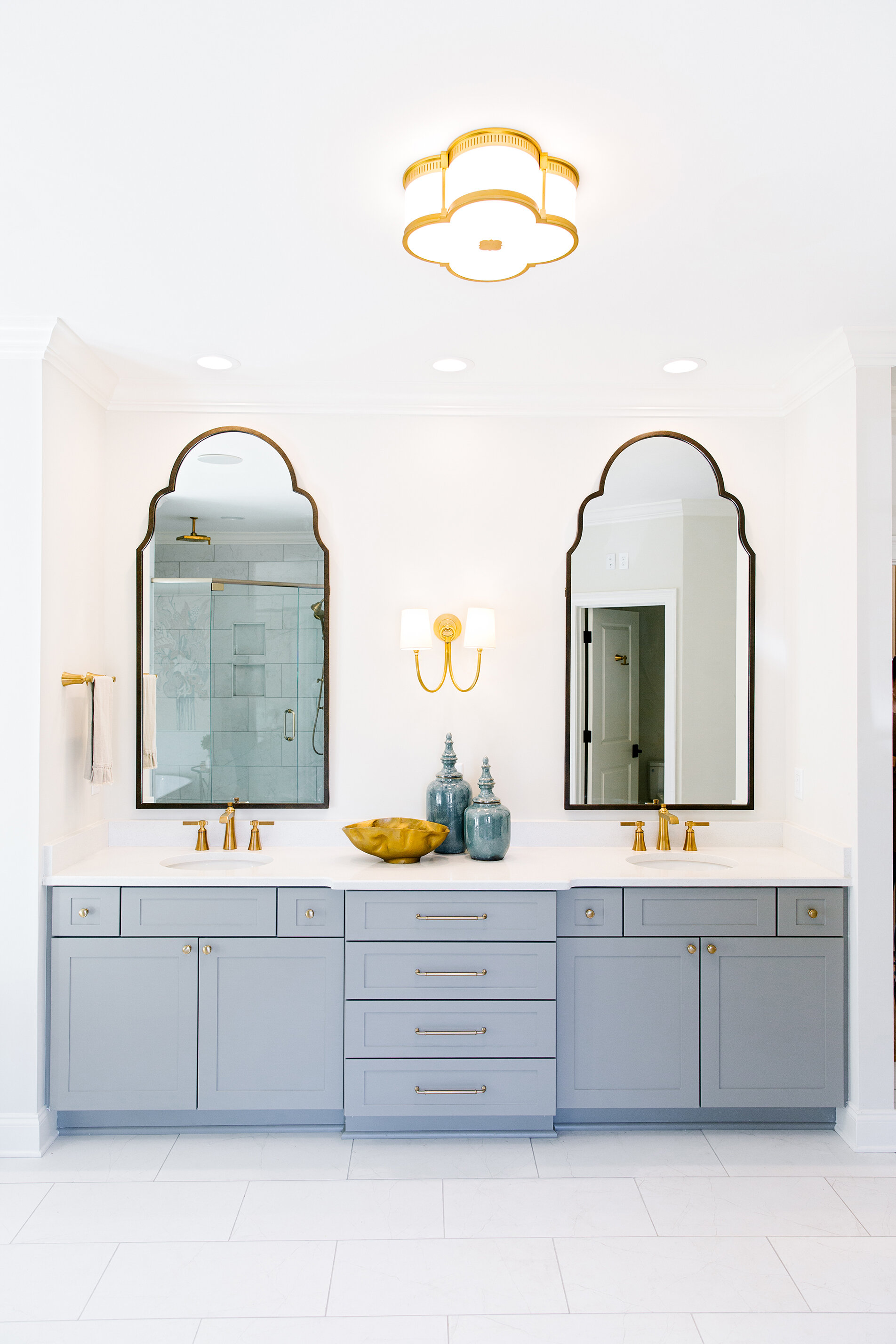
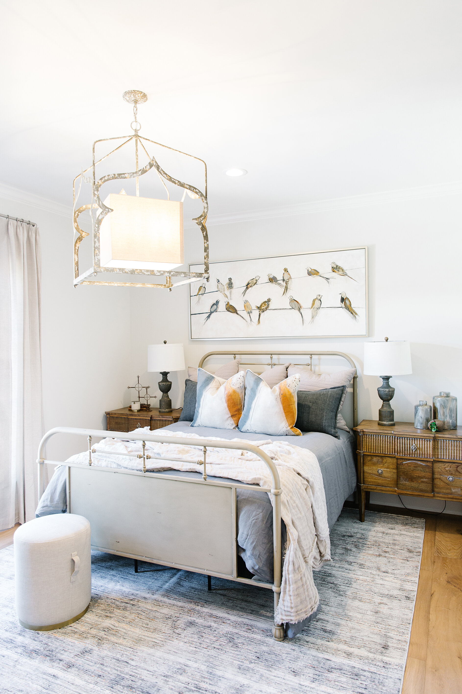
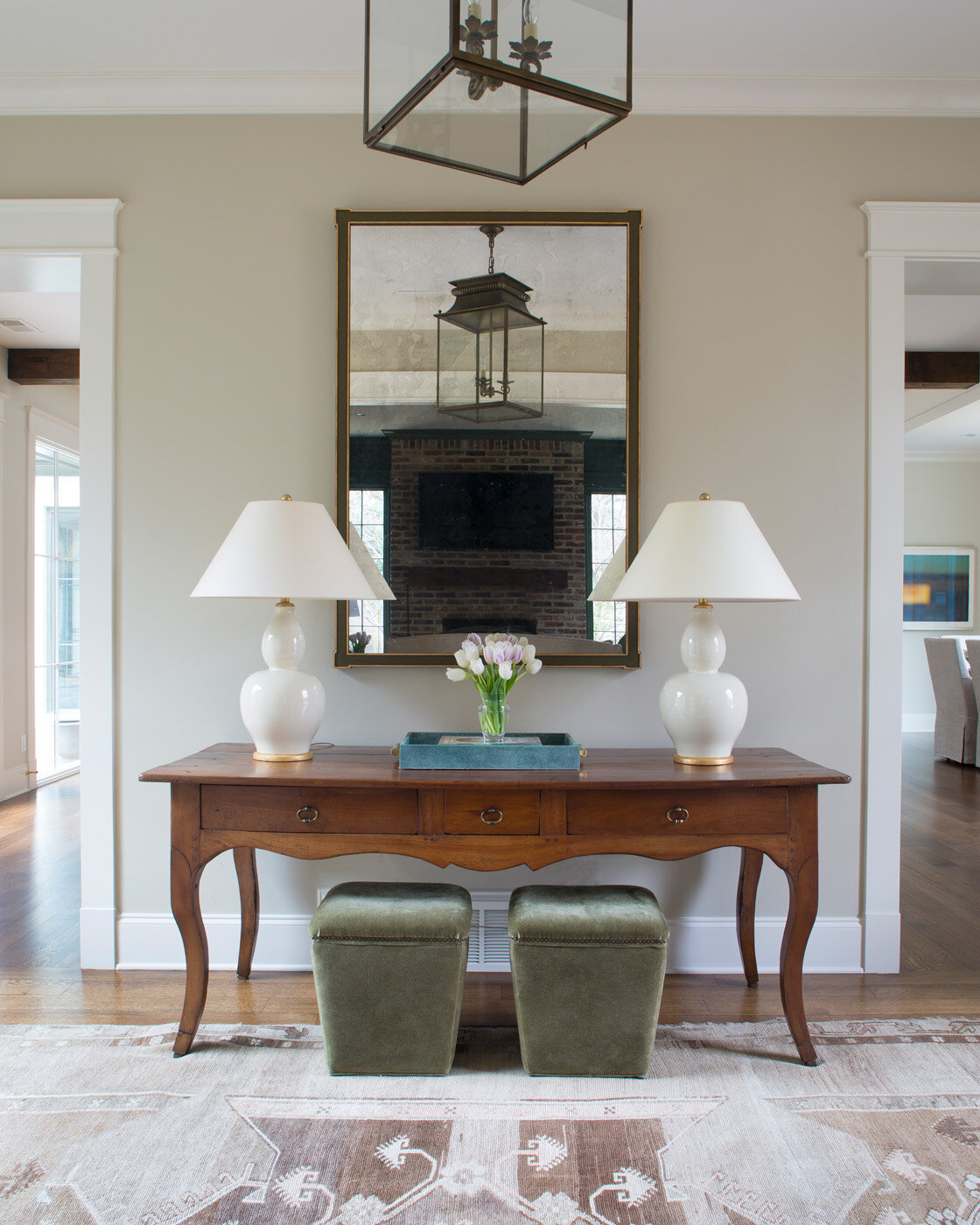
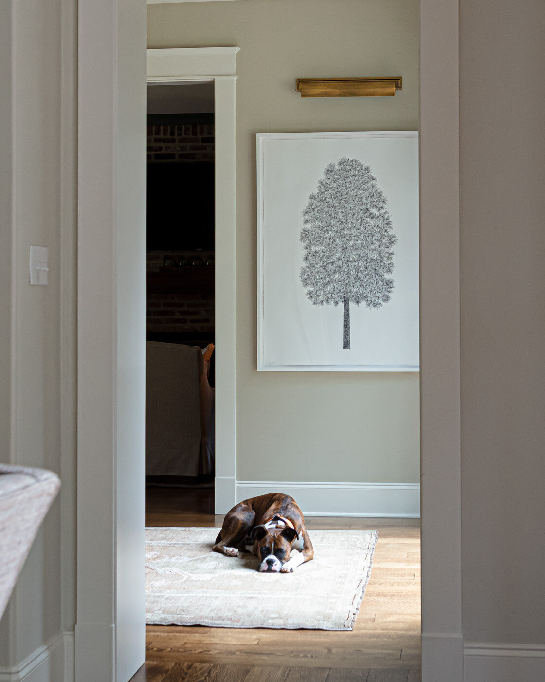
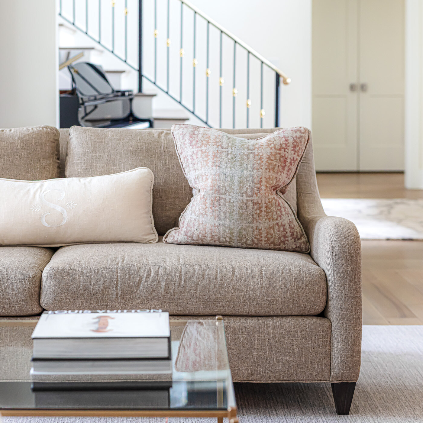
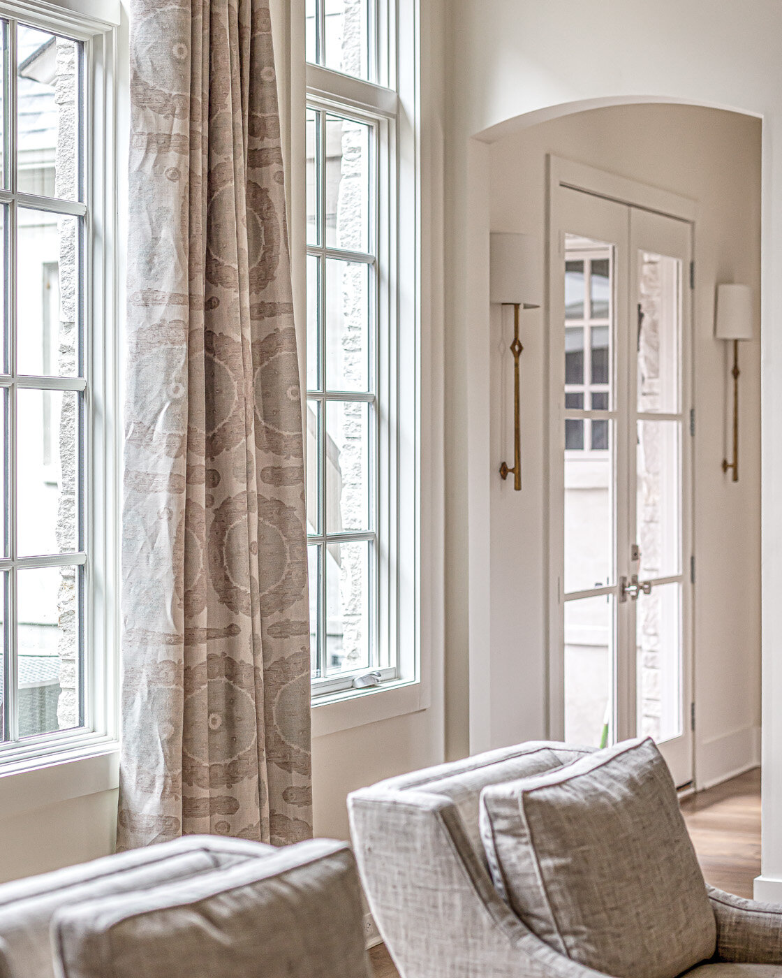
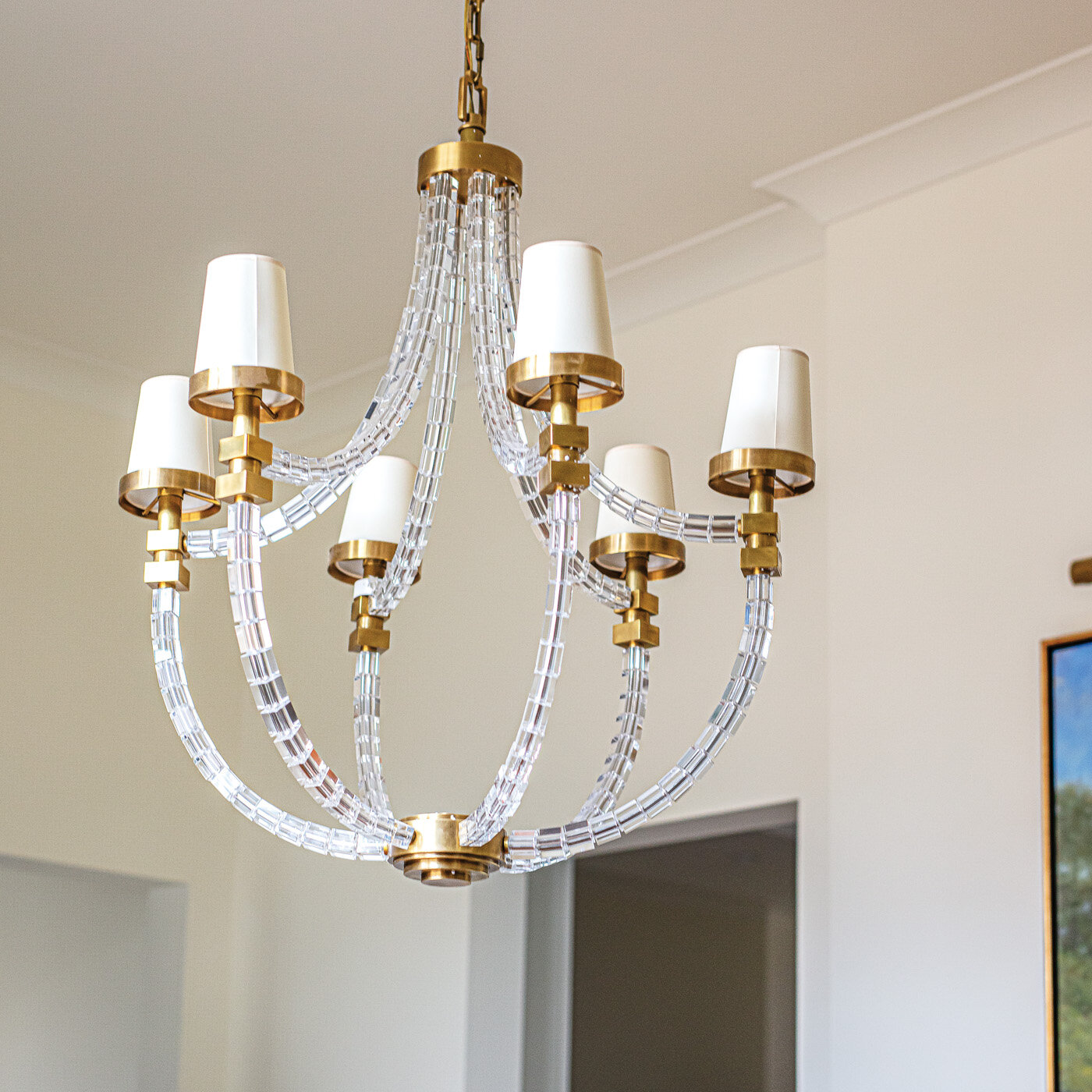
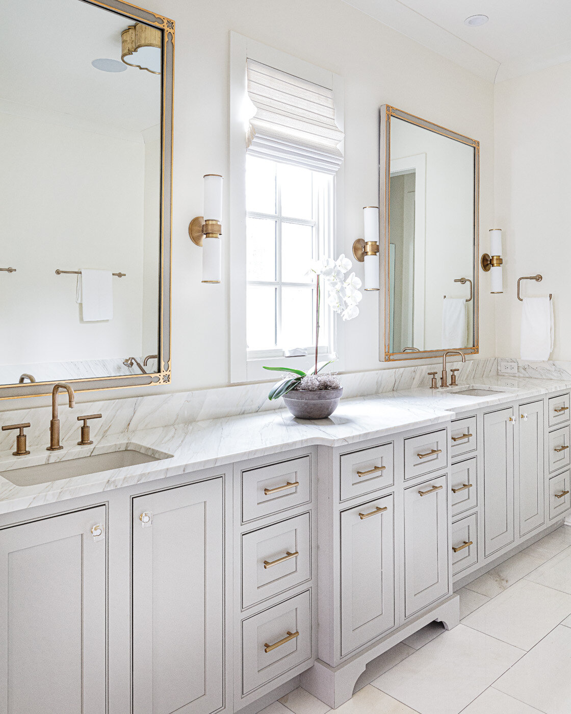
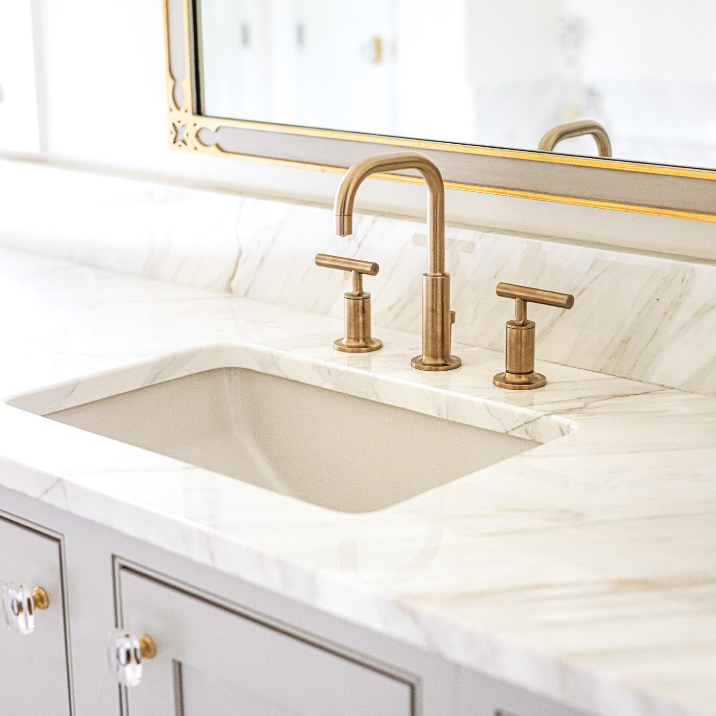
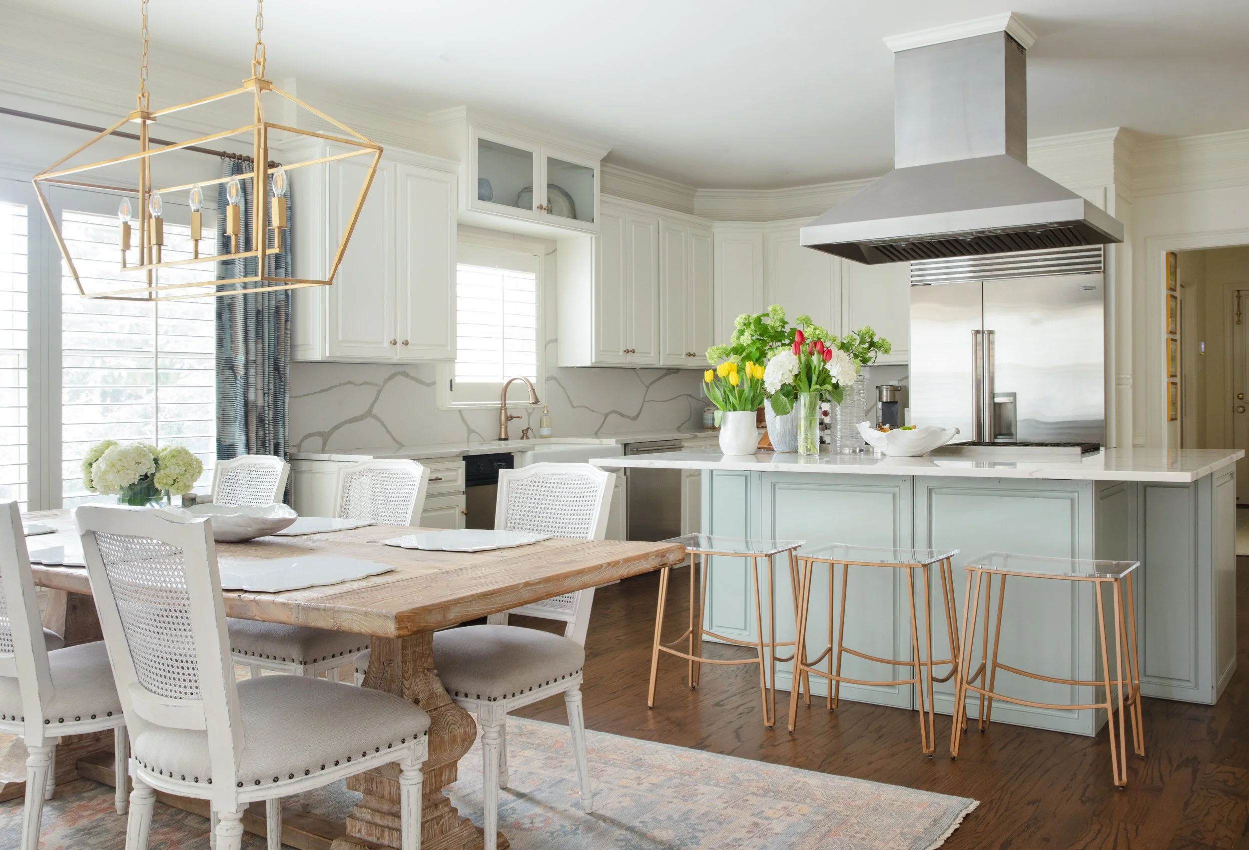
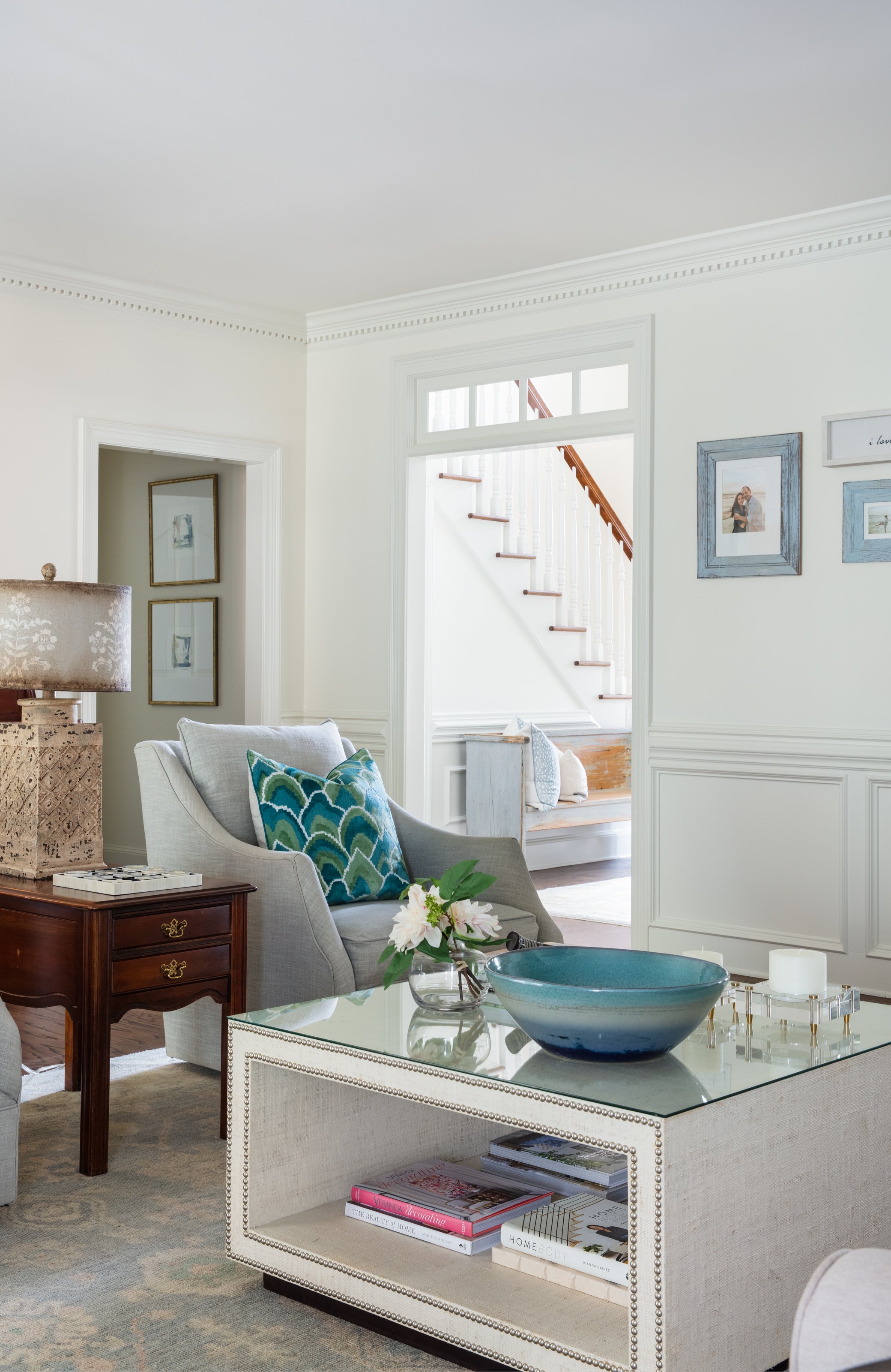
“I like light, bright and happy—welcoming,” says the homeowner. The design team delivered with a clean white wall paint throughout the house, a perfect palette to show off new lighting in dressed-up gold tones, as well as pops of color provided by furnishings and rugs. 

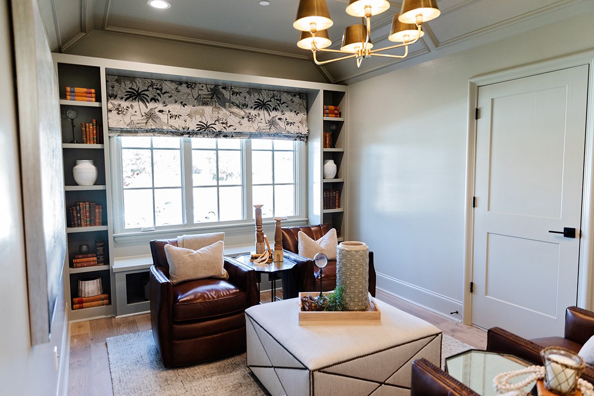
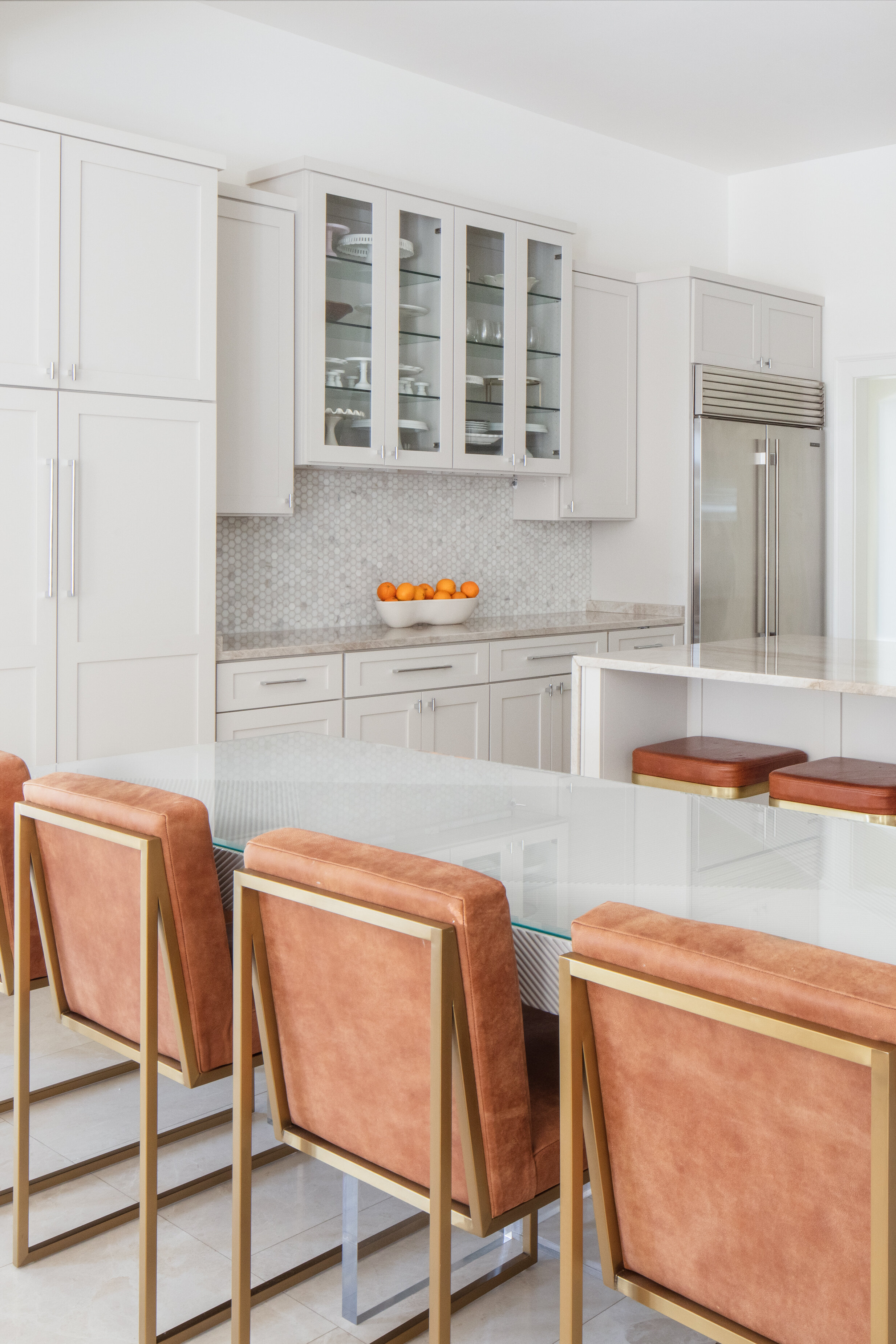
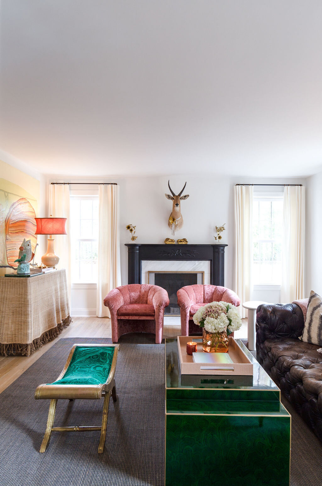
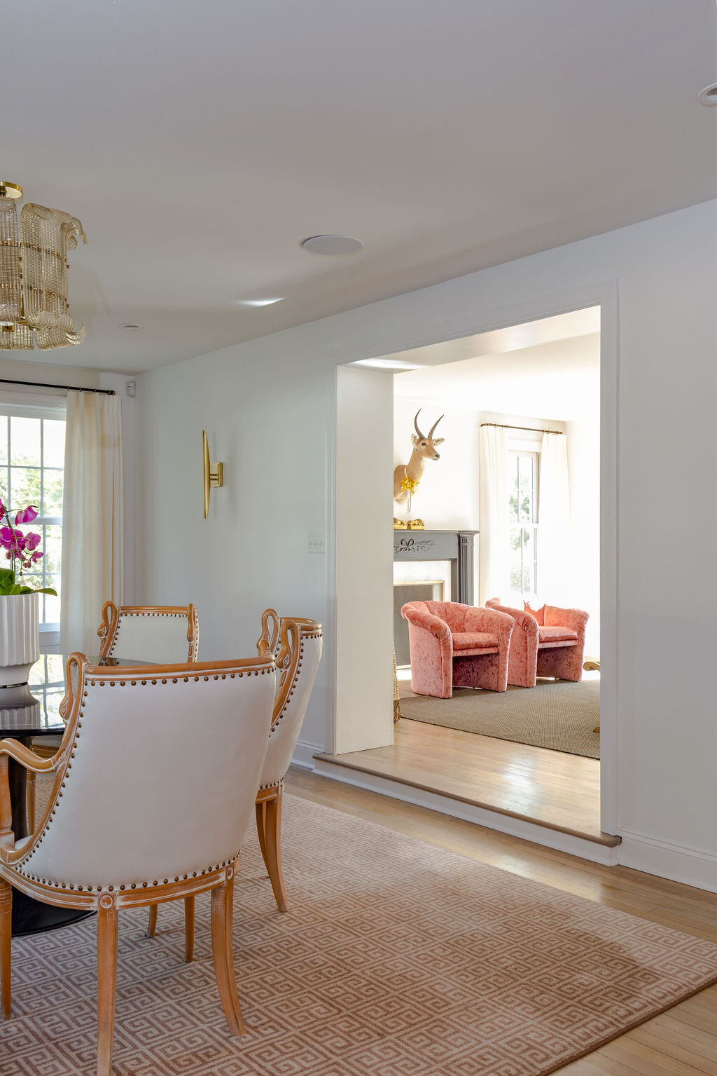
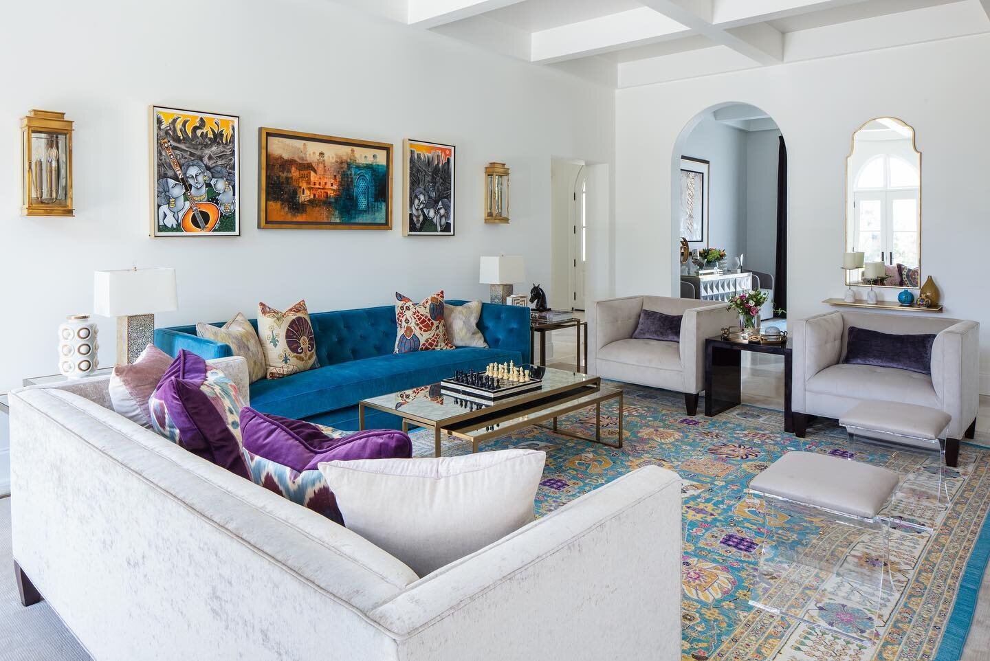
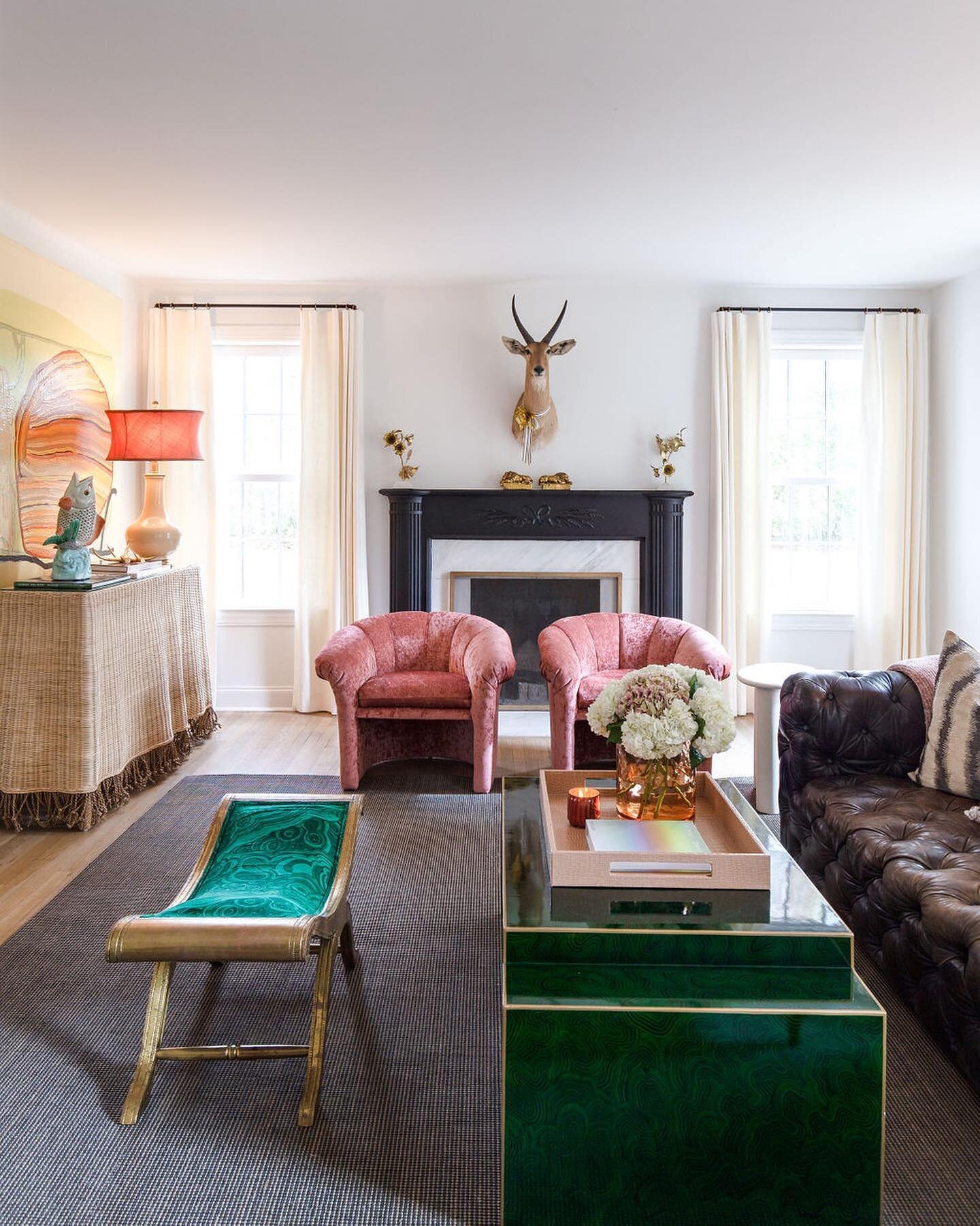
The more dramatic elements weren’t always an easy sell, says Michaelis, recalling the decision to place two leather and cowhide chairs in the homeowner’s office, directly off the front entryway. Although the designer describes the pair as her “most favorite chairs of all time,” she recalls that the client might not have shared her vision at first. “We really had to talk her into them, but she loves them now. They’re fun to see when you walk in the front door.”

Michaelis credits years of successful collaboration on multiple projects for the fact that this homeowner is a “perfect” design client. “She listens to us. She knows what she likes, but she’s always willing to listen to our vision.”

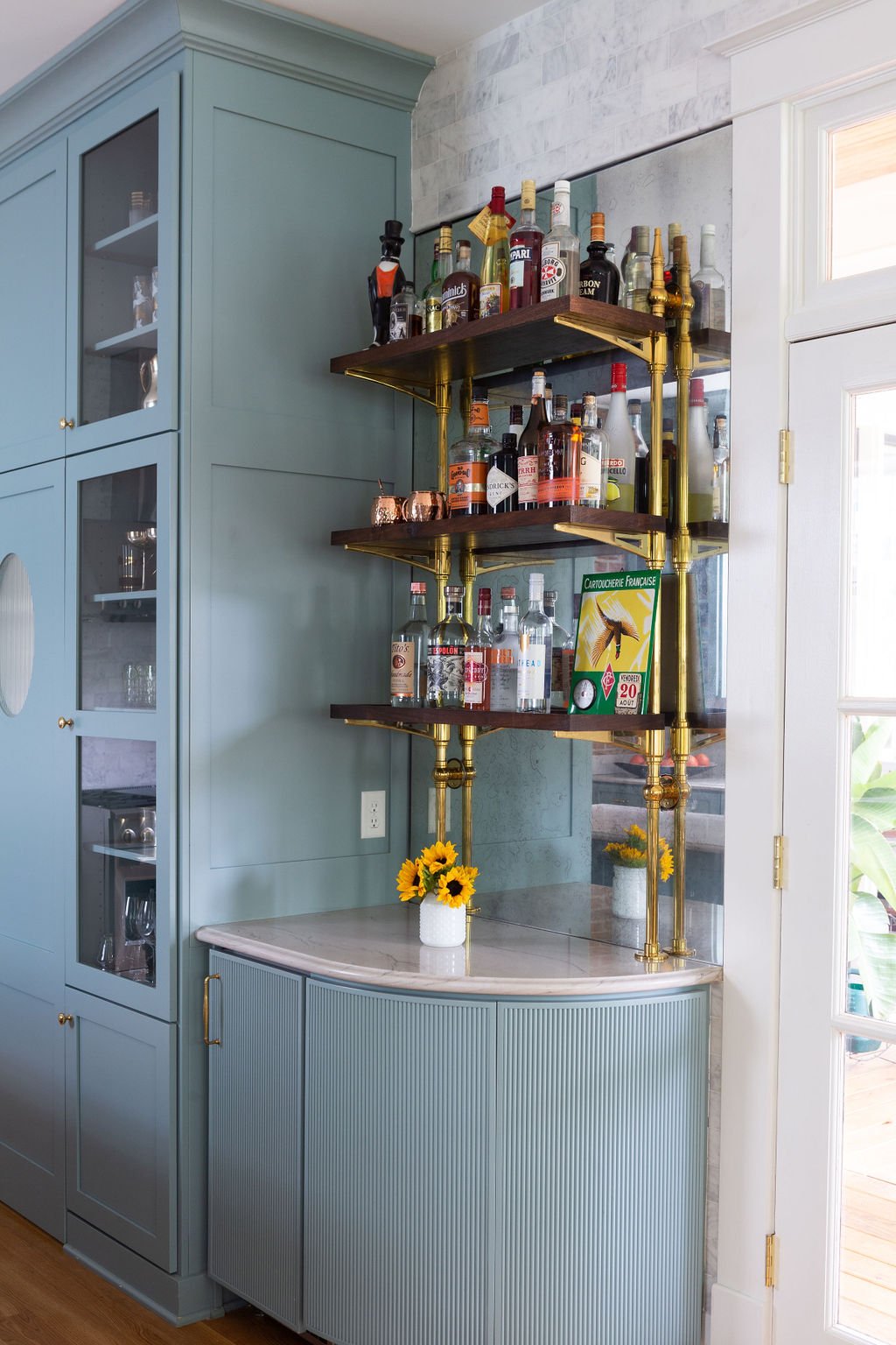
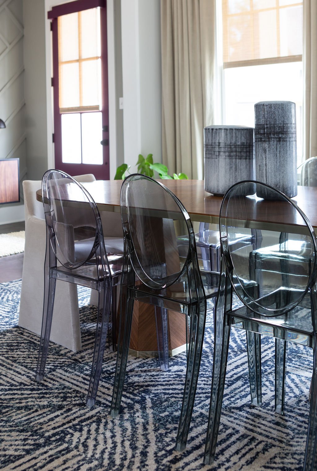
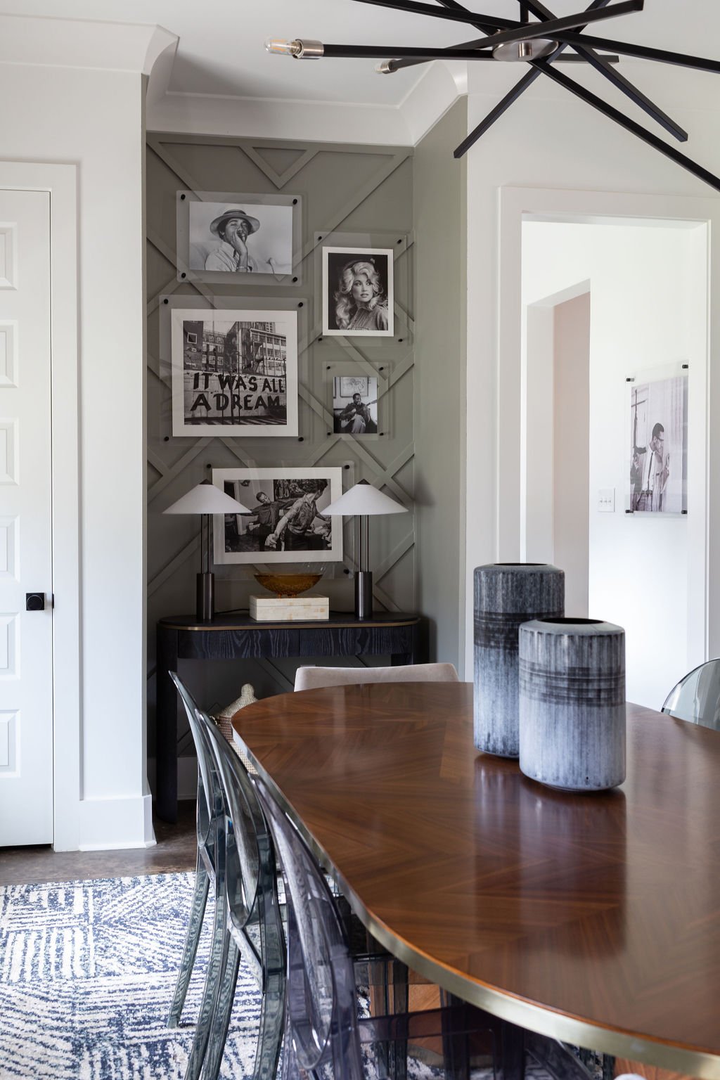
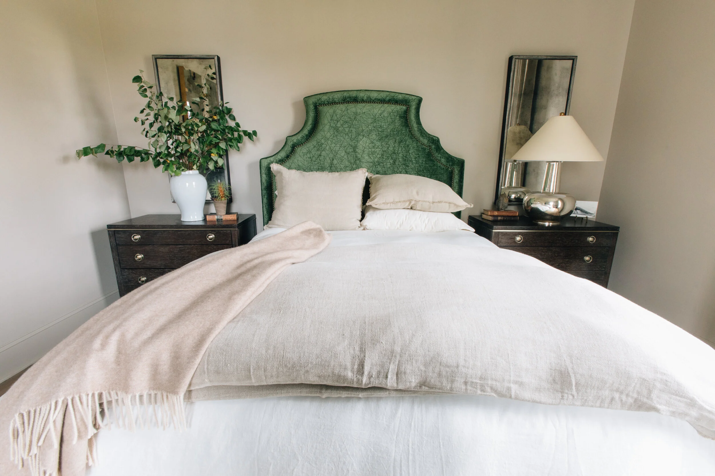
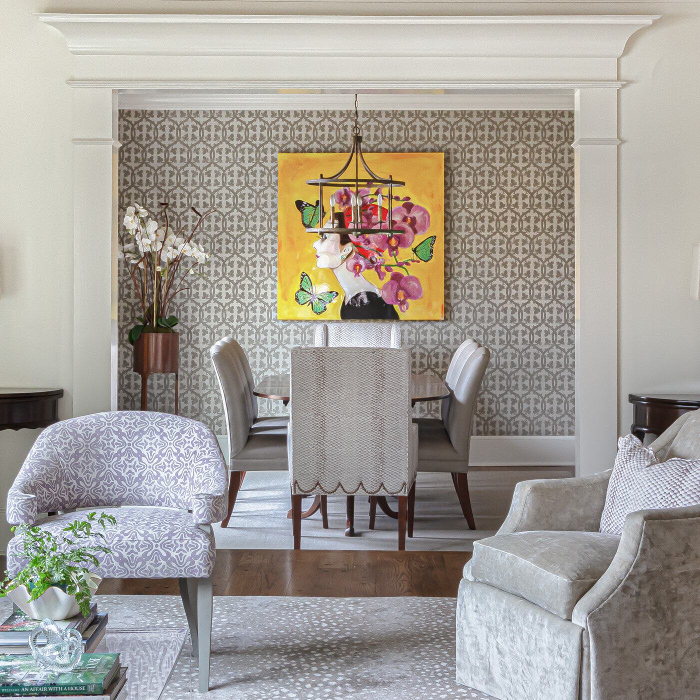
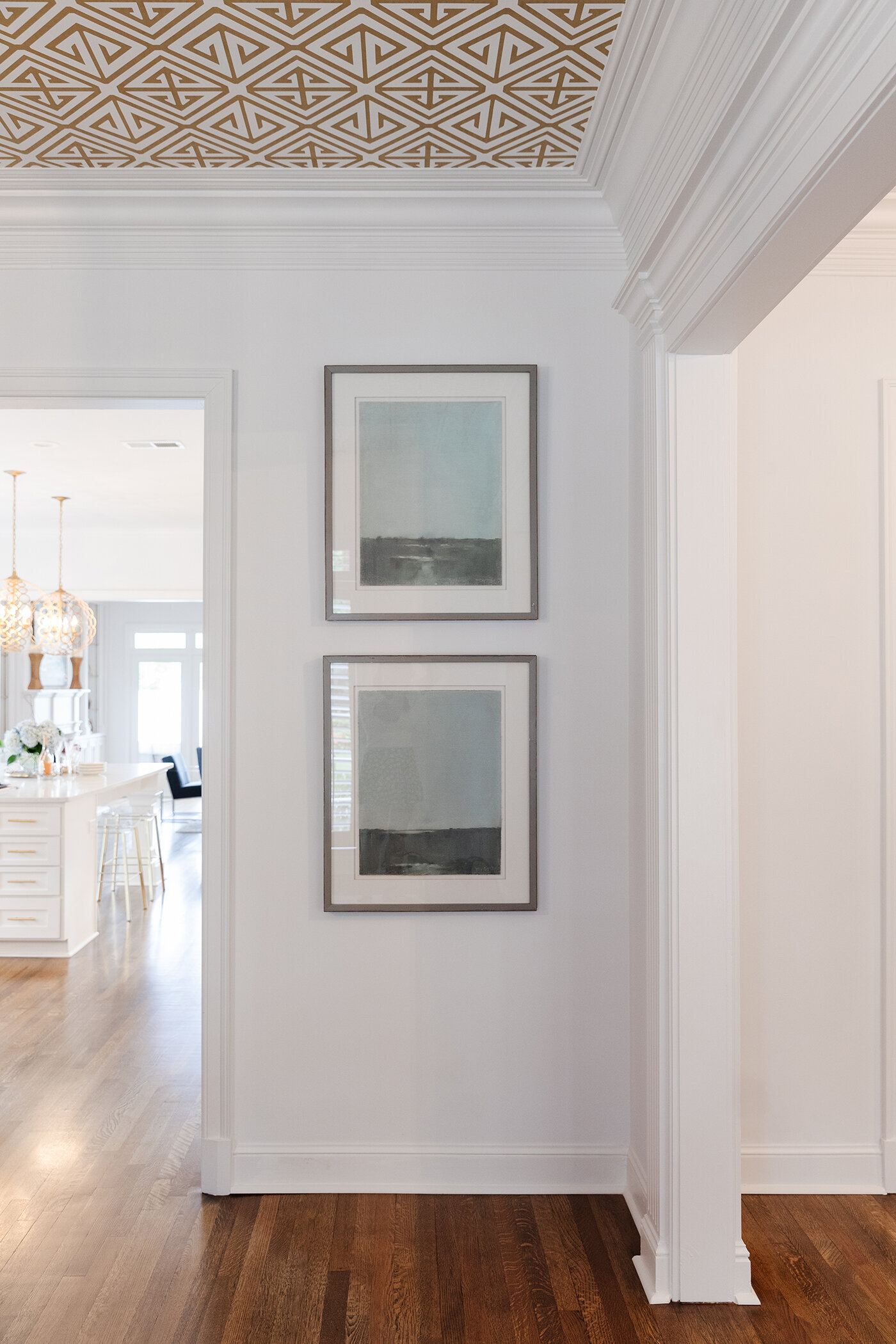
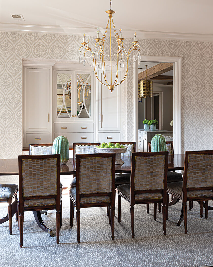
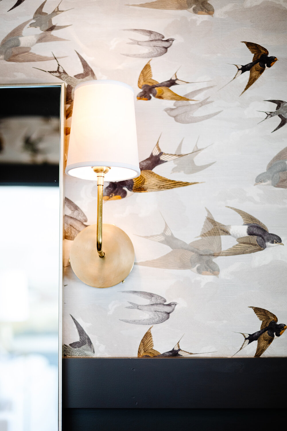
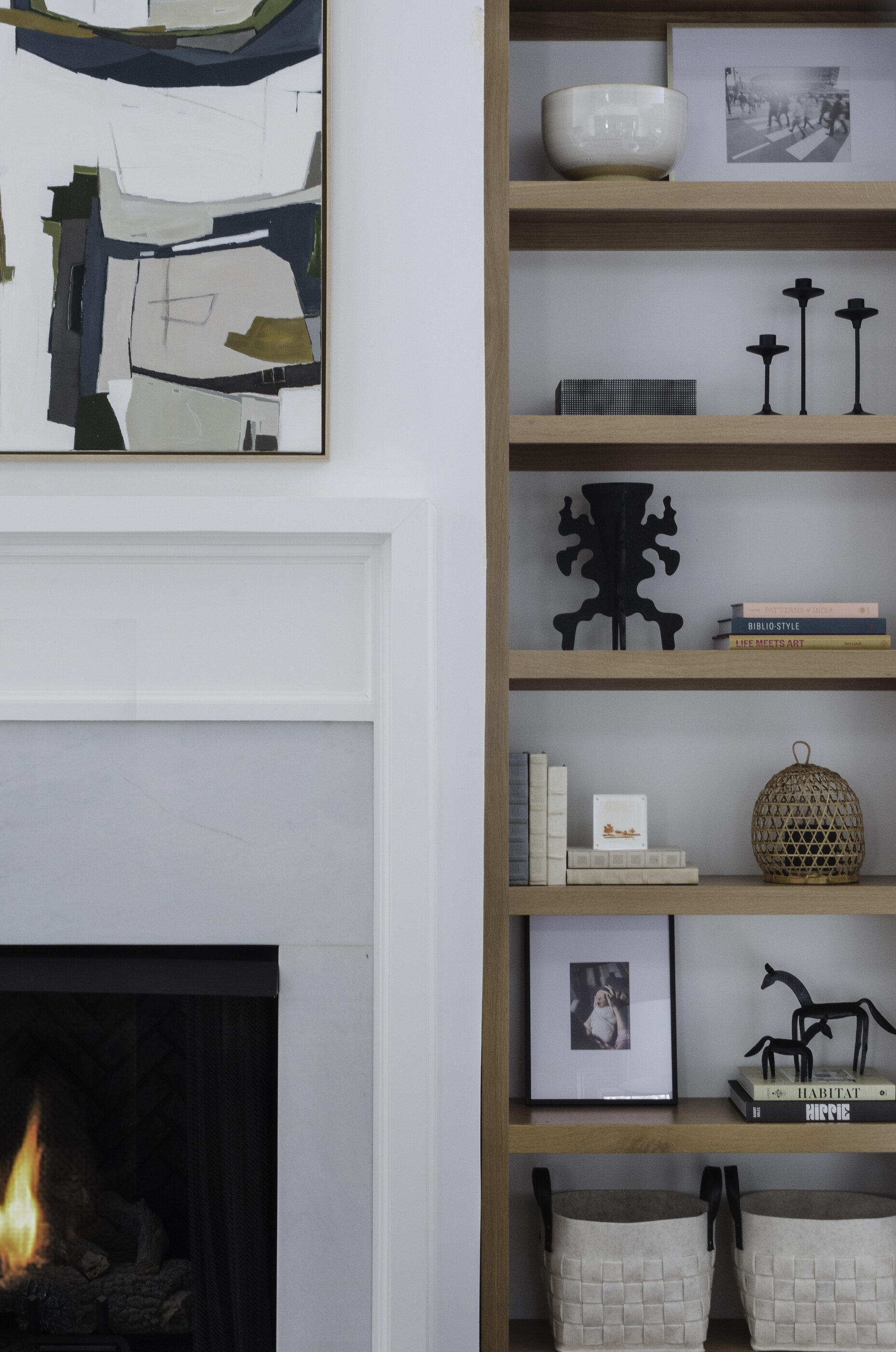
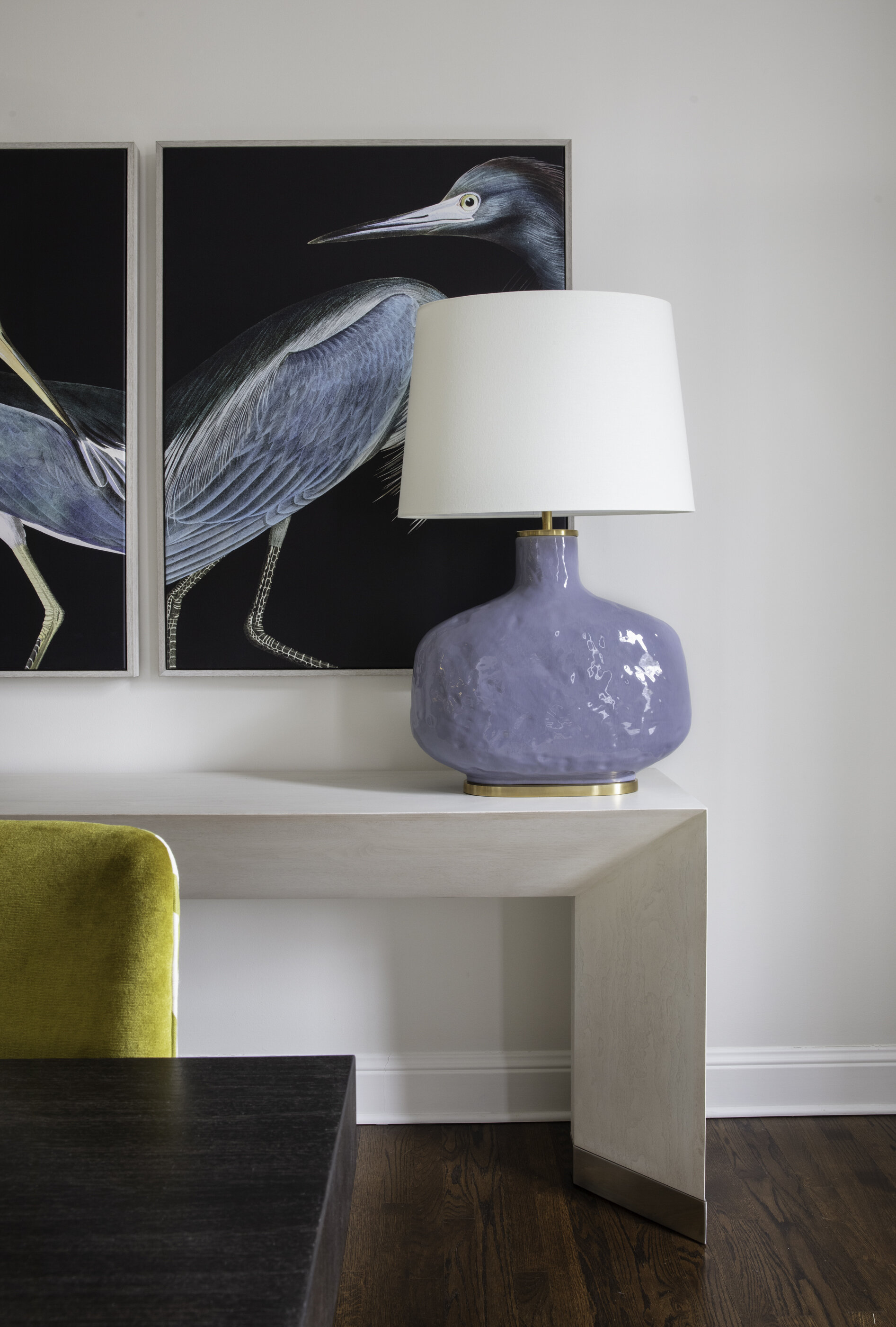
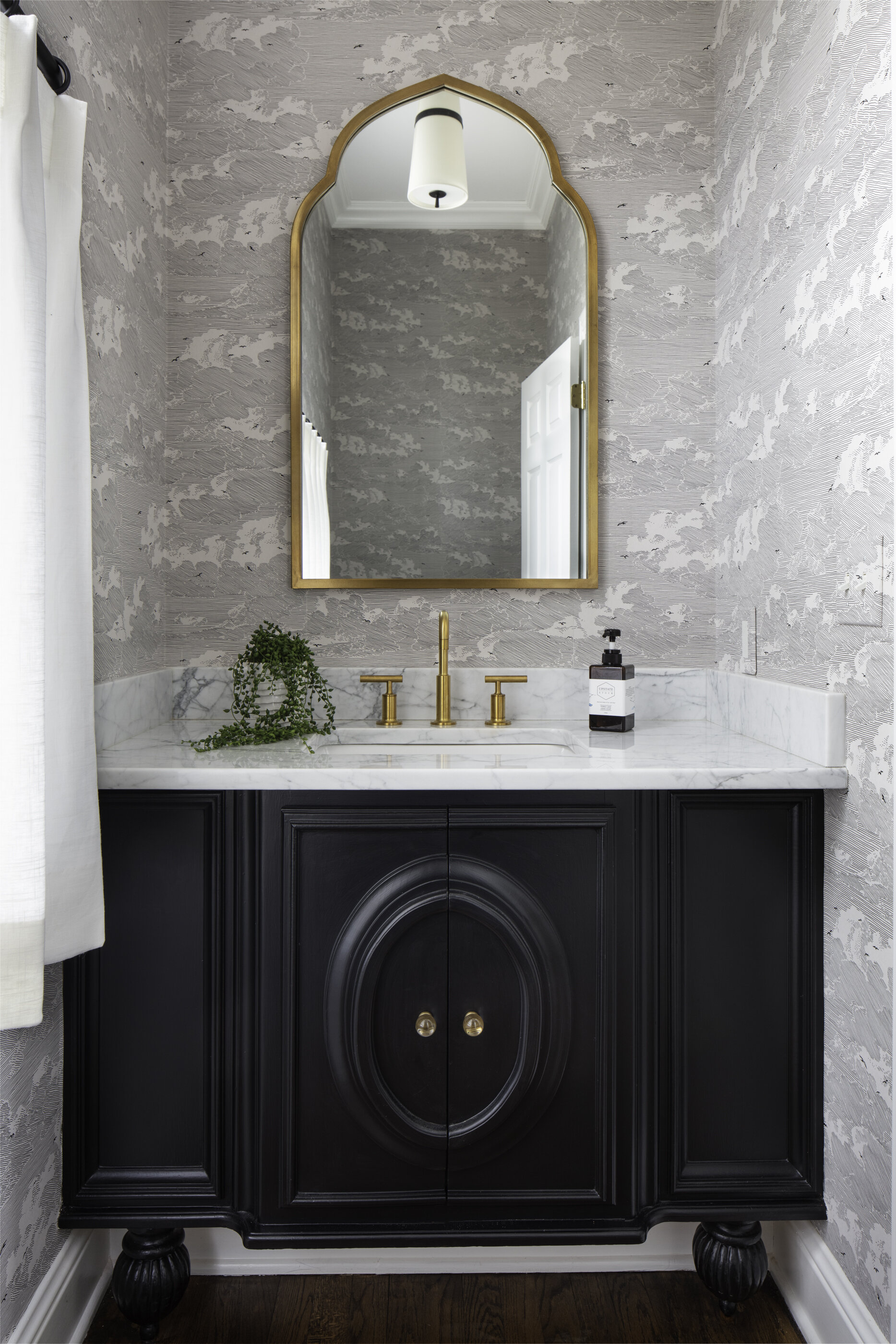
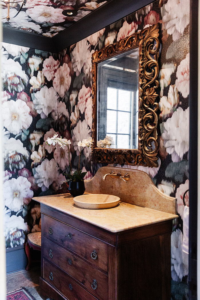
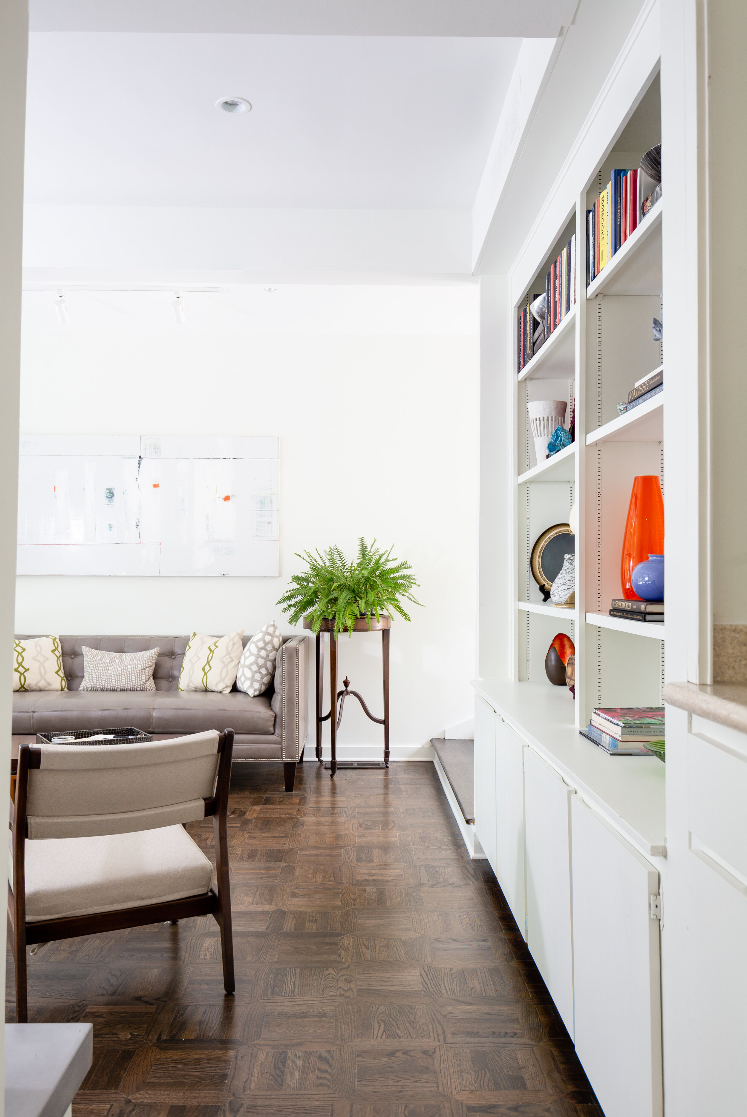
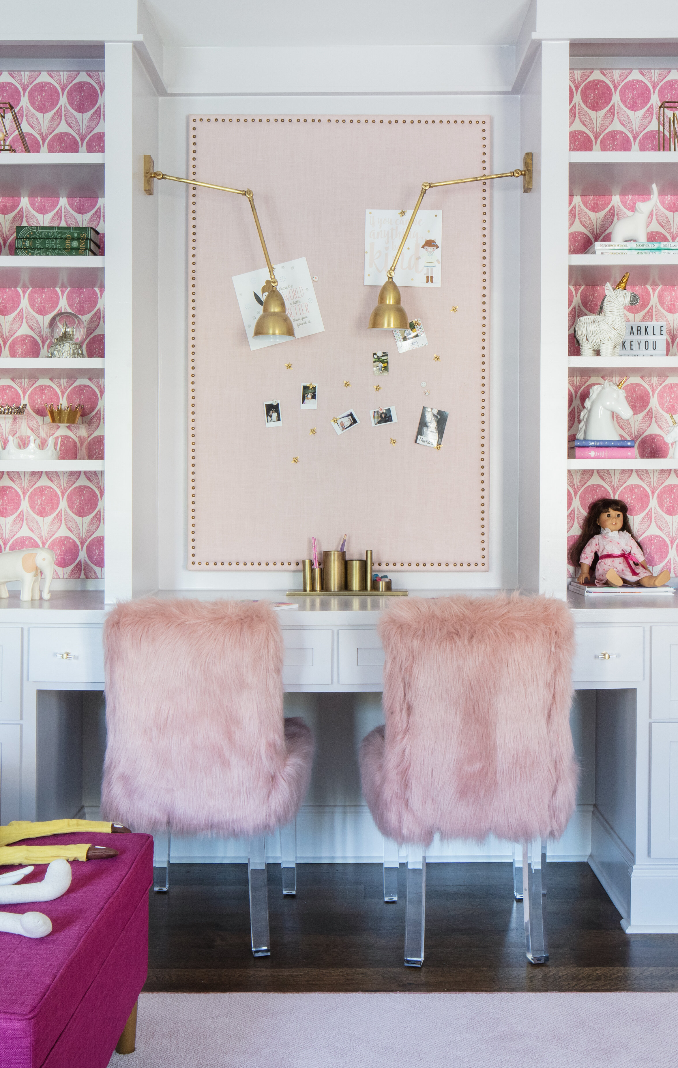
One design element that Toney and Michaelis helped ease the homeowner into was wallpaper. Michaelis remembers, “We started with just putting wallpaper inside the built-in shelves in the living room. After we did that she liked it so much that we’re about to add it in the dining room and she wants it all over now!” 

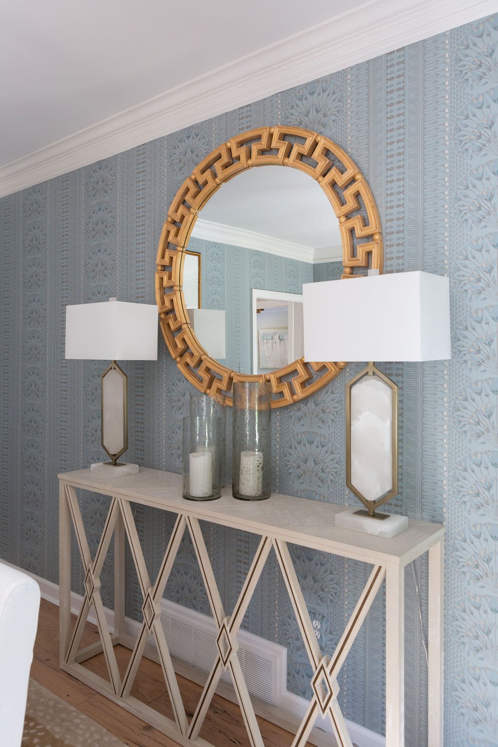
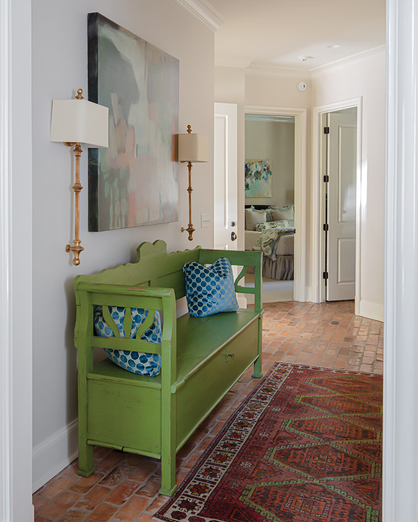
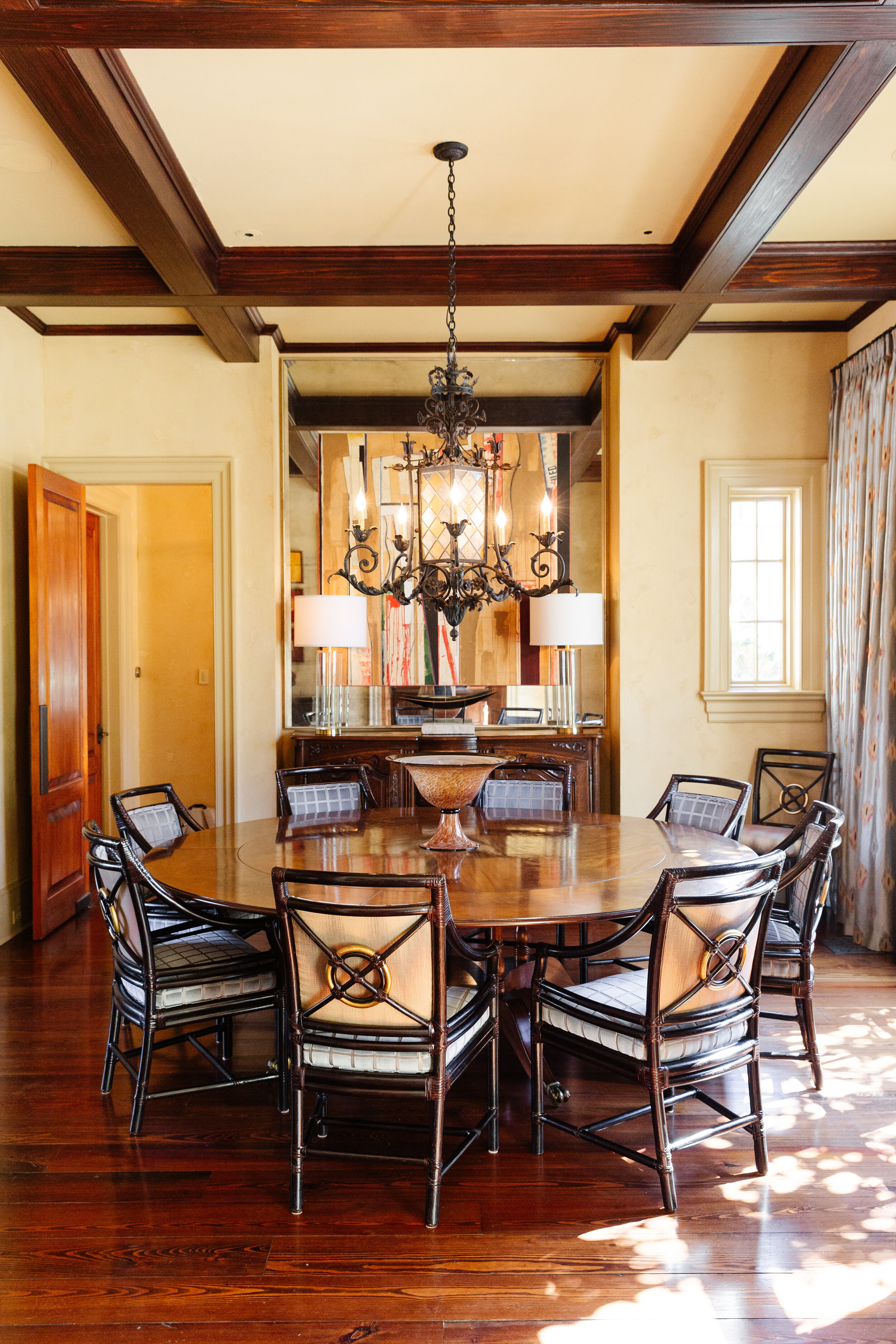
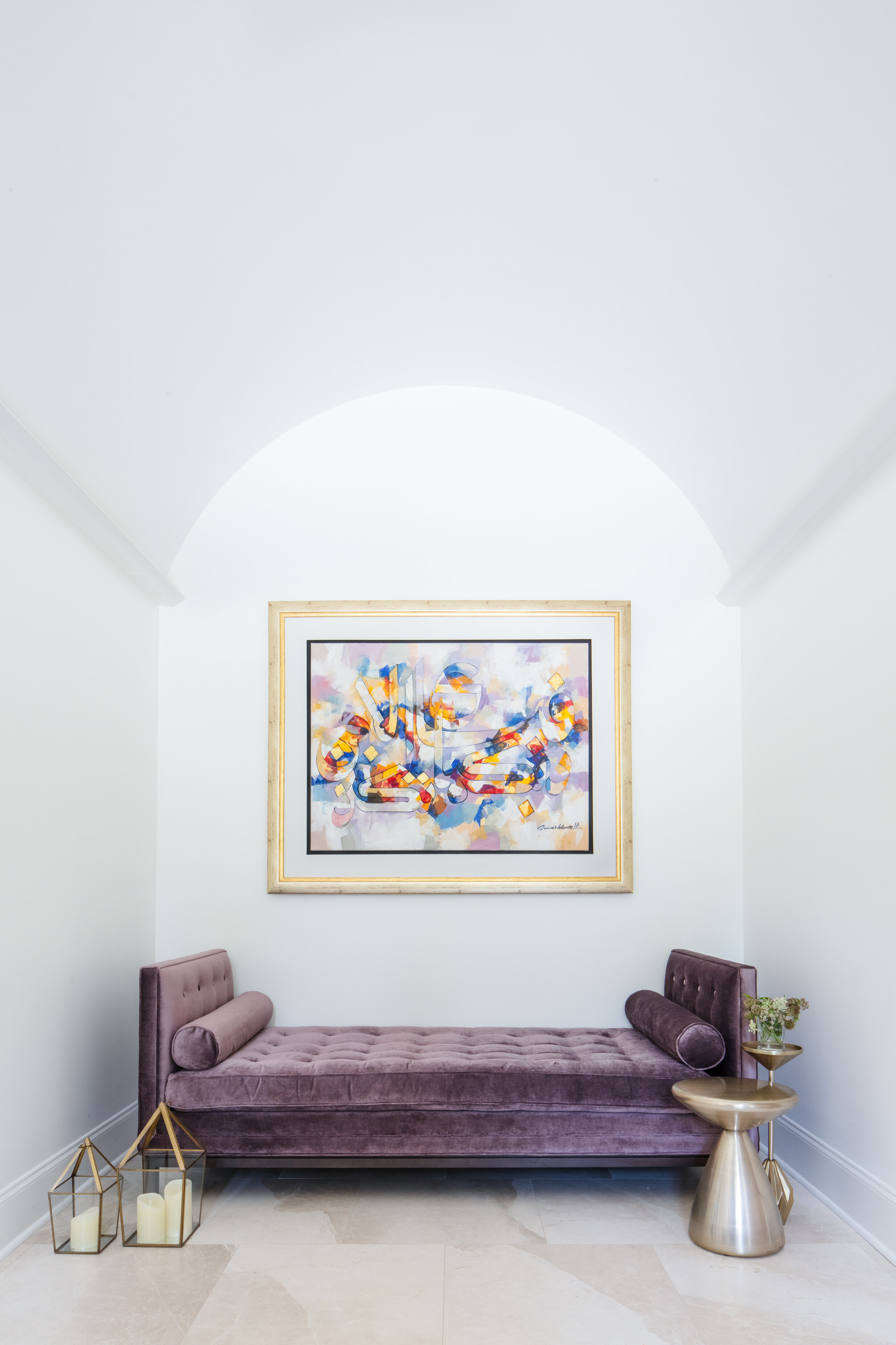
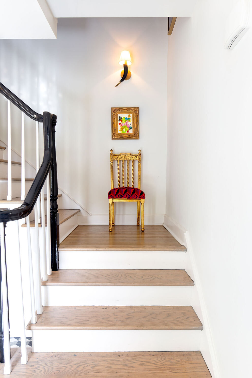
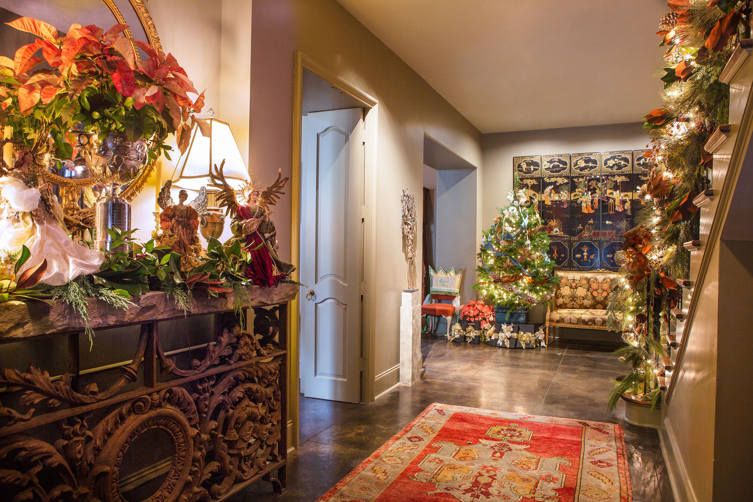
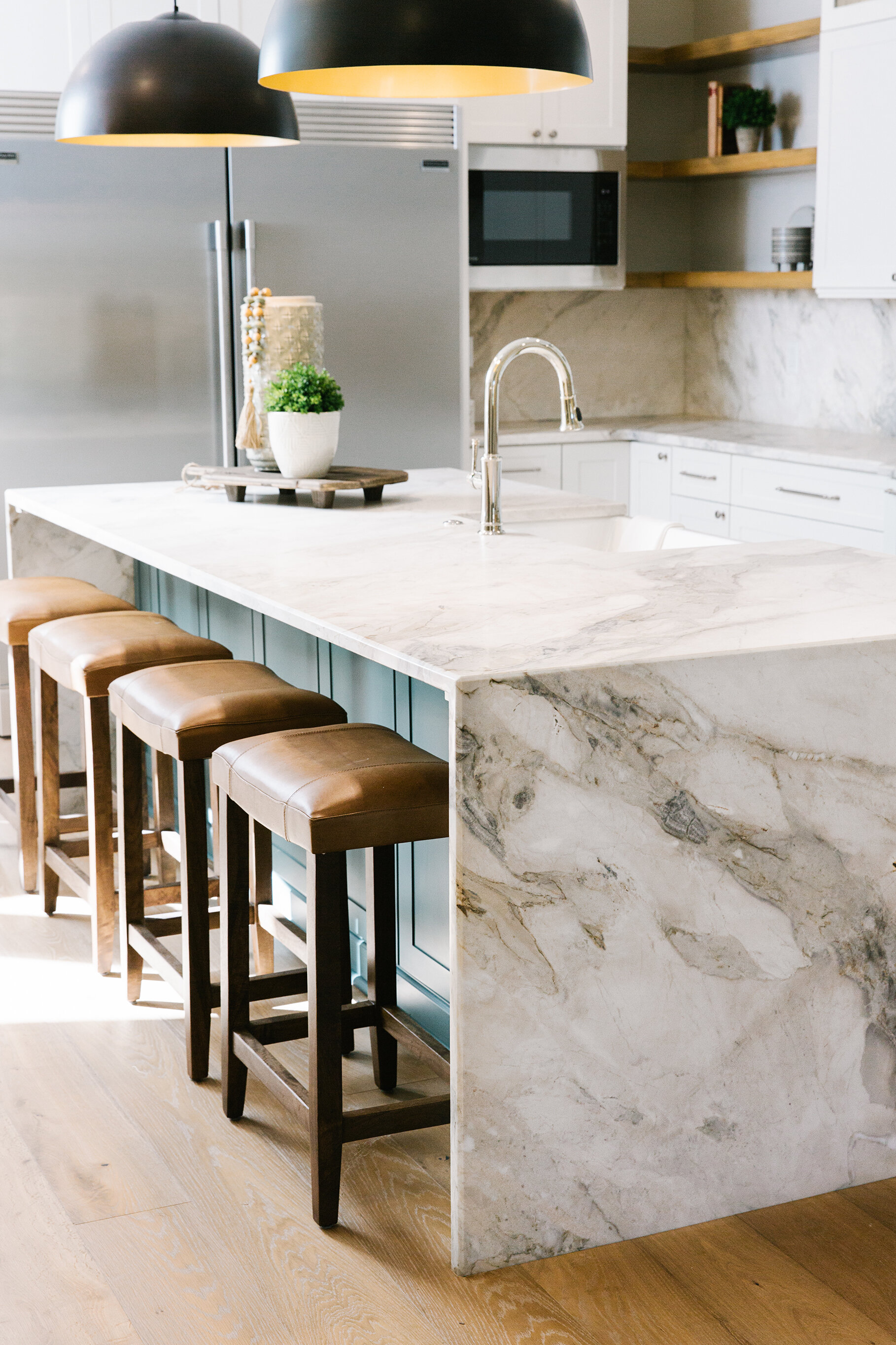
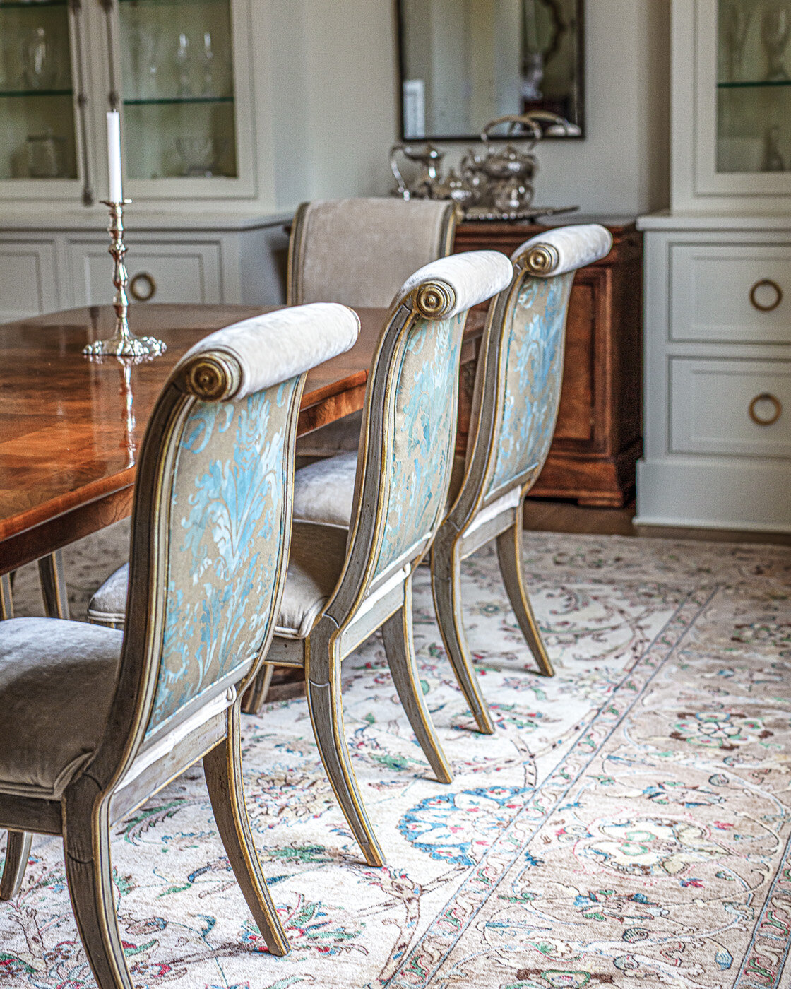
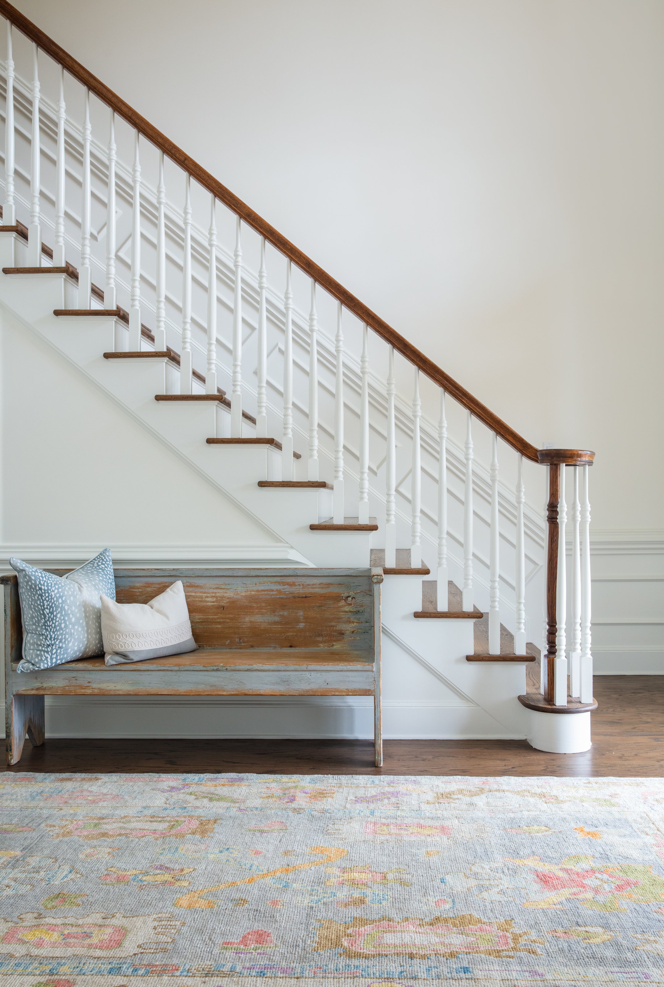
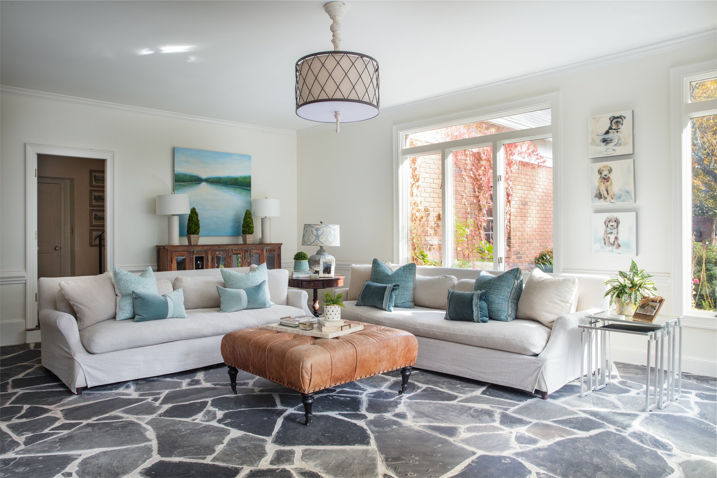
The beautiful Turkish rugs that grace the home also took a bit of convincing on the designers’ part. The family owns Flooring Solutions of Memphis, so carpet, tile and hard wood are in their realm of expertise. They were a bit reluctant, however, to invest in oriental rugs. According to Michaelis, “A lot of people hesitate on rugs, so I say, ‘Just let me bring a few rugs over…’ Once she saw these she had to have them.” Heavenly Rugs in Germantown provided all the rugs in the home, including the one the designers say is “the rock star of the room” in the entryway.

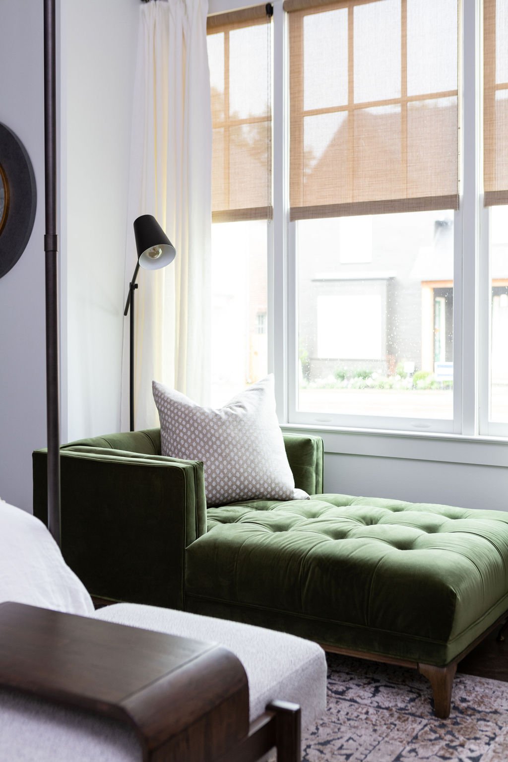
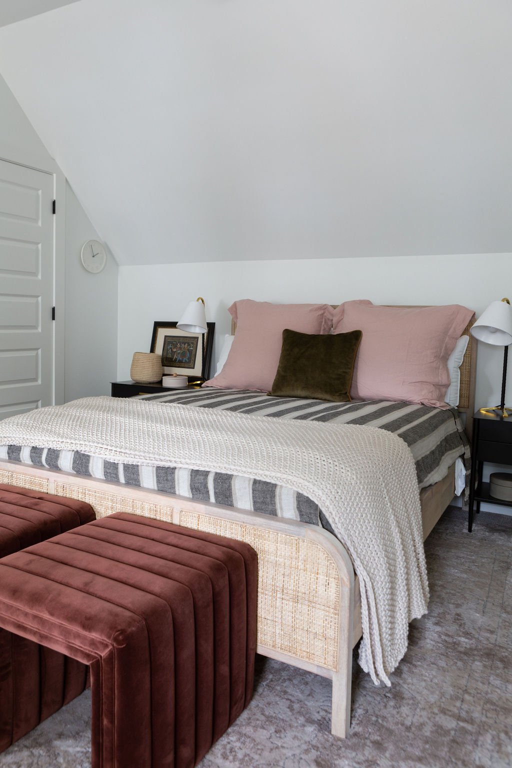
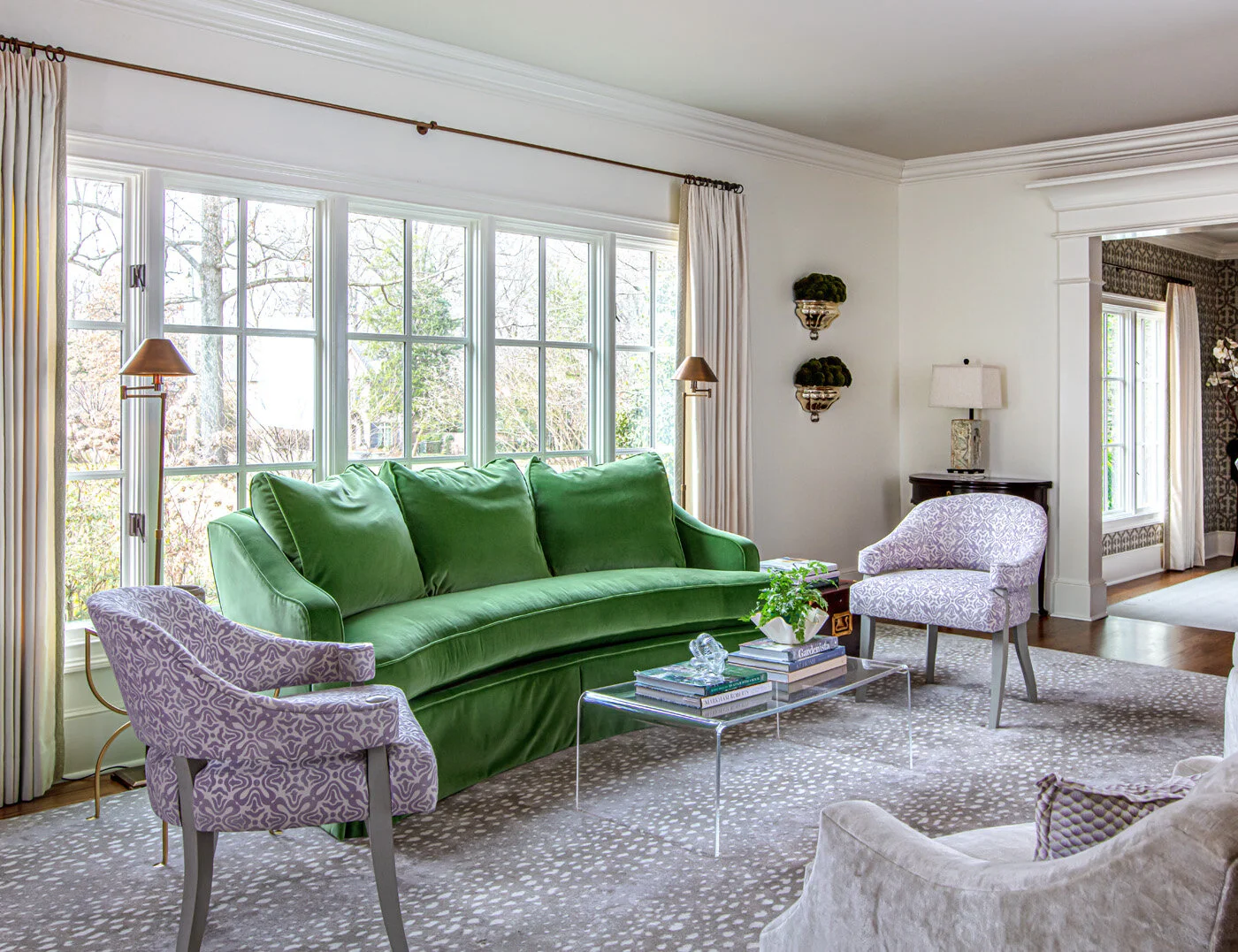
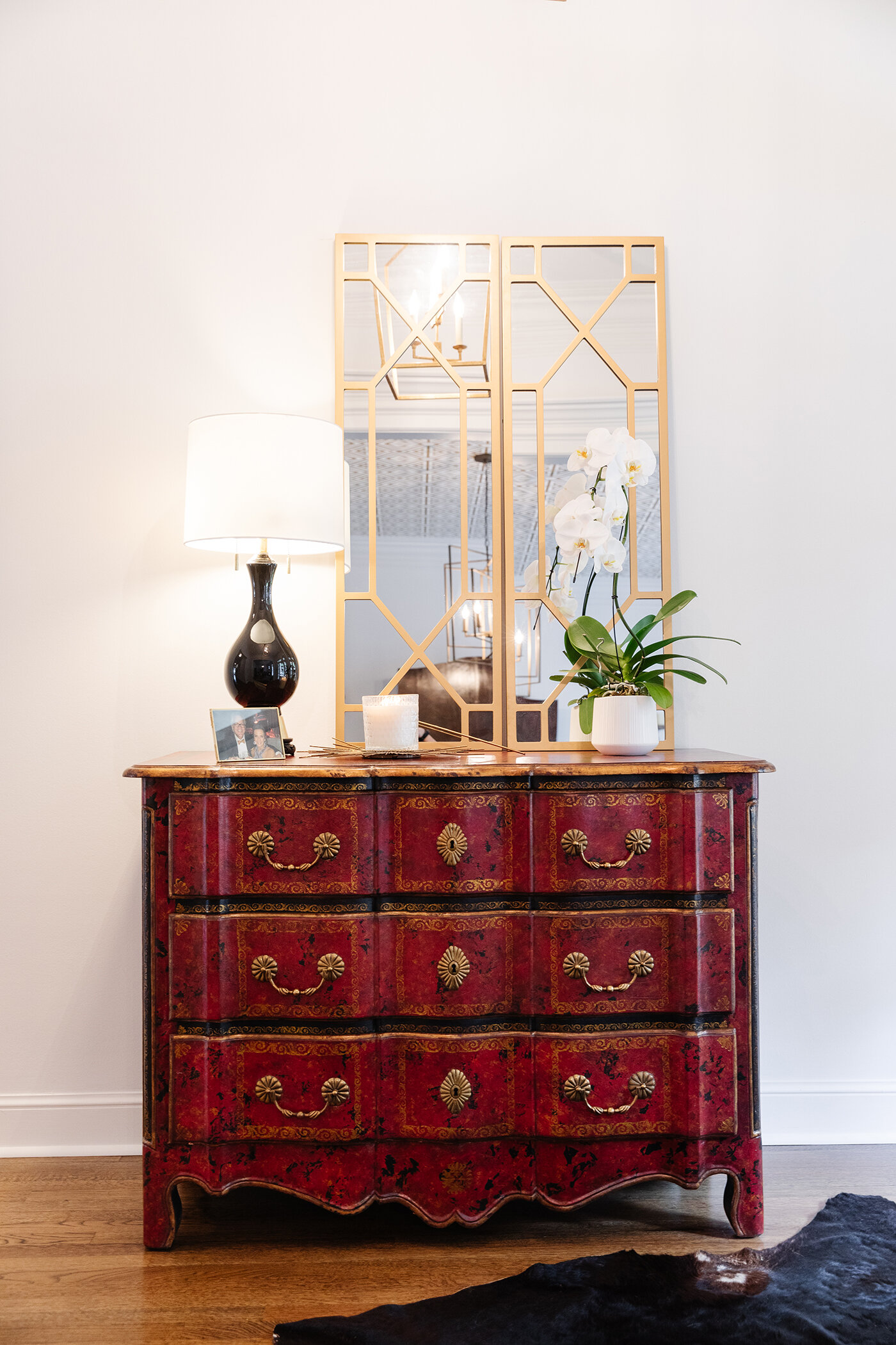
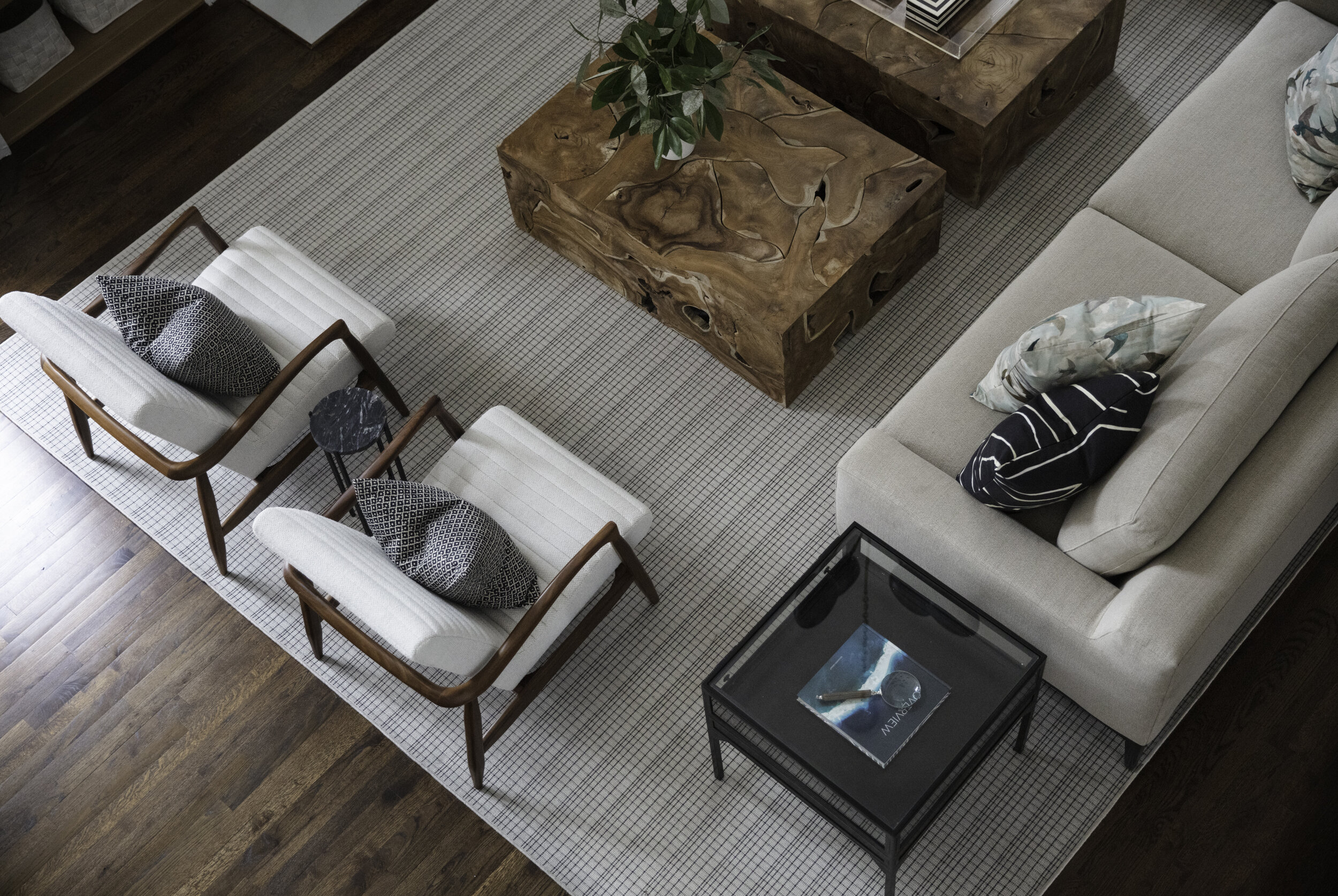
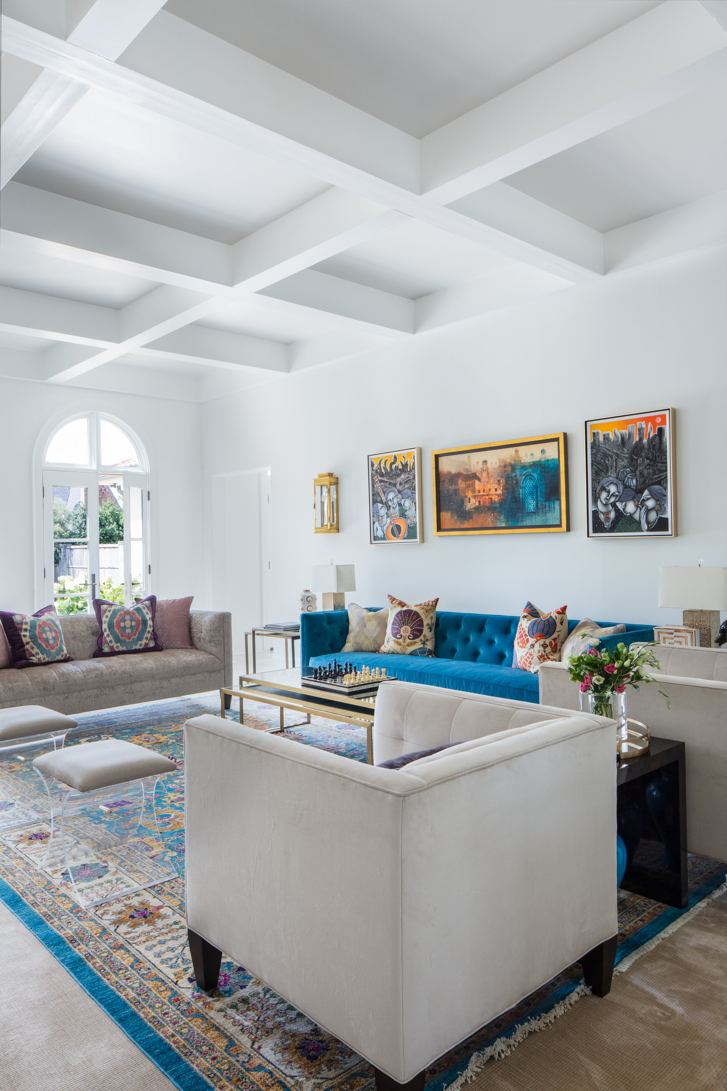
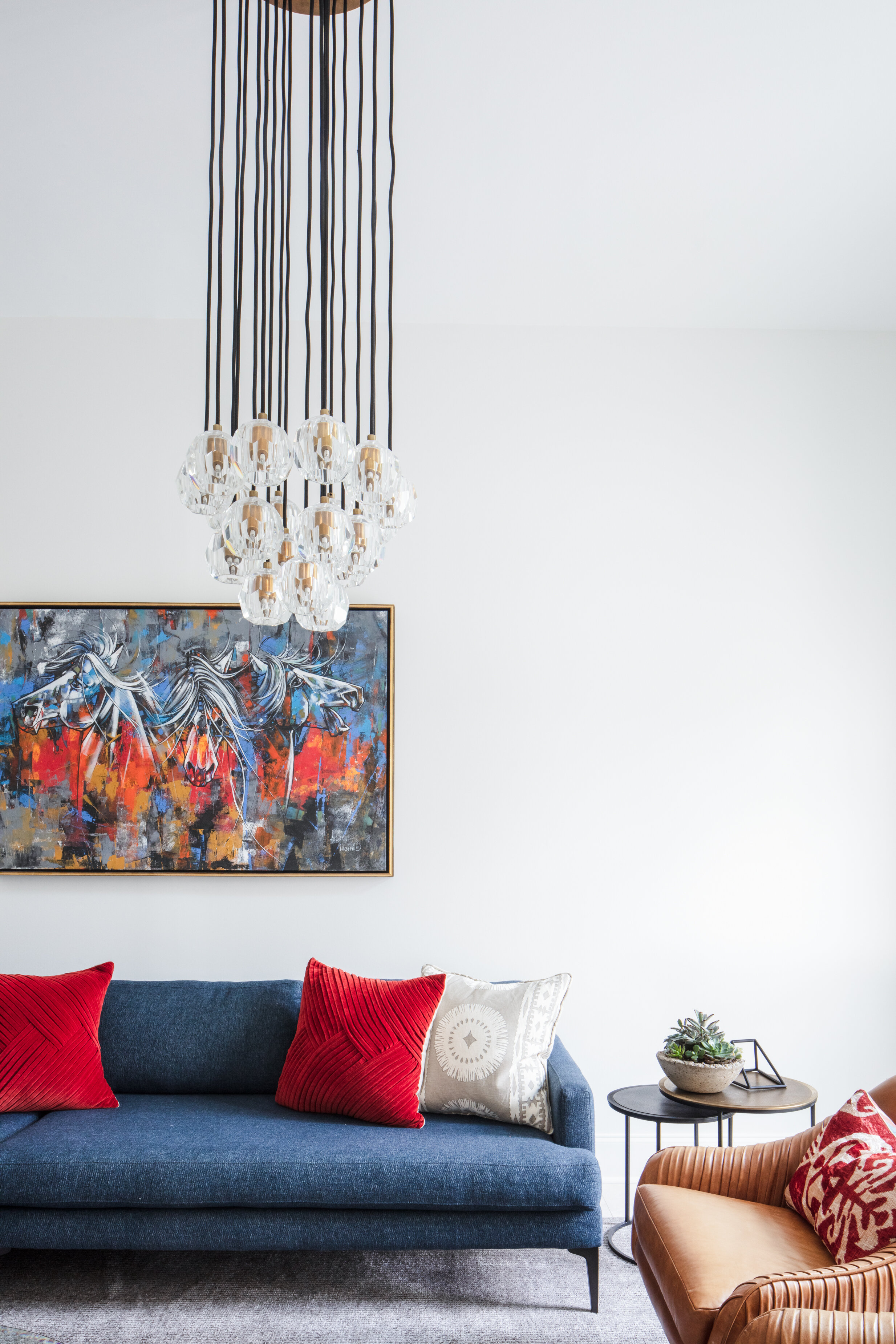
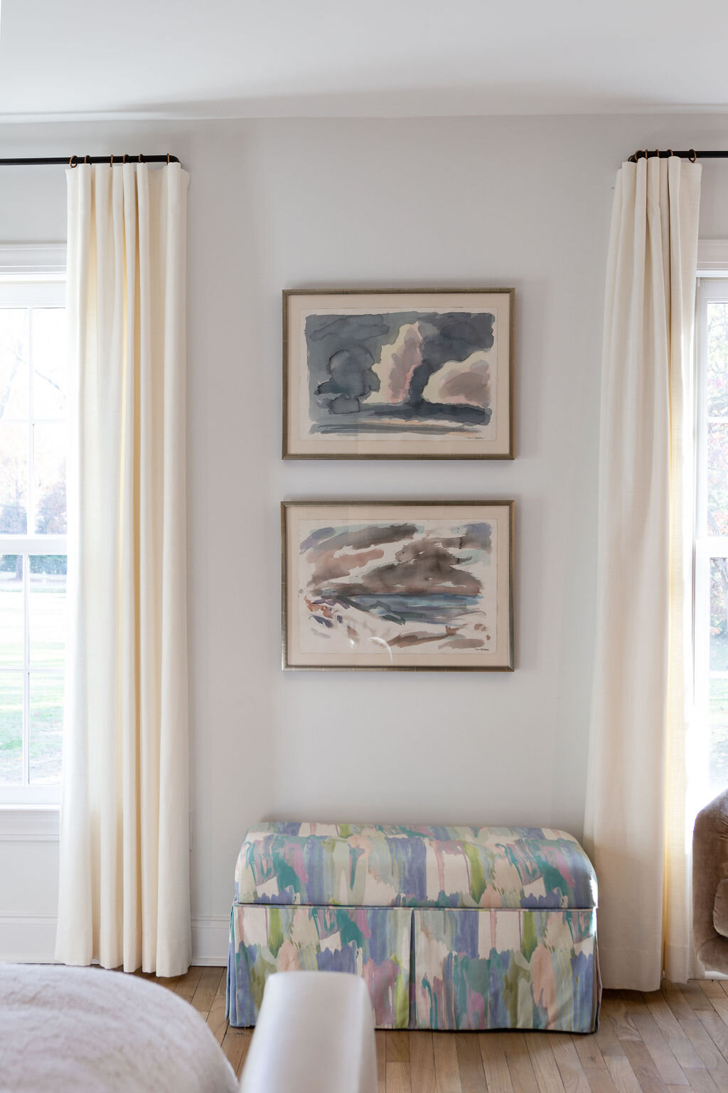
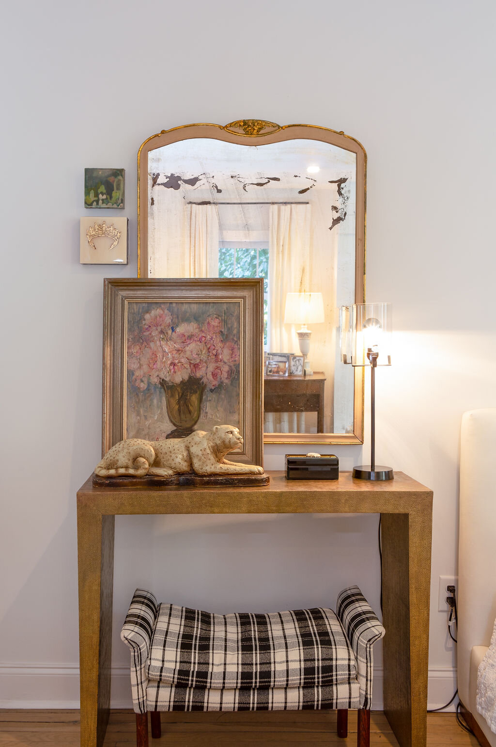
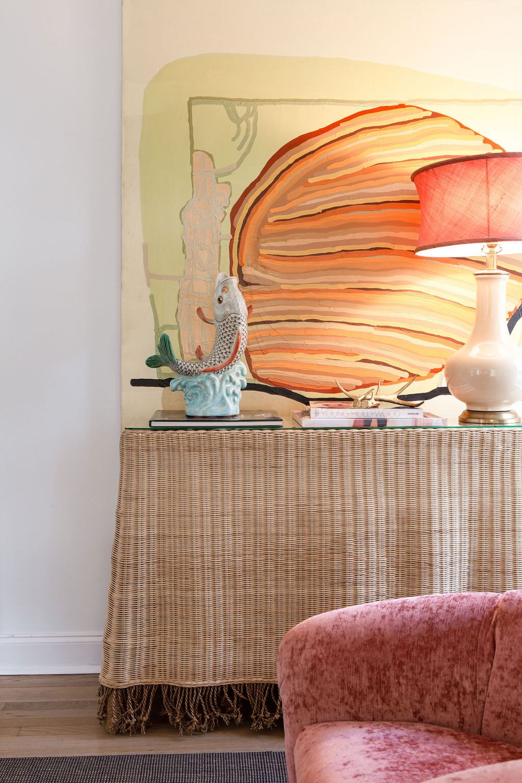
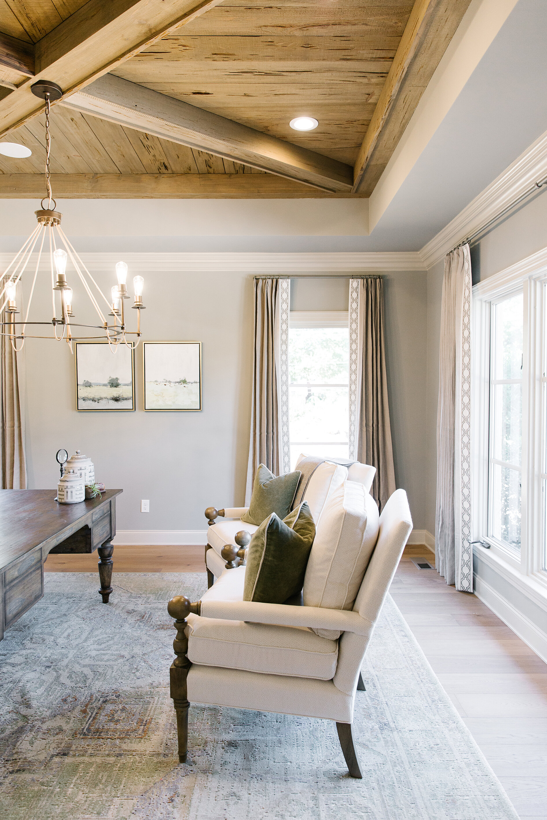
Just as jewelry adds interest to an outfit, the homeowner has found, after living in the house for two years, that a few perfectly placed, bold-colored pieces make all the difference in decor that’s otherwise mostly neutral. Toney likes to bring in the accents in the form of art, accessories, draperies and throw pillows, items that are easily altered as time passes and styles evolve. “We try to steer our clients toward traditional. They might get tired of grasscloth in time, they might not, but wallpaper is something that’s fairly easy to take down. We’re not saying don’t ever have anything trendy in your home, because you always want the newest and the best, but if the bones are traditional and timeless, then it’s easier to change and flow with what’s popular,” says the designer.

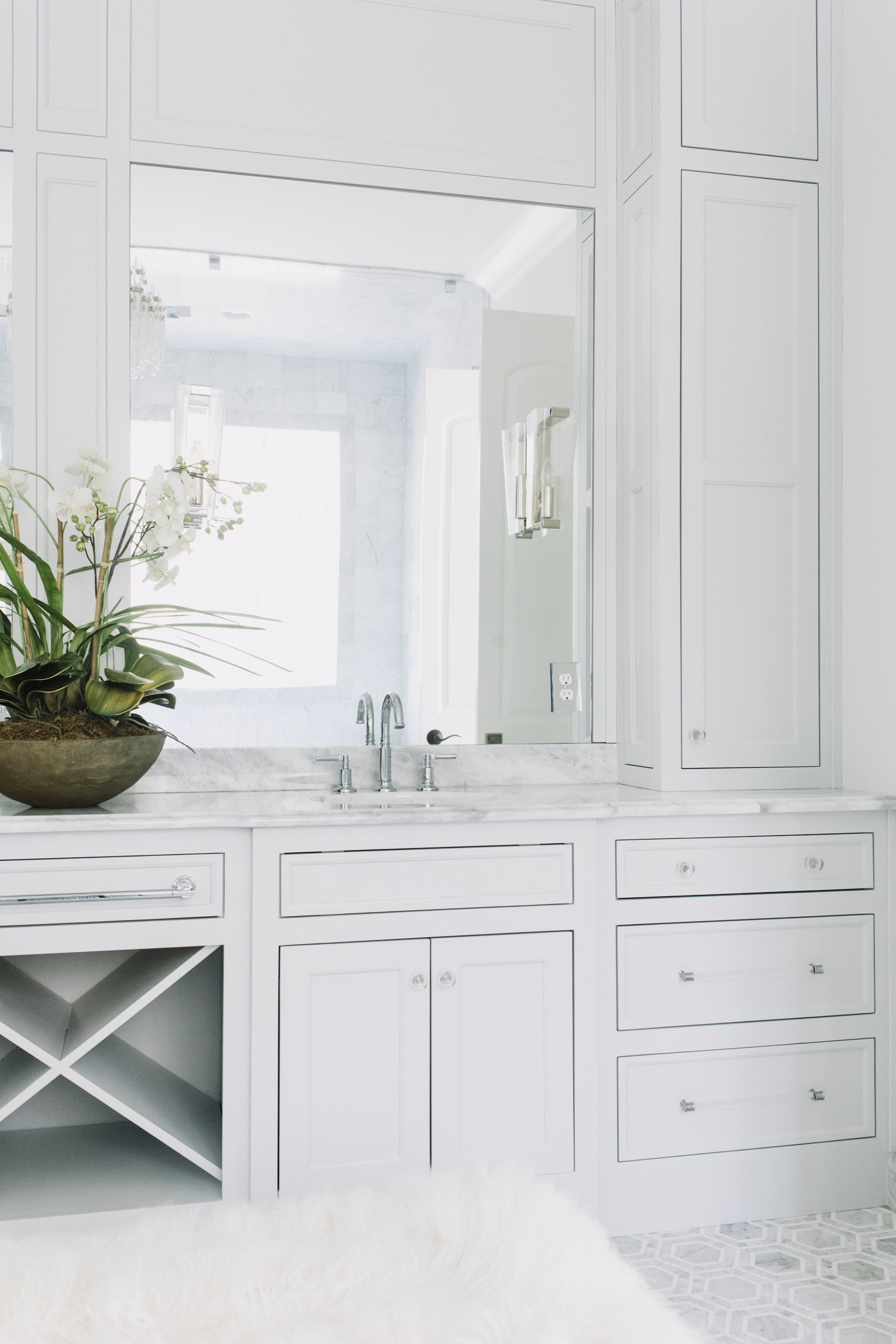
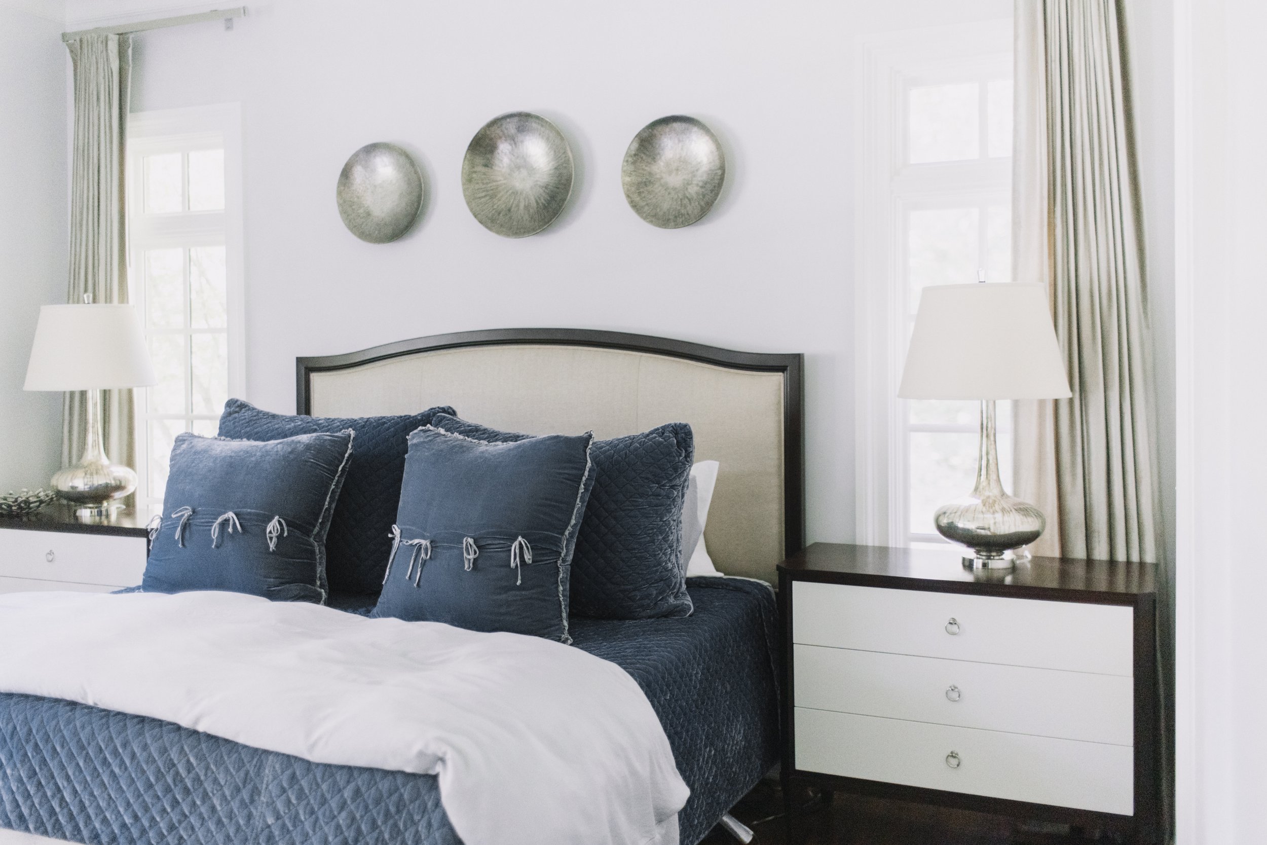
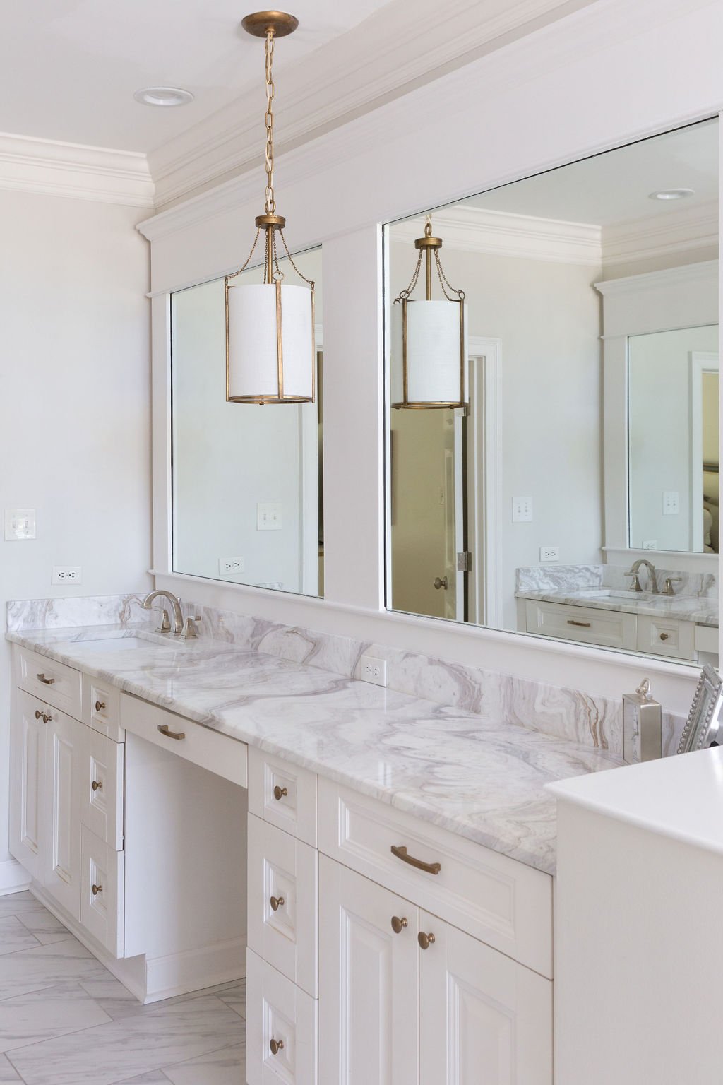
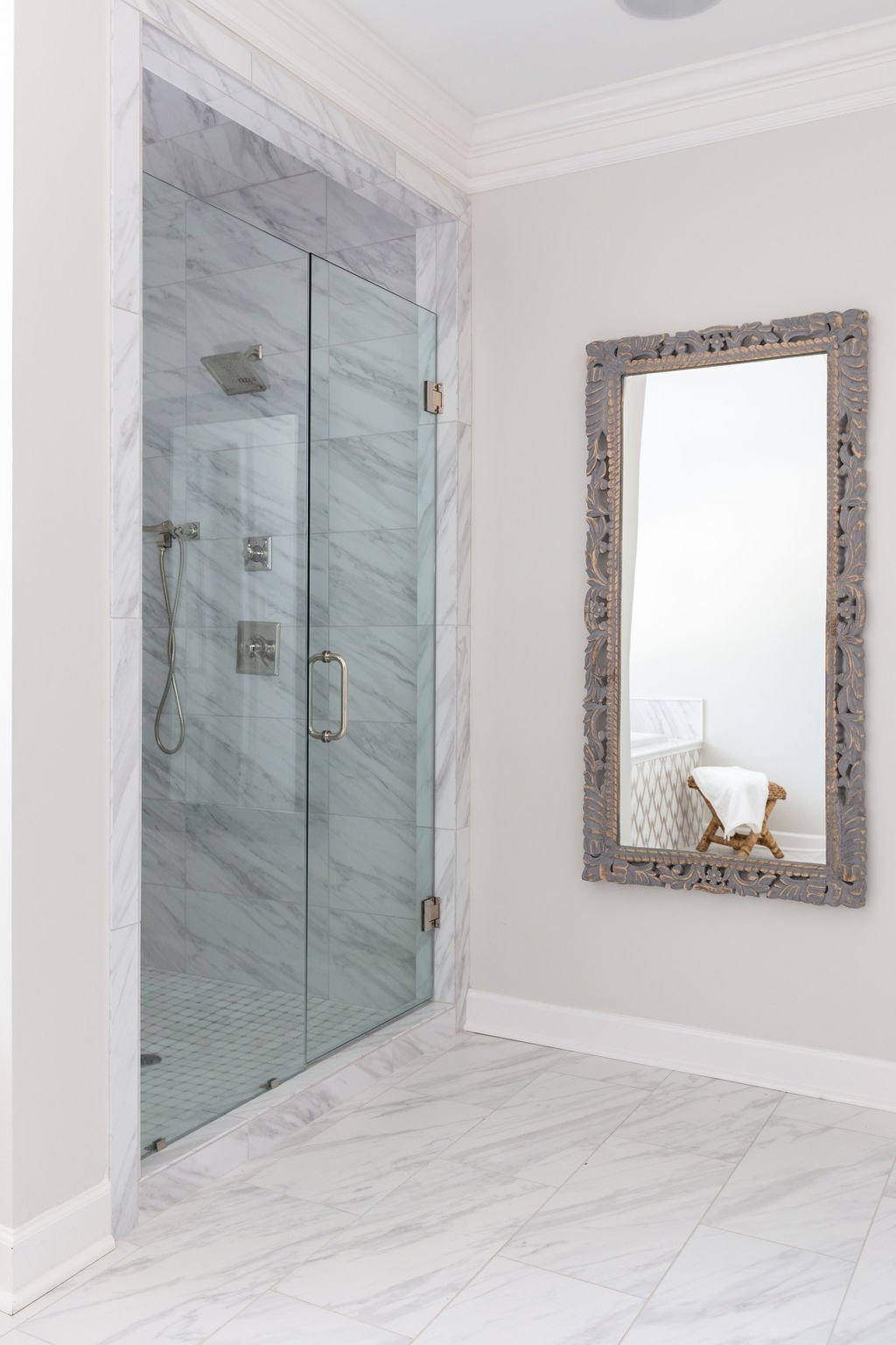
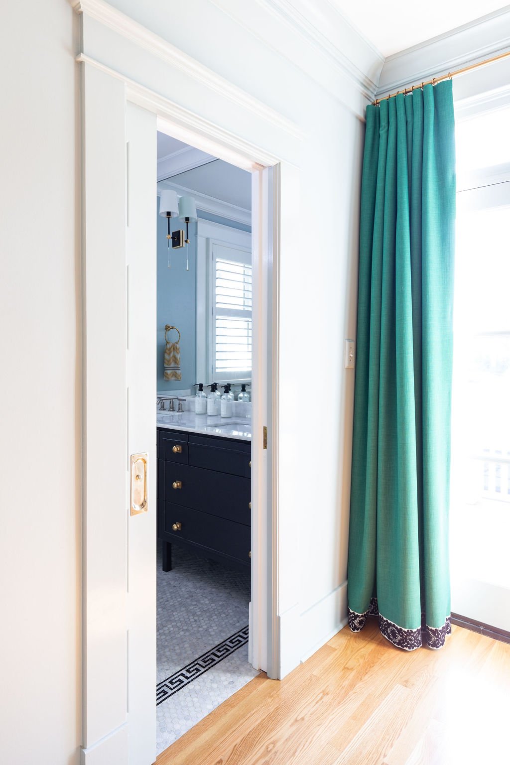
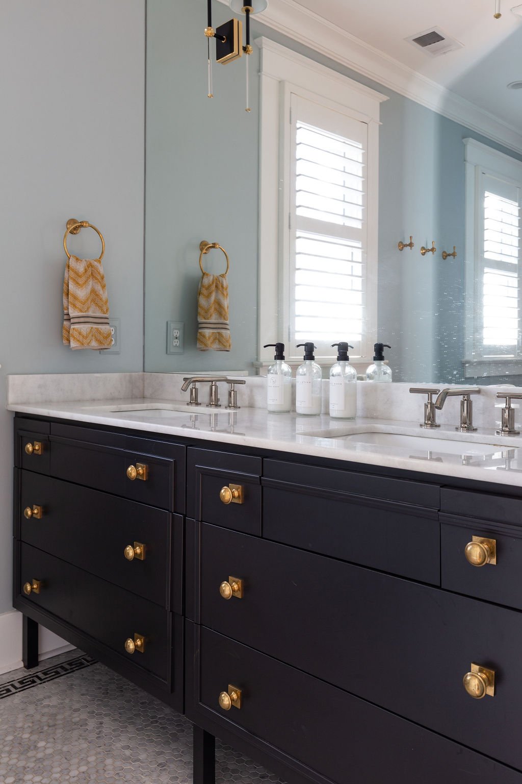
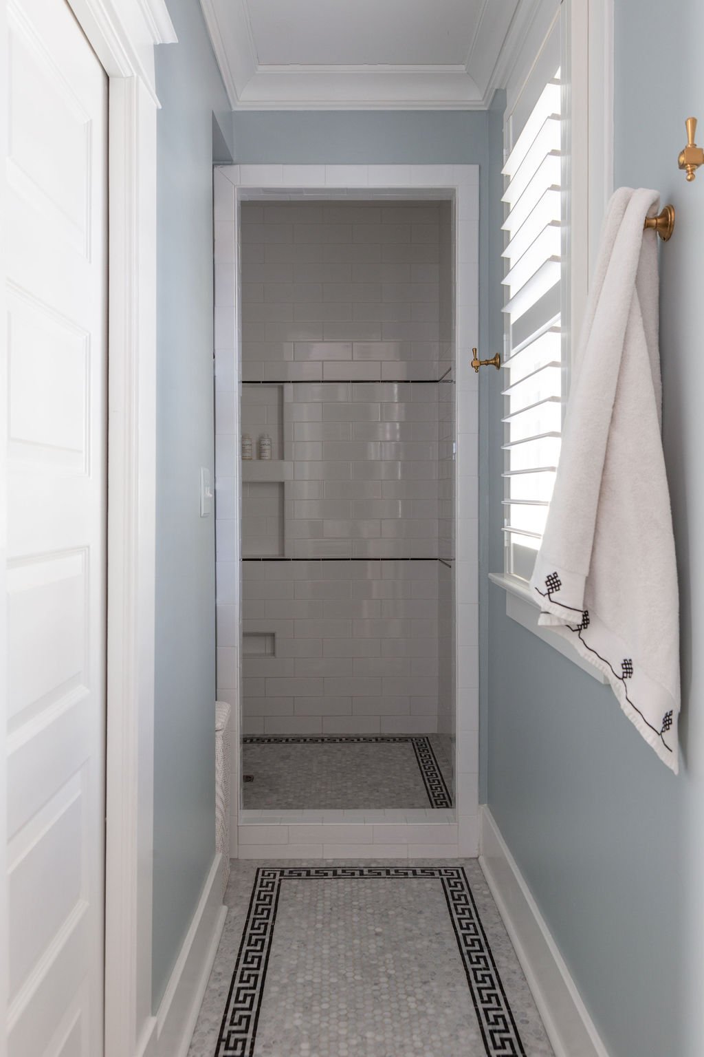
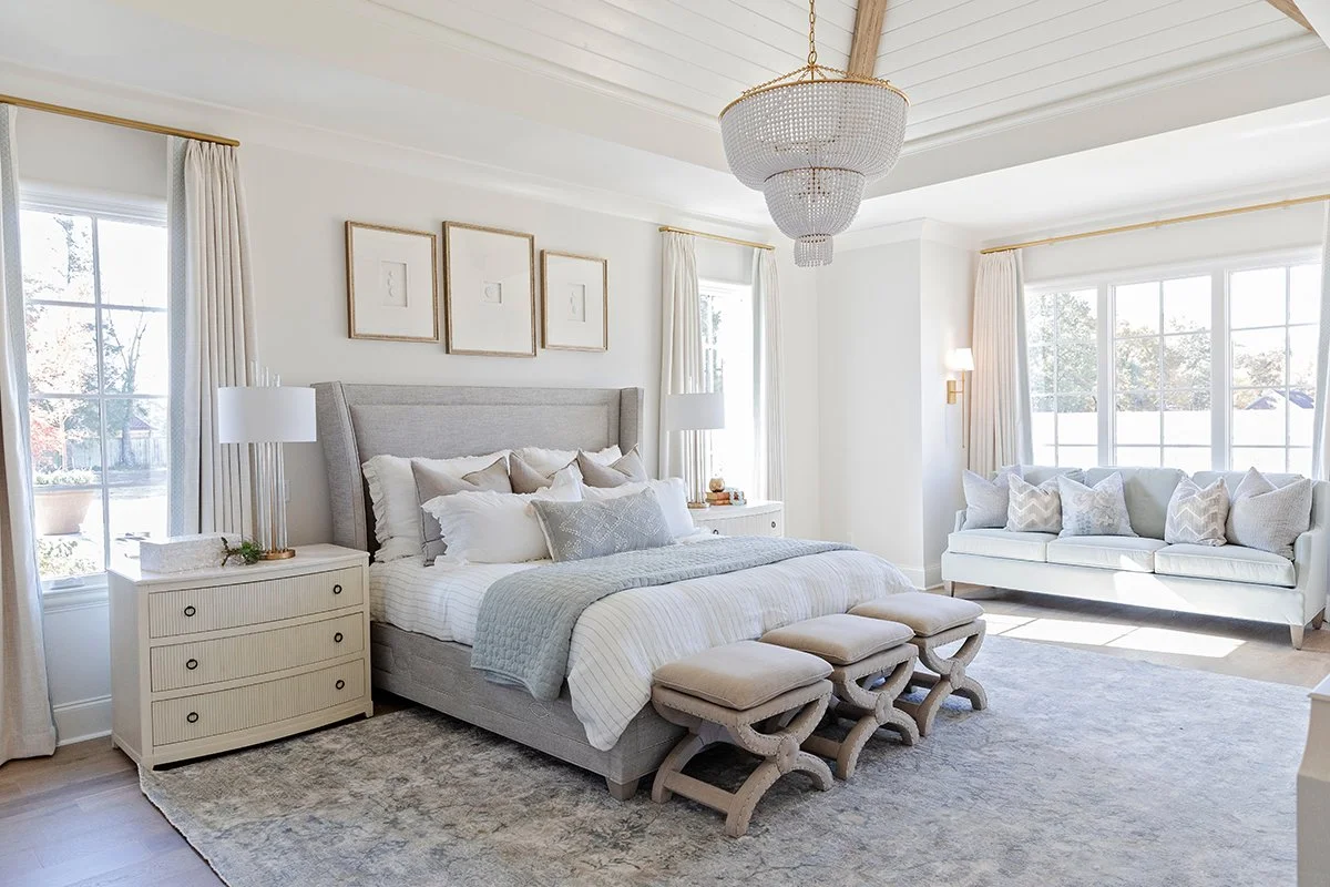
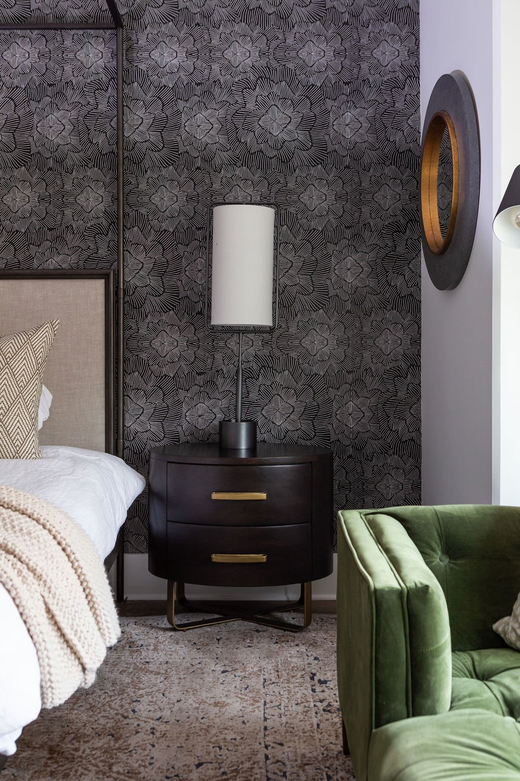
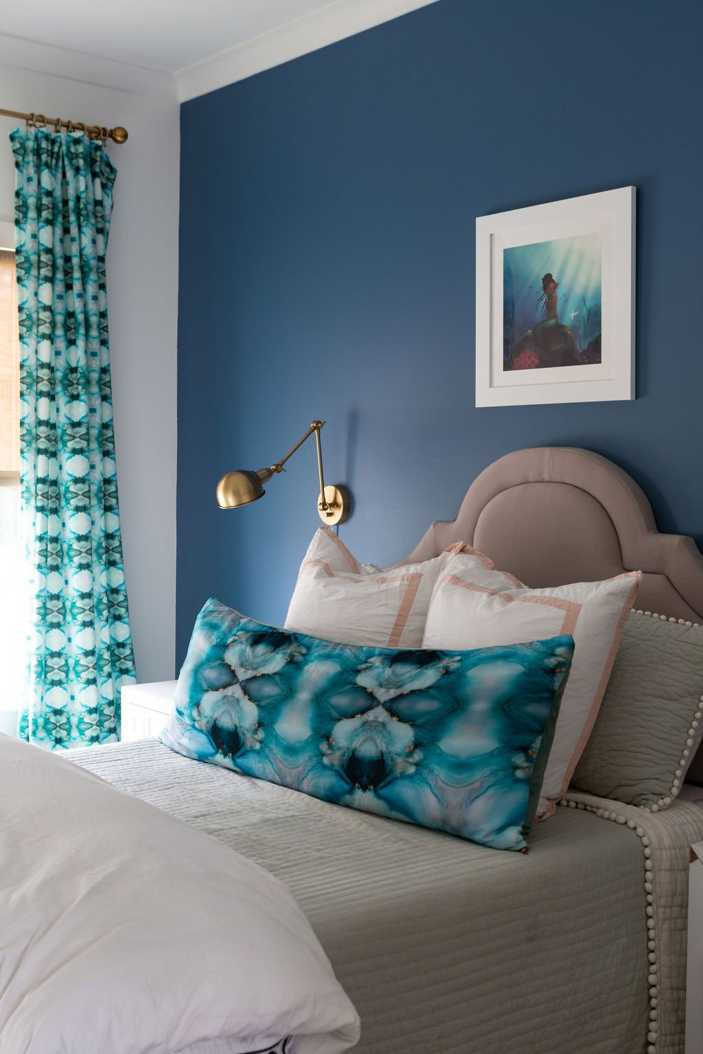
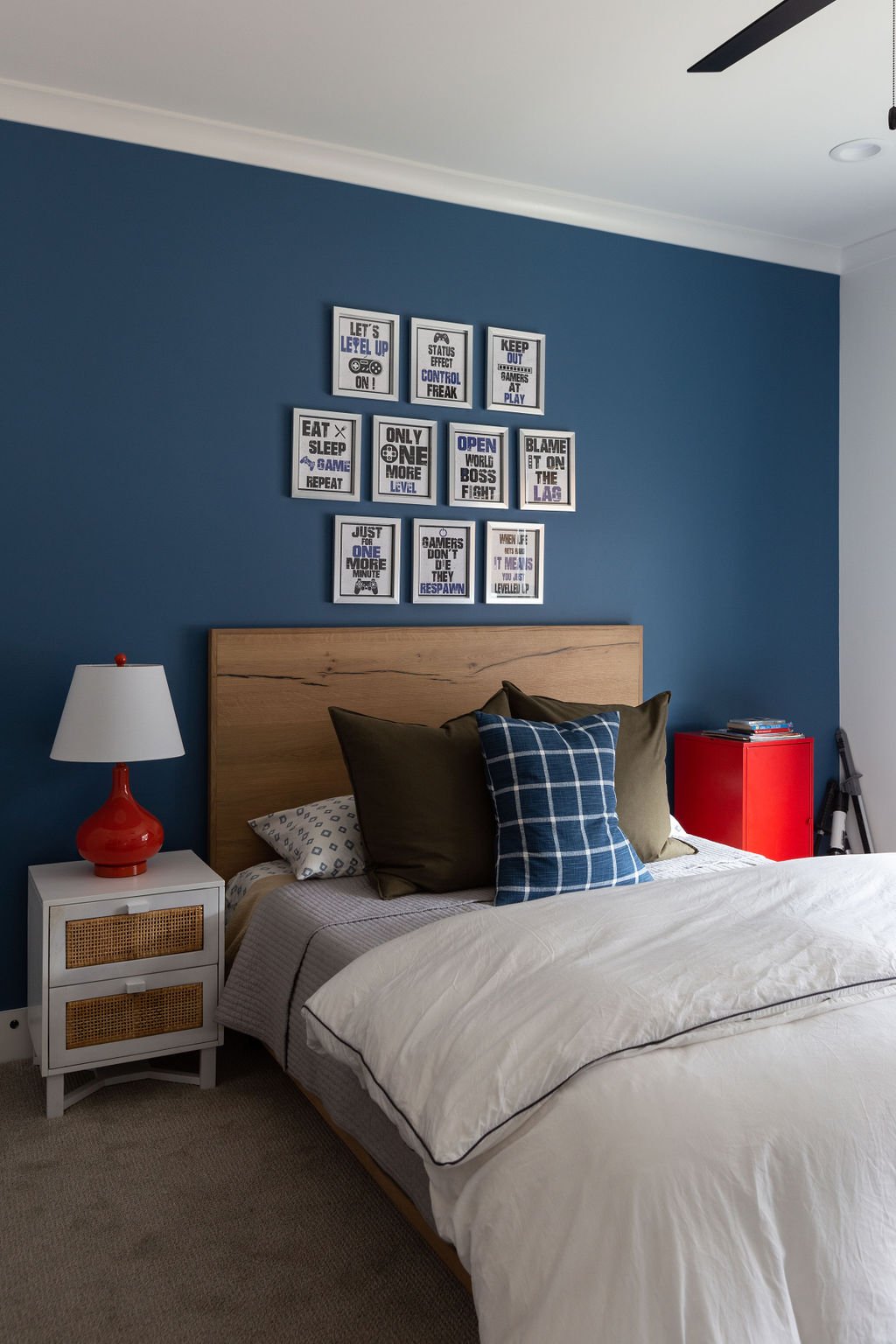
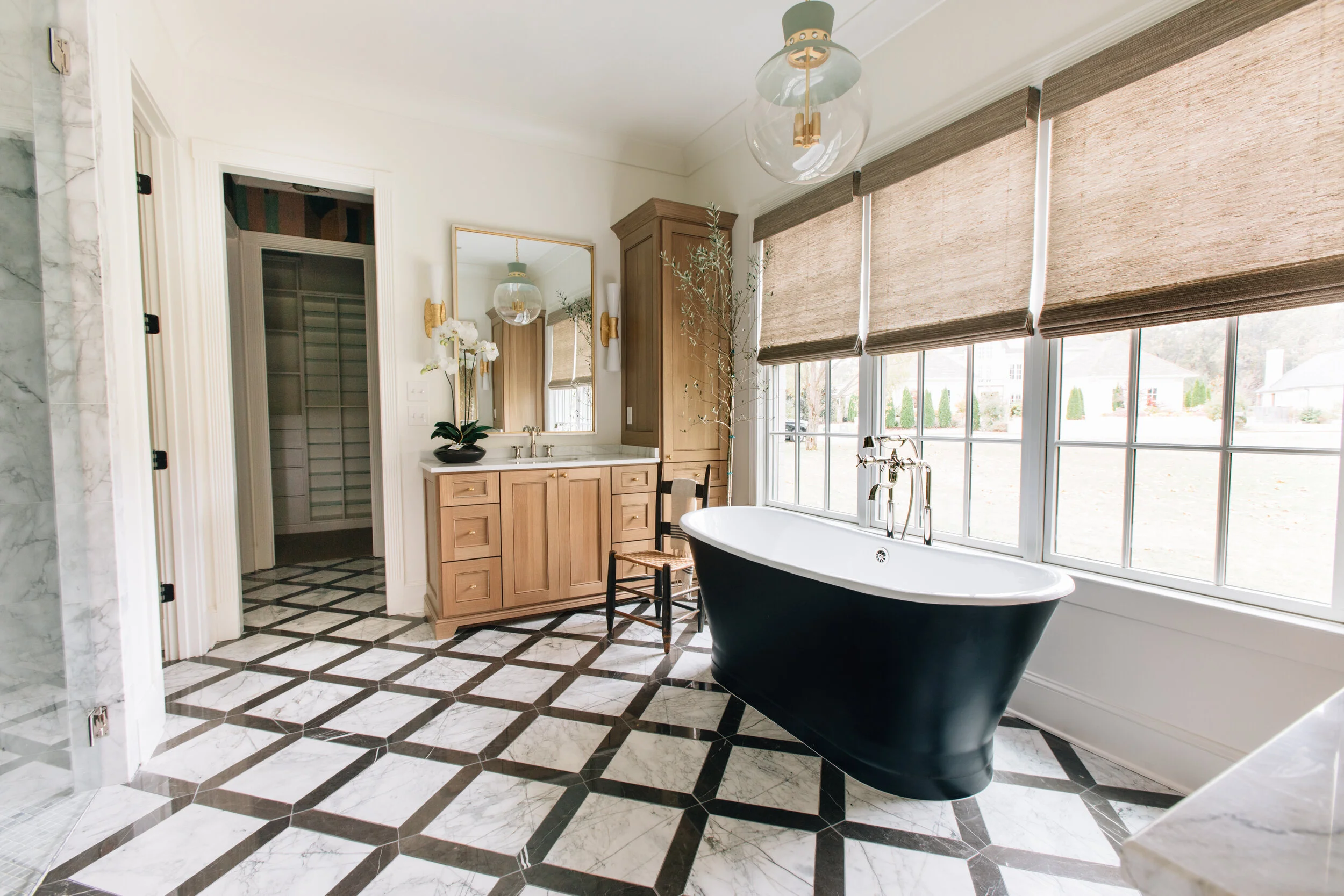
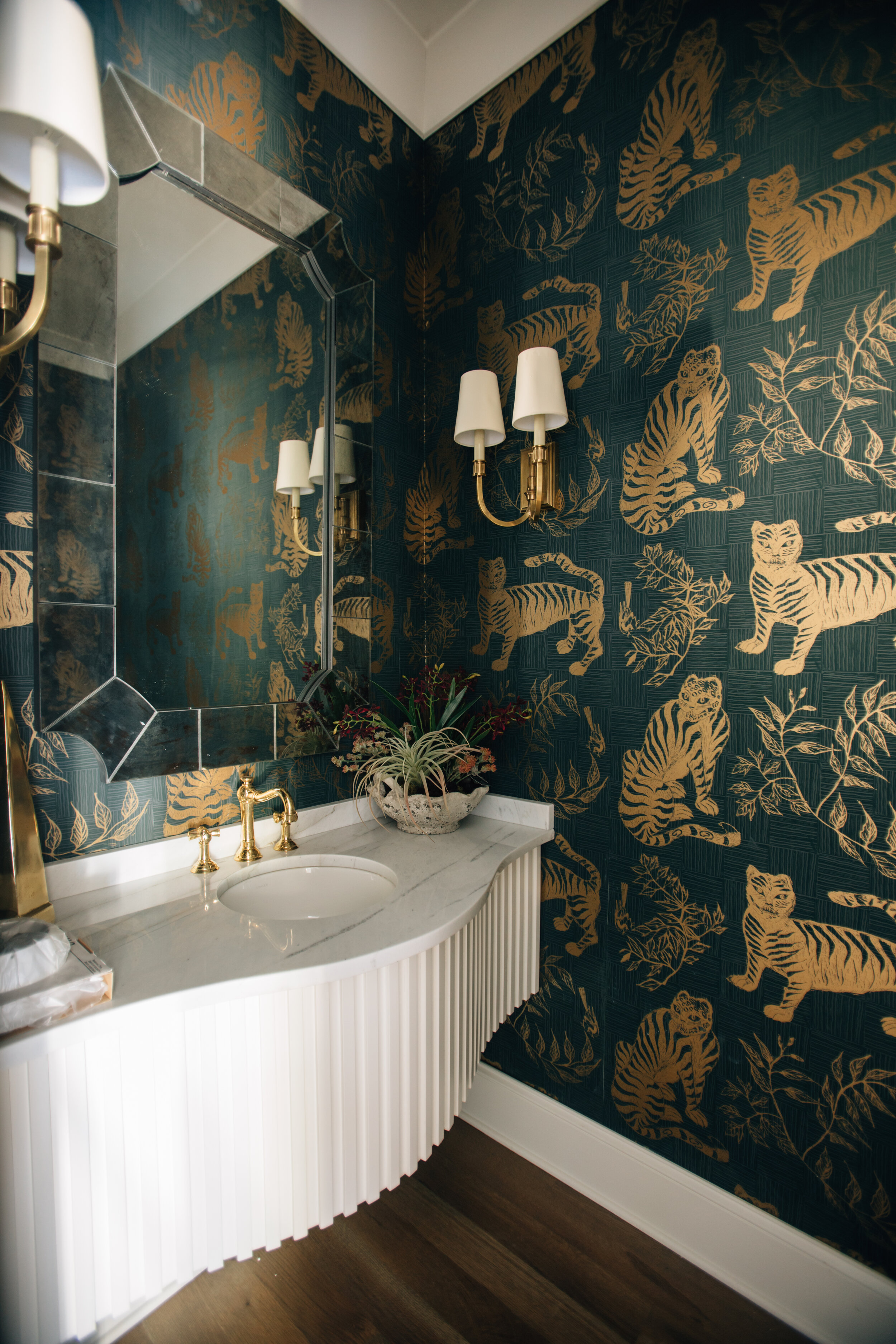
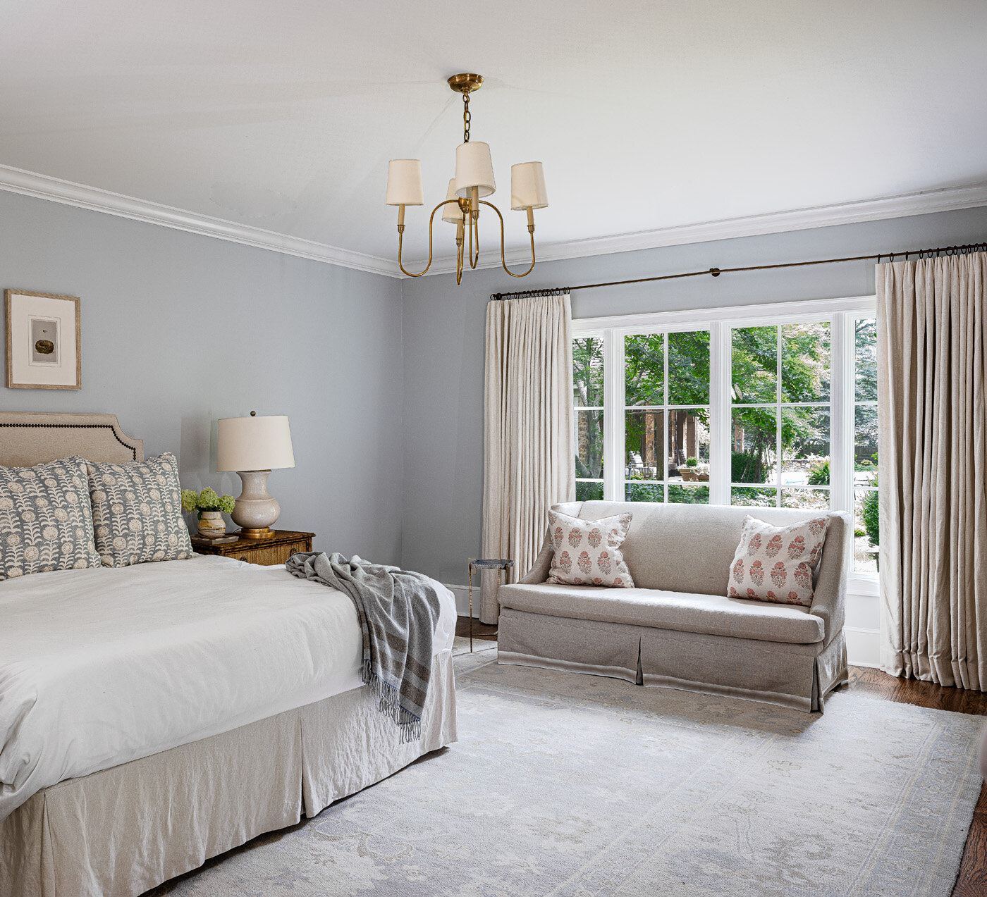
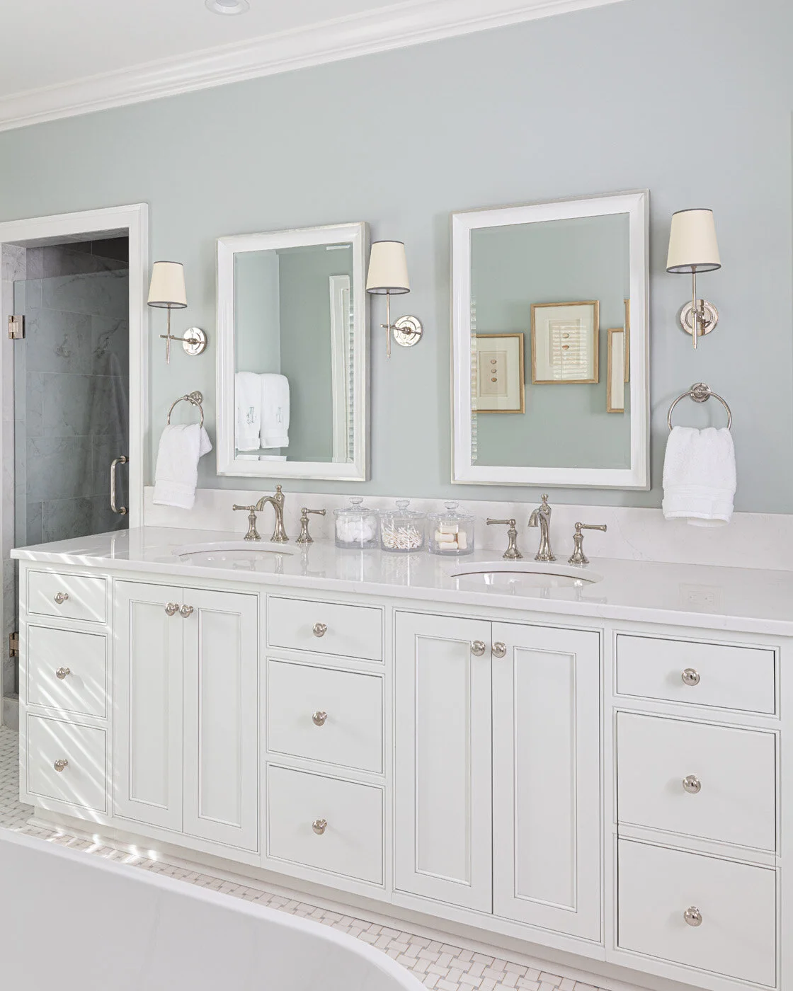
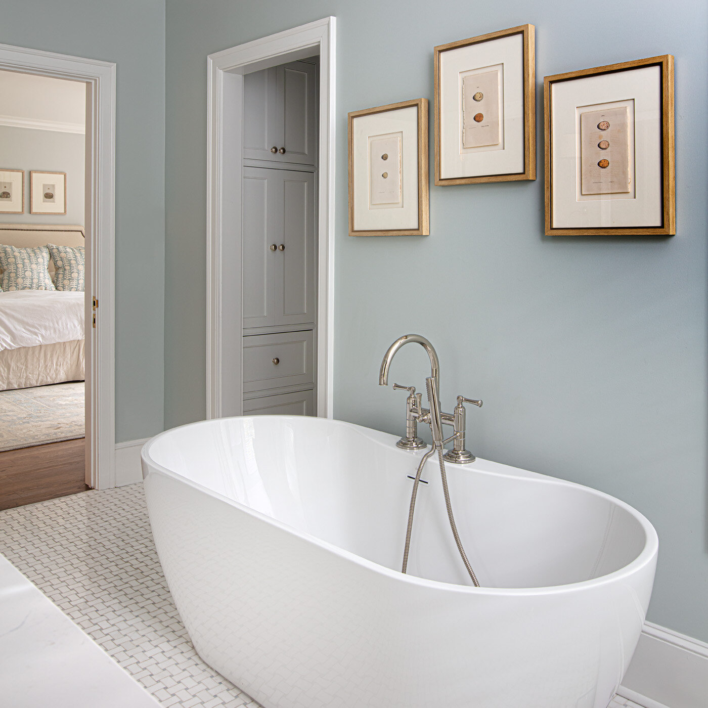
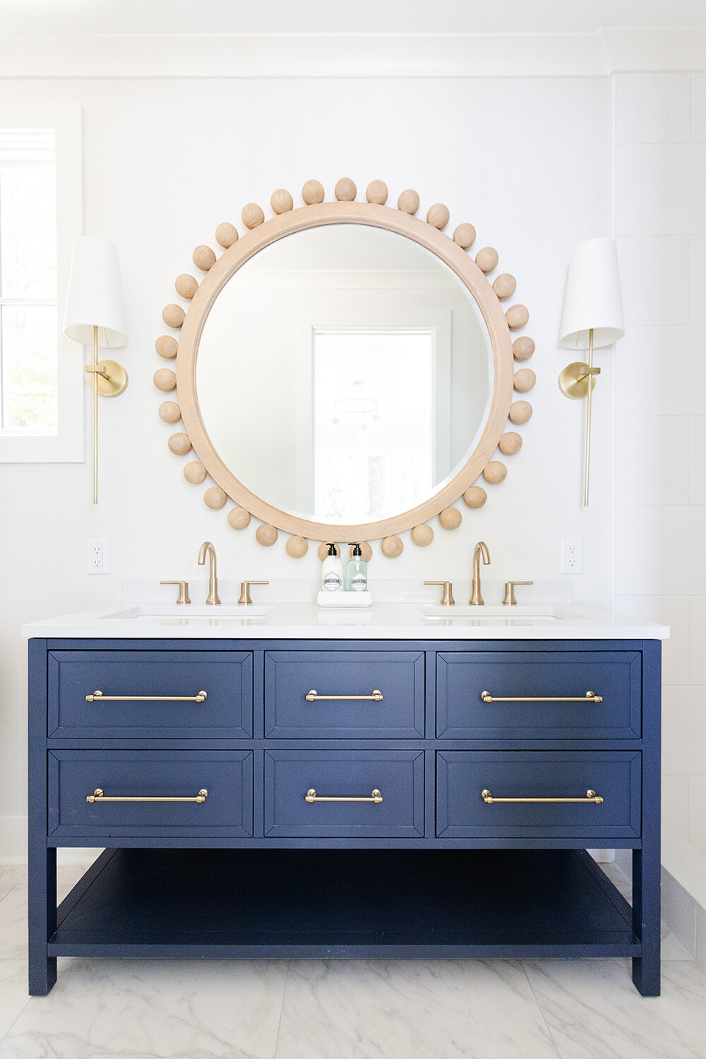
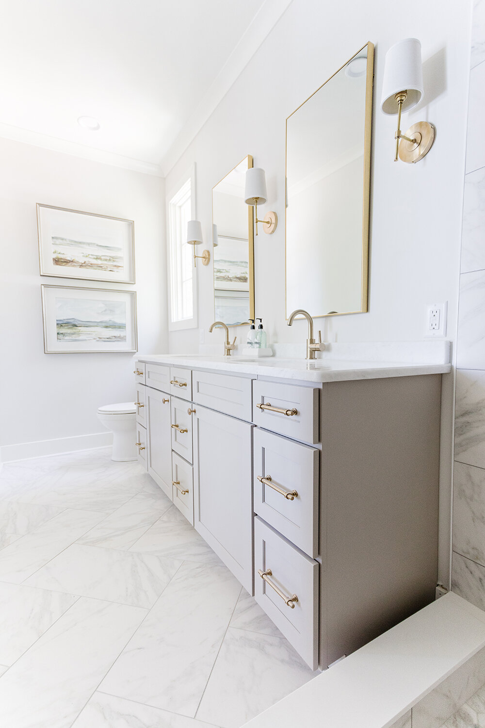
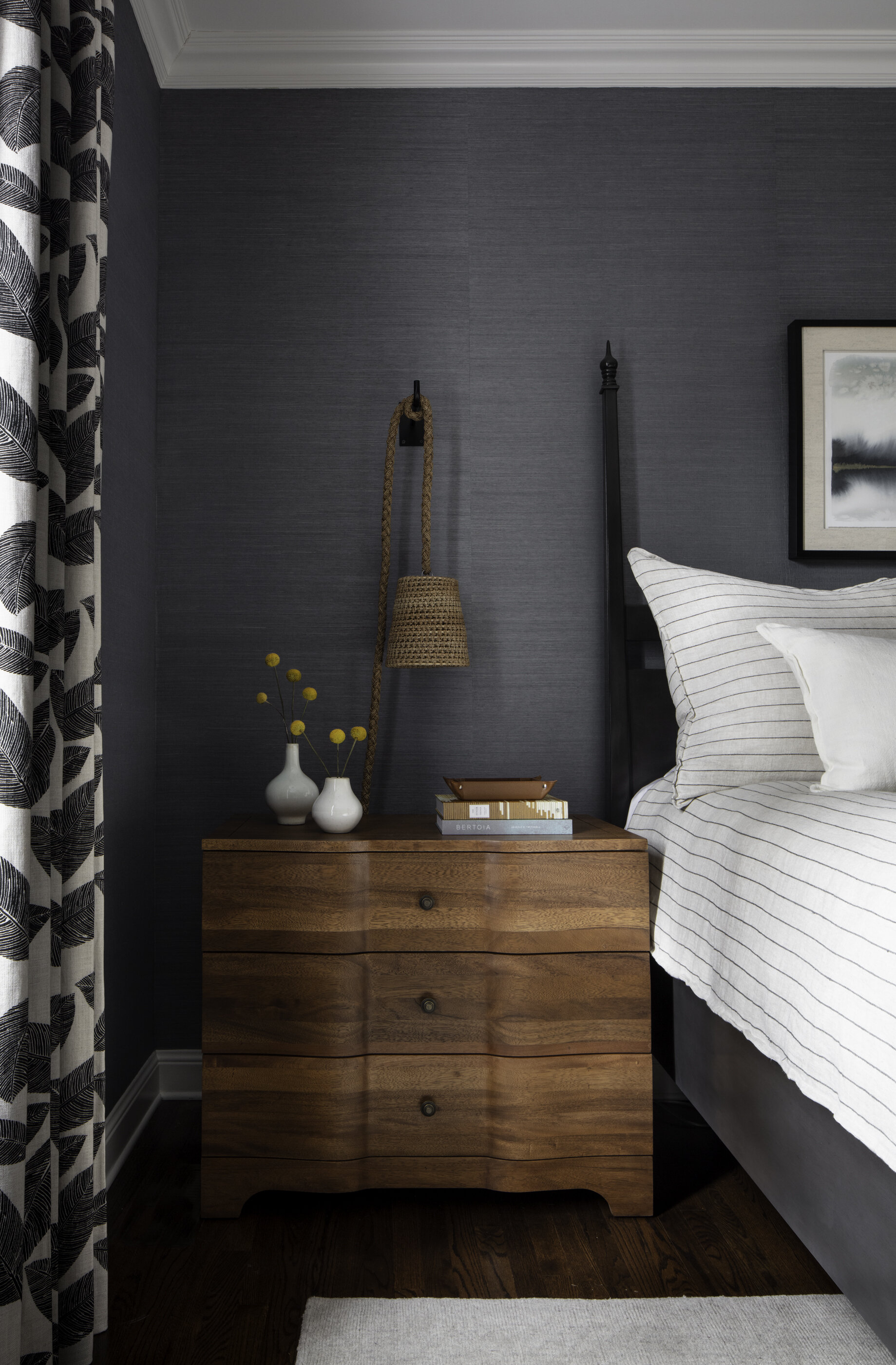
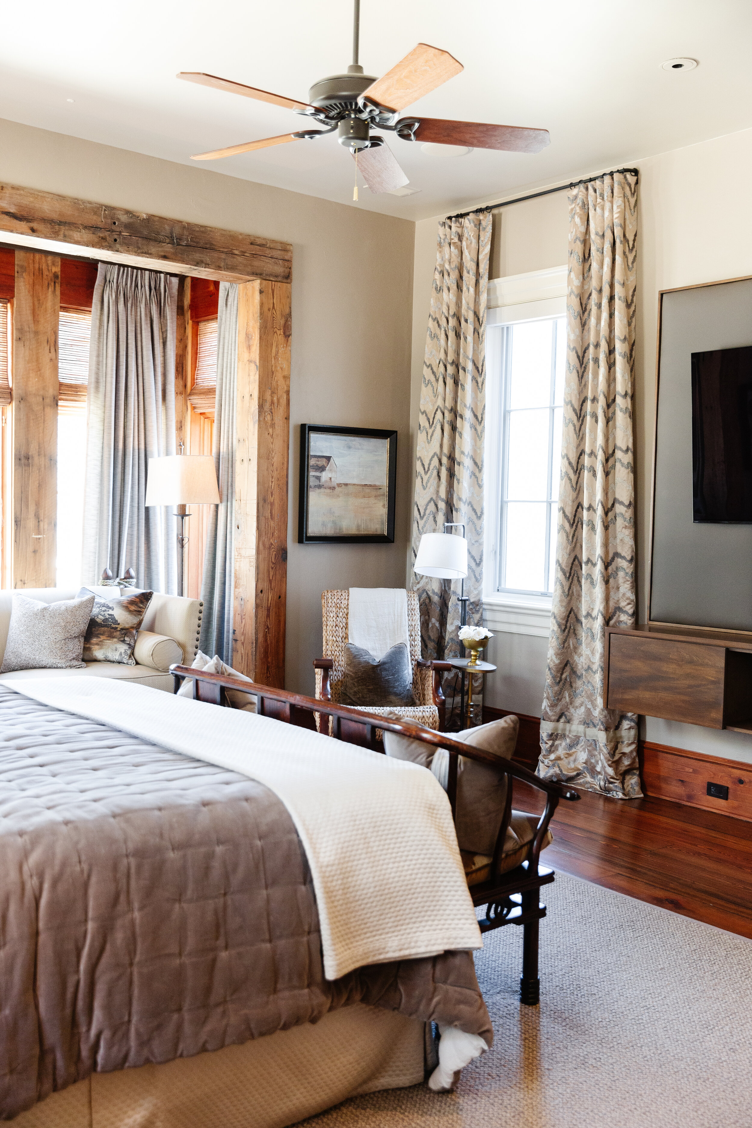
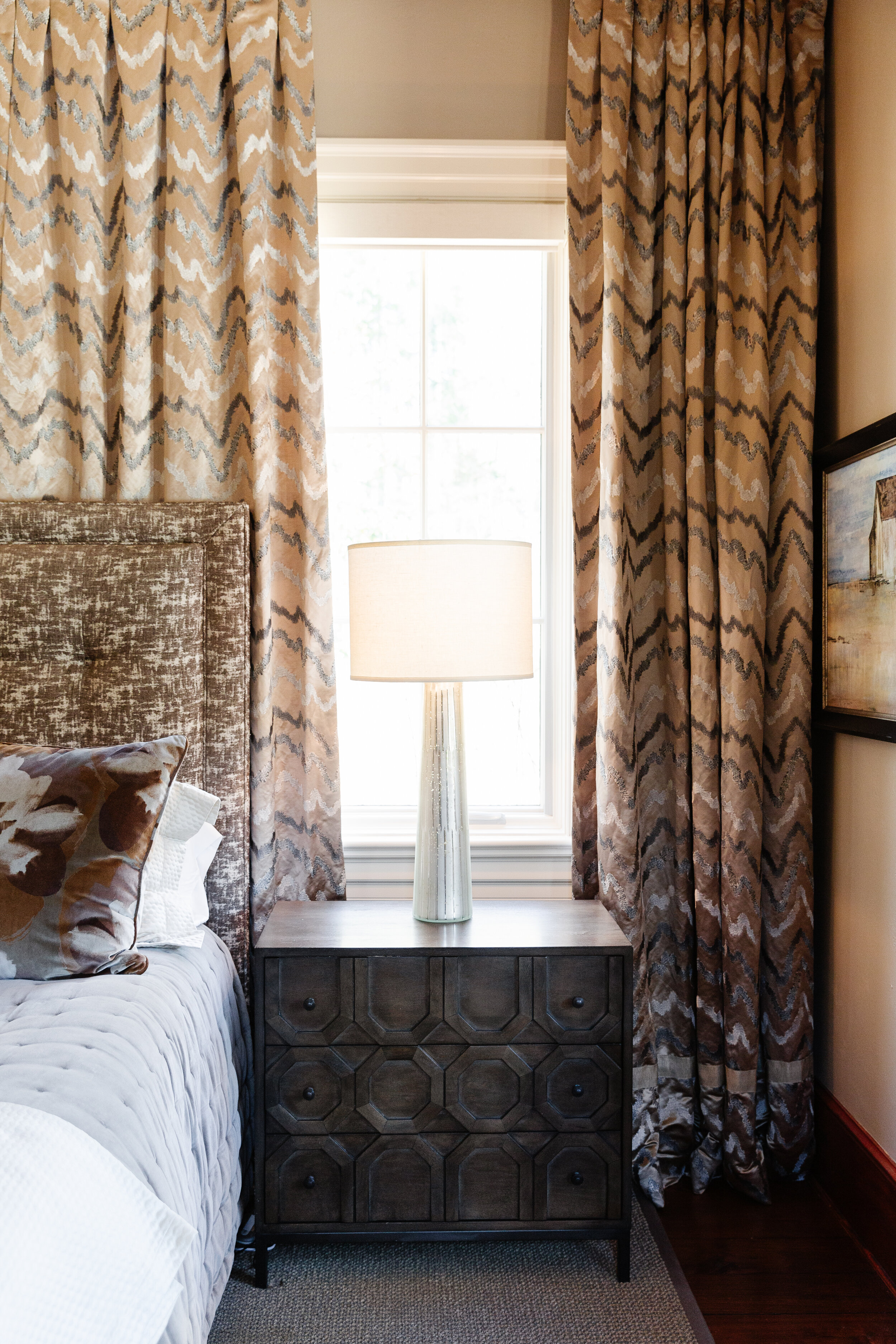
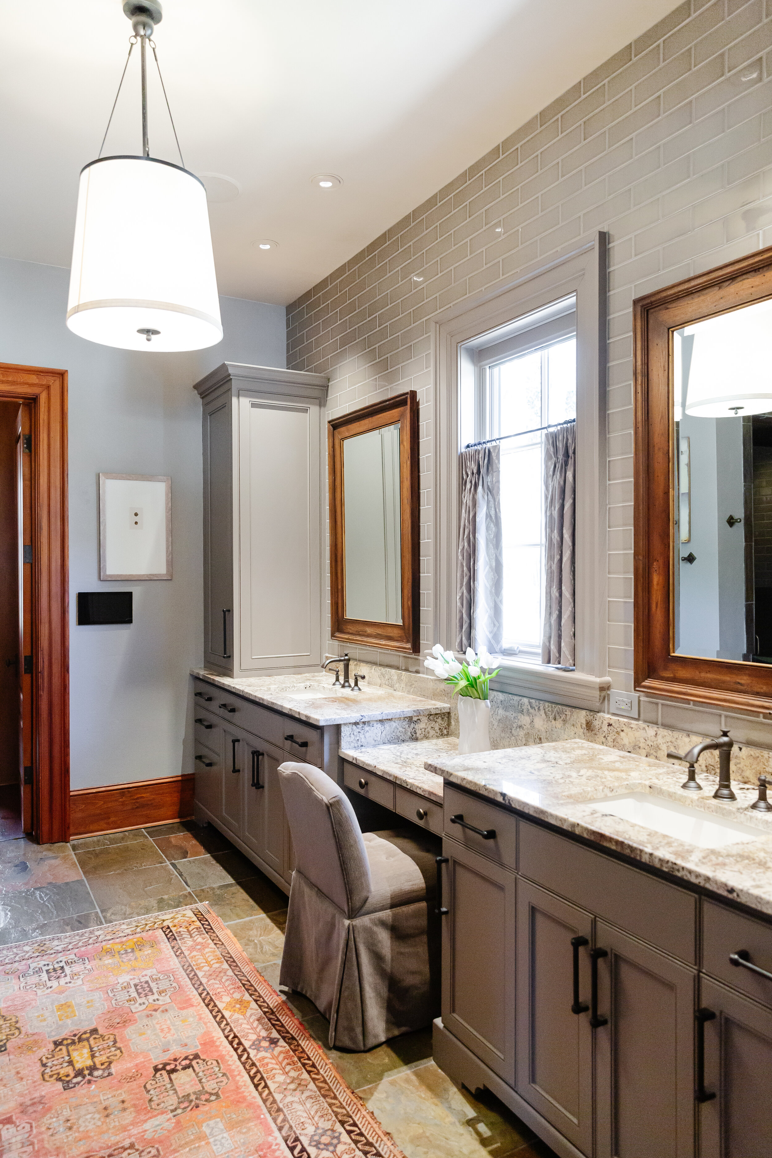
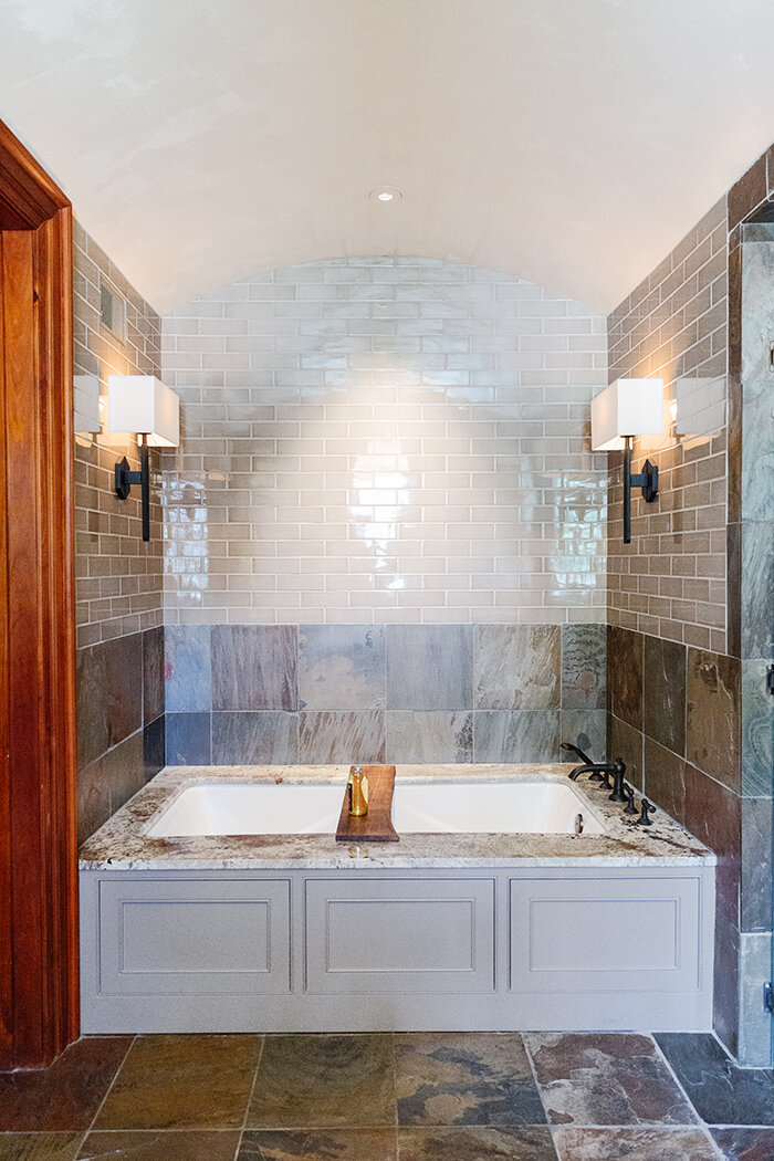
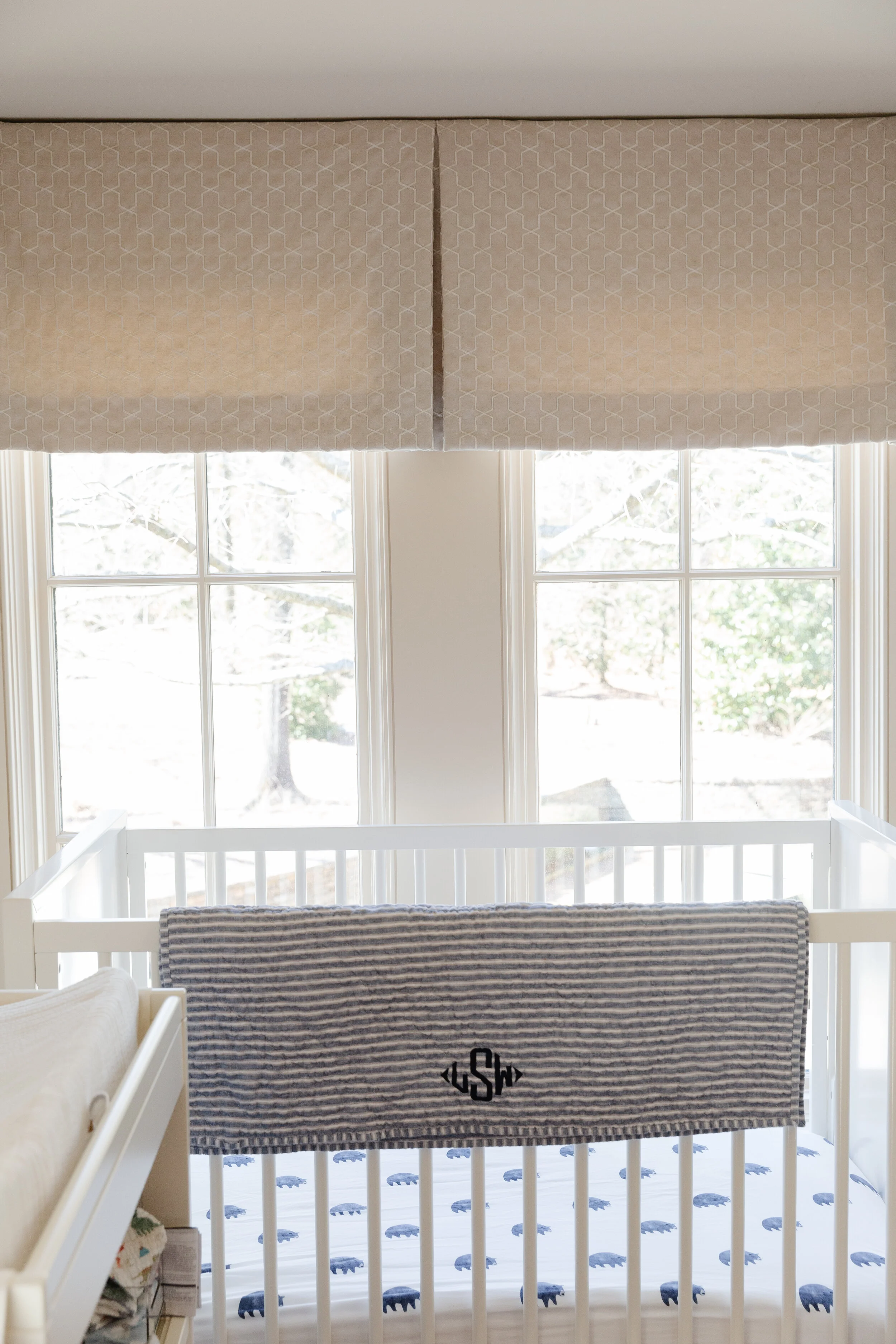
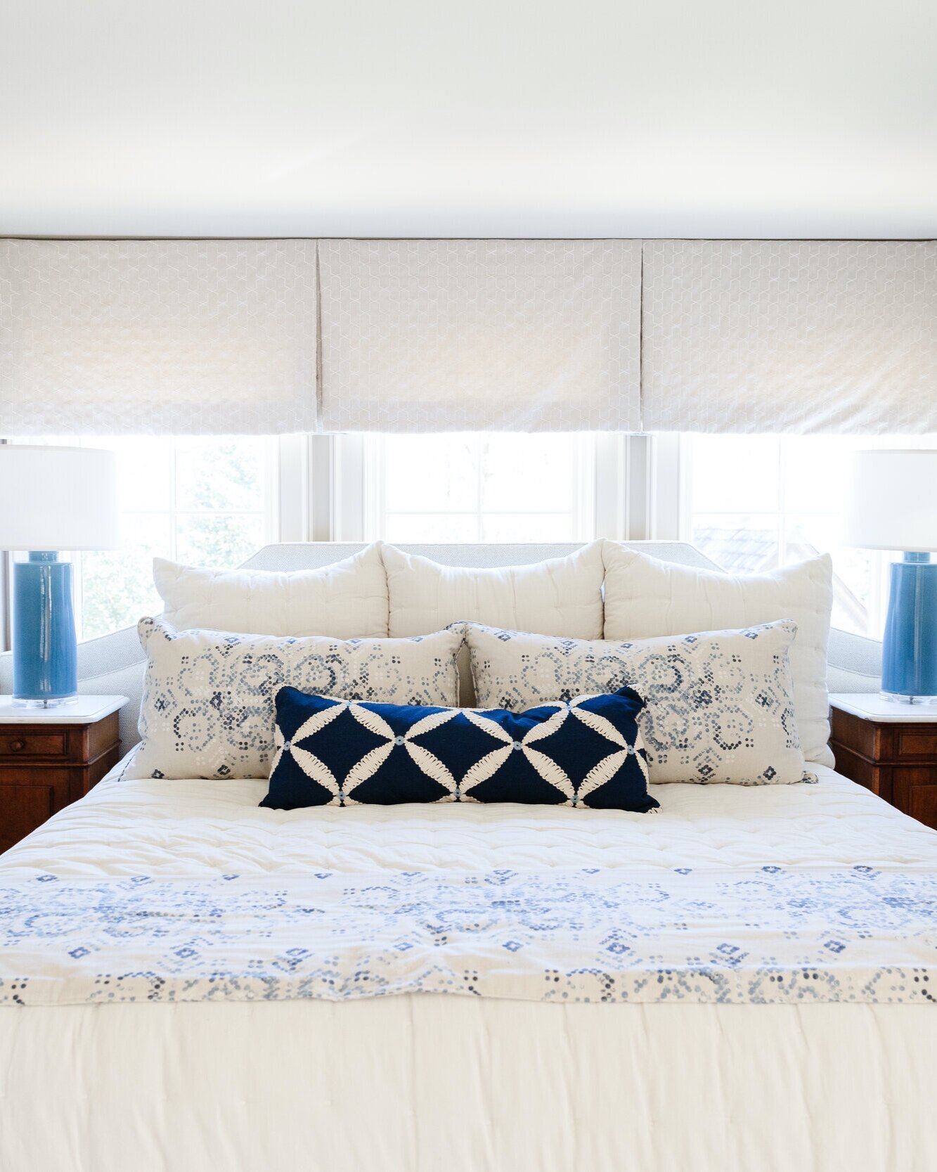
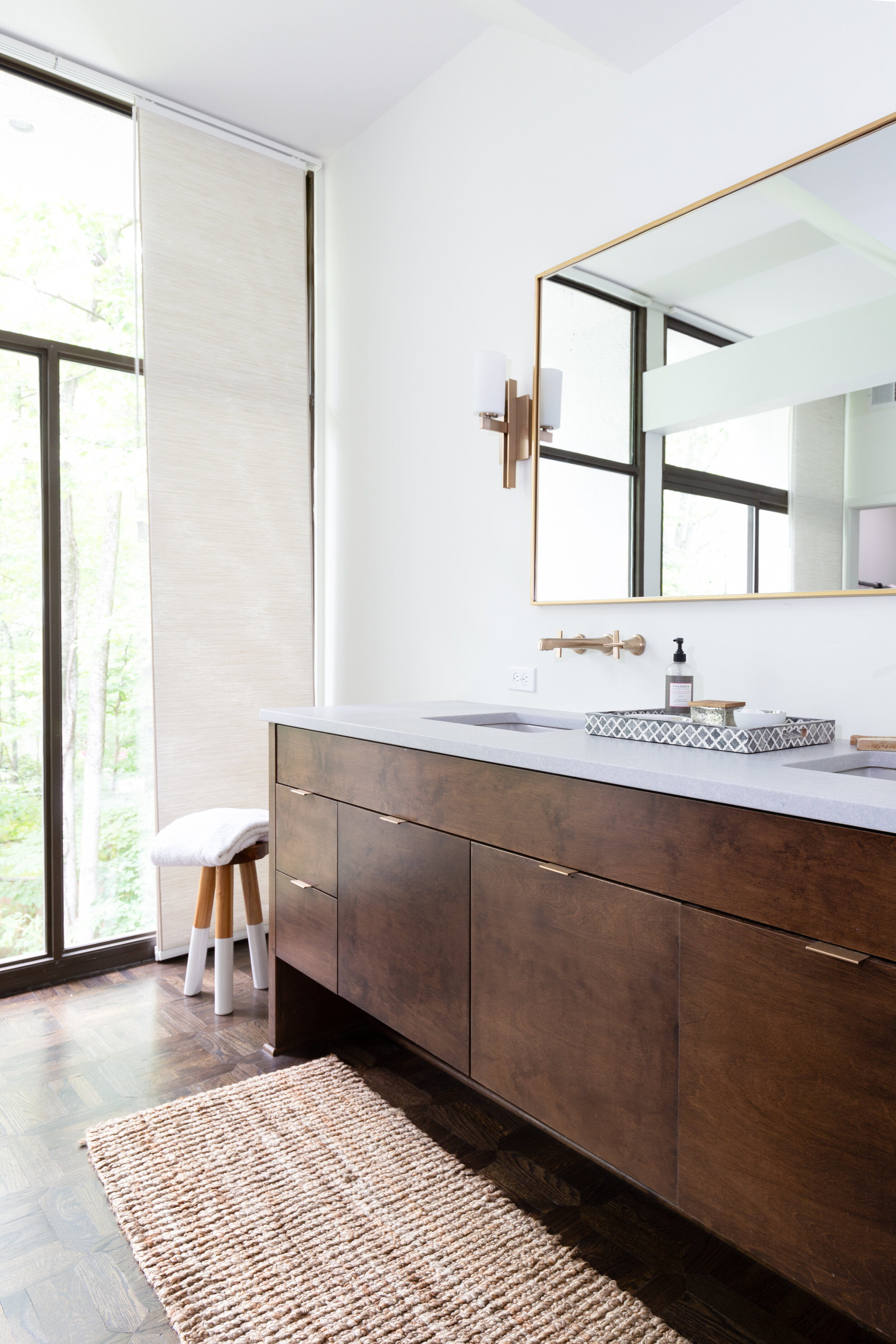
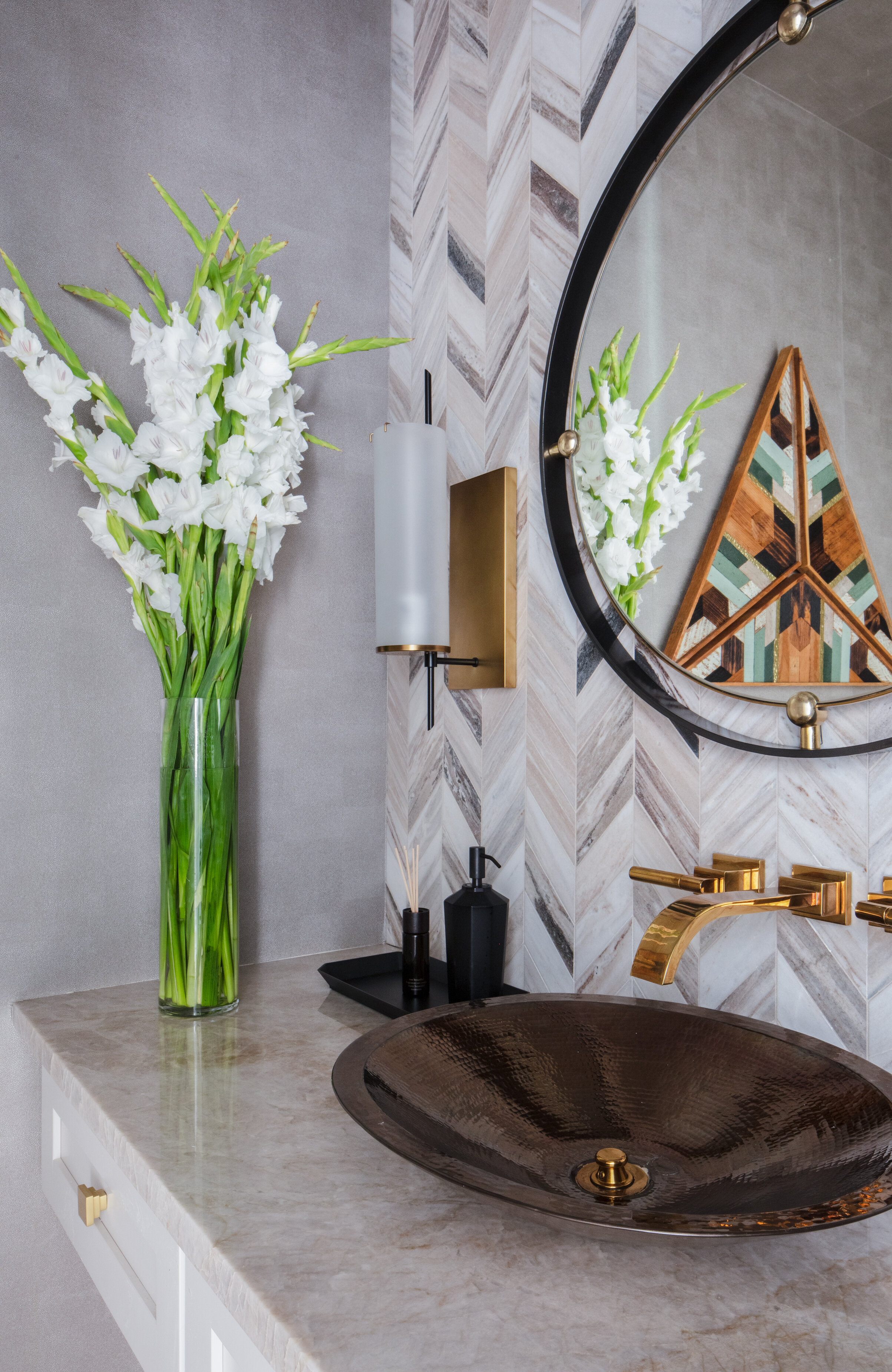
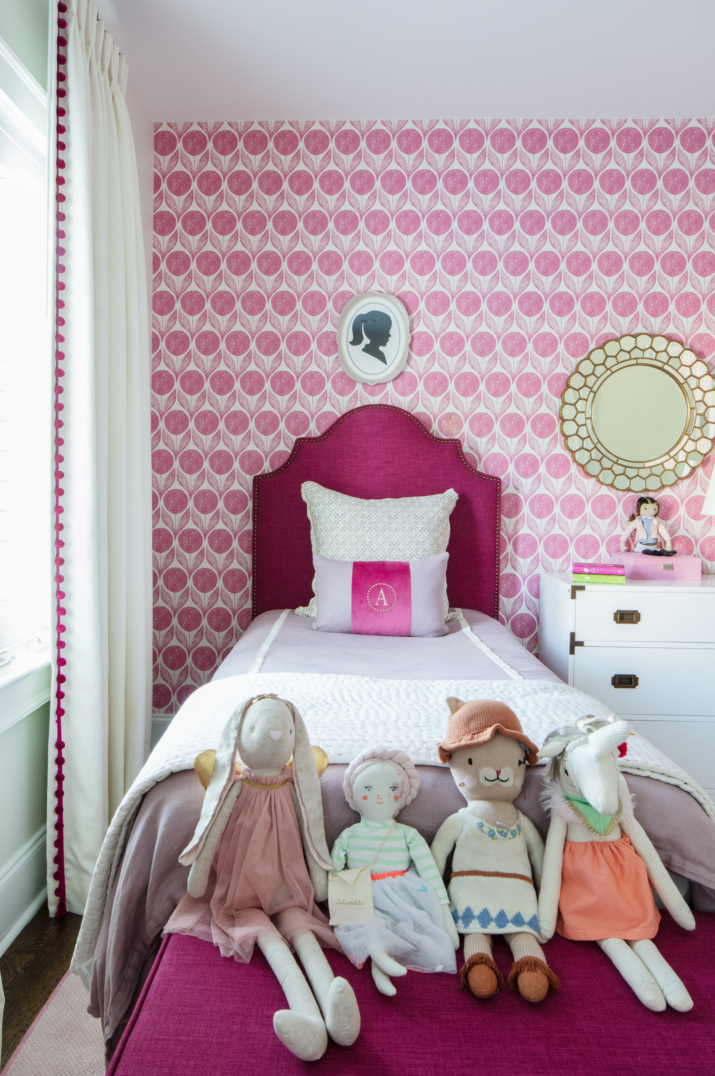
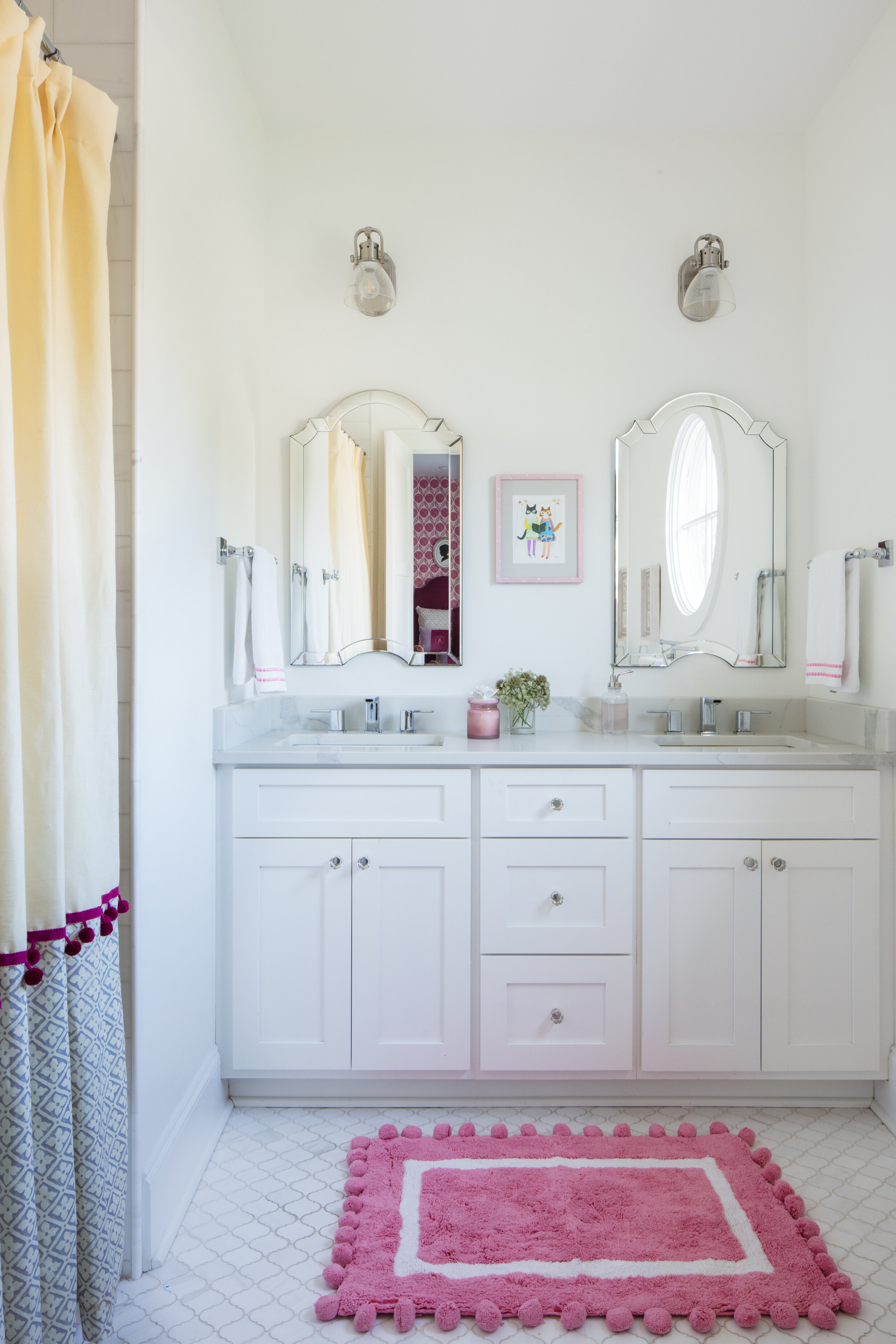
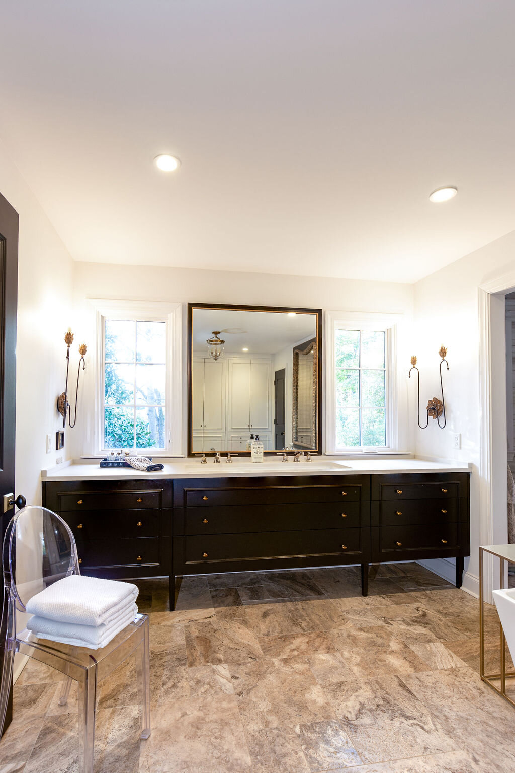
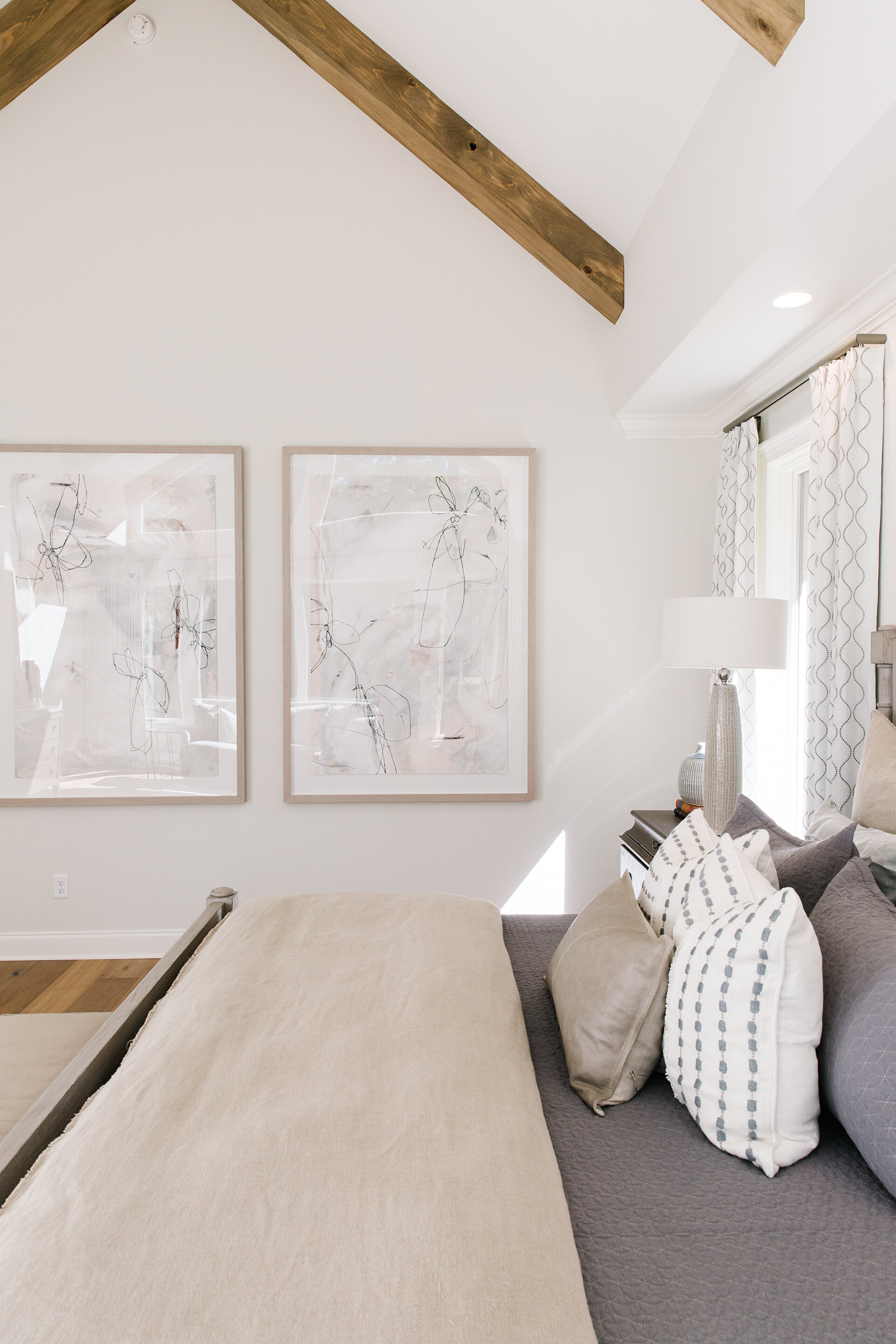
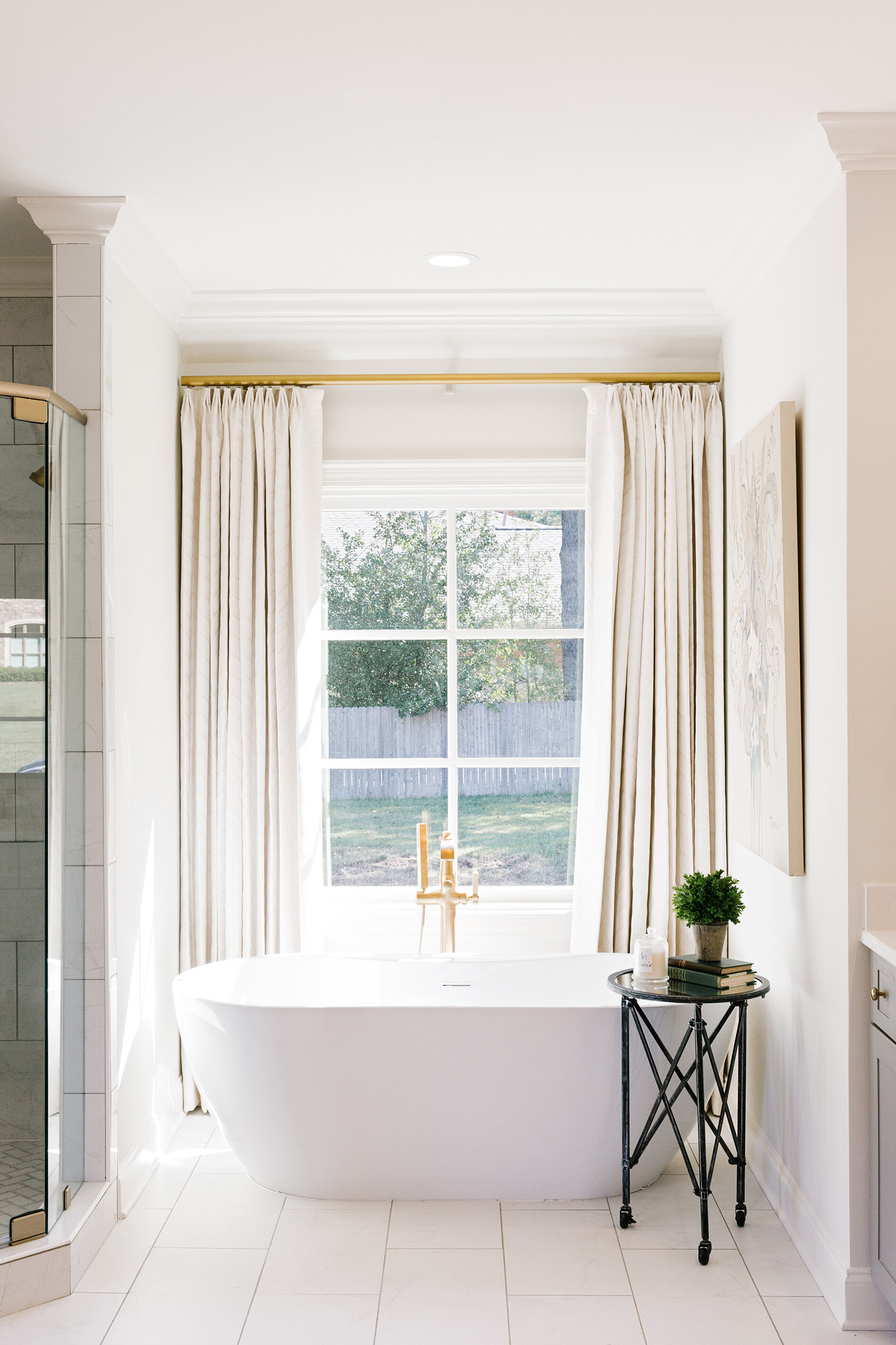
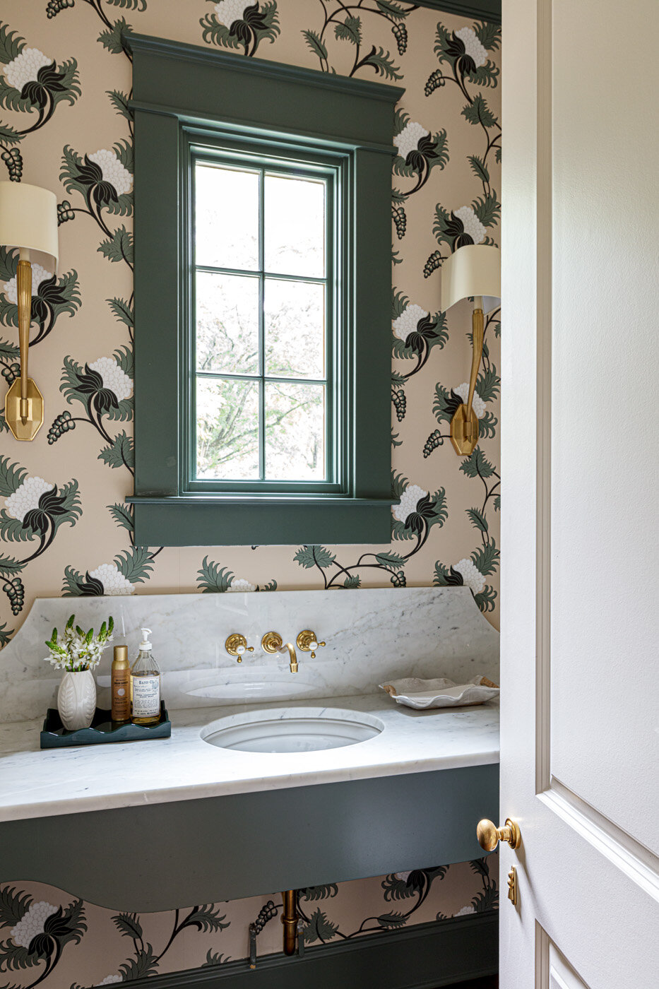
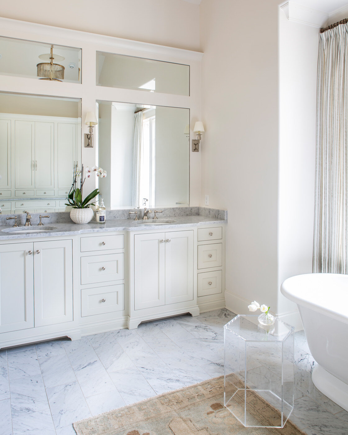
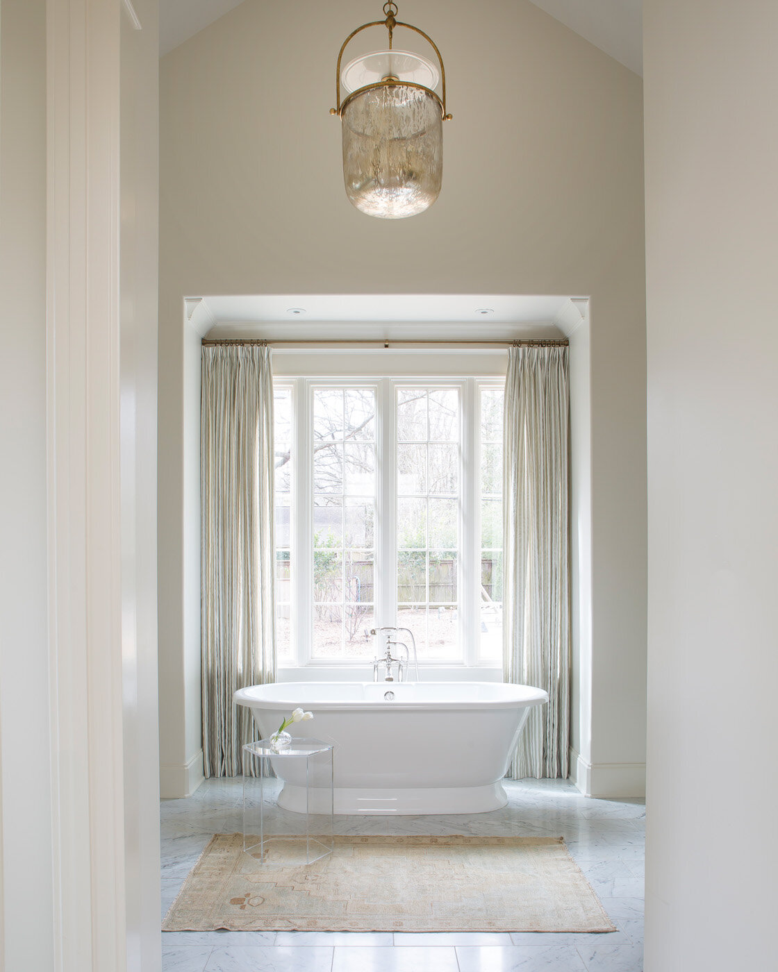
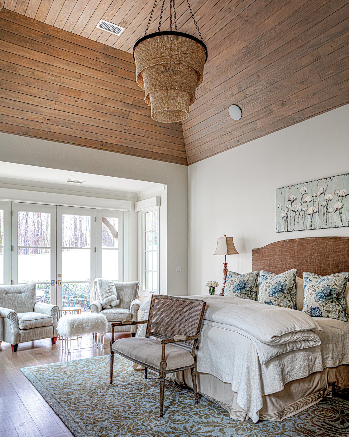
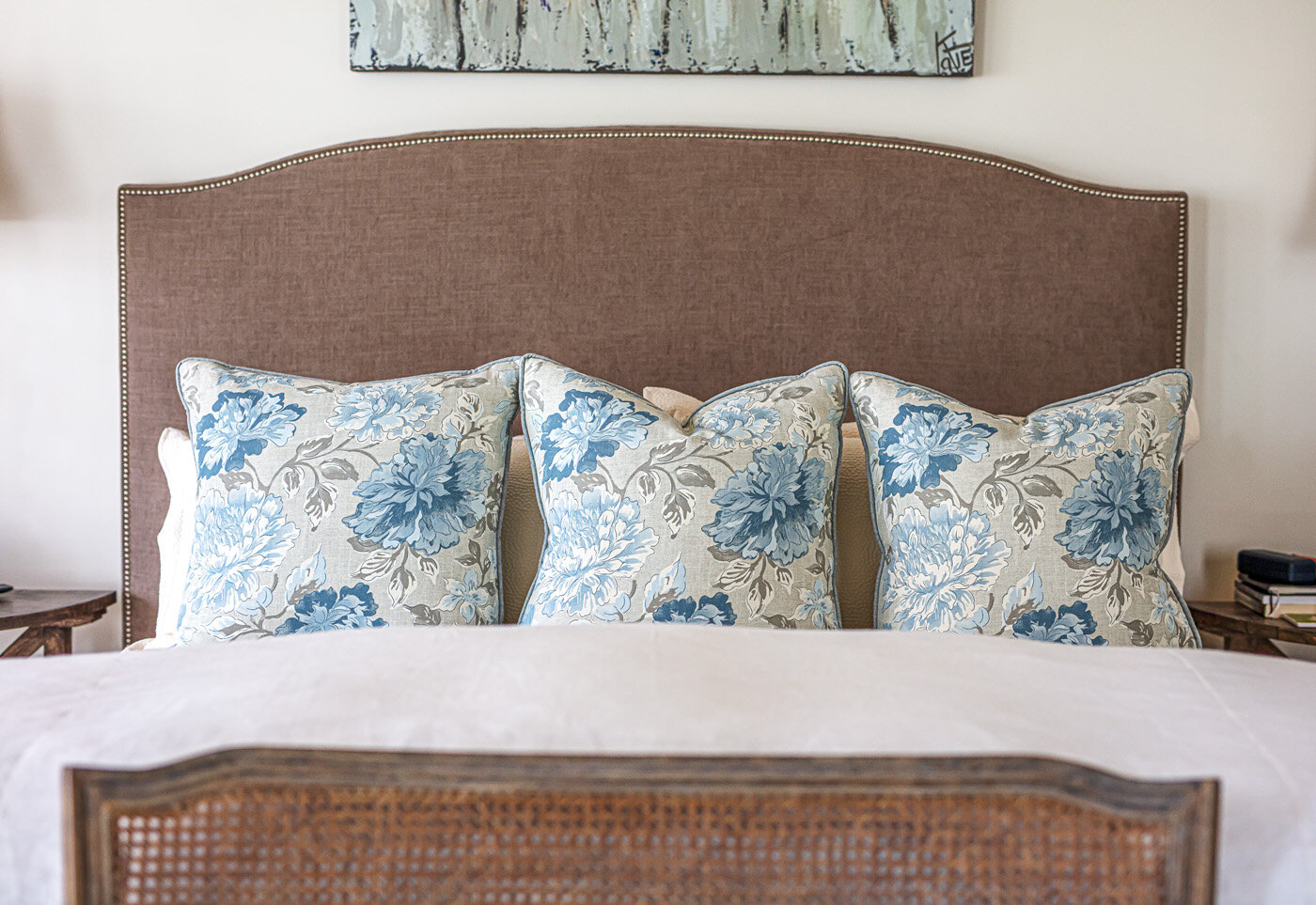
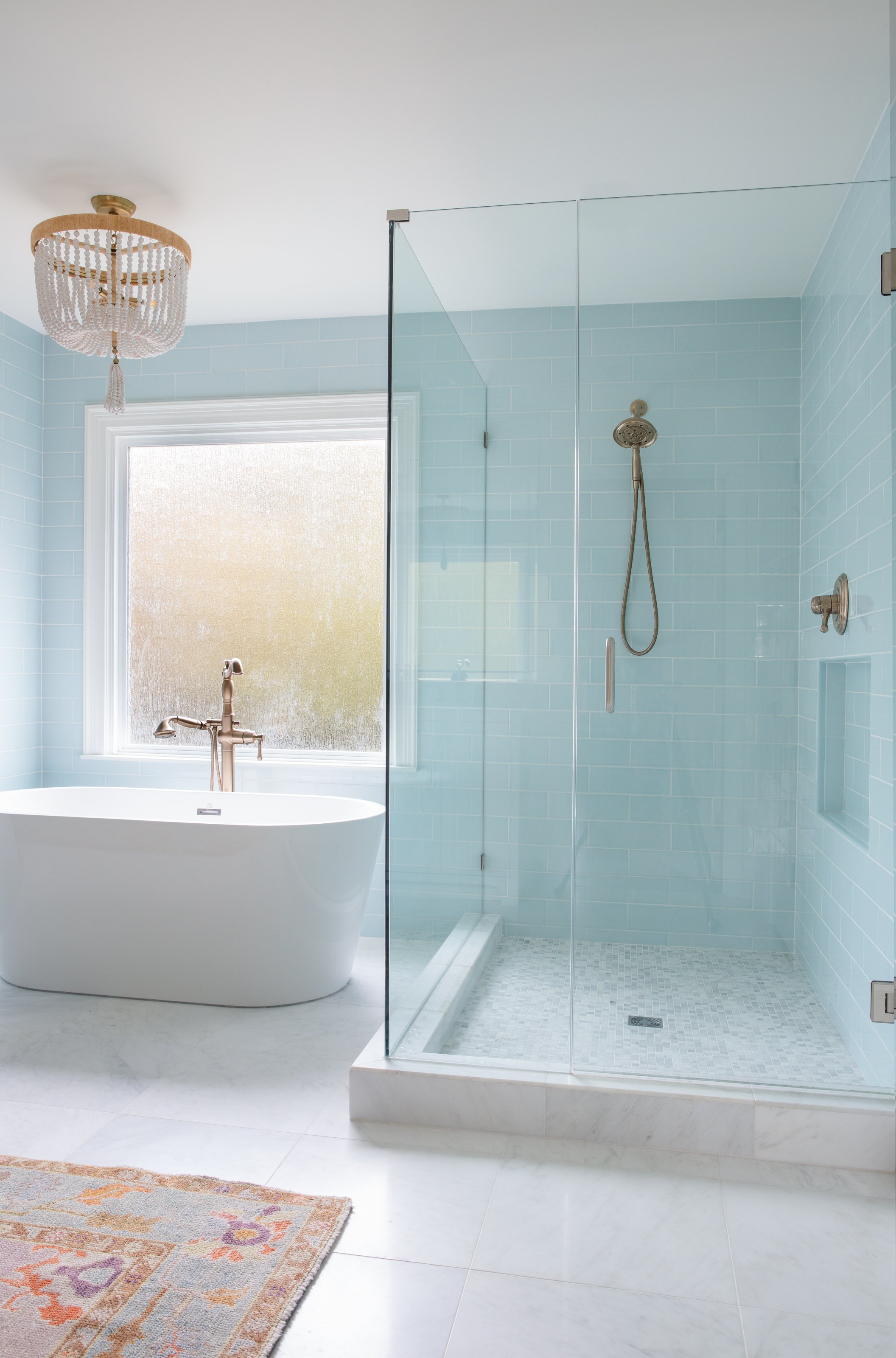
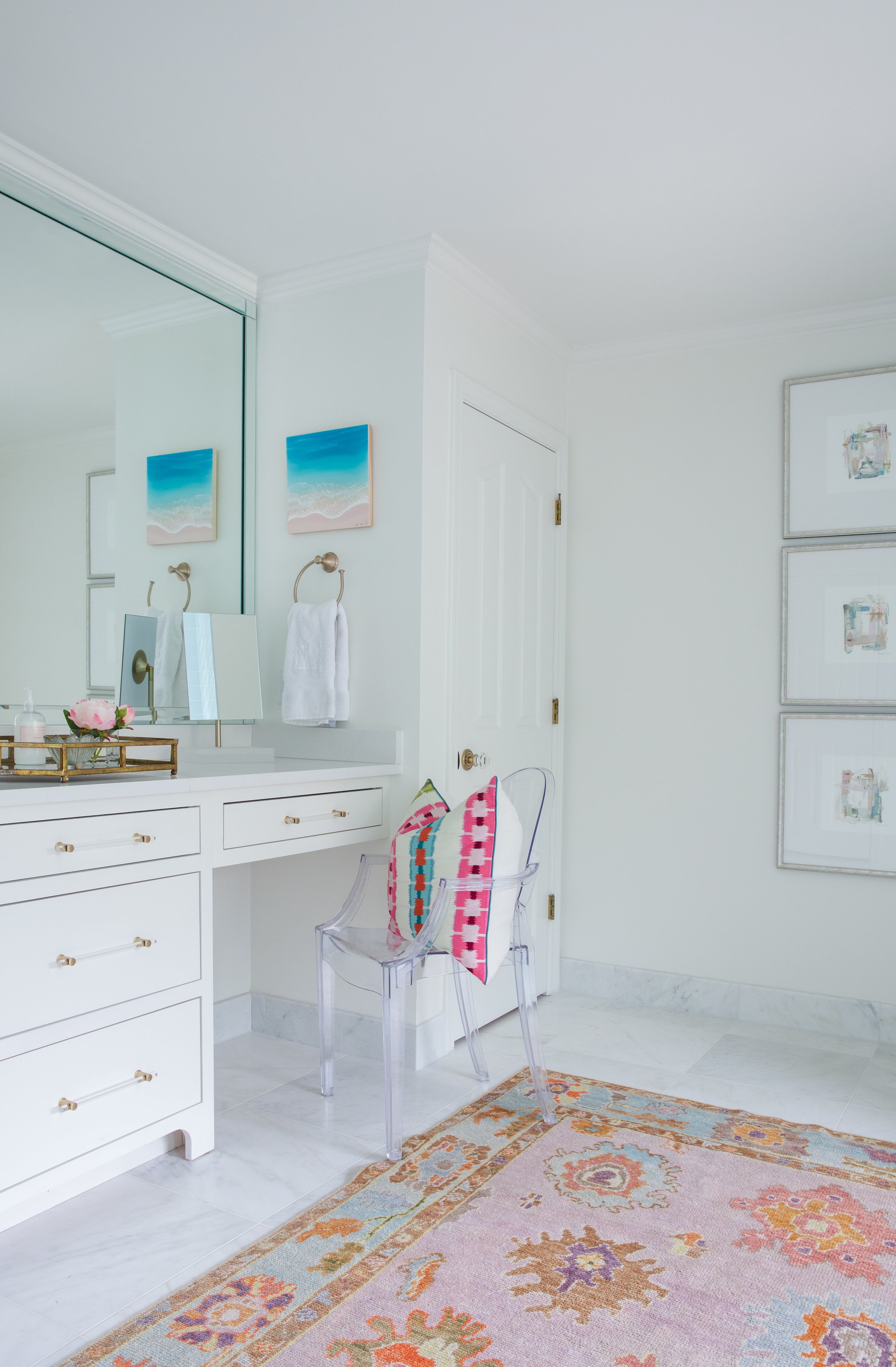
Many of the accents throughout the home are in cool blues, ranging from peaceful light hues in the primary bedroom to beachy blue glass tile in the daughter’s bathroom to bold batik-look wallpaper in the son’s bath. 

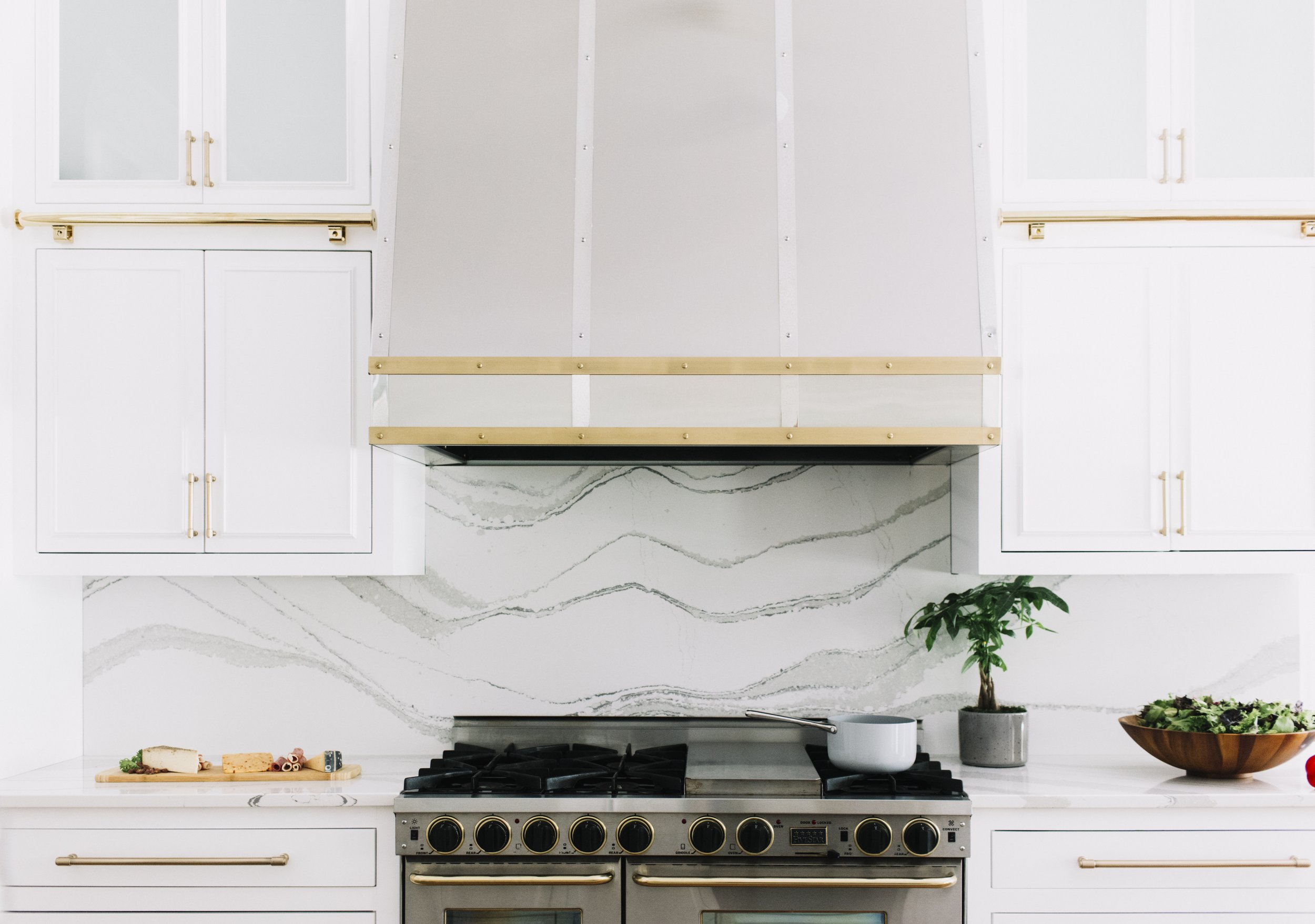
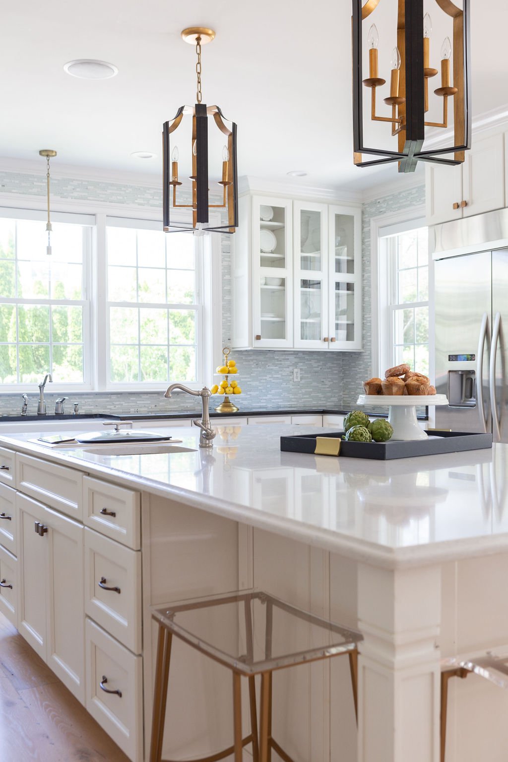
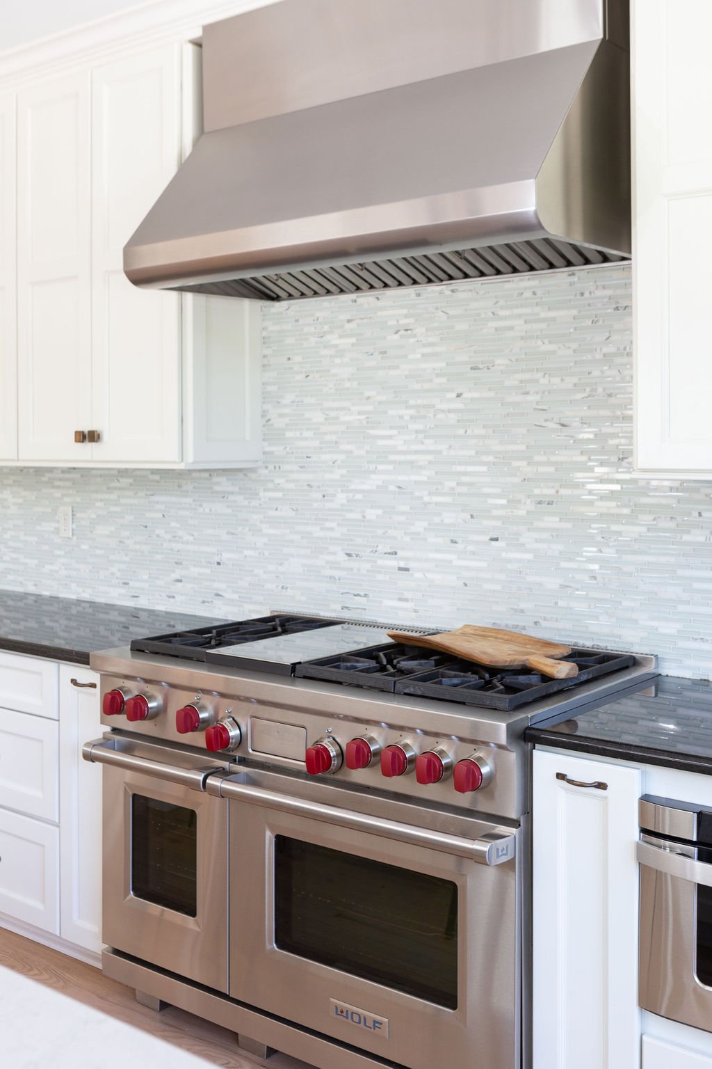
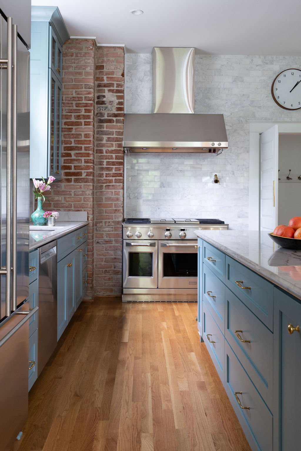
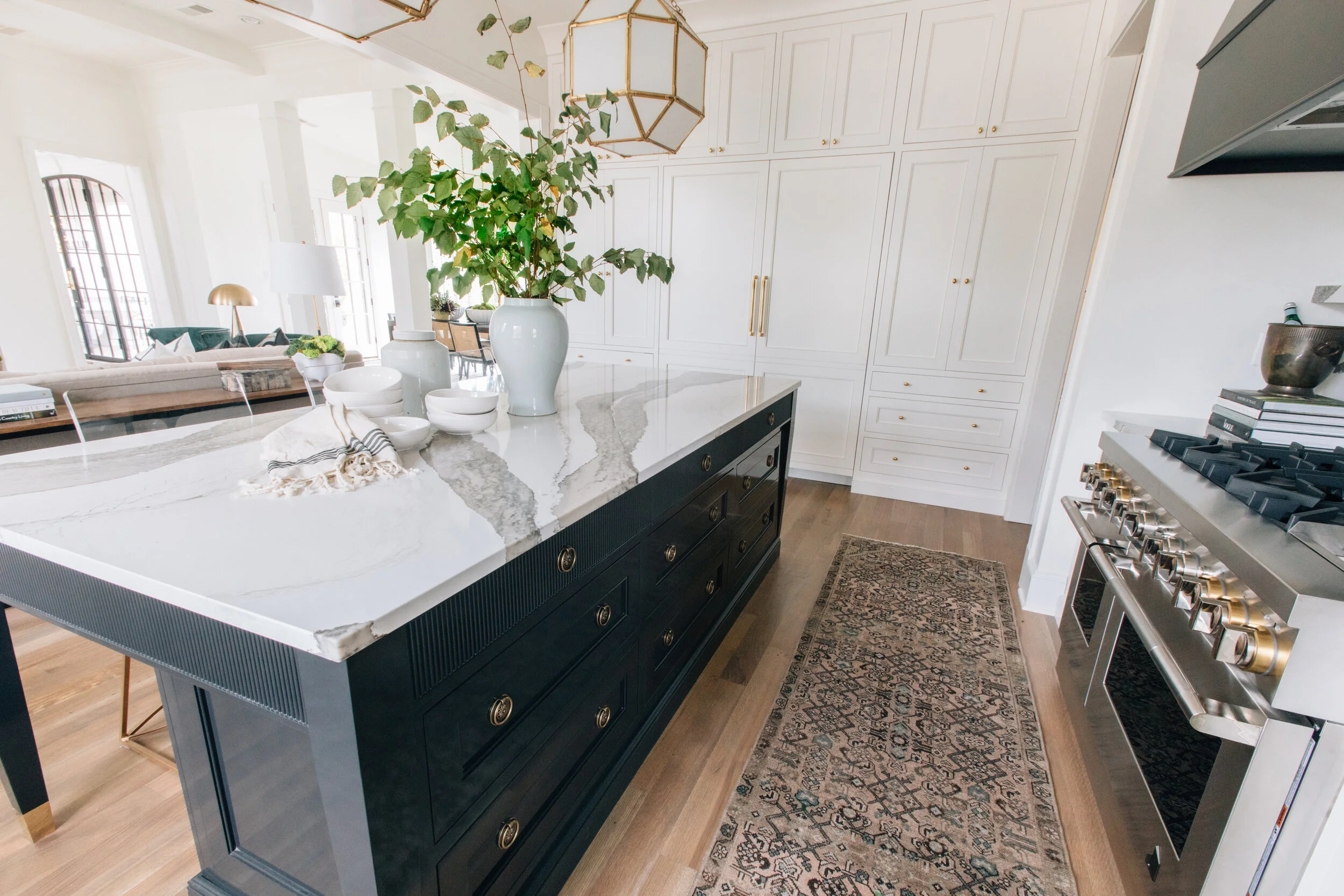
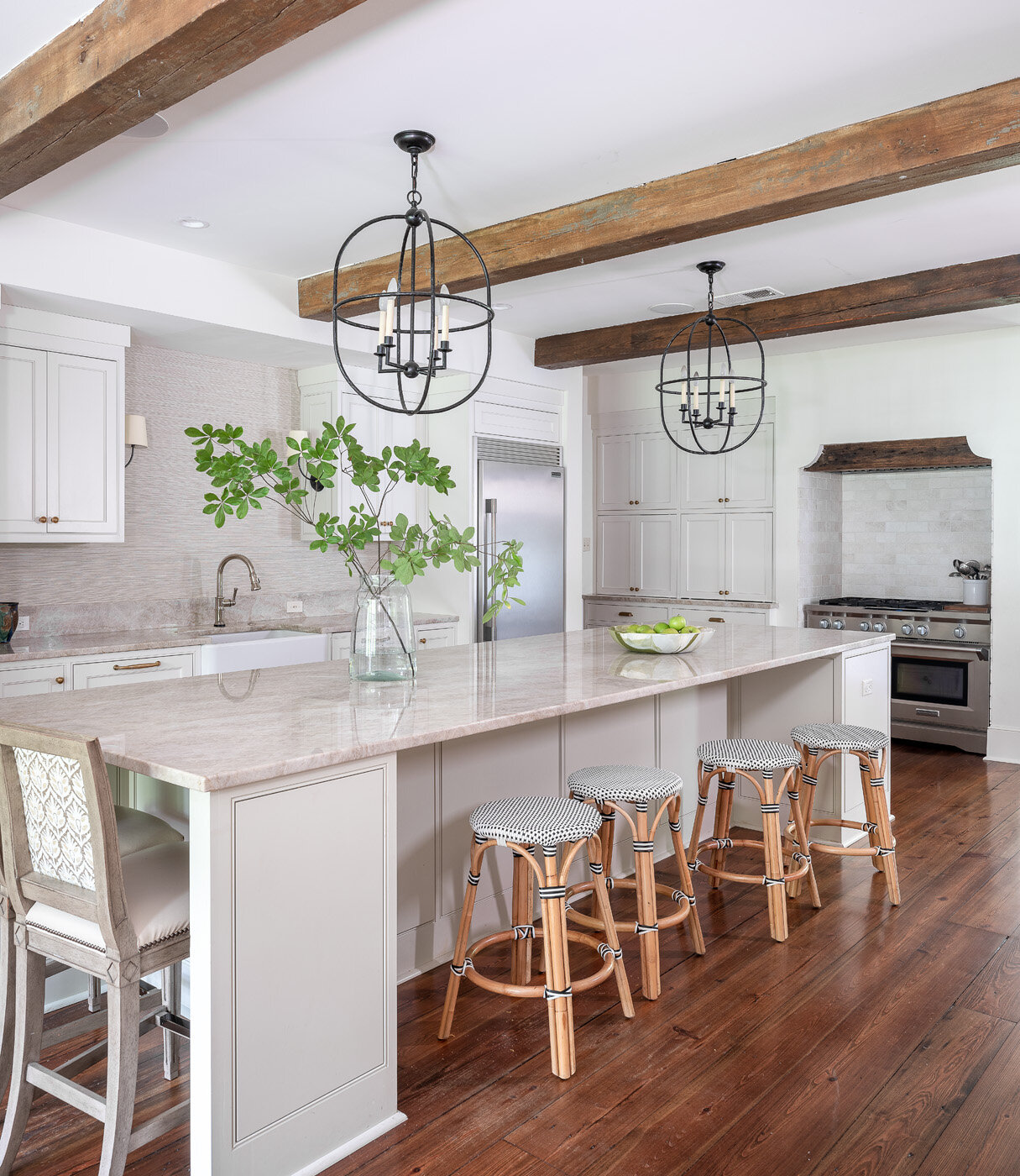
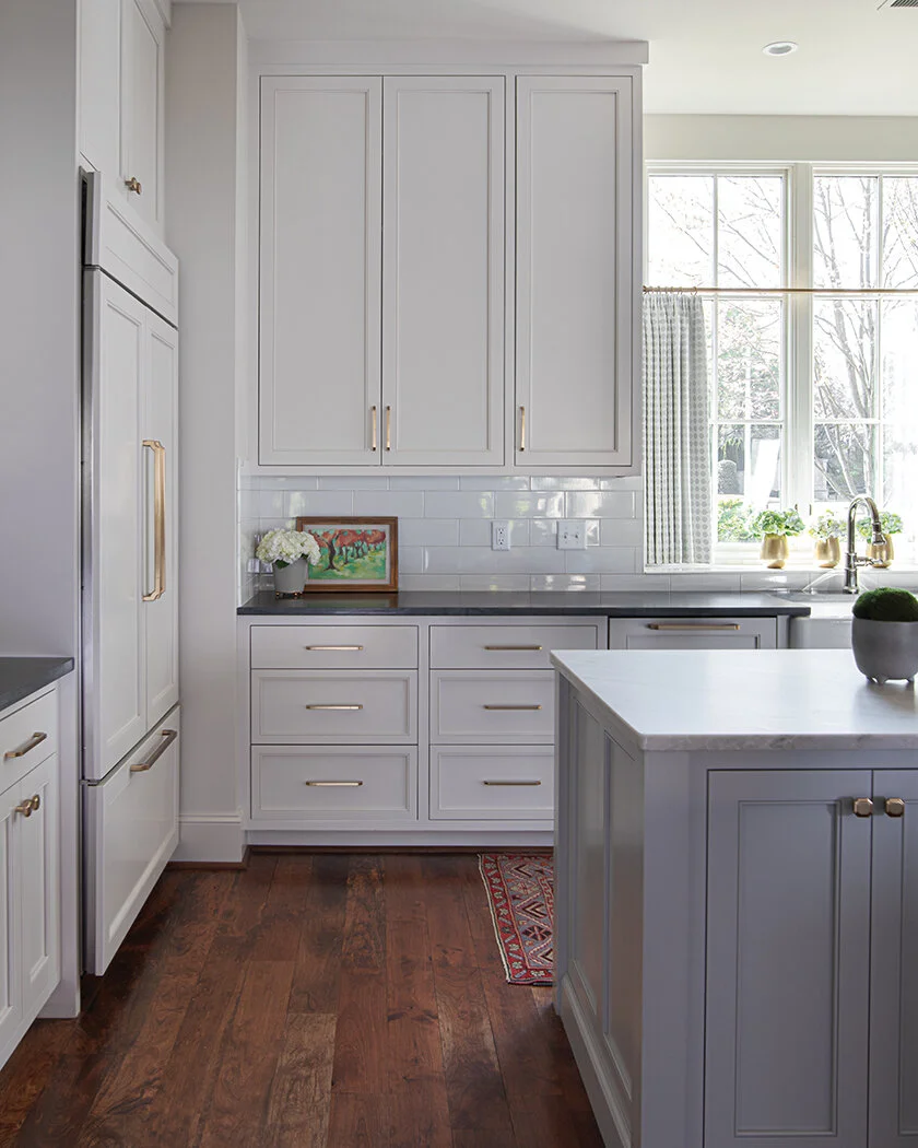
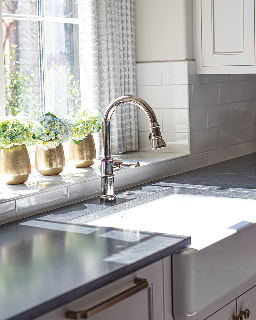
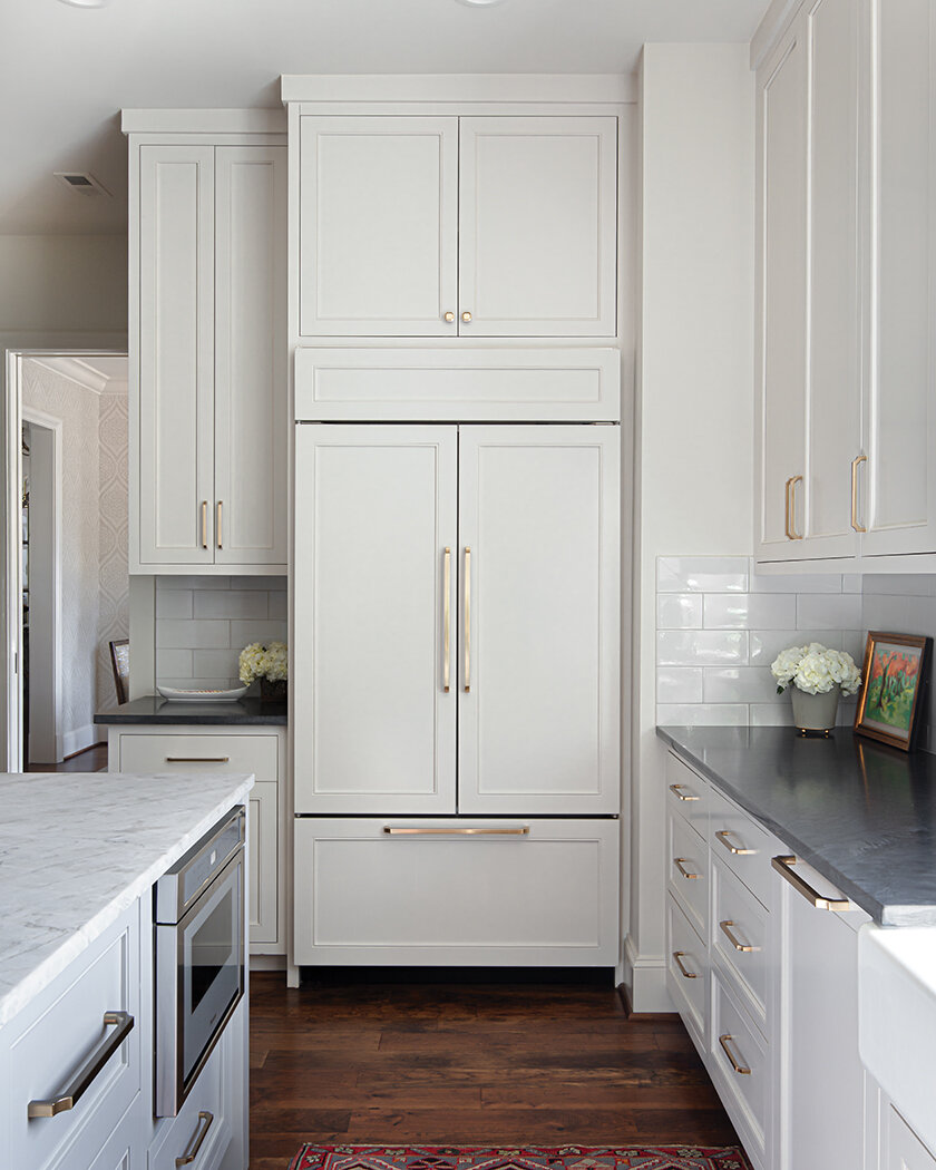
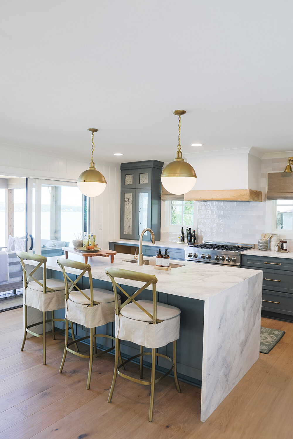
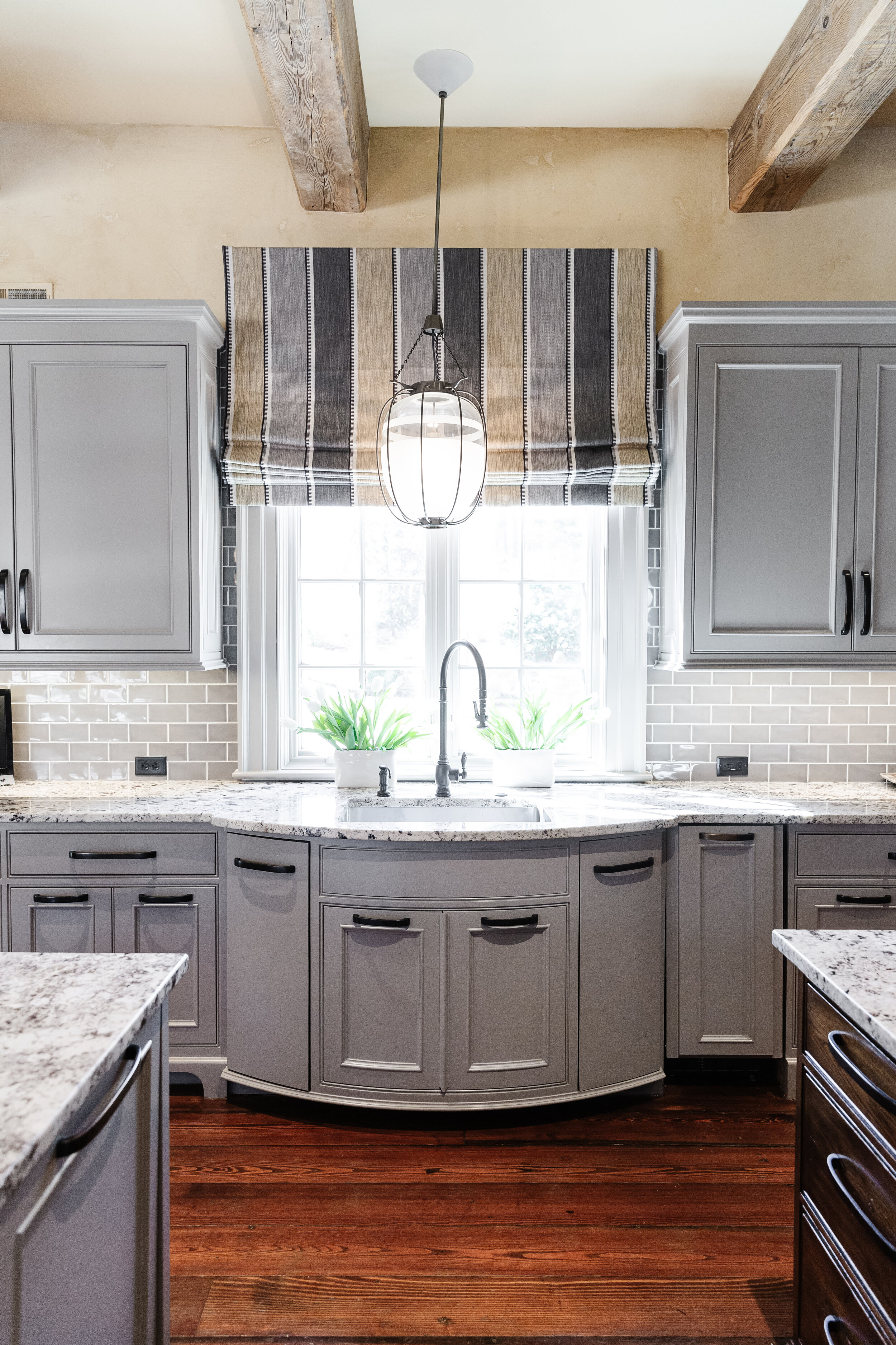
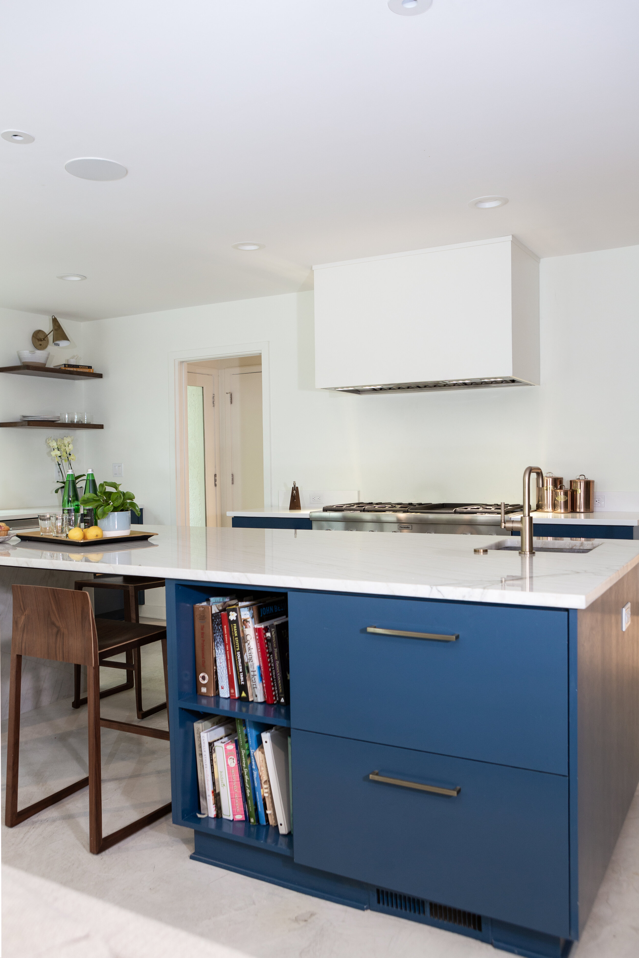
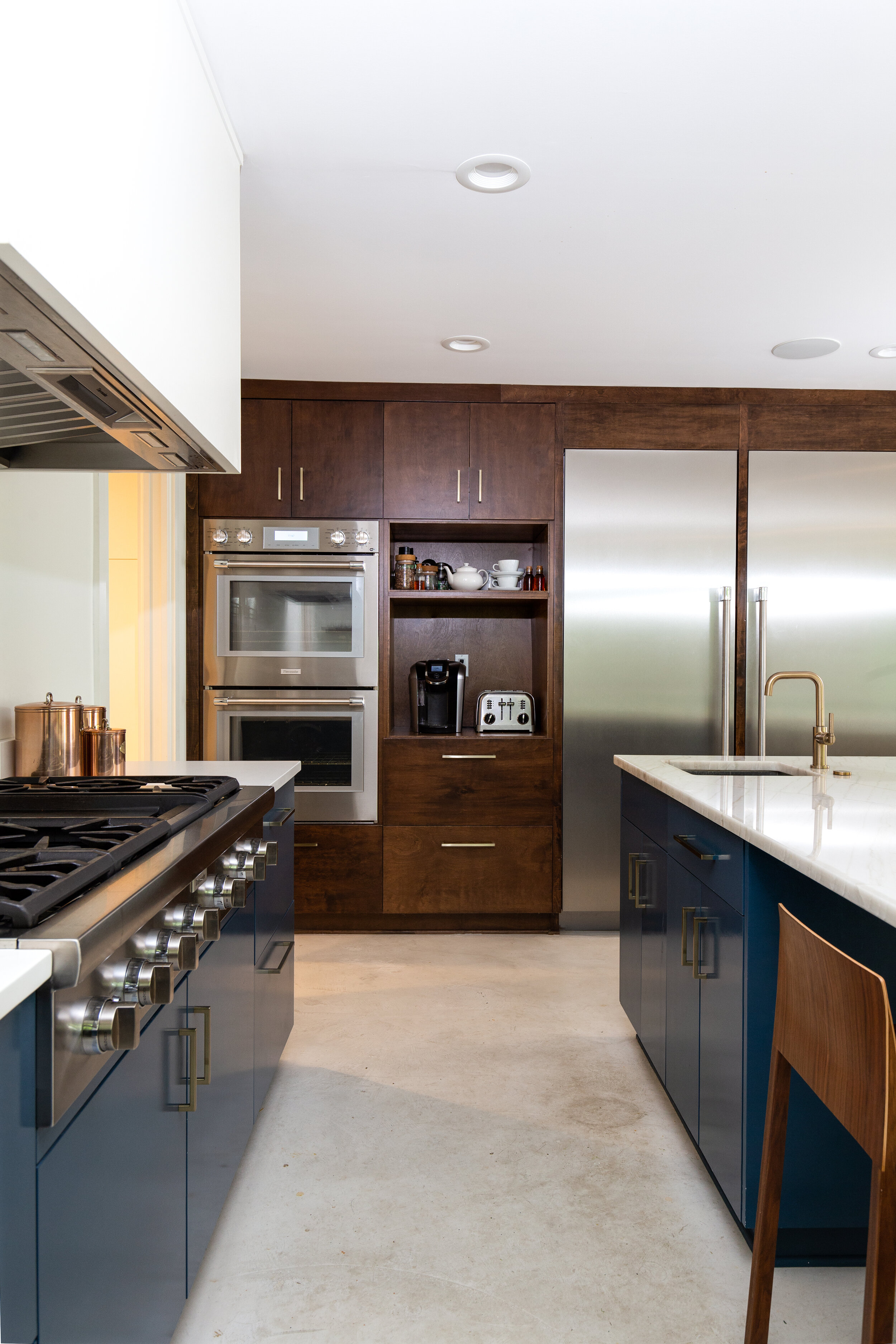
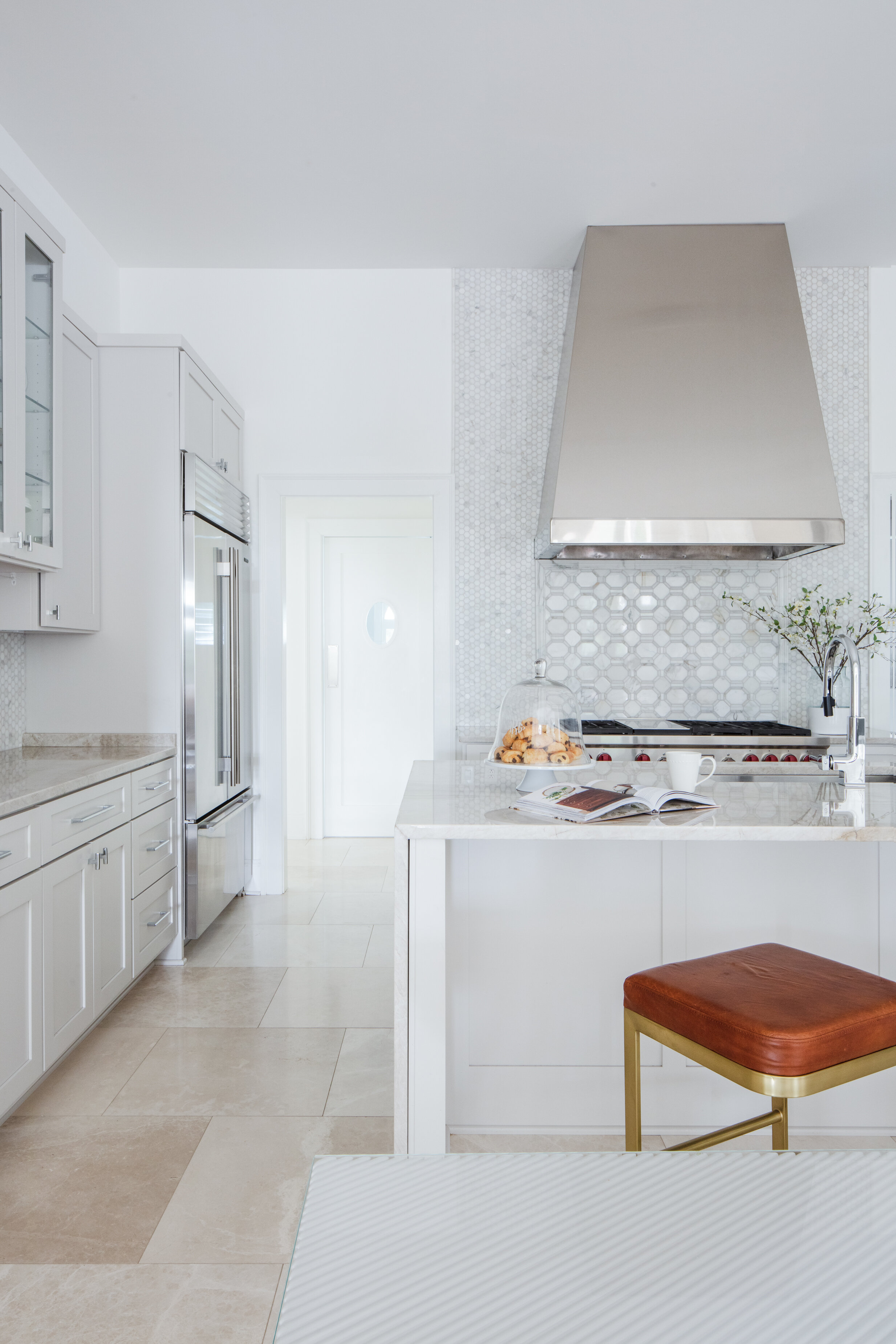
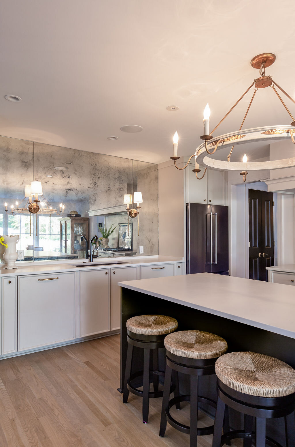
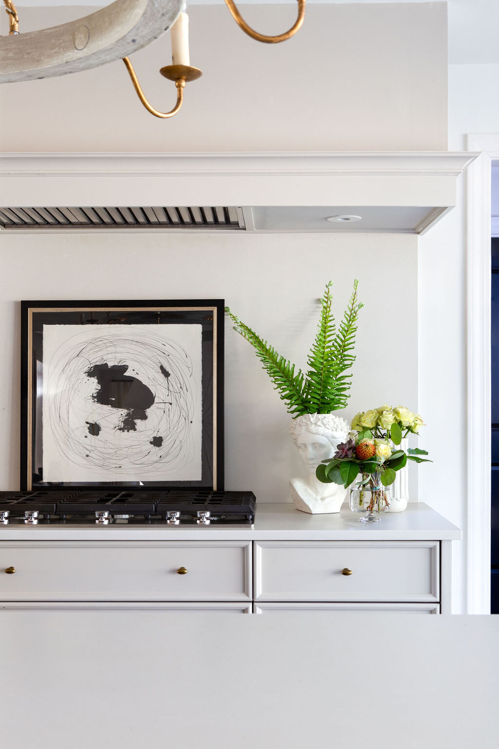
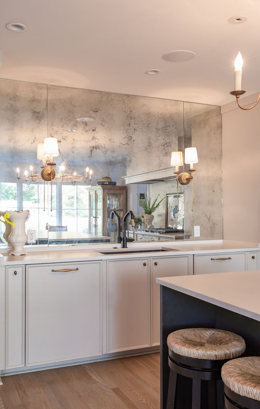
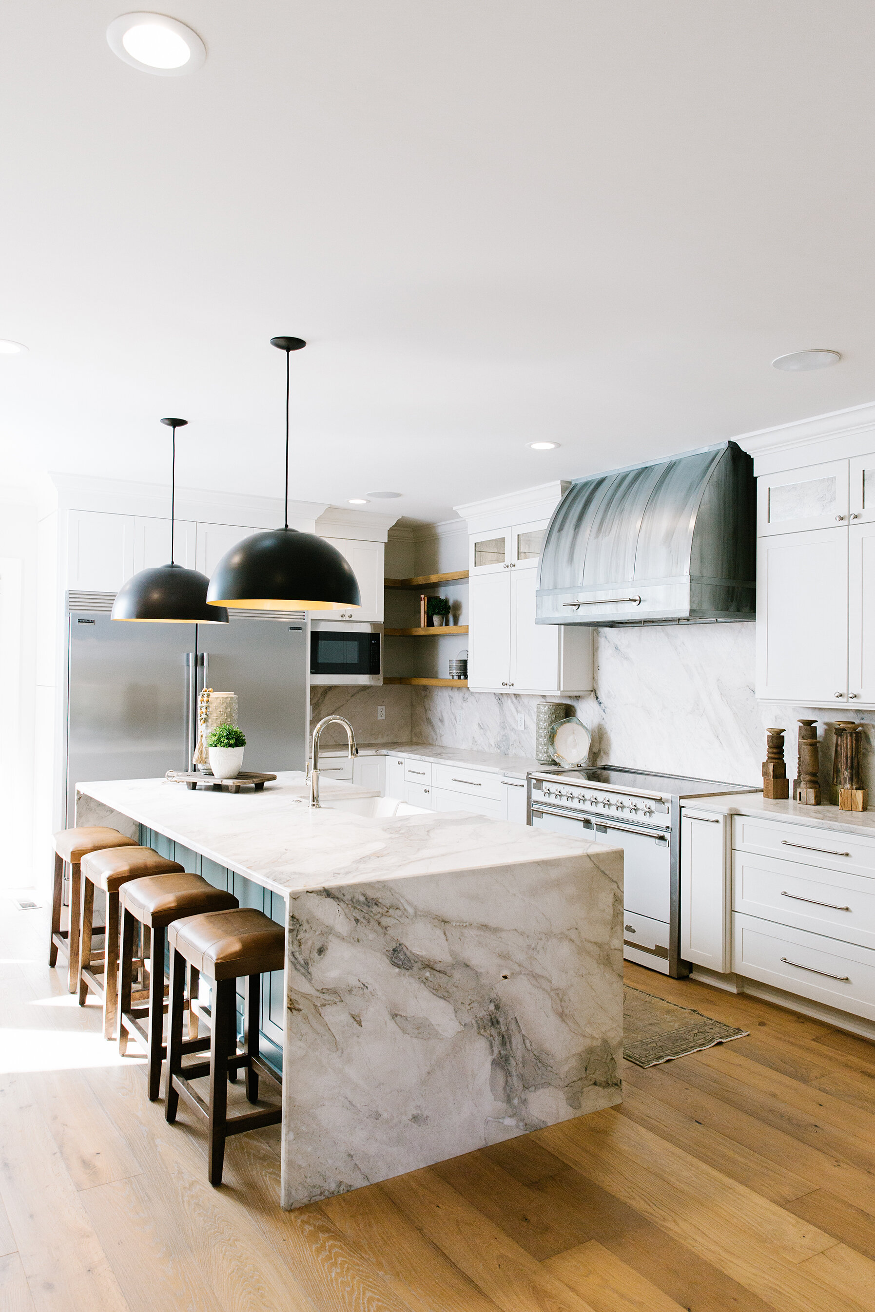
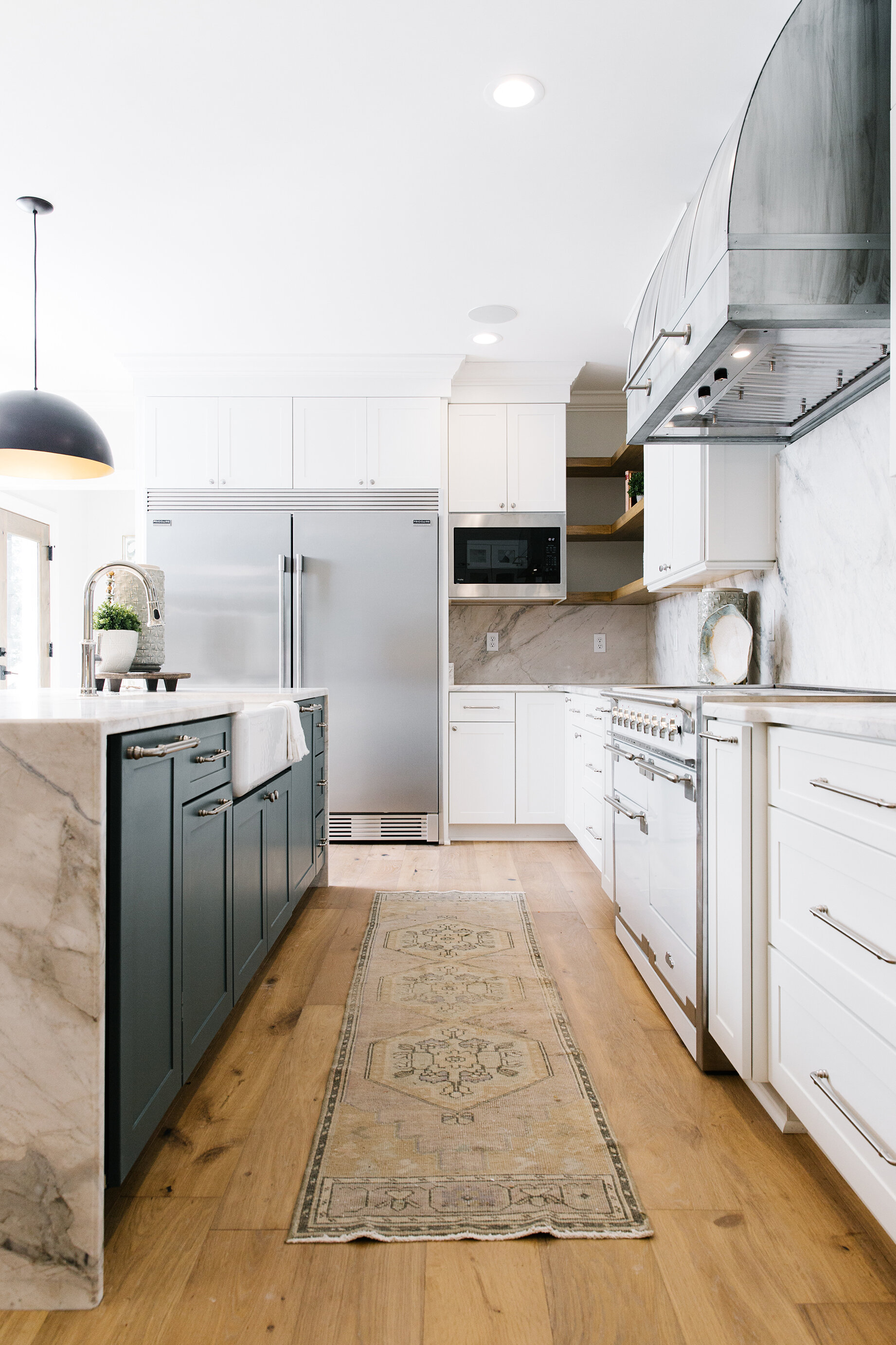
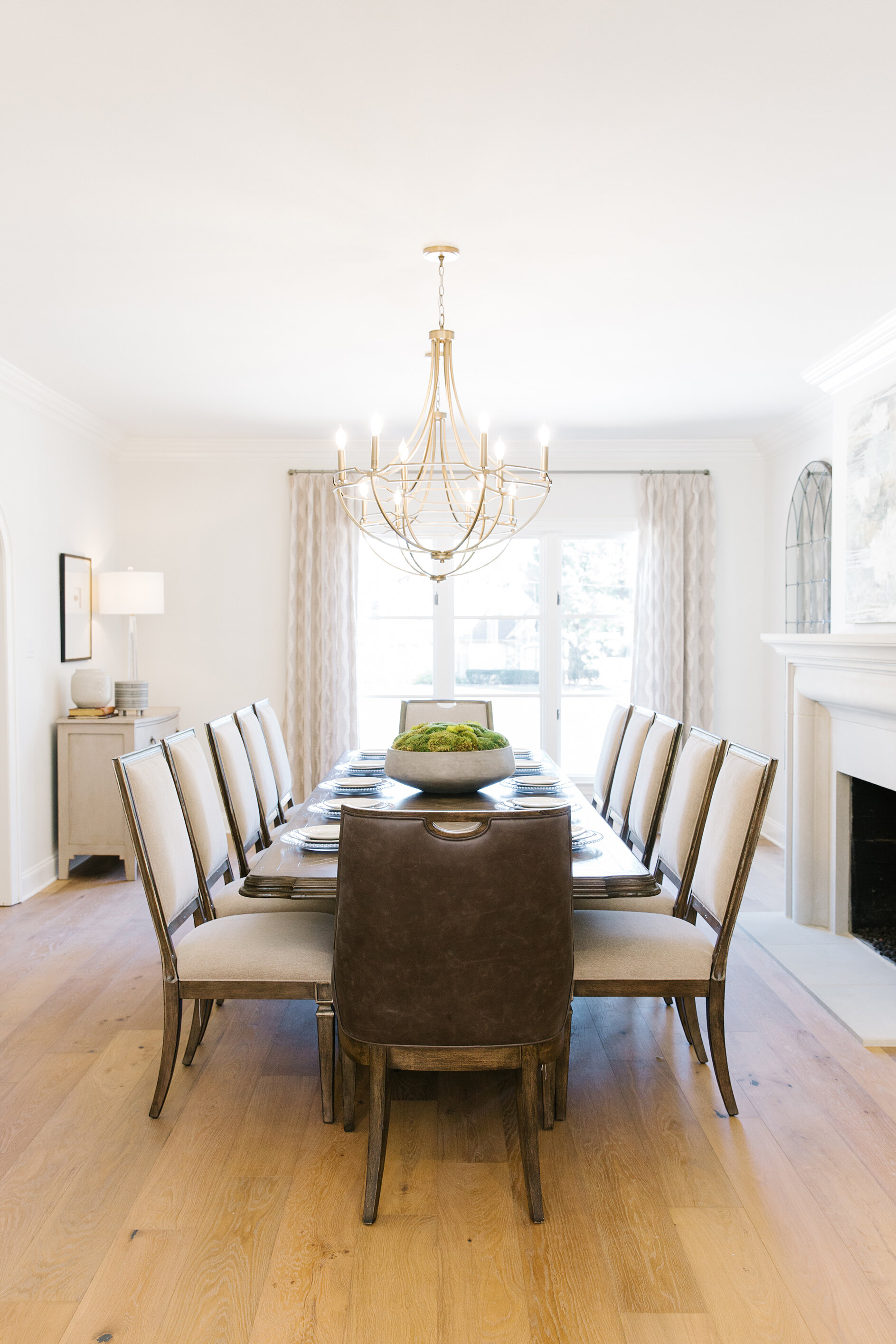
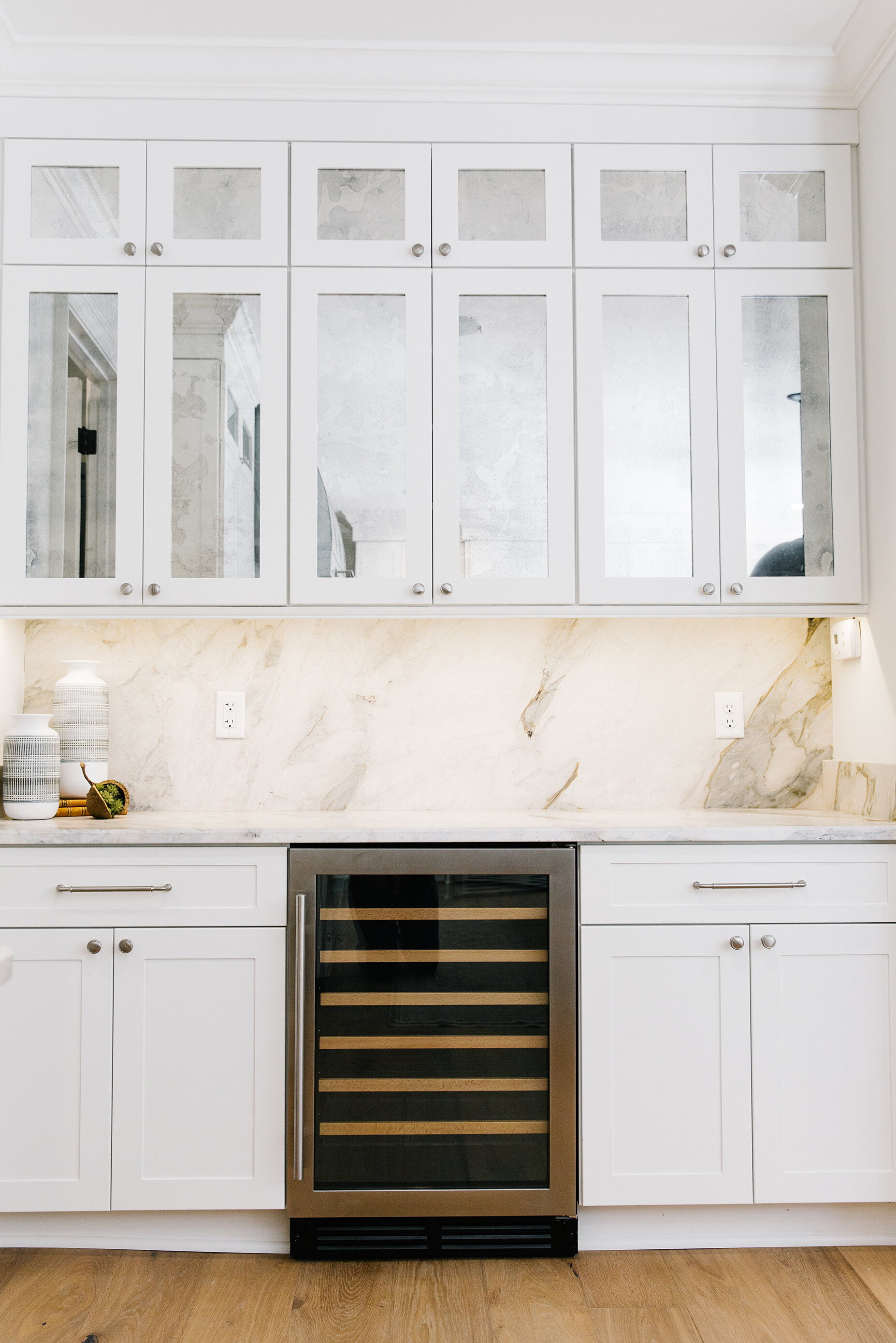
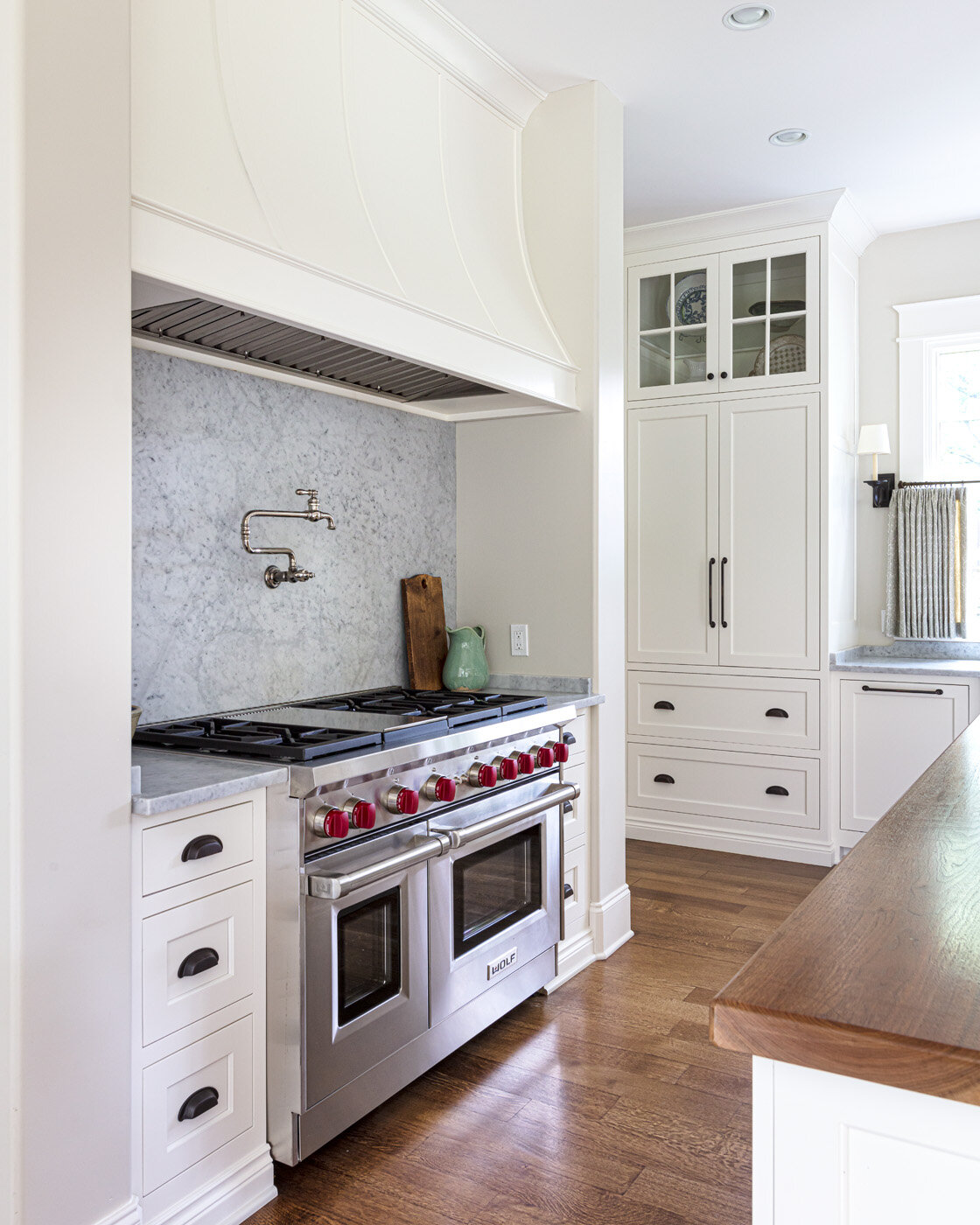
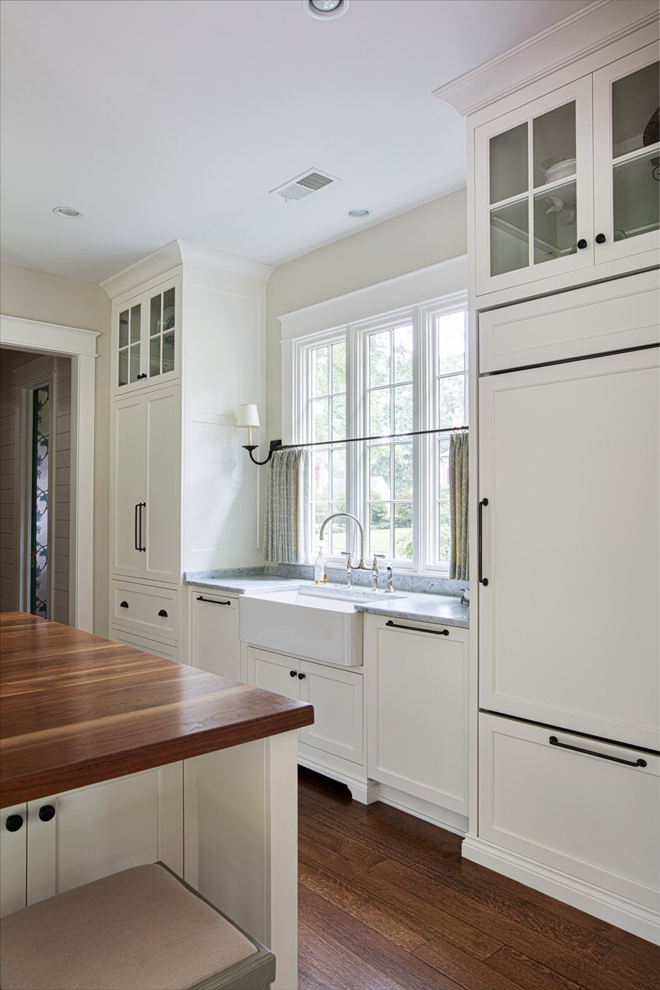
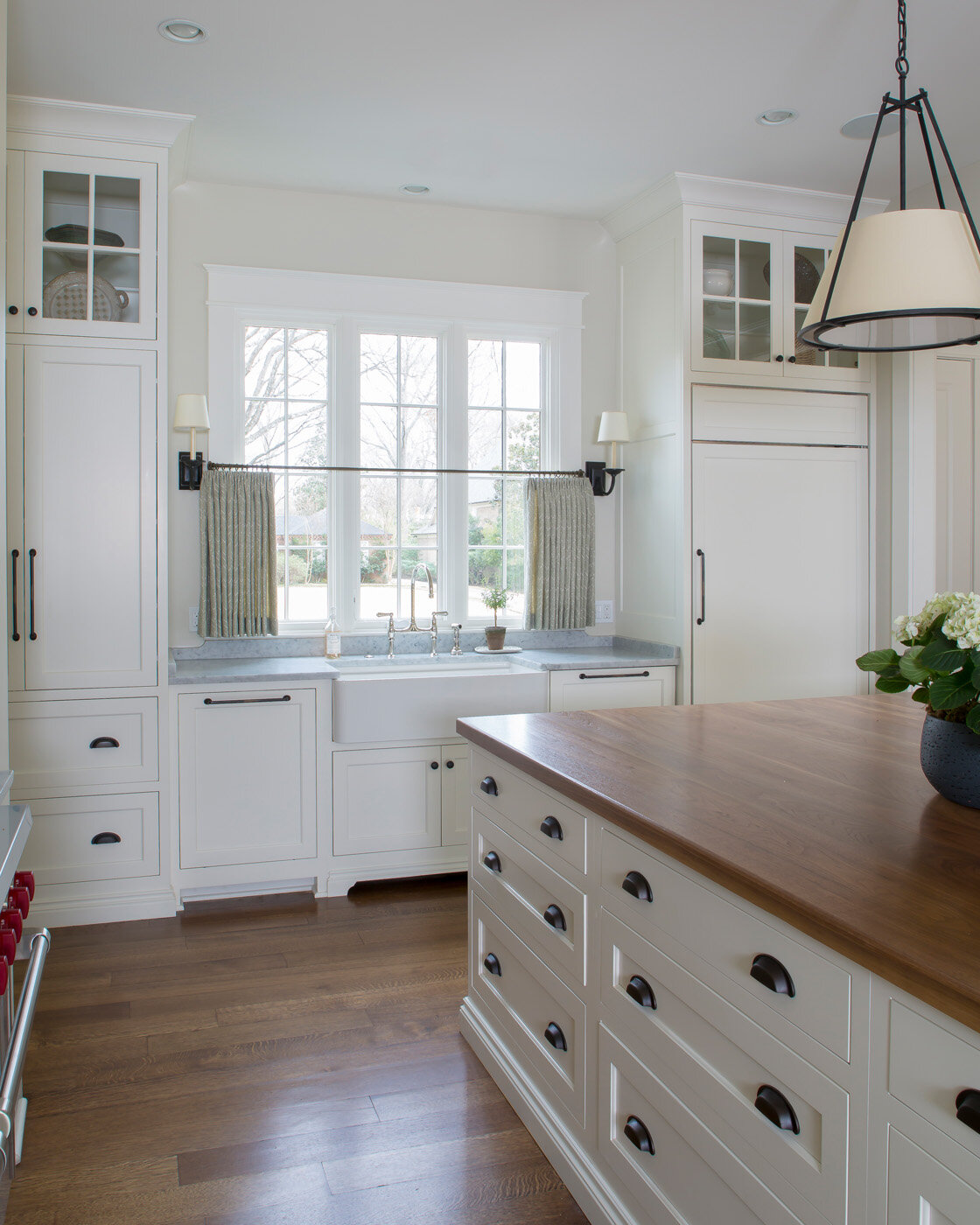
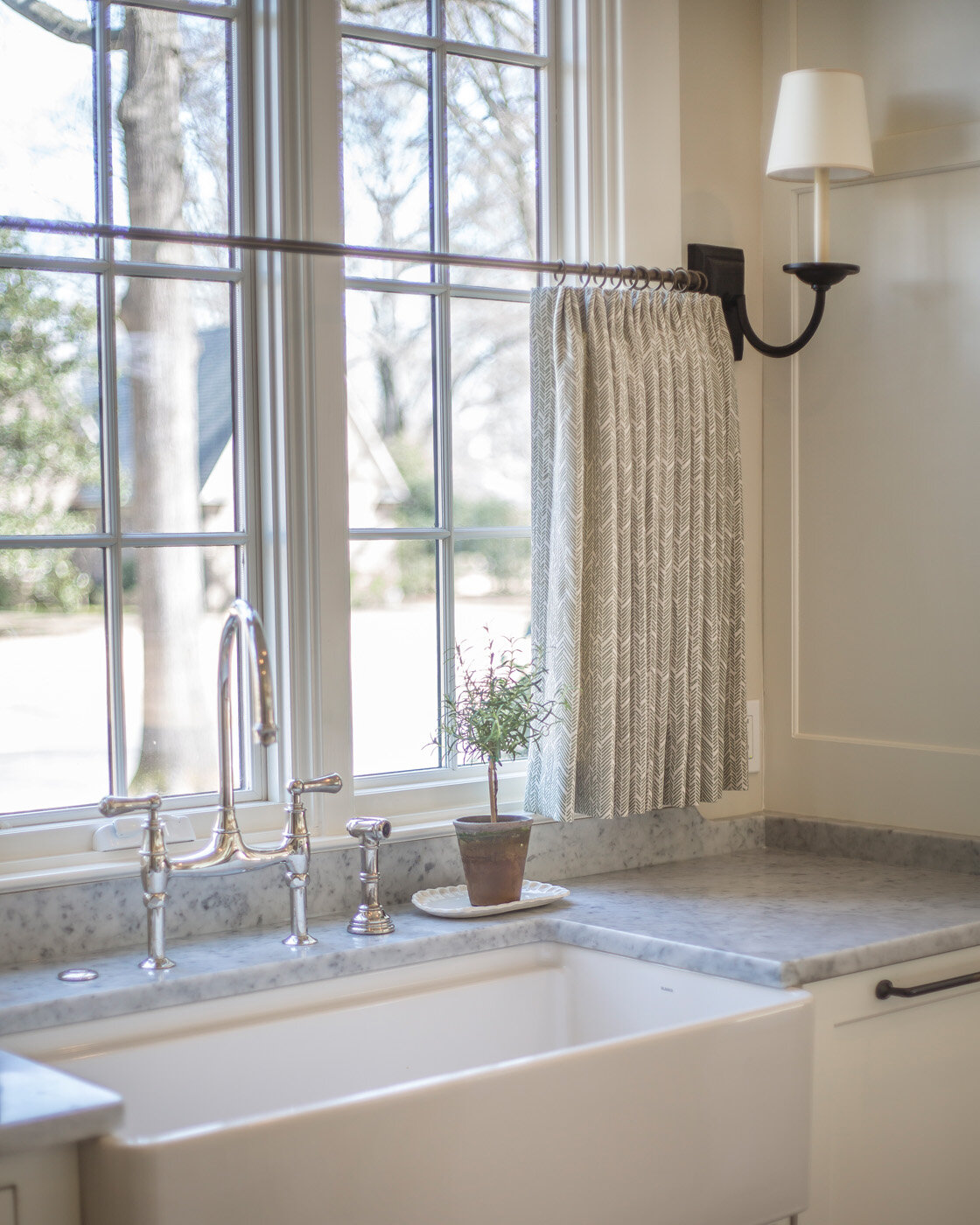
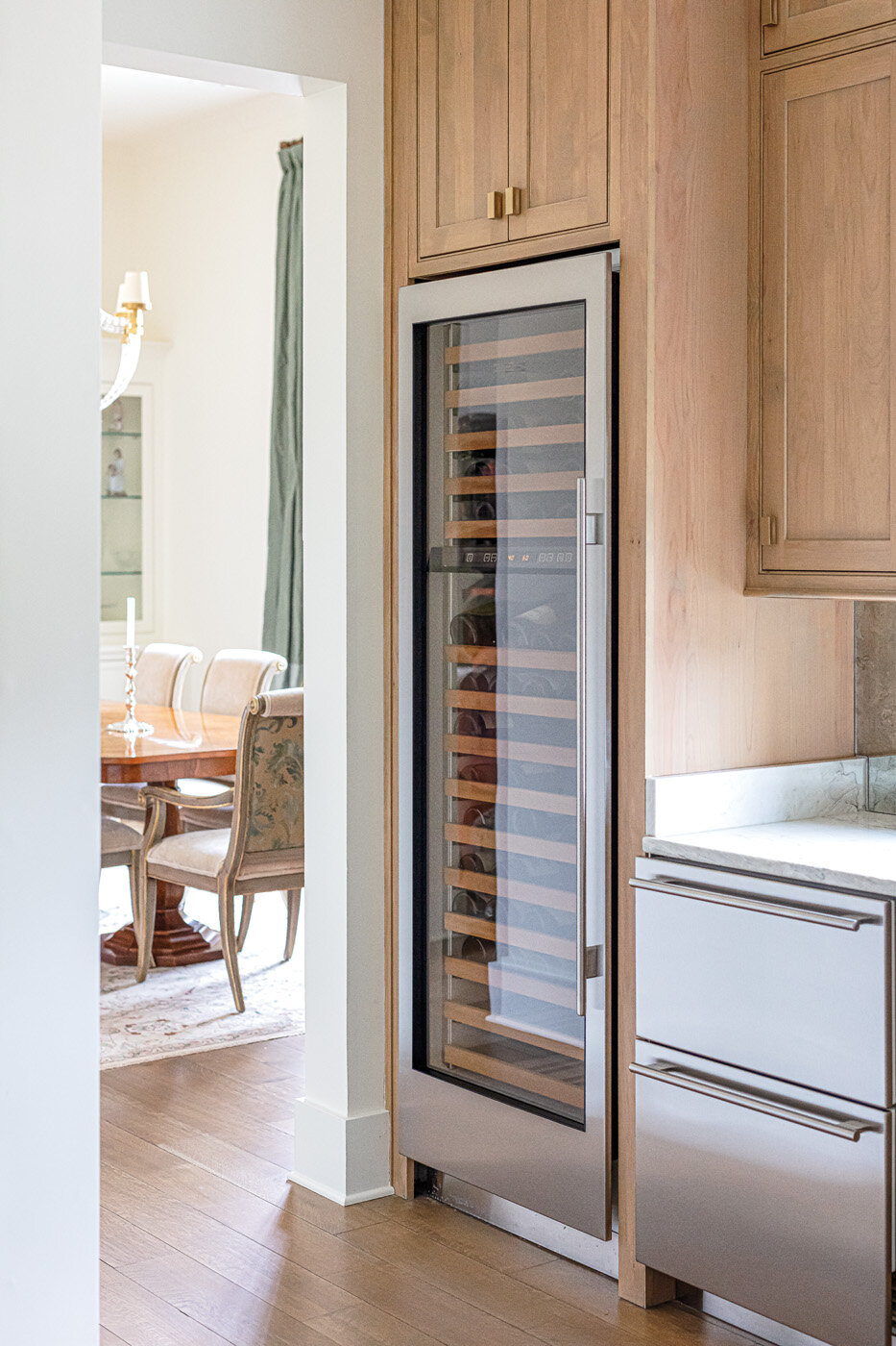
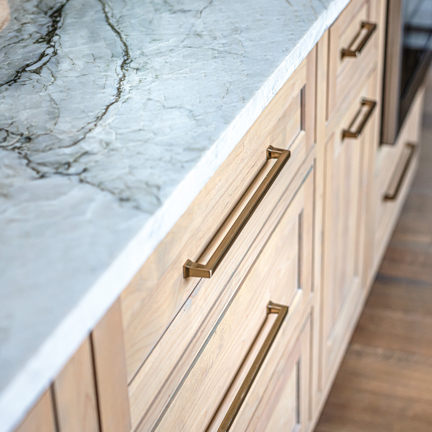
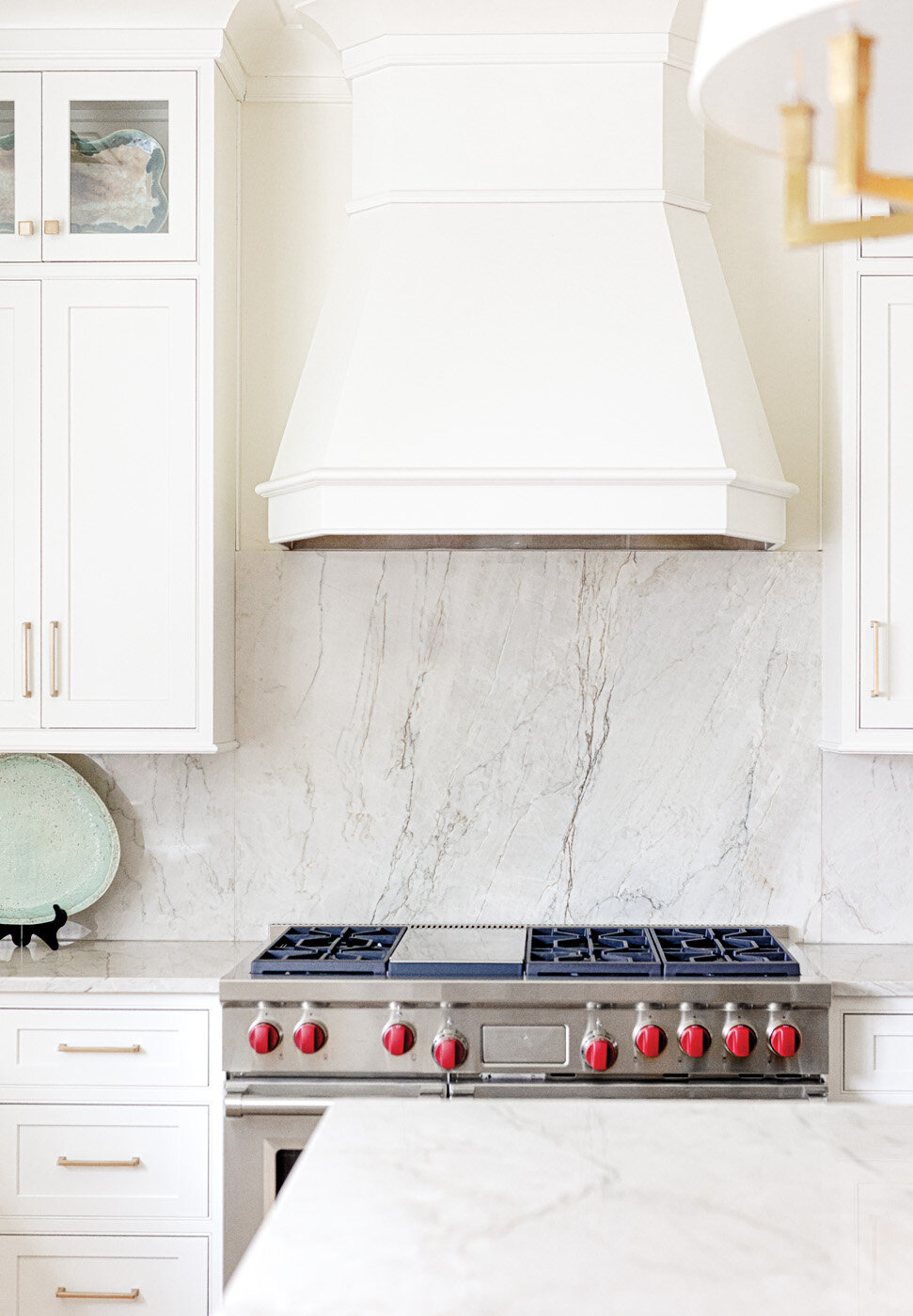
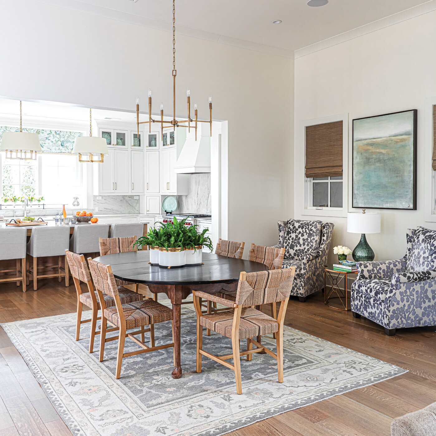
The kitchen island boasts an ethereal blue green, Oyster Bay by Sherwin Williams. Previously dark stained wood, as was the rest of the kitchen cabinetry and trim, the lightened up wood, along with new countertops, lighting and fixtures, brought the kitchen beautifully up to date without a complete remodel. The large kitchen features a generous eating area that the homeowner loves as it offers plenty of overflow seating from the nearby dining room when she hosts large family gatherings. 

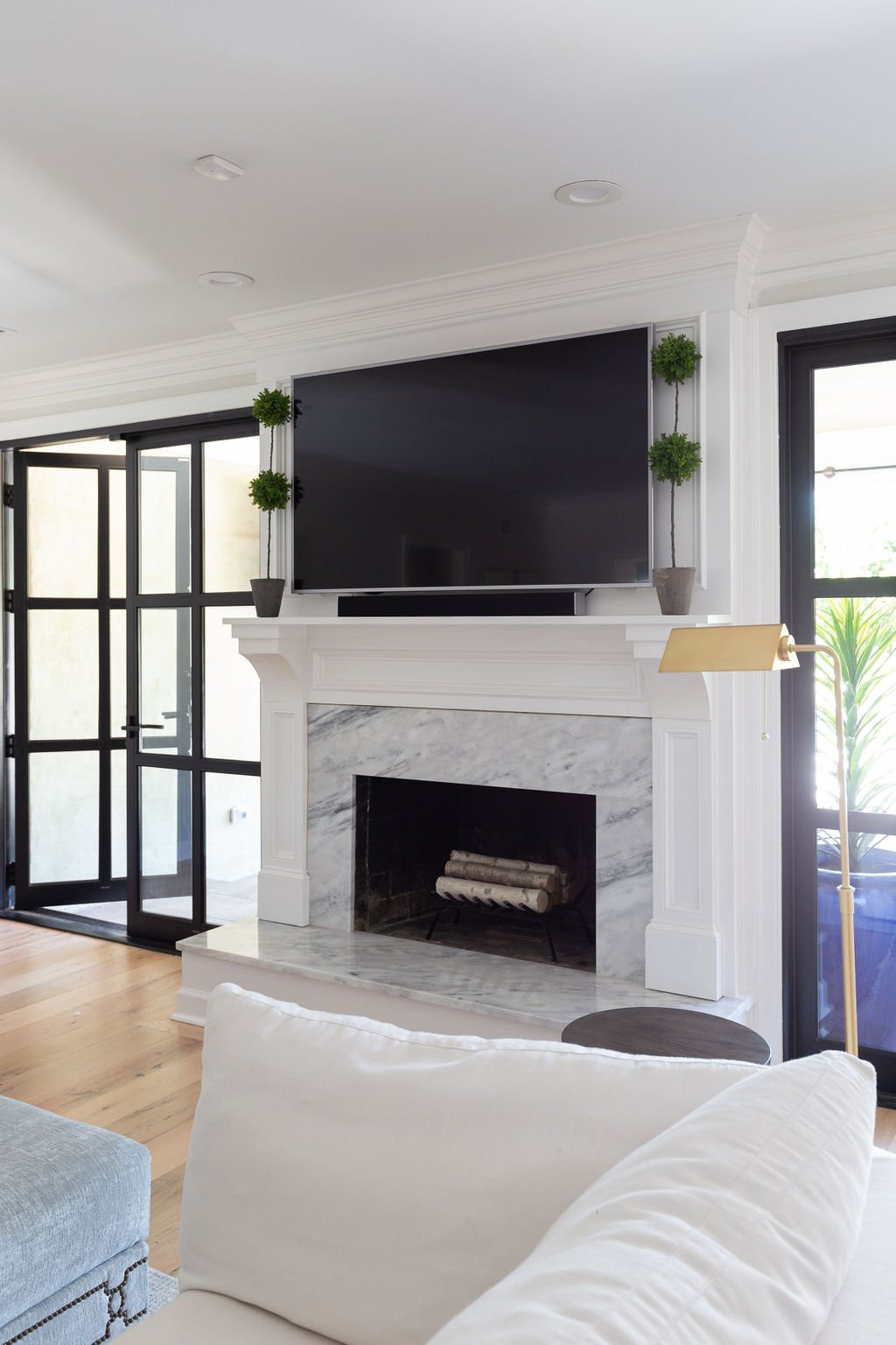
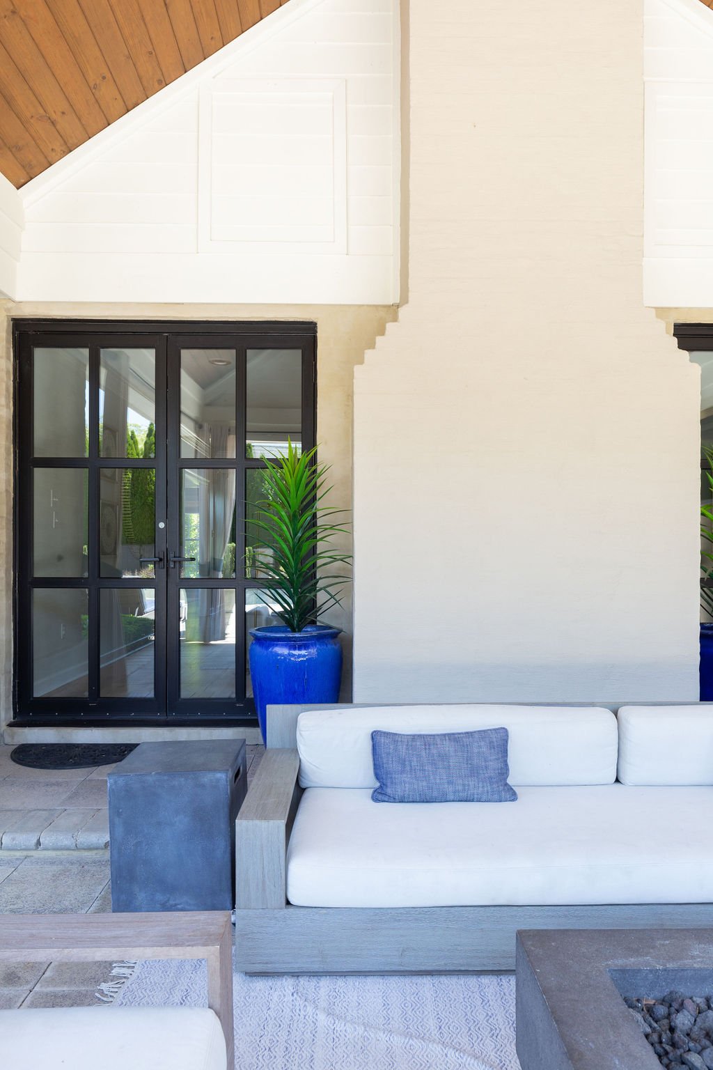
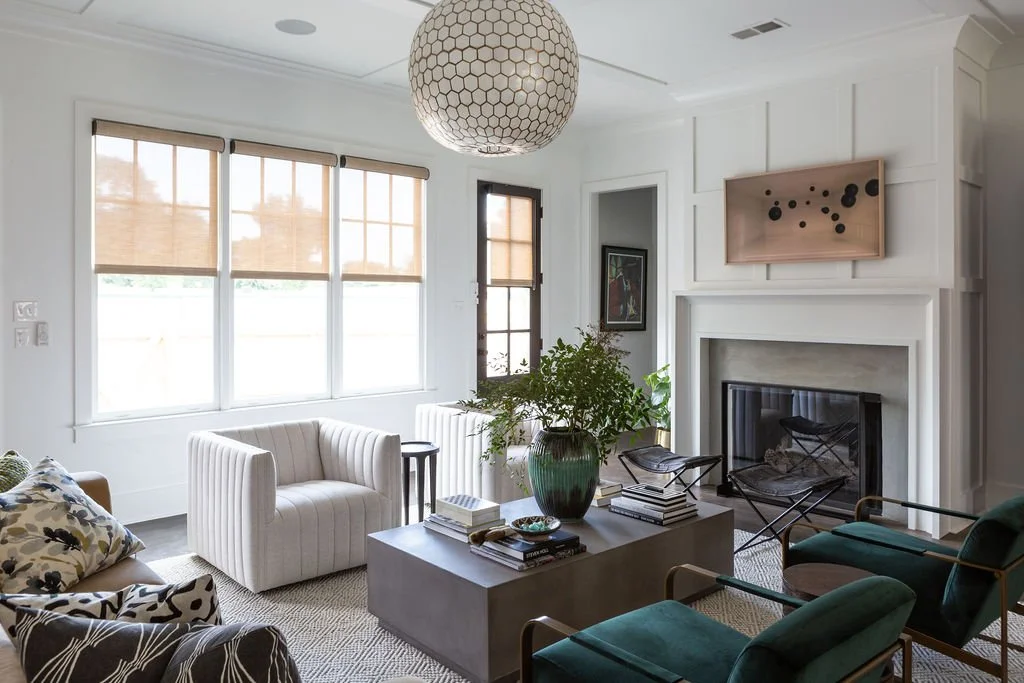
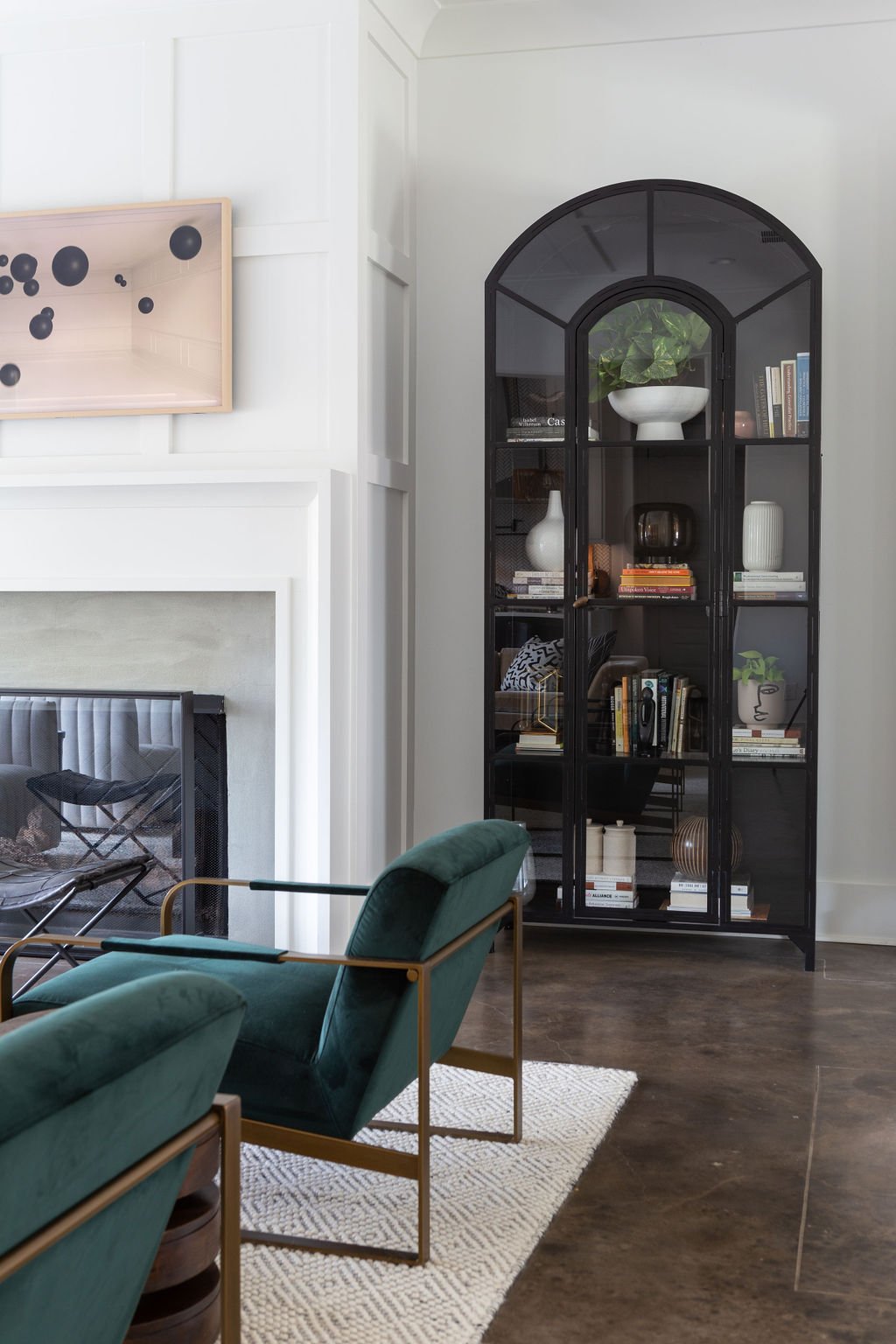
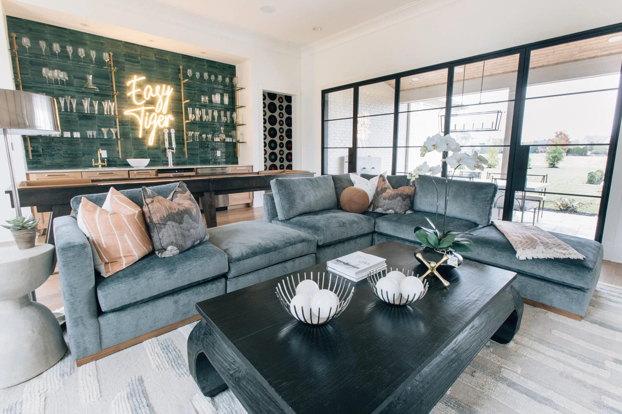
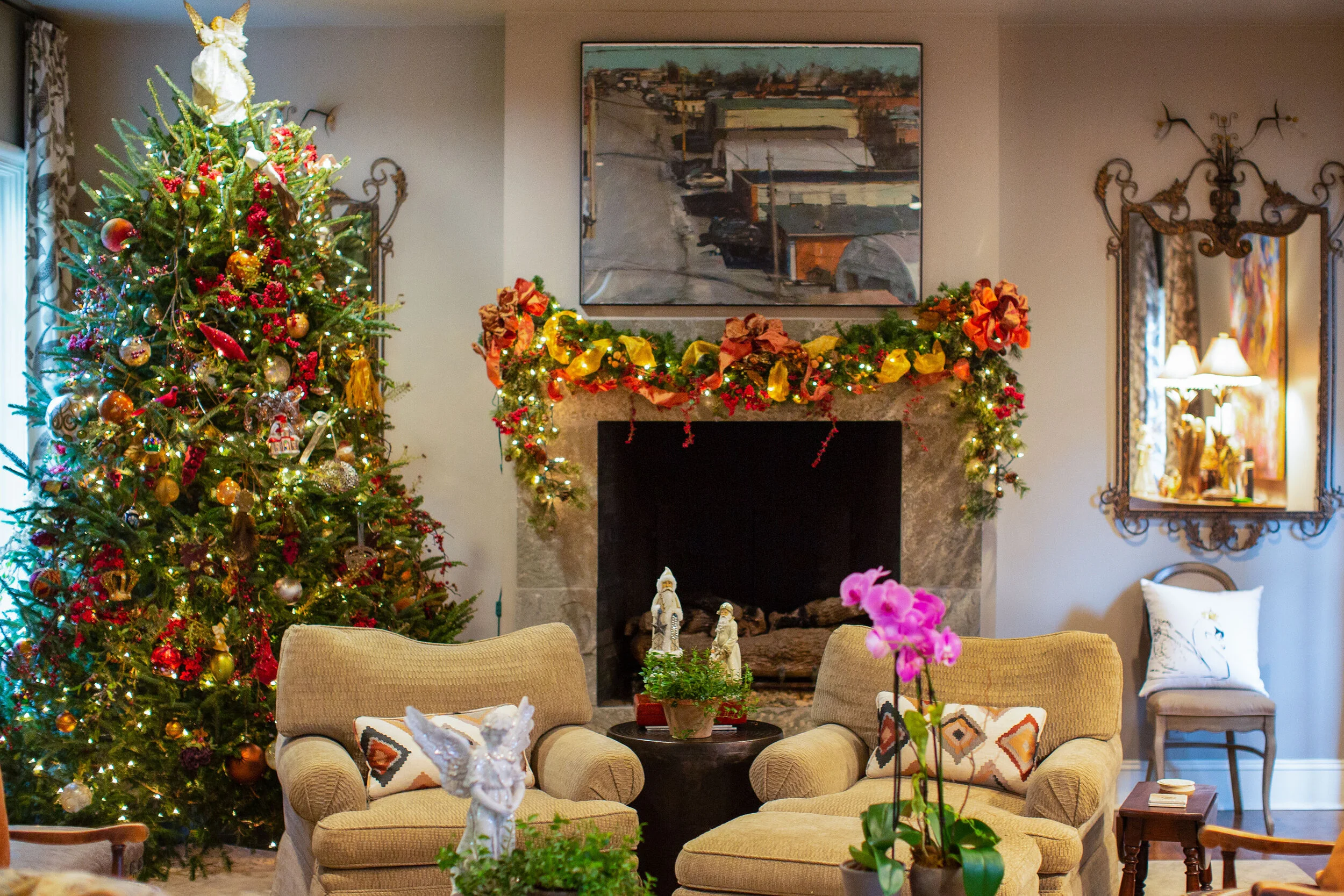
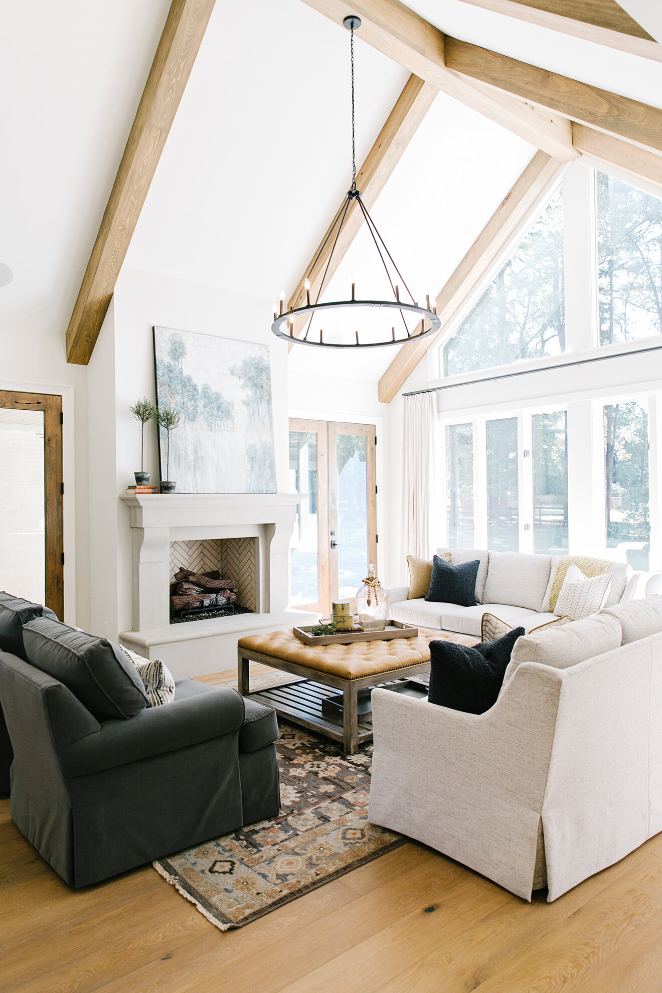
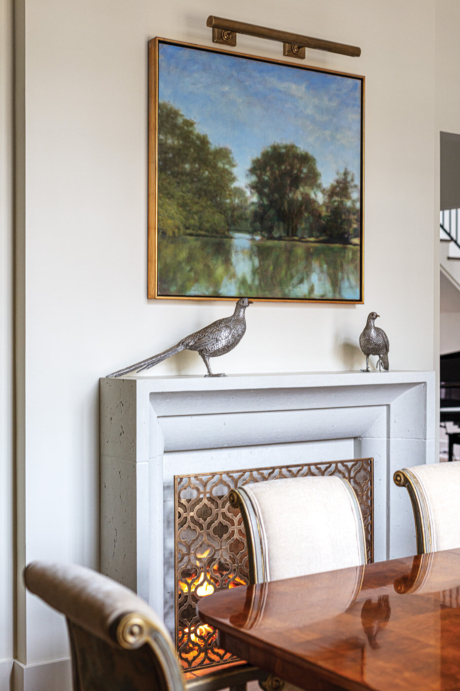
The family room that overlooks the backyard received a facelift that started with help from Flooring Solutions: the addition of an eye-catching bluestone floor. A brick fireplace was limewashed to tone down the color. A new mantel completed the overhaul in the comfortable, but not too casual space.

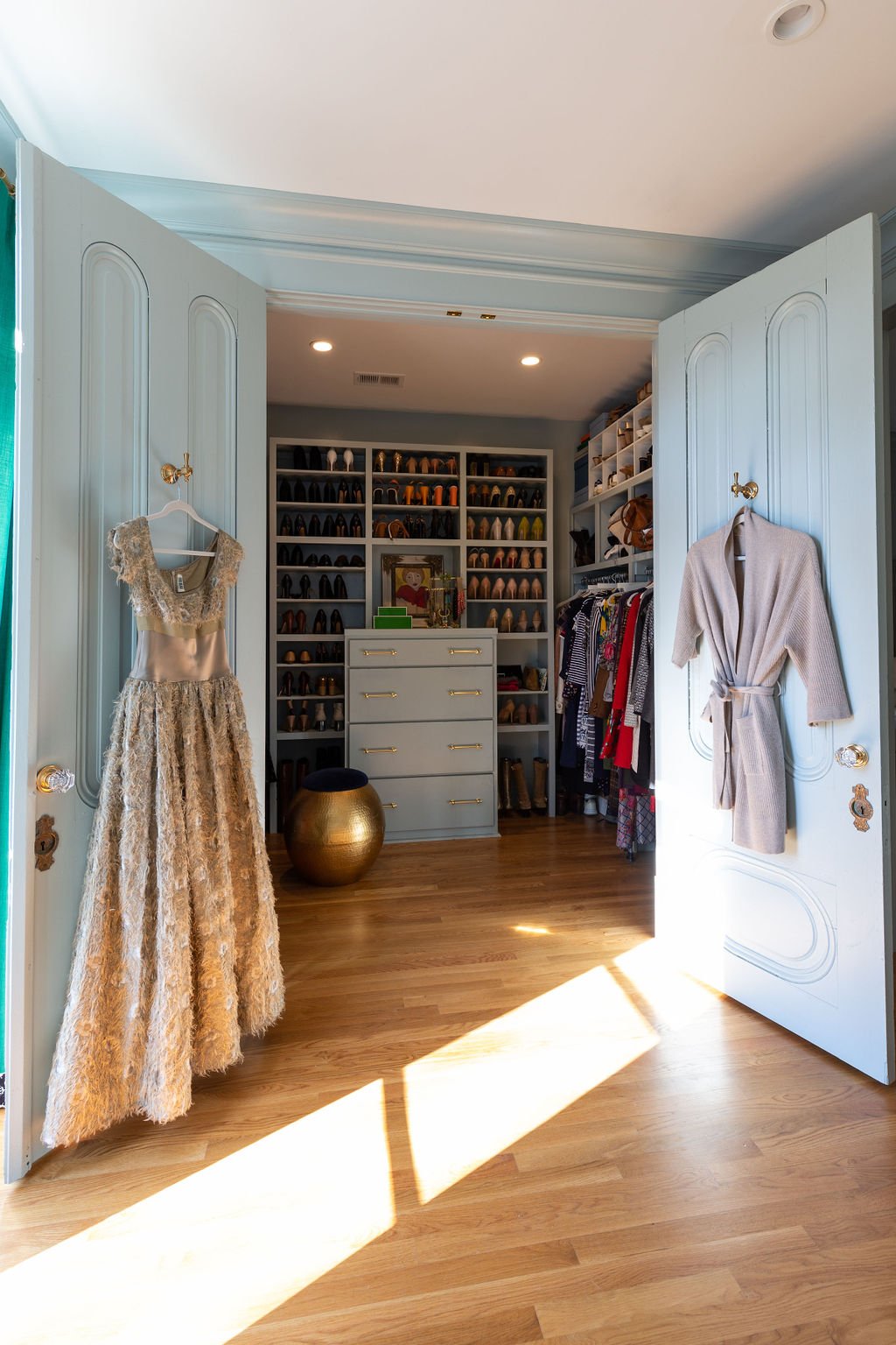
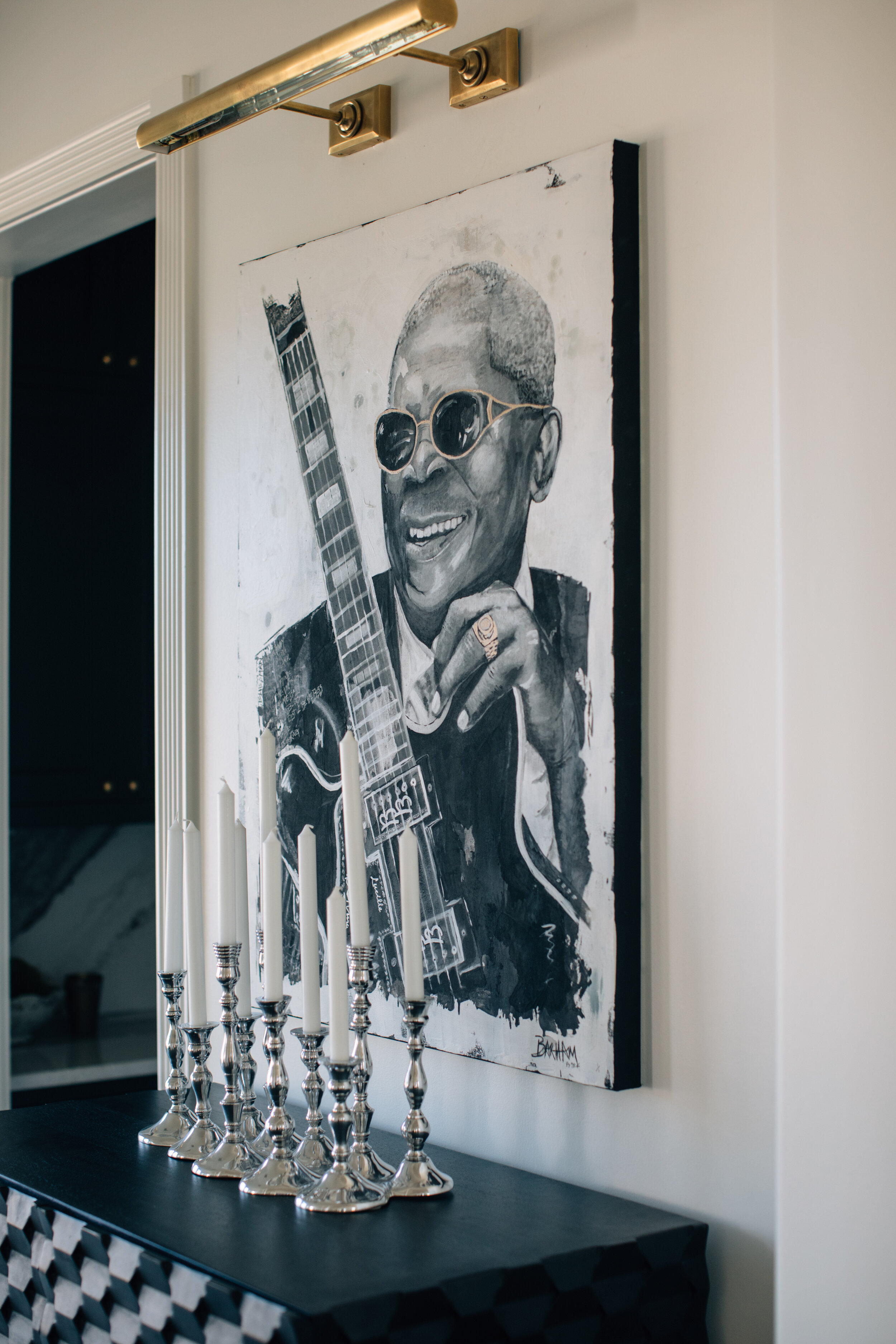
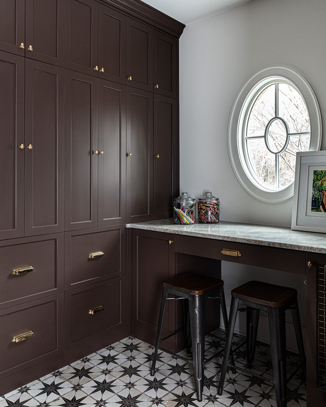
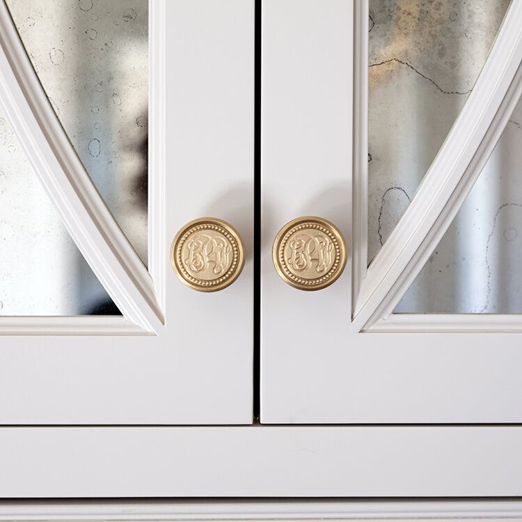
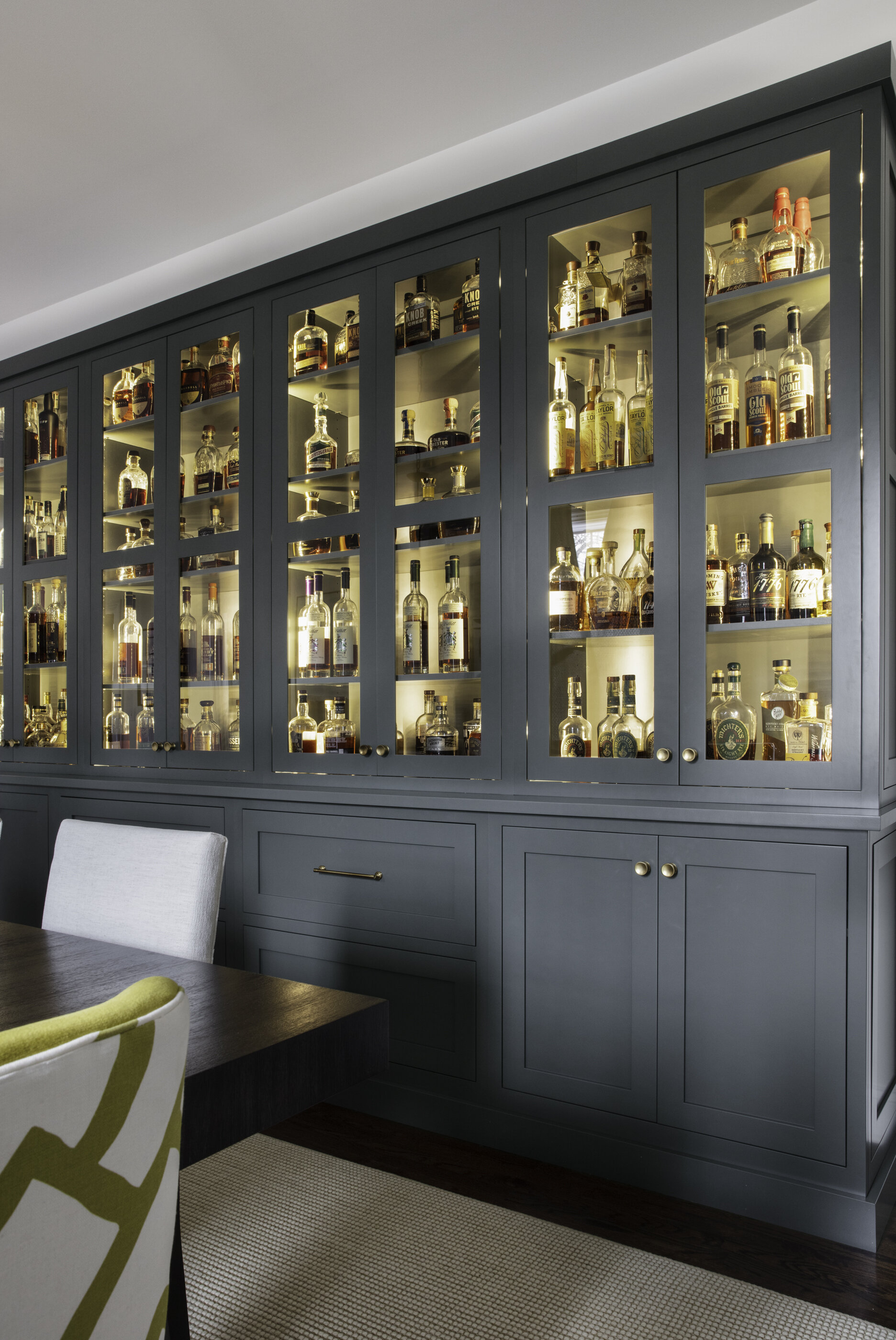
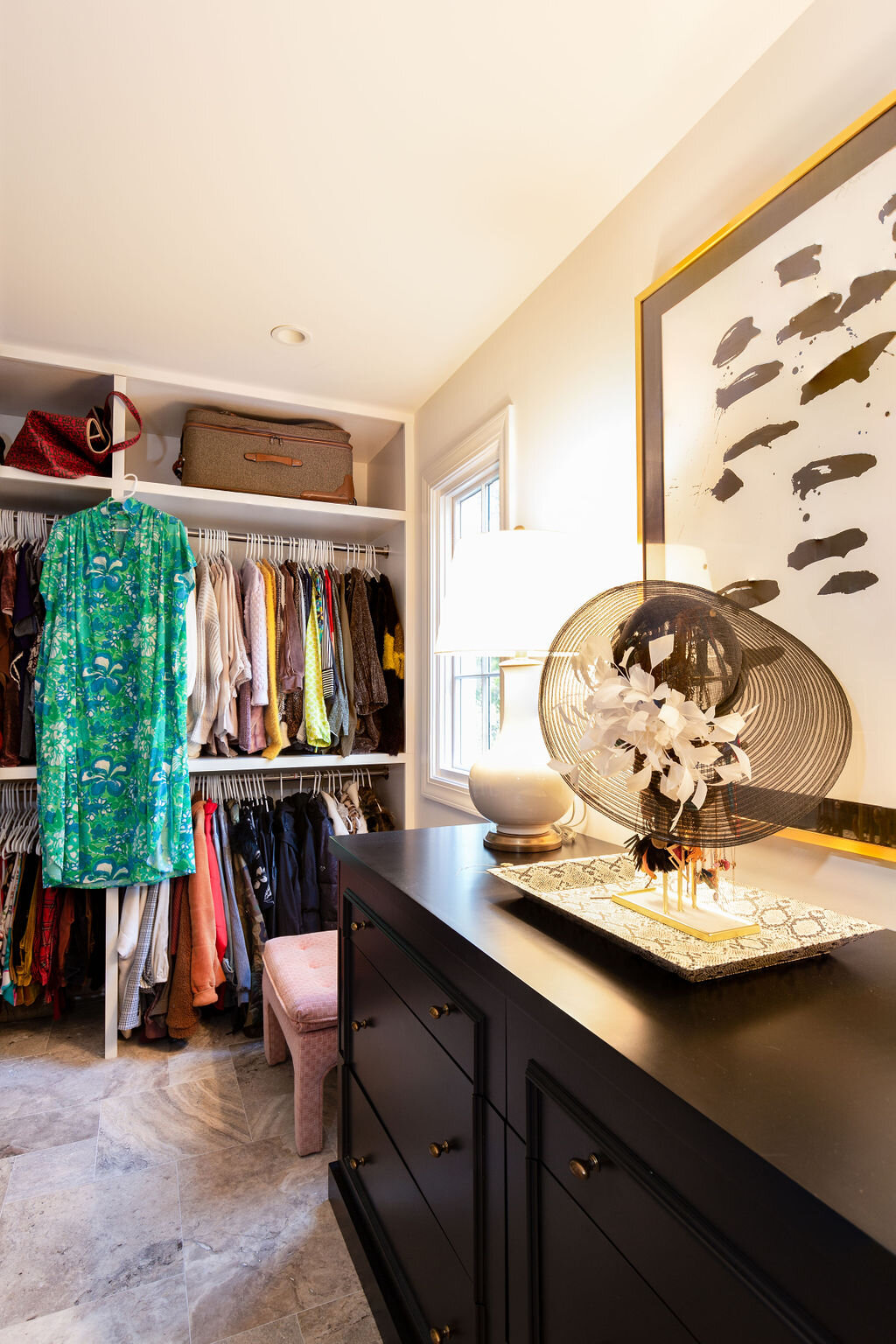
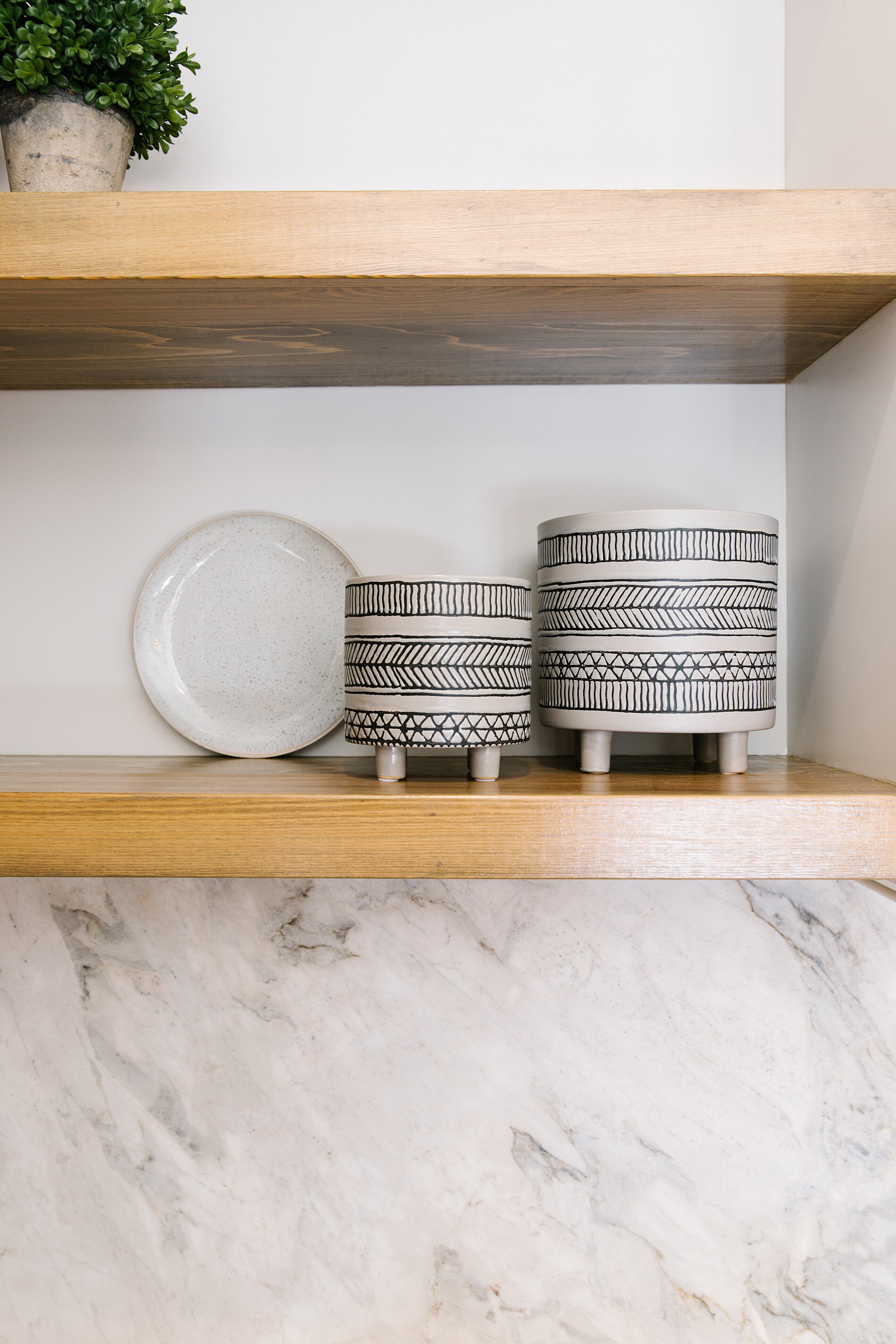
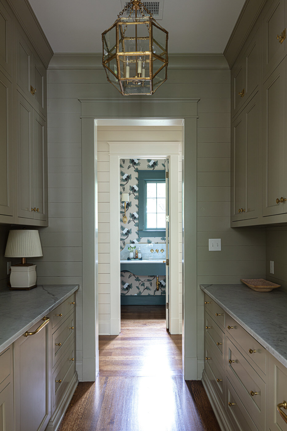
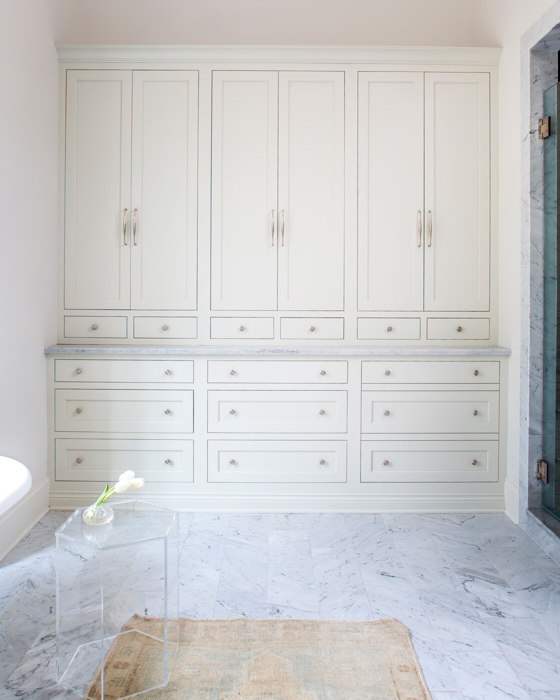
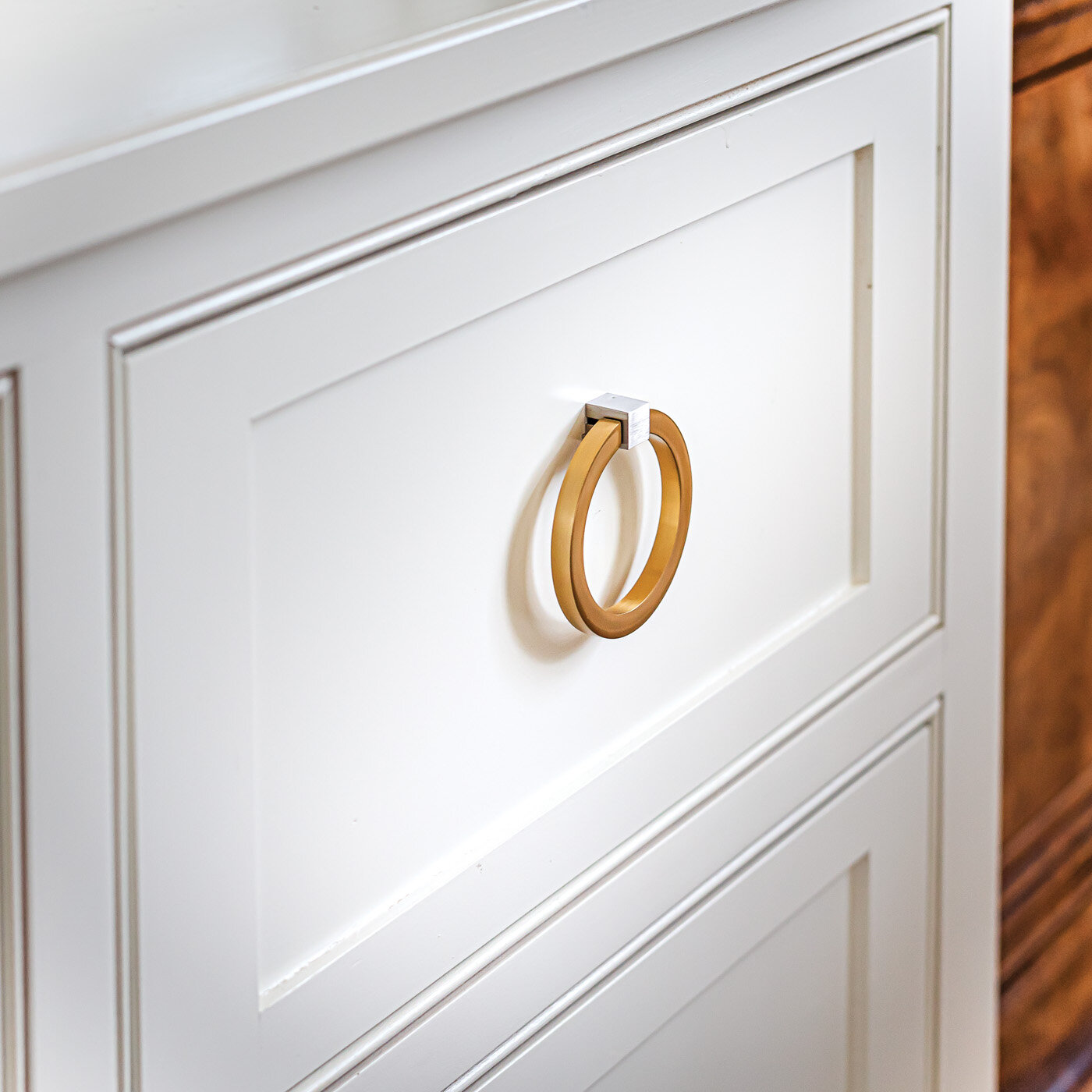
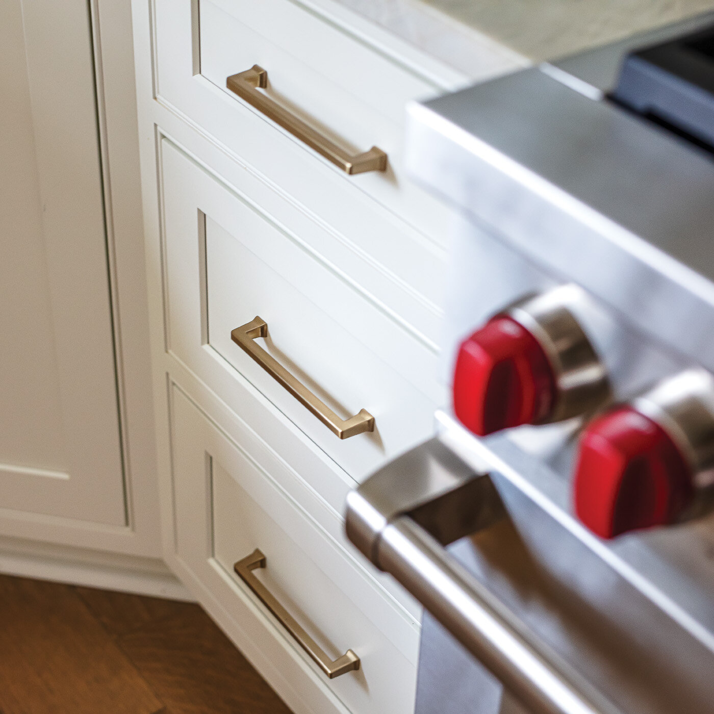
The First Fruit team paid attention to even the smallest details during the renovation, like replacing door hardware throughout the house with crystal knobs for a timeless look, and bringing in The House of Order to assist in organizing the closets, kitchen and pantry.

Although Toney and Michaelis have helped the homeowner transform almost every area of their house, the designers still refer to the project as a work in progress. Toney says, “We’re constantly dropping by all the time. Sometimes we’ll get something in at First Fruit that I just know would be perfect here. I shoot her a picture and she says, ‘Bring it by!’” It’s clear they love working on the “house with the good bones” and enjoy their “perfect” client.

Home as a Solace

Interior Design by Alexandra Lauren Interiors | Story by Terri Glazer | Photography by Kristen Elizabeth Photography

For the past two years everyone has spent more time at home, leading many homeowners to renovate or redecorate. The project designer Alexandra Lauren recently undertook for a Jackson, TN, family was more than freshening up, though. Both health care providers who have experienced heightened stress from the pandemic, the couple now think of their home as a haven from the storm.

The family moved into the house in 2019 and engaged Lauren to begin the renovation shortly after settling in. The designer describes it as “a rare property.” Surrounded by forest, yet conveniently located in town, its architectural style and the lush gardens painstakingly cultivated by the previous owner exude a French country feel. The designer’s task was to update the interior to more accurately reflect her clients’ modern taste in a way that highlights the unique beauty of the home’s breathtaking natural setting.

General Contractors Larry and Ricky Cupples of Cupples Construction oversaw the renovation work. Lauren says they were the perfect choice for the job since they originally built the home. “When time came to gut and remodel it, they knew where the internal ‘bones’ of the house were.”

First on the agenda was the primary bathroom. In order to “bring the outdoors in,” Lauren enlarged a small window and situated a freestanding soaking tub under it. “We played on the concept of shinrin-yoku, which means forest bathing in Japanese,” she explains. “I am a huge fan of free sunshine. By enlarging the window we not only flooded the main bath with natural light, but also opened up beautiful views of the forest outside which weren’t previously visible.” The reworked floor plan allowed for a marble enclosed tub and shower, fulfilling the clients’ only request for their primary bathroom. 

Mirrored French doors do double duty, adding light and interest to the space and cleverly covering the entrances to the water closet and the owners’ closet. 


Next up on the renovation schedule were the son’s and daughter’s suites. The homeowners wanted to give their teenage children grown-up spaces with enough sophistication to serve as guest rooms once the kids are grown and gone. 


Lauren achieved this goal beautifully. The daughter’s bedroom is fresh and feminine without being “little girly.” Rose quartz is the overarching theme, from the wall color and bedding to the lamps and drawer pulls on the bedside chests. Contrast and interest come from the art above the bed—a framed panel of Ellie Cashman wallpaper— and a throw pillow in the corresponding fabric. The whimsical light fixture, fashioned from wire embellished with hundreds of mini bulbs, brings to mind a dandelion puff ball. The room’s furnishings, along with many of the elements used throughout the home, are available at Lauren’s Jackson design studio, Alexandra Lauren Home Collection, and on her website, alexandralauren.com.


“La vie en rose” continues in the adjoining bathroom in a subtle-yet-fun leopard wallpaper and in the cabinet hardware.

 “Wallpaper is back in a big way! But it’s not your grandma’s wallpaper. We’ve been using it a lot. It’s much easier to remove and I always go for VOC-free papers. We even have a wallpaper bar in our studio with a huge library of new wallpapers.”

—Designer Alexandra Lauren

A Phillip Jeffries wallpaper was the inspiration for the boy’s room design. The nailhead-patterned grasscloth appears on a feature wall in the bedroom, setting a handsome and decidedly masculine vibe. Lauren played up the nailhead motif in an upholstered headboard and again in the adjacent bath in an ingenious way. Flanking the brass mirror, a pair of nontraditional sconces with black metal shades filter light in a reverse dot pattern. 

For the upstairs game room Lauren opted for drama in a big way. The walls, the trim and even the ceiling are bathed in Benjamin Moore Black Pepper, a bold, saturated blue gray that makes a big statement. 

Moving back downstairs, Lauren gave the kitchen and two living areas a major facelift, removing walls and reconfiguring space. The end product is a chef’s kitchen that is at once gorgeous and useful, complete with a family dining area, with a separate chic and comfortable living room on either side.

The gleaming kitchen features white cabinetry and countertops, dressed up with brass hardware and accents. The design brought new life to the existing Sub Zero refrigerator. Formerly covered in wood panels painted with a French country scene, the two separate units now shine in stainless steel. Lauren separated them and installed a wine tower between. She also added a rolling library ladder in the kitchen to provide easy access to items stored in the upper cabinets. Punching up the glam factor are the brass ladder rail and a custom range hood that mixes stainless and brass. The real showstopper is the lighting over the grand, new kitchen island. Lauren grouped several Kelly Wearstler crackled glass pendants to achieve the effect of a massive chandelier proportionate to the island’s generous size. 

Filled with light, living room one is elegant and ultra modern, but still cozy enough for the family to gather for a TV night. The designer chose Simply White by Benjamin Moore for the walls and trim and furnished the space in whites and cool tones. She brought the fireplace style up to date with the same Cambria Britannica stone she used on the kitchen countertops, fabricated by Counter Solutions in Jackson. “I love its dramatic veining lines,” she says. “Traditional Carrara marble has finer lines, but these clients weren’t afraid to go bold.”

Lauren’s design aesthetic paid special attention to standout lighting, which she calls “the jewelry of the home.” The chandelier in living room one is a perfect example. Striking and graceful, the Hubbardton Forge piece is an artistic creation that blends form and function flawlessly. Hand forged to order in the USA, the piece is available at alexandralauren.com.

“We’re seeing a modern influence on lighting as the next big thing in design. Even more vintage or austere historical vendors have tipped their hat to modernity. Lighting is getting ultra futuristic and fun.”

—Designer Alexandra Lauren

In the second living area a completely different but equally striking light fixture takes center stage. The John Richard Hans chandelier features a cascade of 23 brass drop lights set at varying heights to form one stunning effect. 

This room’s renovation included removing a corner fireplace on the back wall and building a long, low one in the center, bordered by warm wood shelving on either side. Lauren repeated the Cambria in a low floating hearth beneath the fireplace and furnished the space in neutral and cool tones to provide continuity with the kitchen and the other living area. All three rooms have views of the backyard pool area; the designer says she especially loves the “fire and water” effect when both the fireplaces are lit.

Although Lauren’s design talent is evident in every room, she says the home is really a reflection of the family that lives there. “My approach is that life is going to take precedence over the design layer in a home. It’s my job to amplify that lifestyle for my clients. They need to be the star of the show. Your home should be as representative of you as the clothes you wear. More importantly, it’s about how you want to feel in your own private space. 

“Colors affect your senses and textures engage your moods. All these design elements combined affect your life and how you feel. My goal was to create a sanctuary for these front-line workers and their family in the midst of the stress of the pandemic.”

The Right Place for the Right Family

Design by M. Cate Interiors | Story by Terri Glazer | Photography by Stefanie Rawlinson

When the right family finds the right place and the right designer, everything comes together perfectly to create a true dream home. Designer Jessie Cate’s Germantown clients and their new-to-them house are proof.

The family’s previous residence was great—a brand-new build with all the latest bells and whistles. While it had all the trendiest details, it didn’t have enough bedrooms to accommodate their five children or a yard large enough for the young siblings. The couple knew they needed to move, and realized they’d probably need to buy an existing home to get the large lot they wanted, but busy schedules wouldn’t allow them to take on a total redo. 

When they found the place they now call home, it was just what they were looking for; a “unicorn” as Cate describes it. Built in 1991, the house was in great condition and had already received a major facelift from Salvaggio Group, thanks to the previous owners. In fact, it was the gorgeous backyard with outdoor living room, kitchen, lounge area and resort-style pool, as well as plenty of green space, that drew them to make the purchase.   

The couple called on Cate in May 2020 to help make this great house their home. She recalls having discussions to make sure their expectations would be realistic for a 30-year-old home, since they were coming from a tricked-out new house. When they shared that they had hardly even used some of the luxury features of their previous place, she knew they were on board. 


“There was a bit of a disconnect between the exterior and the interior of this house. It felt a little dark and heavy inside with stone accents and dark floors,” the designer recalls. “My clients love the beach; it’s their happy place. I wanted to give them that same feel of relaxed comfort so I played on blue shades and the feel of the exterior rooms and tried to keep it with the traditional fit of the architecture.”

Cate goes on to explain that for this project, as she does with all her clients at M. Cate Interiors, she adopted a save/splurge policy that involves prioritizing the areas most important to the homeowners, then saving in other aspects of the plan.

To that end, she decided that instead of replacing the existing hardwood flooring throughout the home, it would stay, stripped of its ebony finish. Now covered in clear-coat, the floors show only remnants of their former color, left intentionally to evoke a casual, coastal feel.

My goal is to give clients the best version of them in their house so that they love coming home. They love having friends over because of their house; they’re happy to invite people into their space. I want their friends to come in and say, “Oh, this feels so you” and to feel comfortable. It’s not about my look, it’s about the clients and what the clients want. 

—Designer Jessie Cate

Interior walls that were once a variety of colors including dark navy and gray now wear the same shade of white, a Sherwin Williams stock color. Cate says, “It changes with the lighting, so even though it's all the same paint color, you don't necessarily feel it. It’ll keep their touch ups easier as they need to; they won’t have to try to remember which color paint went where.” She also updated lighting throughout the house, sourcing many of them from Gabby, a line with a variety of related fixtures to provide continuity of style from room to room.

The home’s two-story entry is compact yet impressive. A striking floral arrangement by John Mark Sharpe draws the focus upward to the staircase landing, where a custom commissioned beach scene by local artist Whitney Winkler speaks to the family’s love of the ocean.

Elegant Thibaut wallpaper and custom drapes with a subtle herringbone pattern give the dining room a grand and elegant aura, while washed linen slipcovers on the dining chairs keep the mood from going too fancy. A simple gold chandelier and Greek key mirror add to the timeless feel.


The gem of a kitchen was already in place, thanks to the previous renovation. Generous proportions give the room and the light-filled breakfast area adjacent to it a gracious feel. Cate only had to paint the walls, change the lighting and update the cabinet hardware. Handsome Ashley Norton pulls and knobs were a splurge item important to the homeowner and the designer wholeheartedly agrees with the choice. “Nothing else was going to complement the flow of the rest of the house,” she says, noting that the client’s ability to come to decisions easily made her a dream collaborator. “She knew what she did and didn’t want to splurge on and she made choices quickly to keep the project rolling.”

The centerpiece of the den is a comfy sectional big enough for the whole gang. It encases an equally inviting oversized ottoman upholstered in cloud blue chenille. Nailhead trim gives a nod to formality in this family-friendly space. The room’s fireplace received a complete makeover, Once covered in dark, heavy fieldstone, it now has a fresh and  traditional look with classic marble and clean, white trim. Pairs of stately iron-and-glass doors flank the fireplace, providing full-length views of the beautiful outdoor oasis.

On the den’s rear wall a rich navy blue chest creates a smart focal point. Hanging above it, an original painting by local artist Georgia Jane of the iconic M bridge is a testament to the couple’s love of their adopted home town. 

The primary bedroom was another area Cate was able to transform while staying on the “save” side of the save/splurge mentality. She used the clients’ existing bedroom furniture, fluffed up with new linens, and filled in with a new reading chair, simple art and black-and-white photo portraits of the children. “This is a place where Mom can come and have a moment of quiet to relax or work,” says the designer.

If the bedroom is the homeowner’s retreat, the adjoining bathroom is nothing short of a resort-style spa. Wide vanities with white cabinetry topped in Onda Bianco marble line both walls. The countertops were a must-have for Cate. She explains, “I try to give my clients the best version of them and there are very few things that I say we have to have, but this countertop was one of them. When I saw it I sent the client a picture and I said, ‘We are doing this.’ She loved it too without even having seen it in person. It’s like dreamy clouds.”

The brown and gray tones in the stone reflect perfectly the colors in the dramatic marble and gold accented mosaic on the tub surround. That tile was a definite splurge, but delivers plenty of bang for the buck as it makes a big impact in a small space. Savings in the room came from keeping a traditional soaking tub with decking rather than opting for a freestanding model and from forgoing extra features such as body sprays in the shower. The homeowners felt that a spacious shower stall with one spray head and a handheld would suit their needs fine. Cate’s design also called for budget friendly marble-look tile on the bathroom floor. The large-scale porcelain blends seamlessly both with the countertops and the marble on the shower floor.

New lighting in the bathroom includes a graceful gold chandelier above the tub and matching pendants over the counters. Cate opted for the pendants in the place of cans to layer the lighting without the hassle or expense of tearing out mirrors and walls to install sconces. 

General Contractor Kenny Cook oversaw the renovations throughout the home, including the transformation of an upstairs foyer area that once led to the home’s playroom into the extra bedroom the clients needed to give each of the children his or her own space. Now, the homeowner says the family is staying for the long haul. The designer says, “She told me she feels like she can see them here longer; this was more their home than it was when they had the previous brand-new house. When you get to incorporate your own thoughts and ideas you create something more cozy and welcoming. It’s just homey.” 

Patience Pays Off

Design by Spruce | Story by Terri Glazer | Photography by Stefanie Rawlinson


To say that it took a while to bring this home to completion would be an understatement. Designer Selena McAdams began working with the owners shortly after they moved into the Midtown Foursquare in 2007. The fact that not one item she selected for them has been discarded in almost 15 years is a testament to her guiding philosophy. “You have to have an end game you are always working towards,” she says. “You can always be true to being classic and not have to get rid of anything along the way. I think that’s probably the biggest thing.”

The owners knew they wanted to make the 1912 classic home in the Evergreen Historic district their own, while staying true to the house’s original character. McAdams laughs when she recalls that their initial meetings, in the “pre-Pinterest era,” centered around the client's binder full of pictures cut from magazines. Those clippings inspired a series of smaller design collaborations over the years, and when the couple prepared for the home’s recent major redo, out came the binder again. Says McAdams, “Design elements that she and I liked 15 years ago were still some of the inspiration now that they were finally doing everything.”

She attributes that fact to the timelessness of the owners’ taste. “I think this is an example of how a home can feel updated and honor the true classic elements of its architecture without being trendy.” 

Classic, yes, but with bold statements that reflect the personalities of the people who live there. In the front room a baby grand piano and a large acrylic painting on panel, “Tender” by Seattle artist Anne Siems, share center stage. Overhead, the home’s original chandelier has a new life, thanks to the client, who polished a century of tarnish off it and added oversized modern bulbs to bring it into the 21st century. The room is home to two of the first pieces McAdams selected for this family in 2007: a dramatic black vase on the piano and a set of resin antlers over the fireplace worked then and continue to wow today.

The homeowners commissioned local artist Suzy Hendrix to create a pair of stained glass windows that would bring a bright, fresh approach to the design element often seen in architecture of the period. Hendrix delivered leaded glass beauties with a pop of a tomato red hue that reappears elsewhere in the home.

The family loves to entertain, and their newly completed dining room is the perfect place for a dinner party. McAdams says the homeowners wanted a wall of built-ins with a formal, fancy feel. Finished in deep green lacquered paint and topped with neutral-toned quartzite, the Bylercraft custom cabinets showcase a collection of china, silver and glassware. A Megan Hurdle painting, commissioned by the homeowners from a personal photo depicting a sunset in Rosh Hanikra, Israel, fits beautifully under a small, high window, but the “jewelry” of the room is a custom Wunderwurks chandelier. 

The dining room is a shining example of how select high-end elements can pair with more modest items to create a stunning final product. The banquet-sized dining table came from a friend of the owners, a home stager who found the piece too large to be practical in her work. Refinished, it anchors the decor perfectly. The dining chairs were early acquisitions from Pottery Barn and Pier One. McAdams worked her redo magic on them, covering them with practical yet handsome leather-look vinyl dressed up with contrasting piping.

“Working with Selena consistently was so helpful because I didn’t feel like I was throwing away money left and right on small, quick fixes and making decisions with no eye as to what would come next. With Selena’s eye on the big picture, we just kept building on what was there,” says the client.

The family room’s loungey, sunroom vibe is a product of a masterful mix of factors. The original pie rail, coupled with faux wainscoting that cleverly mimics an expected historic detail, is painted fresh white and topped with wallpaper that calls to mind the iconic Beverly Hills Hotel palms pattern in a fresh iteration. Says the client, “I had been looking at the Beverly Hills palms and a lot of different patterns,  but I felt like I’d been looking at it for 10 years. I’d seen it in so many magazines and it felt like I was about to do something I’d been waiting so long to do and that I’d get it on my walls and be tired of it already—it wouldn’t feel new to me.” 

McAdams echoes her client’s opinion. “I’m hesitant to lead people down those paths, because they are so iconic. And I think that because you see them so frequently, you tend to tire of them more quickly. I was so on board with this pattern because yes, it’s a palm, but it’s also more understated, less likely to be seen over and over. I think that the motion of this palm is energetic; it sets the mood for this family’s main living area.”

Vintage lamps and accessories provide a subtle mid-century chic mood, while a console in geometric wood parquetry and a sleek aquarium bring in natural elements. Vibrant color comes from a rust ottoman, a pair of navy velvet chairs, and family favorite pillows McAdams sourced years ago that have been used in various rooms over time.

While McAdams steered the homeowners away from a vintage wallpaper pattern in the family room, she fully embraced the idea in the nearby powder room. The client loved the Josef Frank Citrus Garden pattern from Schumacher so much that she had upholstered a bench in the fabric. Created in 1947 and recently reissued, the vibrant pattern is familiar, but not overexposed, says the designer. Tomato red trim ups the wow factor, along with a period-appropriate wall sink and an artistic light fixture.

Stepping into the kitchen is like taking a trip to a super stylish Parisian cafe, so fitting for this family, who are local restaurant owners. The Bylercraft cabinetry is painted in Benjamin Moore Atmospheric, a saturated blue green off which neutral quartzite countertops play perfectly. Marble subway tiles line the walls. Although the room has a narrow footprint, the homeowners wanted to make sure there was room for an island. The result is fabulous, complete with mini tile accents, a brass footrail and French bistro style barstools. The traditional brass and graceful curve of the island are mimicked in the reeded cabinet bar area on the opposite wall. By its side, full height, glass-front cabinets flank the swinging door that leads into the hidden pantry. 

At the kitchen’s rear a casual dining area features a banquette, an idea that came from the client’s folder of clippings. McAdams encouraged its bold yellow, faux leather upholstery to warm up the space, and despite some initial nervousness, the homeowner trusted the designer’s choice and couldn’t be happier with its look or its kid-friendly durability. A pair of cheetah king pillows from Spruce, McAdams’s Memphis design shop, and a vintage overhead light fixture give the breakfast nook an extra helping of verve.

McAdams supported her client’s ambitious ideas, and multiple affairs with paint colors, by giving her room to dream and plan, and then stepping in when the rubber met the road and significant purchases had to be made. The result is a favorite space that incorporates the client’s vision polished with the sophistication of a professional designer.

Compromise is often the name of the game in old home renovation and this house was no exception. The project, overseen by Tom Hamilton of Hamilton Builders, included demolition of an earlier kitchen addition, a large-scale expansion of the upper levels and the rear of the house. The client initially wanted to add a mudroom for her busy family, but once she realized that changing the footprint wouldn’t be practical, a compromise came. Hamilton constructed a six-foot extension at the rear of the kitchen with a bank of cubbies so each family member has a place to stow their things upon entering the house.

The dimensions of the new primary bedroom made closet design a challenge. McAdams remedied that situation by building in separate closets for husband and wife. The result looks like a smart fix to the common dilemma of old-house living and creates a space that appears original to the home, rather than a new addition popped onto the back. Covering the “hers” closet is a pair of elaborately carved wooden doors. “I found these in a shop downtown. I initially didn’t know how we’d incorporate them, but I called the homeowners and said, ‘These feel like you,’” recalls McAdams. “They were on board, though, and now they’re beautiful on her closet.”

While the design in the rest of the house went on for an extended period, the choices for the bedroom were made in a matter of a few minutes—a fact the client attributes solely to the relationship built over time with a trusted designer. “She knew where I wanted to go. She knew the colors I liked. I was tired of making decisions by that point. The bedroom was really important, but I was just getting to an overwhelmed stage.” McAdams hit the mark with a custom, locally made bed and new nightstands, as well as pillows and luxury bedding from Spruce. 

An important advantage of this long-standing designer/client relationship was the husband’s recognition and appreciation of McAdams’s taste and guidance. Her professional seal of approval on design decisions reduced the stress that a large renovation can create and allowed the clients to realize years of home design dreams.

Through many years of getting to know their style and taste, from starting small and working up to a total home renovation, McAdams says these clients absolutely love living in their home. “They’re giddy about it because they were patient and waited to fully execute their home renovation dreams, just the way they wanted it.”

A Story To Tell

Design by Warehouse 67 Design | Builder John Duke Homes | Story by Terri Glazer | Photography by Annabella Charles | Christmas Decor by John Mark Enterprises

That description is perfectly fitting for a classic English manor. One with timeless style, distinctive details and a sense of warmth. While it might be an unexpected characterization for a brand-new Vesta showhouse, it depicts perfectly the ambiance of this home, and it’s exactly what the designer had in mind from day one of the project.

“We always love English. It never goes out of style; it’s a classic design and architectural style that feels warm and inviting,” says Kim Loudenbeck, owner of Warehouse 67 and designer of the home. Along with builders John and Elizabeth Duke, Loudenbeck set out to create a modern English manner that would feel warm and cozy, “as if it has a personality and a heart”, traits that sometimes elude large homes. To achieve that goal she paid careful attention to detail in every design element. Her focus paid off—the result is a seamless blend of timeless beauty, updated clean lines and features for the way families live today.

With its decorative brick work, timber accents and stone chimney, the exterior is vintage British. Modern flair appears in the iron and glass front door. The designer says the departure from a more traditional wooden door allows natural light to flood the entryway and also creates a sight line all the way through the house to the stunning pool area out back.

Loudenbeck says one of her favorite aspects of the house is the way the spaces flow from grand and open to cozy and intimate. The study off the foyer is decidedly one of the more tucked up spots. The limestone fireplace and coffered ceiling set the mood, which the designer further played up by painting all the trim in an atmospheric gray/green.

Across the entry, the formal dining room is light-filled, thanks to a large window. Tall wainscoting topped by wallpaper harkens back to a different time without being fussy. As Loudenbeck explains, “The architectural elements we created are tied to the historical, but the way we’ve done it is with clean lines and the colors give it more of today’s styling.”

The family room leans to the grand and gorgeous side. Its vaulted ceiling draws the eye up to handsome wood beams, the handiwork of local craftsman Wade Burrus. “In a historical home you would have post-and-beam construction with beautiful beams and timbers,” says Loudenbeck. “And the hearth in an English home is what the whole room centers around. We did a classic limestone fireplace and added custom paneling on the wall, but we chose a color that would make it dramatic.” On the back wall three large sliding doors allow traffic to flow effortlessly onto the bluestone patio, through an inviting outdoor room, to the pool with a trio of waterfall features and landscaping that brings an orderly English garden to mind.

The adjacent kitchen is a study in understated beauty. Loudenbeck partnered with Lisa Russell of LM.Designs to create a unique and functional space in the heart of the home. “Sometimes less is more and this is one of those kitchens where the elements in it are done so well that it doesn’t need a lot of fluff,” says the Loudenbeck. Those elements include more timber accents from Burrus, paired with an of-the-moment waterfall quartzite countertop. They do not, however, include wall cabinets on the range wall. Loudenbeck instead opted for a pair of floating shelves and room to display artwork. “Negative space can be really good. It lets you focus on the areas that you want to be the focal points and highlight the pretty spots,” she says. 

Nestled behind the kitchen is the scullery, an area fast becoming a must-have in well appointed new homes. With more cabinet space, a coffee bar and a second set of appliances, the room is all about function. To that end, the design includes a built-in “hub,” a desk area from which family schedules, meal planning and more can be easily managed. 

“Half baths are fun to design because you can kind of be moody,” Loudenbeck says, and the main floor powder room in this home is a perfect example. Loaded with millwork and painted dark, the walls are topped off with a wallpaper that is historical and current at the same time. “Classic traditional, but in an updated way, is trending right now. We are seeing a lot of the high-end design companies doing throwbacks on fabrics and wallpapers. I think people like having cleaner and more modern elements but there is something comforting about remembering the past,” Loudenbeck says.

The designer’s philosophy on primary bedroom design is simple: because homeowners spend more time there than any other place in the house, it should be especially beautiful and comfortable. “When you wake up surrounded by things you love, it sets a good tone for the day,” she believes. This home’s primary suite is a beautiful example of that theory. Under a vaulted ceiling embellished with timber beams, a fabulous gold and beaded chandelier lights up the spacious bedroom. A bay window adds architectural interest and makes a perfect spot to relax with a good book.  

The window treatments in the primary bedroom and throughout the house are functional curtains that can close for privacy and open to maximize natural light. Loudenbeck says she intentionally shied away from using interior shutters or other treatments that would permanently cover the windows. “The lines of the house are so pretty that to cover up those windows would be a shame,” she says. “We wanted to accentuate them and frame them out instead of taking away from them.” 

The primary bath design hinged on the room’s centerpiece, a double cast iron tub in relaxing blue hues. A pair of freestanding vanities in natural wood tones topped with quartz countertops hold their own due to thoughtful details like high backsplashes and gold tone fixtures, while still allowing the star of the show to shine.

The home’s main staircase, illuminated by tall windows, was inspired by Thomas Jefferson’s design philosophy, which Loudenbeck learned as a college student. “Jefferson thought a grand staircase was a grand waste of space,” she recalls. “So our challenge was to create the grandeur but also make it usable.” Compact and beautiful, the space is definitely not wasted. Even the space under the staircase was put to use. It holds a 200-bottle climate-controlled wine room fit for a connoisseur.

Atop the stairs a pretty vestibule, framed by more of the molding that gives the house so much character, leads to the spacious game room. Furnished with an inviting sectional sofa, leather chairs and large ottomans, the room exudes comfort and relaxation. Loudenbeck describes the distinctive brass and glass chandelier as the room’s “jewelry,” emphasizing that even a home with the essence of English style can accommodate modern accents successfully.

Three additional bedrooms and baths, along with a charming wood paneled flex space that could serve as a nursery as easily as a home office, round out the second floor.

Building a strong team from day one, John Duke was able to masterfully execute the vision of timeless beauty. With a stunning palette as a backdrop, the team of designers at Warehouse 67 created a comfortable yet elegant space that harmonizes with the home’s architecture. Custom furnishings and designer details from Warehouse 67 were planned early in the process to enhance the home’s character and charm. And just in time for Christmas, floral designer John Mark Sharpe added the final touches to this picture-perfect holiday home. 

Loudenbeck summed up her affection for the home during a walkthrough on the eve of the Vesta Homeshow’s opening. “This is what we wanted—when you walk through the space you can connect to it and it almost speaks to you. This house already has a story to tell.”

Old Neighborhood, New Vibe

Design by Maggie Clarke Interiors | Story by Terri Glazer | Photography by Stefanie Rawlinson

The heart of Cooper Young, a Memphis neighborhood known for its classic cottages and bungalows, might not seem like the expected setting for a new subdivision, but this home in developer Griffin Elkington’s Cooper Station proves that old and new, traditional and contemporary can coexist beautifully.

As with all 15 homes built by Elkington on the former industrial site, architect David Anderson designed the house’s exterior elevation to include traditional features fans of quintessential Midtown architecture love—clean lines, large windows, a welcoming front entry. The inside, however, takes a much more modern tone, thanks to the work of designer Maggie Clarke, owner of Maggie Clarke Interiors.

Dr. Chenobia Webster-Hill hired Clarke to guide the decor in December 2020, while the home she shares with husband Corey Hill and their two young children was still under construction. Clarke attributes much of the finished product to ideas the homeowners brought to the table. 

“Chenobia and Corey did a wonderful job!” says Clarke. “They picked out all the paint colors, all the tile for the kitchen and bathrooms, and the woodwork in the entryway was her idea. I came in just for furnishing and styling, so that was interesting because usually on new builds I do everything. On this project the clients gave me a springboard.”


Clarke asked the couple to send her inspiration pictures. In them she found a definite trend toward contemporary spaces in neutral tones, punched up with pops of bold color. She carried that aesthetic throughout the home, starting from the first step inside the front door. Accented with custom woodwork in a stylized chevron pattern designed by the homeowners and painted a tranquil gray/green, the entry wall is the perfect home for a pair of vibrant Jean-Michel Basquiat art prints. Webster-Hill selected them, along with all the art in her home. Clarke explains that although she occasionally makes broad suggestions, it’s her policy to have clients choose their own works of art. “It’s such a personal thing. Art has to speak to you.”

That said, she is thrilled with the Basquiat pieces in the foyer. “They set the tone and foreshadow what’s to happen in the rest of the house.” In the dining room a gallery wall features the same distinctive woodwork, topped by equally striking black and white photography.

The ultra modern dining table from Four Hands is surrounded by smoky lucite side chairs. A pair of eye-catching end chairs upholstered in creamy velvet creates the perfect juxtaposition of hard and soft. 

The adjacent living room exudes modern sophistication through an eclectic blend of lush fabrics, dark wood accents and natural elements, all set against the backdrop of crisp white walls and dramatic stained concrete floors. A globe-shaped light pendant from Serena & Lily is like the cherry on top of the space, says Clarke. “I love the scale of it; it’s like a focal point. I love a capiz light fixture! The softness of capiz adds balance and a little feminine touch to the lines of the room.”

The showstopper sofa is a perfect example of the synergy between client and designer that produced such a successful end result. “She called me and said, ‘I have a sofa for you.’ And I said, ‘Oh really, because I have a sofa I want you to see. Exactly the same sofa,” recalls Webster-Hill. The CB2 piece sets the room’s cocktail lounge vibe, while the rest of the furnishings, from a pair of swanky white swivel chairs to Chairish cocktail stools, beckons guests to sit and relax.

Due to the home’s open floor plan the kitchen and the living room are technically one space, but the kitchen has a personality all its own. Vivid green paint chosen by the homeowners with Clarke’s stamp of approval, wooden light pendants, white cabinets and carrara quartz countertops play out the neutral-with-bold theme here, and Webster-Hill couldn’t be happier with the heart of her home. “This is my favorite spot in the house,” she says, standing at the kitchen island. I love to stand right here and eat. I love the view.”

And who wouldn’t love that vista? From her kitchen island vantage spot, she can look out not only at her sophisticated living room—large windows across the home’s back wall provide a view of the spot the homeowner calls her family’s outside oasis. The back courtyard proves that a small space can make a large impact. Brandon Malone of Malone Construction Enterprise built a compact yet elegant pool that packs a big punch, complete with a waterfall feature and lighting. The patio also has a cozy nook where the man of the house can enjoy a good cigar in style and comfort. 

The downstairs powder room makes a nod to the neighborhood’s classic history. Clarke recalls, “When she hired me, Chenobia said, ‘I want this to look like a speakeasy.’ So we went really dramatic, from the wallpaper to the art. There’s even a black potty!”

An accent wall bathed in bold black-and-white wallpaper makes a standout feature in the primary bedroom. The room still has a quiet feel, despite the party on the wall behind the bed, however, thanks to a clean-lined canopy bed, neutral bedding and a simple wood console. The green velvet chaise next to the window is a favorite reading spot for the children. A tall, lanky Regina Andrew lamp stands alone on each of the nightstands, providing simplicity and drama at once. 

Upstairs, Clarke’s clever design will allow the two children’s bedrooms to grow with them as they transition to teenage years. She called on local artist and personal friend Whitney Winkler to design aquatic-themed textiles for the mermaid-loving daughter’s room, while the boy’s abode is handsome in deep blue and white, completed in natural wood with red accents.

The second-floor TV lounge is a study in comfort with a cushy sofa in serene blue velvet, a pair of inviting chairs, and a button-tufted leather ottoman large enough for the whole group to prop feet up. The undisputed star of this room, though, is Corey’s prized collection of vintage album covers displayed as wall art. Grouped tightly in three rows, the vinyl jackets make a stunning visual impression and call to mind memories of the giants of soul, R&B and funk.

Although they’ve only lived in their Cooper Station home for a few months, Webster-Hill says her family has found that the new development has quickly come to have the front-yard hospitality for which older neighborhoods are known. “It’s been a great experience. The people are friendly and welcoming,” she says.

A great neighborhood and a great house, she adds, thanks to a great designer. “We built a house. She created a home.”

A Love Letter to Memphis

Design by City Hill Design | Story by Terri Glazer | Photography by Javen Photography

When the 2021 Vesta Home Show opens next month, Mid Southerners will have the chance to tour five spectacular new homes. In the spirit of anticipation, we’re taking a look back at Tiger Hall, one of our favorites from last year’s Vesta show. 

“Go with what you know” is always a good idea. Tiger Hall, one of the homes featured in the 2020 Vesta Home Show is proof. Sisters Amy Mobley and Katie Norrid, owners of City Hill Design, found inspiration for the project’s guiding concept from the city they know and love.

Says Mobley, “If you're from here, you love all things Memphis. I don't care if you're in Collierville, Germantown, you're proud of your city. So we decided Memphis was going to be our theme. What does Memphis entail? It's got art, music, a ton of history and classic design. And so that's where we kept everything, in those parameters.”

CityHill_Vesta2020_TopEdit_017.JPG

The team of sisters and lifelong Memphians sent David Anderson and all the collaborators who would contribute to Tiger Hall that concept and a vision packet. “We gave them color tones, the vibe that we were going for and the keywords that we were looking for,” Mobley says. Their other guiding concept was to create a show home from which guests could take bits and pieces to incorporate into their everyday life. “Kind of like fashion runway shows in New York, how it's outlandish, and just kind of over the top and fun. We wanted people to walk through and be inspired to take parts of it and go with it.”

Mobley was excited to work in tandem with Tiger Hall’s builder, City Hill Homes, owned by her husband Zach Mobley and Jonathan Draper. “People think that because our companies have the same name, we always work together,” she says, “but this was our first full crossover project. It helped that I’m married to the contractor—we could talk him into a lot more. He was a good sport.”

Norrid explains that the design team, which also included Rachel Welch, relished the chance to step outside familiar parameters. “We were like, ‘What can we do, what has Memphis not seen? Can we mix it up and shake up what you normally see at a home show—give people some things they haven’t seen before without being too wild or weird?’” 

DSCF2122-comb-Edit crop v2-web.jpg

Their concepts hit both marks. The house has innovations galore and nods to the Bluff City everywhere, starting with the exterior elevation. In an homage to Graceland, Memphis’ most iconic home, Anderson gave Tiger Hall two symmetrical rows of windows across the front. He also situated a balcony above the front door, a perfect fit for its Spring Creek neighborhood, where families often visit in front yards. Both Mobley and Norrid live in Spring Creek, so they know firsthand how neighbors spend lots of time out in the common spaces and chatting with each other. 

Tuscan Iron Entries fabricated the home’s iron and glass front door, the matching rear door and all the iron work. Light spills into the entryway, illuminating a show-stopping floor that marries wood and marble in a custom pattern that Mobley says was a study in collaboration between the home’s flooring and stone artisans. The open stairway also provided a challenge for contractors, but the result is unparalleled. Anderson designed the staircase facing the home’s rear side, and with open treads, again to maximize light.

CityHill_Vesta_Oct26_006.JPG

Having a game room directly off the front entry is decidedly outside-the-box architecture, but it works beautifully in Tiger Hall. Separated from the foyer by a wall of frosted, ribbed glass, the area features a pull-down projection screen, a full bar and a comfy sectional upholstered in, of course, blue suede. City Hill designed the piece with open sections to accommodate viewing the action both on the TV screen and at the custom shuffleboard table behind it. The “Easy Tiger” neon sign above the bar was a huge hit with Vesta attendees. “We could have sold 20 of those!” laughs Norrid.

Across the entry the formal living room opens to the kitchen to the right and the dining area at the rear, where light floods in through a wall of windows. In the kitchen, handmade cabinetry from BylerCraft in Whiteville, TN, is the star of the show. Norrid calls the kitchen island a labor of love from the craftsmen. “It has reeded detail all along the sides with hidden drawers built in. It’s high-lacquer black and it looks like an antique chest. The top was almost like a table overlay and the legs are all on little brass casters.”

CityHill_Vesta_Oct26_011.JPG
CityHill_Vesta2020_TopEdit_011.JPG
DSCF2212-Edit crop-web.jpg

Adds Mobley, “One thing we found is unless you work with somebody who really custom makes everything, it's hard to create a vision—something that's not your normal or typical piece. They literally made every detail come alive.” 

Adjacent to the kitchen, a scullery and butler’s pantry make entertaining a breeze. So much prep space, as well as the home’s effortless flow from room to room and to patio areas both in front and behind create a perfect setup for entertaining. 

Two bedroom/bath suites, the primary and a guest, complete the downstairs.

CityHill_Vesta_Oct26_027.JPG
CityHill_Vesta_Oct26_026.JPG

On the second floor, much of the space is the domain of the homeowners’ teenage daughter. Mobley says she and Norrid had a blast designing the area and took inspiration from decor superstar Kelly Wearstler. The custom upholstered bed and funky light fixture provide a subtle 80’s vibe and the gallery wall is anything but standard. Layered over picture-frame molding, art is attached to chains suspended from the ceiling.

CityHill_Vesta_Oct26_188.JPG

The homeowners requested a home gym and City Hill delivered masterfully. From the mirrored wall to the combination wood/rubberized floor, to the locker-room style closet, the space is the perfect setting for working out, topped off by a custom mural of a stylized Bluff City skyline by Sam Reeves.

That mural is just one of a gallery’s worth of local art pieces Norrid and Mobley placed in the house as a love letter to their hometown. The designers approached a long list of local artists, explaining their all-things-Memphis concept for the show home, and they were amazed by the response. “So many people painted specific pieces just for the Vesta. I was blown away!” says Norrid. 

Tiger Hall is home to art from Leslie Barron, Meghan Hurdle, David Butler, Erika Roberts, Katie Toombs, Pam McDonnell, Maggie Russell, Chelsea Fly, Candace Boatright and Drew Barham, who just happens to be the brother of Mobley and Norrid. Not just local artists, the subject matter is also pure Memphis. It spans the landscape from Skateland to Shelby Farms to downtown trolleys. And there’s a who’s who of local music legends: Elvis, Johnny Cash, BB King and Justin Timberlake. The music itself became art in a downstairs hallway where classic albums and singles line the walls in a fun geometric pattern. 

Winks to the Mid South keep coming, but in subtle ways. The built-in kegerator in the bar sports a tap from Grind City Brewing and crushed velvet on the headboard in the downstairs guest bedroom is a modern take on decor from the home of the King himself. Tigers roam on the dramatic wallpaper in the powder room. Local vendors like Elle Woven rugs and Blue Pencil home organization also put their mark on Tiger Hall to create a true showplace with the best of Memphis.

In fact, Norrid says her young daughter proclaimed City Hill’s Vesta masterpiece so recently. “We were out riding in the neighborhood in the golf cart and we went past the house. My little girl stood up and said, ‘Look, Mama, it’s the best stuffs house!’”

Truer words were never spoken.

The Best of Everything

Design by Ann Prince Interiors | Story by Terri Glazer | Photography by Ross Group Creative

When a designer partners with homeowners to outfit a new residence, the task is often to select all new furnishings. That wasn’t the case with this East Memphis house, however. Ann Prince, owner of Ann Prince Interiors, became a specialist in “mergers and acquisitions” for the project, crafting a stunning design aesthetic that blends newly purchased pieces, favorite items from their former house and treasured family antiques with furniture, art and more acquired from the previous owner’s estate sale. The finished product fits the home and family perfectly.

The owners, a family with three school-age children, came to own the house through circumstances so serendipitous that they knew it was meant to be. When they mentioned to a family member who is a realtor that they were planning an addition to their former house, she suggested they look at properties instead.

It wasn’t long before she showed them the house they now call home, and although they weren’t initially planning to move, the homeowner says they love their new place. 

The previous owner had raised her family there and was ready for a new chapter. She was ready to part with some of the beautiful furnishings and extensive art collection she had amassed over the years. The new residents were the fortunate recipients of several pieces of furniture and works of art she placed in an estate sale. Prince used her design expertise to incorporate them, along with the family’s existing furnishings and some new pieces, to create an elegant ambiance that is also tough enough to hold up to family life.

Case in point is the green sofa in the living room. The homeowner fell in love with its graceful curved shape when she saw it at the estate sale. Prince had it covered in the striking upholstery that’s as durable as it is beautiful. “It’s Schumacher Performance Velvet and it’s amazing,” she says. “I accidentally left the fabric sample out in the rain and it looked just as good after!”

LindseyBlack-CrossCreek-SelaviePhotography-19.jpg

The living room is a study in contrasts as family antiques in dark wood blend with glass and lucite tables. Prince mixed neutral prints in the rug and upholstered chairs to add interest in the background.

She continued the theme of old and new, bright, dark and neutral in the adjacent dining room, where an original painting by New Orleans artist Ashley Longshore is the focal point. The antique dining table is an heirloom from the homeowner’s grandmother, but the side chairs are all new. Although their light, neutral look is elegant, the chairs are ready for action; Prince upholstered them in faux leather she describes as “indestructible.” Nailhead detail on the end chairs mirrors the table’s oval shape. Scalamandre printed grasscloth wallpaper once again proves that neutral doesn’t mean boring.

Prince worked her blending magic again in the family room, and set it all off by painting the built-ins in Benjamin Moore’s Galapagos Green—a saturated yet sedate hue. The previous homeowner had the pair of abstracts now above the sofa in a different spot, but they look so perfect in their current placement, it seems as though they were meant to be there all along. The size and scale of comfy armchairs from the family’s former home also work well in their new setting.

Cindy-McCord-Windstone-Outdoor-Living-04.jpg
DSCF2122-comb-Edit crop v2-web.jpg

Just off the family room, a casual dining area seems to bring the outdoors in, taking advantage of the home’s lush, green setting. The gallery-style area is light filled thanks to a full wall of windows that counteracts the weighty design of the rough-hewn wood ceiling. Further down the gallery hall, Prince continued to play up natural elements; she papered the friends’ entry in green Clarence House wallpaper with stylized leaves for just a touch of whimsy.

The kitchen received a facelift, as did several other areas of the home, thanks to Architect David Anderson and RKA Construction. Storage was the homeowner’s top priority and Anderson delivered in spades. From the wall of cabinets and drawers in the kitchen to the “secret” wine closet near the bar area to the mud room with a locker and drawers for each child, there’s a place for everything—even a built-in dog kennel and a Chippendale-style pocket doggie gate to corral Olive the pup. Midtown Cabinetry & Millwork crafted all the custom cabinetry.

The renovation of the master wing included reworking the laundry room and upping its design quotient. A cheerful blue palette that includes eye-catching cement floor tiles makes the thought of doing the wash downright appealing.

The mood is more serene, though, in the revamped master suite. Anderson’s plan reimagined the layout, and the current floor plan is simple and restful. Large windows in the bedroom afford full views of the parklike backyard and pool. The master bath is an elegant blend of marble, white and chrome with soft, blue-gray walls.

DSCF2212-Edit crop-web.jpg

Part of the remodel included adding a downstairs bedroom and bath for the family’s youngest child. Her suite is roomy and comfortable, perfect to “age up” with her as she grows.

Although the beautifully blended house is the star of the show, the home’s backyard is another example of how the current residents have meshed with the former ones. The previous owner was an avid gardener and her labor of love is evident throughout the backyard. Winding paths reveal adorable fairy gardens and surprises, all conceived and created throughout the years by the past owner. The current homeowner admits she isn’t an accomplished gardener, however, her mother-in-law is an expert who often lends her talents to preserving and improving the scenery.

The family enjoys the pool, firepit and back house constructed by the last owner, but have put their own stamp on the backyard with the addition of a hidden batting cage and putting green perfect for boys who love sports.

From the front door to the backyard, the house and grounds are truly a haven. The best of everything, whether newly acquired, from the family’s past, or through the home’s heritage, blends so perfectly it feels that it was destined to become the place this family would call home.

DSCF2256-comb-Edit crop-web.jpg

Timeless with a Twist

Staging & Redesign by House of Chic | Story by Terri Glazer | Photography by Annabella Charles

East Memphis newlyweds tackle a total renovation to combine their lives and their favorite furnishings in perfect harmony.

Jennifer Jones Landrum says that when she and her now-husband Mike Landrum were introduced a year and a half ago, they were “instant soulmates.” They married within a year of meeting, and why not? They knew they were meant to be together.

Cindy-McCord-Windstone-Outdoor-Living-09.jpg

Eager to find a new home to start their life as a married couple, the pair purchased a 30+-year-old house in an East Memphis gated community in January 2020. Jennifer wasted no time in coming up with a total renovation plan to wake up the property she describes as “sleepy, but with great bones.” Despite delays brought on when the COVID pandemic hit two months later, the Landrums moved into their home in November, and they couldn’t be happier. Jennifer’s design aesthetic produced a fresh setting, the ideal backdrop for all things newly married. She and Mike both brought favorite furniture, art and accessories into their combined home, completed by a few special pieces they acquired together to make the place truly theirs.

Having been somewhat neglected for the past few years, the house needed a head-to-toe update, and no one was better prepared to take on a project of that scale. The owner of Staging & Redesign by House of Chic, Jennifer is an Accredited Staging Professional and a member of the International Association of Home Staging Professionals. “I always tell my clients ‘fresh is in,’” she says, and she heeded her own advice in her personal project. To revitalize the facade, she reworked the front porch, changed the front door, and painted the brick. All new landscaping completed the transformation.

LindseyBlack-CrossCreek-SelaviePhotography-19.jpg

The interior, once dark and multi-colored, has new life thanks to fresh white paint throughout. Says Jennifer, “I wanted an all-white house because we have quite a bit of art, and white really makes artwork pop.” To achieve a more open feel, the reno plan also included raising every door header to 10 feet high, and replacing all the light fixtures.


Taking furnishings from two mature people who have spent years acquiring their own pieces and meshing those into one cohesive design could present a real challenge, but Jennifer says that was not the case when it came to marrying her things with Mike’s. She points out pieces in the home’s entryway as a perfect example. “The chest was his, but the mirrors above it were mine,” she says, adding that the ease with which their items blended affirms that fact that they were meant to be together.

Expert Tip: Jennifer’s rule of thumb when working with an all-white paint palette is to use the same color, in different finishes, on the walls and the trim. “White oxidizes over time, so if you choose different colors the trim and the walls will eventually change differently. For a clean, sleek look I use one color so everything oxidizes the same.” She chose Decorator’s White by Benjamin Moore for her home.

The dining table is new, purchased from The Back Room by Bella Vita to fit their current lifestyle. “Our whole key with this house and this time in our lives was to make everything user friendly. We use this dining room all the time for everything from parties to pizza night,” Jennifer says. Much-loved upright hutches from the couple’s previous homes play well with the pedestal table’s washed finish. The room gets a punch of pizzazz from the ceiling, papered in a metallic geometric pattern from Thibaut. She explains, “I love accent walls. I often suggest them for my clients, so I decided this ceiling was the perfect place for some interest.”

webhome-44.jpg
webhome-35.jpg
webhome-35.jpg

The kitchen that was dark and closed in is now light-filled and inviting. New white cabinets, a massive white quartz island and a couple of show-stopping light pendants in champagne gold are the stars of the show. The island’s acrylic barstools are the perfect perches for morning coffee thanks to their placement across from a large picture window. Once closed off by shutters, the window now opens to a lovely garden vignette.

Jennifer designed the keeping room adjacent to the kitchen with a rather unconventional furniture layout, but she says it’s a big hit. She grouped an assortment of swivel chairs in what she calls a “conversation circle” so family and guests seated there can easily turn to face one another, focus toward the kitchen, or view the pool and the new open-air porch outside the room’s back window. Jennifer designed the cozy veranda, repurposing plantation shutters removed from the kitchen to provide privacy.

.Past the keeping room sits the home’s comfortable family room, a large space with an inviting sectional sofa, a hammered-steel top dining table that Mike brought, and an original diptych by local painter Katie Toombs. “It’s of Shelby Farms,” Jennifer says, “Mike and I love to walk out there so it was fun to find those two paintings.”

“Marrying” the two gathering areas is a wine bar area Jennifer conceived to provide a segue as well as easy beverage access from the pool. The granite countertop came as a happy surprise, a perfect fit repurposed from the master bathroom vanity, and the wallpapered panel on the wall gives the spot depth and dimension.

The downstairs master bedroom is a tranquil retreat, but the adjoining bathroom is the part of the home which underwent perhaps the most major transformation. Its unusual “his and hers” layout and long, narrow configuration had turned away previous would-be buyers, but Jennifer, aided by architect S Berry Jones, reimagined the area and created a luxurious spot that suits her needs and Mike’s to a T. Gone are the two tiny shower stalls and two separate water closets. A stunning oversized shower area and a soaker tub across from it now anchor the room. Jennifer repeated marble rectangles accented with coordinating penny tile trim to create visual flow between the fixtures. To-the-ceiling mirrors with lighting embedded over two vanity areas give the room a soaring feel. And Jennifer says separate vanities, as well as closets, are a godsend, given her and her husband’s opposite organizational styles. “He’s neat. Everything is perfect in his area. The first time I saw Mike’s closet [in his previous home] I laughed and said ‘If we ever get together, we’re going to need separate bathrooms.’ Fast forward and here we are!”

WEBMurphy-Mont-Alban-16.jpg
webhome-93.jpg
webhome-2.jpg
wwebhome-82.jpg

As a seasoned home stager, Jennifer knows well that taking things that have been in separate places for years and throwing them together could result in a design disaster, so she called on all her professional skills to create a cohesive look in her own house. “We both agreed to take our best things, our favorite things, blend them, and still try to get a fresh look.” Asked if it was hard for either of them to let go of anything, she replies, “Both of us were in a place where we were ready and we really wanted this to be our home.” Art is important to the Landrums and holds a place of pride in their house. In addition to the paintings by Katie Toombs, their collection includes pieces by artist Rana Rochat and others. In the home’s main hall a large commissioned work by Florida collage master Debo Groover is yet another example of the effort the couple made to knit their decor together. Through countless photos and multiple Zoom meetings, Groover was able to incorporate the exact colors of beloved pieces in their home into the work. 


It’s clear that Jennifer loves her house and the happy new phase of life it represents for her and Mike. “This is our story. The way I look at it is, it’s timeless with a twist. It was fun to take it through renovation to what it could be,” she says. “It had great bones; it just had to be rediscovered and given a fresh feel.”

webhome-95.jpg

A Home Reimagined

Interior Design by Robin Selberg | Story by Terri Glazer | Photography by Ross Group Creative

 It may have started with a small idea, as home renovations often do, but as the recently completed project at this Germantown home grew in size, it also gained approval from the homeowners, the designer and the contractor. “One thing we all agree on is that all the things we did we would do again,” says Michael Murphy of Murphy Custom Homes, who conceptualized and oversaw the job. “It became a bigger project as it went along, but it all turned out well.”

Cindy-McCord-Windstone-Outdoor-Living-09.jpg

Interior designer Robin Selberg recalls, “It all began with the homeowner telling me she thought she would need a new refrigerator before long and maybe she wanted to paint the kitchen cabinets.” Selberg had worked with the couple when they built the house in 2006 and on subsequent projects, so she was happy to help her long-time clients and friends with another update.

LindseyBlack-CrossCreek-SelaviePhotography-19.jpg

As the family had lived in their home for almost 15 years, their needs had changed. Says the homeowner, “We originally built the house to raise kids in. We wanted everything comfortable and I didn’t want to have to worry about people breaking things.” Now, with the children older and transitioning to adult life away from home, the time had come to make some adjustments in the house. Although those plans started small, Selberg and Murphy steered the homeowners to a major rework of their dining room, kitchen and laundry room, and they couldn’t be more pleased with the finished product. 

Selberg knew the client had wanted to change the layout of her kitchen for a while, and this seemed the perfect time for a redesign. Murphy’s vision included a complete reimagining of the kitchen, as well as an adjacent bar area/butler’s pantry which led into the dining room. On the other side of the kitchen, Murphy took out an oddly-shaped and seldom used home office to create a larger laundry room with all the bells and whistles, including an entire wall of storage space.

“When the house was built, having a desk area around the kitchen was much more popular, but not anymore. People don’t work from desktop computers as much, so taking the office out made sense to get this amazing laundry room. This was one of the biggest ‘trust me’ moments we had with the clients in this project, but it worked out great.”

— Michael Murphy

The homeowner agrees that while it was initially a little difficult to give up existing storage space in the office, the original bar area and the butler’s pantry, the new layout has more storage than she could have imagined. Thanks to organizational help in the laundry room, kitchen and pantry from Trazo Design, there’s a place for everything, with room to spare.

Cindy-McCord-Windstone-Outdoor-Living-04.jpg
WEBMurphy-Mont-Alban-02.jpg

As the scope of the project expanded, it became clear that new cabinetry was a must-have. Murphy turned to Old City Millworks for the kitchen cabinets, storage wall and cabinets in the laundry room, and a unique piece for the dining area that became a game changer for that room, which is long and a bit narrow. The homeowner previously had a buffet for storage on the wall closest to the kitchen, but the placement caused a tight squeeze when guests were seated on that side of the dining table. The elimination of the six-foot wide butler’s pantry on the other side of the dining room wall opened up a perfect alcove for a custom built-in cabinet that is as beautiful as it is practical. “You wouldn’t see that in a design for a new home,” Murphy points out. “But sometimes when you undo walls in a renovation opportunities come up and this is a great example of that. It’s a special touch.”

The cabinet is completed by custom monogrammed door knobs sourced from Graham’s Lighting, as is all the new hardware and lighting in the house. Selberg added new sconces, wallpaper, drapes and upholstery for the dining room chairs to complete the design.

The rest of the space gained from the elimination of the butler’s pantry went into the reworked kitchen. Murphy’s plan recessed the refrigerator into the area to create more floor space in the center of the room. That enabled the addition of two center islands to open the kitchen more to the family room, a goal the client had had for some time. The new, more compact bar space pays homage to a feature of the original design that the homeowner always loved. Small square tiles in a glamorous mother-of-pearl tone cover the counter and backsplash. An original painting by local artist Pamela Hassler, set off by a handsome brass picture light, tops the area and plays well with a pair of modern brass-toned barrel pendants over the island that serves as the home’s casual dining spot.

Selberg incorporated the family’s collection of works by Mid South artists including Paul Edelstein, Shelley Bolton, Leslie Perry and Hillary Butler and added a pair of contemporary abstracts on Tibetan paper by Lisa Weiss, sourced from L Ross Gallery, to the home’s newly designed entryway. 


WEBMurphy-Mont-Alban-16.jpg
webhome-2.jpg
webhome-48.jpg

Although she’s pleased with every part of the project that began with the need for a new refrigerator, the homeowner is thrilled with the cedar beams Murphy was able to restore to the family room. The home’s initial design included similar beams, but they had been reworked as part of another project a few years ago, and the second version had never measured up to the originals. To achieve the more open floor plan, Murphy needed to install steel beams to replace load-bearing walls. He called on master woodworker Wade Burrus to cover them with wood and to recreate the square pattern the client so missed. The handsome, rough-hewn cedar brings a cozy, lodge-style feel to the area where the family spends most of their time.

Similar skilled work shows throughout the project, literally from ceiling to floor. The renovation included changes in areas that were floored in antique brick. Fortunately, Selberg was able to locate matching pavers and have them laced in so seamlessly that they appear to be original to the house.

That level of expert workmanship, the vision of the general contractor and the creativity of the designer combined to take this renovation from a small change in the kitchen to a whole new version of the home that is the ultimate blend of beauty and practicality. 

Lake Life Redefined

Design by Warehouse 67 | Story by Terri Glazer | Photography by Annabella Charles

 Kim Loudenbeck’s latest project, her recently renovated home on Pickwick Lake, brings a new definition to lake life. Asked to tell the story, she begins this way: “We've been in our [Eads] home almost three years now and we had the urge to tackle a new project.” 

Cindy-McCord-Windstone-Outdoor-Living-09.jpg

The interior designer and owner of Warehouse 67, a self-confessed “project addict,” attributes her desire to create beautiful spaces to her childhood spent drawing and painting. “To me, renovating a house is like creating a three-dimensional work of art. I get to envision what’s in my head and make it a reality.” And she continues with a laugh, “I’ve never met a house I didn’t like! Every house I go into, I see what it could be and it just makes me so excited and gives me so much encouragement to transform it into a space that people can live in and enjoy.” 

Not wanting to move her family again, Kim and her husband Jeremy initially considered flipping a home in the Memphis area, but low inventory in the Mid South real estate market made that challenging. They broadened their geographic range, considering the possibility of operating an AirBnb in coastal Florida, and even as far away as Scotland, but ran into a series of roadblocks that eventually led them in a different direction. 

LindseyBlack-CrossCreek-SelaviePhotography-19.jpg

After helping several clients with houses at Pickwick, Kim started to consider a home on the lake. “What I was hearing was that everyone has either a place that’s been passed down in their family for years, or a custom-built new home on the lake. You rarely ever see a beautiful turnkey house that's been renovated to become the best version of a lake home,” she says.

After about a year of looking, the couple came across what they saw as the perfect opportunity in the Riverton, AL, area. The 1984 ranch home checked off all the boxes they wanted for a renovation: a large lot, waterfront access and a panoramic view of the water. “I can always change a house,” says Kim, but you can’t change the location.” 

Once they completed the purchase of the house in July 2020, the family spent the summer enjoying Pickwick Lake, as well as the hiking trails and waterfalls in the Riverton area. They fell in love with the historic area and neighborhood. Over the summer she reached out to other local homeowners to learn what they loved most about their lake houses. She found out that some of the most popular features are a large gathering room, lots of places for people to sleep, a well-appointed kitchen, a covered porch and outdoor living areas, so she set about making plans to reimagine their 1,500-square-foot place into the perfect getaway spot for the family.

 “I love taking spaces and transforming them into something that people can enjoy and that fits with the setting. I’m so grateful that I was able to realize the vision that I had in my mind for what this home could be. It is now as beautiful as the view and the location where it sits.”

 —Designer and homeowner Kim Loudenbeck 

Cindy-McCord-Windstone-Outdoor-Living-04.jpg
“Our big three must-haves were function—something we could live in—a nice dining room we could entertain in, and a place for the bourbon to live and be celebrated.”—Homeowner Kayla Arcuri

By October the plans were finalized to double the square footage of the home. Demo began the week of Thanksgiving, overseen by the Loudenbecks. Kim explains that they wanted the project moved along so it would be finished by this summer. “It’s harder when it’s far away. Once you start, you want to get to the end result and just be able to enjoy it. By doing it ourselves we were able to meet that deadline.” They called on subcontractors with whom they had existing relationships in Memphis for part of the work, and also used local workers from the nearby area. 

As was the case with most everything in 2020, the renovation had special complications brought on by the pandemic. “Trying to rebuild during Covid with all the product shortages and challenges, to say it was hard is an understatement,” says Kim. She admits, “We've had to be way more hands on with this project than on any other we've ever done. Even though it's been stressful it's been good because I've learned new things. We even hauled loads of building materials up there ourselves to keep the job on track! I don't know how many miles we put on our vehicles, but now that it's done in record time, six months from start to finish, it's so worth it.” 

Kim says she loves the fact that the home isn’t a typical “cookie-cutter” new construction. “We kept the beautiful characteristics that were there and we added to it in a way that was harmonious with the original structure. It makes for a very unique home that is intriguing and interesting visually. You never know what's around the corner, and I think that's part of the charm of this property.” 

“It had a natural stone exterior, very typical of the area,” says Kim. “On the new addition we added stone to complete that feel and to make it seem like it's been there all along.” The project included a complete gut of the two-story section of the home along with rebuilding the single-story side to make it two-story as well. 

Maximizing the waterfront location was the Loudenbecks’ first priority. To that end, they replaced walls in the living room and kitchen with 16-foot sliding glass doors to provide expansive water views. Two of the three bedrooms upstairs have a pair of full glass window walls for panoramic views. “You almost feel like you’re floating on the water,” says Kim. 

She describes the biggest challenge in any renovation project as the limitations involved in working around a footprint that is already established. “We've done a lot of new construction and with that the sky's the limit—you can put walls where you want them. But when you're married to a footprint you have to get much more creative on how you utilize that space.” Despite the constraints, she feels like they were able to pack a lot of features into the lake redo.

Designwise, the location of the home gave Kim a sense of freedom to push the limits a bit more than usual. “Here in Memphis you kind of have to keep in certain parameters when you're designing. At the lake I felt like I was a little bit more free to do things that I normally wouldn't do for a main home,” she explains. 

In her planning of the space, Kim wanted to use a mixture of more modern pieces with traditional elements to redefine lake living. “So many of the lake homes I have been in have either been older homes with a reflection of past generations or newly built homes with a mountain lodge vibe. I wanted to create a space that incorporated all of the natural elements of its surroundings with a fresh approach that is current and relaxed.”

LindseyBlack-CrossCreek-SelaviePhotography-13.jpg
webhome-2.jpg
webhome-48.jpg

Kim used textural details and natural colors to achieve this. One bedroom has the shiplap look, painted in deep navy to give it a pop of color. In another she added green wainscoting. The bonus room is designed in a relaxing natural palette with an unexpected colorful focal point—the American flag that once flew on the original home. 

In the kitchen, blue-gray cabinets with antique mirror panels, waterfall-edge countertops and gold hardware elevate the design but stop short of making it formal or fussy. Kim even extended the design into the pantry, an often neglected area of nondescript shelving. “The pantry is so cute and cozy,” she says. “We put in cabinets and a countertop. We increased the depth of the wall cabinets and brought them all the way down to the countertop, making it an extension of the kitchen; it doesn't feel utilitarian at all!” 

At just under 3,000 square feet, the renovated lake house is a bit smaller than most of the projects Kim undertakes, but that presented a distinct advantage when it came to design and furnishings. “Because there aren't as many pieces, it allowed me to hand pick every one for its character and charm. The home is beautiful in itself, but I was able to layer on even more interest with the furnishings and the fixtures,” says the designer. 

Kim’s affection for her pandemic project is evident in the way she describes it. Although the Pickwick home is dear to her heart, she can’t neglect her passion for projects, so it’s probable that she’ll take on another challenge before too long. She says, “We're looking forward to enjoying it this summer, but we never know what the future holds. I know myself and I know that I'm going to want to do another project. I always tell people, ‘It's not if I do another project, but when." 

Trusting the Vision

Design by Lindsey Black Interiors | Story by Terri Glazer | Photography by Sélavie Photography

When Kayla and Nick Arcuri bought their Jackson, TN, home they knew they’d need to do some major decorating. Being cultured, educated people, they set out to find the perfect furnishings for their new abode on their own. 

After a series of missteps and a lot of stress, the couple found themselves completely frustrated. “I was having difficulty picking things that made sense,” Kayla recalls. “We brought home several items and none of them worked for the house. It was driving us up the wall!” With a baby, a toddler and two careers, the busy couple decided it was time to call in a professional.

Cindy-McCord-Windstone-Outdoor-Living-09.jpg

So they started their search for help using social media, a resource that might seem a bit unconventional to some. But, as interior designer Lindsey Black puts it, “I’m not your mother’s decorator.” The owner of Memphis-based Lindsey Black Interiors says many of her clients find her through her Instagram, Pinterest and Facebook posts.

Once the clients and designer connected, plans began to make the home beautiful and functional and to customize it to fit the Arcuris’ unique needs. Built in the mid 90s, the brick Georgian received a major modernization from its previous owners. The result is an open-concept living area that includes the entryway, living room, dining room and kitchen. Black says her task was to bring color and interest into the wide-open spaces and make them feel polished yet still homey and practical for a family with children and dogs. She describes her design aesthetic for the project as “modern mix.” 

To achieve the look Black started in the living room, a cavernous area with soaring ceilings with clerestory windows flanking a fireplace. She cozied up the space by removing oversized white built-in cabinets, the kind used to house large stereo equipment in the era in which the home was built, and adding scaled-down natural wood shelves in their place. A custom painting by New Orleans artist Sarah Ella Cole tops the mantel, helping to define boundaries.  After visually reducing the area to a more manageable size, Black filled it with comfortable upholstered pieces in neutral tones. Performance fabrics prevent worries over spills and other child-related mishaps. A pair of armchairs brought from the Arcuris’ previous home blends in seamlessly and two Noir Furniture coffee tables echo the natural wood look of the shelves. “Because the room is so big, I wanted to use two coffee tables. That way every seat in the room has access to a spot,” she explains. Their separated placement keeps the tables from looking too heavy and their natural construction makes them match, but not match,” she explains.

Two nondescript ceiling fans that formerly hung in the living room didn’t do the space justice. In their place Black chose a Visual Comfort modern chandelier that is part light fixture, part work of art. Says the designer, “I knew that whatever we put there had to be large in scale—that’s a huge vertical space—and really unique and impactful. I love how sculptural it is and also that it’s uplighting so it’s not harsh when it’s turned on.

Cindy-McCord-Windstone-Outdoor-Living-04.jpg
“Our big three must-haves were function—something we could live in—a nice dining room we could entertain in, and a place for the bourbon to live and be celebrated.”—Homeowner Kayla Arcuri

The adjacent dining room also packs a visual punch thanks to one starring piece and several supporting design elements curated by Black. A huge custom cabinet built by Byler Craft in Whiteville, TN, lines one wall, anchoring the space beautifully and providing a worthy home for Nick’s extensive bourbon collection. Coordinating heron prints on the room’s back wall bring a dramatic element. Black and her project manager Mary Katherine Harris sourced the prints from market in High Point, NC, on one of their semi-annual buying trips. The art was so striking they knew they’d find the perfect spot for it in a client’s home eventually, and the Arcuris are the happy recipients. Kayla says they are among her favorite parts of Black’s design. “They just fill me with joy when I look at them.”

Entertaining will be a priority for the homeowners in the post-pandemic era, so they told Black they wanted a dining table that would comfortably seat 10. She delivered with a simple double-pedestal design surrounded by eight neutral side chairs and a pair of end chairs upholstered in fabrics that add interest and a nod to mid-century modern. To provide ample lighting over the expansive table Black chose two black and white chandeliers. They fit the bill perfectly, shedding plenty of light without overpowering the room’s other features.

“Our big three must-haves were function—something we could live in—a nice dining room we could entertain in, and a place for the bourbon to live and be celebrated.”

—Homeowner Kayla Arcuri

The Arcuris were happy with the clean, white-on-white look of their kitchen, but a seemingly small design element Black added makes a big splash. The large kitchen window looked a bit bare so the designer brought in a Roman shade in a John Derian Designers Guild fabric that adds a pop of color to the kitchen. The textile also inspired Black’s accessory choices for the living room. She repeated the stunning bird print on throw pillows and pulled from its tones for other accents. 

“Function is very important to me. I try to weigh form and function equally. If you put enough thought into it, you can always find something that checks both those boxes.”

—Designer Lindsey Black

While bright white walls make the rest of the house feel light and airy, the master bedroom is a soothing cocoon of saturated color. Black selected grasscloth wallpaper in a deep slate blue to bring texture and tone to the space. “The clients like color, but because every other room is essentially connected and was white, the bedroom was the logical spot to bring it in, to have a really bold moment on the walls,” she explains. 

Custom drapes in a Thibaut leaf print set a light/dark palette that’s repeated in the furniture, bedding and rug. Palacek rattan and rope sconces, another treasure sourced from High Point, bring an additional natural material into play. Black says she’s a big fan of the lights for more than just their good looks: not only do the wall-mounted sconces free up space on nightstands, their height is infinitely adjustable thanks to the knotted rope design.

LindseyBlack-CrossCreek-SelaviePhotography-4.jpg

“I love a moody master bedroom. Given a choice I’m always going to go darker.”

—Designer Lindsey Black

LindseyBlack-CrossCreek-SelaviePhotography-6.jpg

Kayla couldn’t be happier with the dramatic tone of her master bedroom. “I feel like when I get into bed at night I am so cozy and relaxed. It’s just such a nice place to be.”

As much as she loves the bedroom, the homeowner is also thrilled with the way the whole project turned out. Black agrees that the project was a rousing success and attributes that to the fact that the clients were willing to totally hand the design reins over to a professional. She says, “They really trusted my vision. Even when they were initially a little on the fence about something they made the decision to trust me. I think the projects that turn out the best are always the ones where the client isn’t over analyzing every little detail. They have to remember that’s why they hired me, to know how it’s going to work together, and trust that the end result is going to be amazing. They did an excellent job of that.”

LindseyBlack-CrossCreek-SelaviePhotography-2.jpg

The Evolution of a Home

Design by Parker Design Studio | Story by Terri Glazer | Photography by Annabella Charles

Designer Ann Parker helps an Eads couple adapt their beloved family home to suit their new stage of life.

home-18.2.jpg


When Beth and David Skudder built their home in Eads in 2003, they customized it to perfectly fill the needs of a family with three school-age children. The Skudders loved to entertain, and they had plenty of room for large-scale events. Beth recalls, “I had luaus, I had prom parties, I had homecoming parties. I had game dinners. I had school functions. It was great—lots of life in the house.” As the years went by, the children grew up and flew the nest, leaving their parents to figure out how the two of them could best use the house on their own. 

home-1.jpg

David recently suggested that master bath needed an update, and Beth jumped right on the idea. She enlisted the help of Ann Parker, owner of Parker Design Studio, to brighten up the space.

And, as is so often the case with home renovations, a small project snowballed into a redo that encompassed almost every room in the home, along with a screened porch. The Skudders had worked with Parker on several previous design projects, so Beth trusted her implicitly. “There were two things I wanted in this house from the beginning and again in the renovation. Every space had to be useful and the design had to be timeless. Ann helped me so much with that. There’s not one room in the house we don’t use. And I feel like the design will definitely hold up over time

Parker says one of the main goals of the renovation was to freshen the home while still respecting its original design. “It was really important to stay true to the architecture of the house and not turn it into an alien just to update it,” she recalls. “It was about being very sensitive to what was already here while adding updated features.”

What was already there was a houseful of custom features with materials and furnishings both made by local artisans and brought in from far and wide. The original design team, architect Carson Looney of LRK and designer Julie Nicholson, helped the Skudders source distinctive elements including salvaged barn wood from Canada, antique light fixtures from New Orleans, French antique furnishings and large steel windows. Memphis metal sculptor Brian Russell created a stair rail that features balusters shaped like stalks of wheat and a stunning bronze head of wheat for a newel post, a nod to David’s career as a commodities trader. 

home-54.jpg
home-14.jpg

Parker embraced the opportunity to incorporate some of the Skudders’ existing pieces into her redesign. She says, “We reassembled the details without going too far.” She and Beth went from room to room assessing which of the pieces Beth most loved. Those favorites stayed, often with new upholstery or in a different location. The designer notes that often all it takes to revitalize a space is a new light fixture, a fresh coat of paint, a little wallpaper or some cabinet hardware. A small “tweak” can make a big difference.

Beth was ready for a change in her kitchen. She loves to cook and was happy with the flow of the space, but wanted to update the original green furniture-style cabinets and rework the island. She wasn’t interested in buying into the popular trend of having white walls, cabinets and countertops, however. “This house has been too custom from the beginning to all of the sudden make the kitchen generic,” she says. Parker agreed. The new look seamlessly blends the kitchen’s brick wall and wood beams with a handsome island, painted cabinets that are sleek and sophisticated, and pendant-style lantern lights with a decidedly modern flair. 

The adjacent family room went from European traditional, completely furnished in antiques, to a more contemporary blend of classic pieces with new additions and reworked favorites. Parker continued with that aesthetic into the home’s central hall, where a pair of antique needlepoint chairs flank a modern painting by local artist Hamlett Dobbins. The Skudders added several pieces from David Lusk Gallery to their art collection as part of the renovation, including a commission by Tad Lauritzen Wright. The artful anagram contains 29 words related to commodities.

Parker brought in art consultant Anna Wunderlich to maximize the impact of the family’s art collection. Beth remembers, “We literally took every piece of art off the walls and repurposed every single piece throughout the house. It gave everything a new life. I felt like I had new art because it was all in new places.”

The designer’s “keep-what-you-love, change-the-rest” plan applied to the dining room, as well. The homeowners have always enjoyed entertaining around the large round table in their square-shaped dining room. They no longer loved the gold-leafed ceiling or the upholstery on the dining chairs, though. Parker had the ceiling painted in a quieter tone, reupholstered the chairs, brought in an oversized mirror antiqued by local framer Chris Garner, placed art over the mirror for drama, and added gorgeous silk drapes to give the room a feel that’s altogether different from before, but still in keeping with the home’s character.

home-78.jpg
home-63.jpg
home-72.jpg

The master bedroom’s original faux finished walls received a new look thanks to several coats of paint. Parker freshened up the decor in the room with a new upholstered headboard, bedside tables, window treatments and art, giving it perhaps the most major facelift of any area of the home. In the master bath, “where it all started,” according to Beth, there’s the new shower tile David suggested, along with newly painted cabinets, new hardware, countertops, sinks and faucets. The family eschewed trends here, too: Beth had a freestanding tub, so popular in bathroom remodels at the moment, removed. “It just wasn’t functional,” she explains. In its place Parker installed a built-in tub with a granite deck.

With Parker’s help, the Skudders now have a home that’s evolved to fit their current needs—the upstairs renovations even included reworking part of the guest room into a nursery nook for their year-old grandson. But even though the house is now much more suited to the couple’s current lifestyle, their relationship with the designer isn’t winding down. “We love a project,” Beth says. “We truly enjoy the whole process and I’m looking forward to working on more projects with Ann in the future.” 

Old House, New Life

Remodeling by RKA Construction | Story by Terri Glazer | Photos by Stefanie Rawlinson

Memphis artist Hank Gray and his wife breathe new life into a neglected mid-century modern.

The distinctive modern-style house sat uninhabited on a quiet East Memphis cove for years. Someone had purchased the property, had even had renovation plans drawn, but never did the work and never lived in the home.

The future didn’t seem bright for the Bauhaus-inspired structure, designed in the early 1970s by Bill Nixon, now partner emeritus at ANF Architects. That is, until the right buyers came along. Artist Hank Gray, his wife Katherine and their two young daughters had just moved home to Memphis after a stint in Dallas, and were on the search for their next home. 

Sweetbriar-RKA-StefanieRawlinsonPhoto-27.jpg


“We've always been drawn to mid-century modern architecture,” says Katherine, “but this renovation was going to be a huge project.” The fact that the original architect, Nixon, is a friend of the family tipped the scales in the house’s favor, though. “It made us feel like it was meant to be,” says Hank.

The Grays received the previous owners’ renovation drawings as part of the house purchase, but soon decided to move the renovation in a different direction in the interest of preserving as much of Nixon’s minimalist creation as possible. “They were really going to modernize it, kind of, to the point where it just didn't feel like the same house. They were going to raise the roof, but it just wasn't going to be feasible. This is how the home was built,” Katherine explains.

Once the Grays decided to create their own version of the remodel plan, they brought RKA Construction on board to make it a reality. RKA project manager Hunter Cooper oversaw the work. Demolition started in August 2018 and the family moved in about 10 months later.

Nestled into a hillside, the house sits back from the street. Nixon’s original drawings called for a bridge over a low-lying section of the front yard leading to the front door. Although the bridge has yet to be built in the home’s half-century history, the Grays love the idea and hope to find a way to work it into the landscape eventually.

Just inside the front door is a roomy and bright entryway that showcases one of Hank’s large abstract paintings perfectly. The foyer leads to the home’s heart—the combination family room and kitchen. The Grays’ renovation plan included removing walls replacing existing windows with the largest ones possible. The new floor-to-ceiling panes allow light to fill the room, even on a gloomy day, and provide views of the home’s distinctive courtyard and pool area.

Sweetbriar-RKA-StefanieRawlinsonPhoto-17.jpg
Sweetbriar-RKA-StefanieRawlinsonPhoto-1.jpg

Renovations in the kitchen were extensive and included expanding it, taking in the former laundry room and creating a scullery area behind the range wall. Flooring was a challenge the homeowners and Cooper overcame with a solution that is both practical and aesthetically pleasing. When the Grays bought the house the kitchen floor was slate squares. Once those were removed workers found brick underneath. Removing the brick was cost prohibitive, and installing tile over the top would have made the floors too high. The answer? Cover the brick with a thin layer of concrete. Katherine says she couldn’t be happier with its looks, durability and ease of cleaning.

The lack of a space to put a kitchen table presented another quandary. The Grays opted instead for an extension to the kitchen island with a stunning waterfall effect and plenty of room for their family of four to enjoy a meal together.

Both Katherine and Hank enjoy cooking, and their gourmet kitchen suits them perfectly. A large refrigerator and freezer, commercial grade cooktop, double ovens and generous amount of pantry space in the scullery allow them to whip up their specialities, including Hank’s duck enchiladas, with ease. 


Sweetbriar-RKA-StefanieRawlinsonPhoto-22.jpg

The home’s living areas underwent major renovations, as well. The Grays loved the original two-sided fireplace that separates the large den/dining room from a smaller, more formal space, but not the fieldstone treatment that covered it. Now finished in sleek white, the fireplace gives the room a much more sophisticated vibe, the perfect backdrop for the couple’s large collection of contemporary art. Along with Hank’s originals, works by Jeri Ledbetter, Mary Sims, Adam Geary and Ted Faiers grace the walls.

The floors were a happy surprise found during renovation. Existing pine flooring was warped and unusable, but underneath was original solid wood parquet in an intricate geometric pattern. Katherine loved the same floor that was in another room in the house and still remembers her excitement when Cooper texted her a photo of the unique flooring when workers discovered it in the living room.

Full-height windows across an entire wall of the area provide views of the tree-filled side yard, a sight Katherine particularly loves in the spring and fall when the colors of nature are at their finest. 

The master suite received a total overhaul, especially the master bath. Its design, featuring clean lines, rich woods and muted gold accents, evokes a peaceful vibe, but the installation induced more than a little stress for Katherine. An oversized glass panel separates the shower from the rest of the room. So oversized, in fact, that the installer told the Grays it was the largest single piece of glass he’d ever worked with. So oversized that the plumbing fixtures for the free-standing tub nearby had to be removed to put it in place.

Sweetbriar-RKA-StefanieRawlinsonPhoto-30.jpg

Being built into a hill, the home has a large downstairs level, which also underwent extensive renovation to suit the needs of an artist and his family. The only square footage added to the residence in the project is a studio for Hank. It sits adjacent to the Gray girls’ playroom, largely the domain of the younger sister. The nine-year-old has inherited her father’s creative penchant and turned the space into a workroom where she loves to sew; hats and dog blankets are her specialty.

Sweetbriar-RKA-StefanieRawlinsonPhoto-18.jpg

Bringing the long-empty house back to being not only an architectural and design showplace, but also a comfortable family home, was a labor of love for Katherine, who made all the design decisions for the project while also serving as a senior vice president at Independent Bank. She also had to spend time convincing her husband that the project was not only doable, but that it was right for them. A self-admitted doubter at the onset, Hank says he eventually came on board. “I'm glad we did it,” he says. “I love the architecture itself. I love the style of the home and I love that it was done by a Memphis architect.”

A House Becomes A Home

Interior Design by Leigh Dill Interiors | Story by Terri Glazer | Photos by Sélavie Photography

If a house becomes a home when it is a reflection of the people who live in it, then the house where Drs. Amna Khattak and Haris Zafarullah and their two daughters live is a home in the truest sense. With help from local interior designer Leigh Dill, the couple filled their residence with things that tell their story and reflect their culture. Dill says the project is a testament to the concept that when you collect things you love, they will eventually all work together to create a complete look.

LeighDill-Amna-SelaviePhotography-18.jpg


A Memphis resident since 2005, Khattak has amassed quite a collection of artwork, textiles and rugs from her native Pakistan, along with pieces acquired during many vacations abroad with her husband. 

The couple decided to move from their Harbor Town home a few years ago to be closer to their children’s school and activities. After much searching they found nothing to perfectly suit their needs, so they purchased a lot in an East Memphis neighborhood and set about building their dream home.

Khattak’s vision for her house was that of a transitional style Mediterranean with a terracotta roof, stucco walls, arched entryways and a courtyard. The interior of the house had to have a calming effect. Also on her list of must-haves was a floor plan that was family friendly, but conducive to entertaining, as well. Architect Doug Enoch delivered a design that checked all the boxes, and contractor Eddie Kircher brought Enoch’s creation to reality. Dill came on board partway through the process, about the time the house was framed, in time to help with the finishing pieces like paint colors, flooring and furnishings.

Khattak credits Dill with masterminding the tranquil vibe she sought by blending her colorful treasures with a simple palette of whites and neutrals. That pairing of color and calm is evident from the first step through the front door. Crowned by a high barrel ceiling, the foyer features a large abstract painting placed thoughtfully over a dramatic divan in purple velvet.

Just off the foyer a powder room brings all the drama. Variegated marble tiles in a striking chevron pattern extend across the floor right up to the ceiling, punctuated by a floating vanity that holds a vessel sink. Pewter-toned metallic wallpaper ups the glam factor another notch in this small but unforgettable space.

LeighDill-Amna-SelaviePhotography-5.jpg
LeighDill-Amna-SelaviePhotography-12.jpg

A pair of arched openings separate the large living room from the formal dining room. Khattak says the dining room is one of her favorites places in the home, in part due to the artwork that adorns its walls. She recalls, “Leigh was very particular about what kind of art we were going to put in this room. She said, ‘This is an elegant room; we don't need too much going on.’” The pieces Khattak and Dill ultimately chose for the dining room walls are particular favorites of the homeowner: an original calligraphy work that artistically displays verses written in Arabic, and a pair of tall paintings in black and white that depict the Old City of Lahore in Pakistan. 

Khattak says her native country has a very rich culture and a lot of history, especially in its ancient Mughal cities. “I love these paintings because they remind me of back home and all the hustle and bustle of the markets,” she adds. 

An elegant light fixture, a Restoration Hardware dining table and chairs, custom curtains made from Pakistani fabric, and a brilliant blue rug, also imported from Khattak’s homeland, complete the dining room decor. 

That same vibrant blue appears in the adjacent living room’s sofa, rug and art, playing off the crisp white walls and marble tile floors found throughout the home’s main floor. The quiet foundation allows the brilliant accents to get the attention they deserve to clearly tell the story of this family.

LeighDill-Amna-SelaviePhotography-17.jpg

White and neutral don’t have to equal boring, however, and that fact is beautifully illustrated in the home’s spacious kitchen. Dill guided the homeowners in selecting finishes that give the room a light, airy feel, from the stunning marble tile backsplash to the Taj Mahal quartzite counters to the cabinets in a tone that nods to white, but with a bit more color and depth.

Clever swinging doors separate the kitchen from the scullery, a feature Enoch is known for including in his residential architecture. Khattak says she loves the convenience of having extra work area and appliances out of plain view in the bonus kitchen.

Flowing from the kitchen is the family room, perhaps the heart of the home, which Khattak describes as the house’s “wow factor.” Warm oranges and deep blues stand out as the predominant design colors, repeated in the oversized sectional sofa and a pair of Mitchell Gold + Bob Williams barrel chairs, in addition to the room’s true statement piece—the rug. Its Pakistani designer has been featured in Harper’s Bazaar, noted for his juxtaposition of traditional patterns with contemporary colors.  

The master bedroom continues to tell the story of the couple’s extensive travel history. Art from Amsterdam, textiles from Mexico and a rug and drapes from Pakistan merge flawlessly, punched up by a dramatic blue upholstered bed and a modern light fixture that adds an element of fun to the design. 

The upstairs playroom tells the story of the family’s two daughters, Menaal and Aaleen, aged 11 and nine. The two girls are both avid readers, so it’s only natural that their hangout space is literally wallpapered with books. A brightly colored pattern, a collage of front covers of iconic paperbacks from the famous Penguin publishing house, not only hints at the sisters’ favorite pastime, it also sets the saturated color palette for the room. A comfy sofa with twin chaises gives the girls an ideal spot to curl up with their favorite read, as does a pair of window seats set with plenty of pillows.

LeighDill-Amna-SelaviePhotography-36.jpg

Past the playroom is the bedroom Menaal and Aaleen share, and it is every girl’s dream. Khattak says it was important to her and her husband that their daughters have a fully furnished spot of their own as soon as they moved into the house, so she gave Dill free rein with the design. The designer didn’t hold back, choosing bright pink and white wallpaper for one wall and to back the shelves in built-in bookcases, magenta upholstered bed frames with matching treasure chests at the foot, lavender and white bedding, and a built-in double desk with two pink furry chairs. A framed silhouette hangs over each girl’s bed—a must for any stylish young lady!

Although the house has been her family’s home for three years, Khattak says there are still a few chapters left before its story is complete. She and Dill continue to work on finishing touches in the guest bedrooms and there are plans to add an outdoor kitchen on the back patio. She also says she likes having her home as a bit of a work in progress; in fact she so enjoys collaborating with Dill that she’s in no hurry to turn the last page on the process of making the house a home that tells the story of her culture and her family. 

LeighDill-Amna-SelaviePhotography-32.jpg

Chosen With Love

Interior Design by Selena McAdams of Spruce Shop | Story by Terri Glazer | Photos by Stefanie Rawlinson

As an interior designer, Selena McAdams’ job is all about making choices. Her daily work involves making decisions for her clients’ homes and choosing what to put on the shelves at Spruce, the East Memphis retail shop she owns.

AtHomeMagazineSpring2021-8.jpg


The same is true for the home she shares with her husband Patrick and their two daughters, Taylor and Charlotte. Selena chose the house itself, and every piece in it, using careful thought combined with instinct. “I’ve done this [design] for so long that when I see something I love, I know that’s it,” she says.

AtHomeMagazineSpring2021-10.jpg

The journey to making the 1940s era place her family home began about three years ago. She and Patrick had just finished flipping the house next door to their previous residence when this one came on the market, and they were looking to do another renovation for resale. “One family had lived here the whole time and had raised four sons here prior to us purchasing it,” says McAdams. “They had entertained a lot of offers on it, but the fact that we weren’t going to tear it down and we were going to redo it was appealing to them.”

About halfway through what started as a “really awesome project” Selena says something clicked. She realized this wasn’t just a house, it was her house. In fact, she felt so at home there, she decided to throw Patrick a surprise birthday party in the yard while the house was still under renovation.

The couple worked with local architect David Anderson to reimagine the home to suit their family’s needs, and Selena gives his practical design philosophy high marks. “What he is so good about is usable space. He’s so practical—he really has family in mind when he’s making space. He made it to where we live in all the rooms every day, which is great. I’m not a person who wants to have rooms that we’re not using.”

Although much “shifting” of the home had to be done, the architect and designer tried to keep as much of the original structure as possible. Builder Frank Gusmus and his crew from Gusmus Construction made the plan a reality and the homeowners couldn’t be happier with his work.

AtHomeMagazineSpring2021-29.jpg

“I’m a big believer in making your space work for you. If your square footage doesn’t seem like it’s functional, change it.”

AtHomeMagazineSpring2021-26.jpg

Where using the home’s original materials wasn't feasible, Selena was careful to make choices that were in keeping with the character of the house. Case in point is the entryway, where the new tile floor, hardwood stair risers and black lacquered handrail speak to the era in which the home was constructed.

Just off the entry is a sunny office area that Selena calls the “hub” of the home. On the large sofa or at the computer atop a pretty curved writing desk the girls can do school work in a cheerful space that’s not too far removed from the watchful eyes of their parents.

Perhaps the most drastic architectural shift was in the home’s former den, now a sleek and stylish master bedroom. The original design included a red brick fireplace, now plaster washed, and dark beams on the ceiling, which the McAdamses had removed. Hunt Simonton of HS Carpentry constructed the full wall of built-ins in the master. The handsome unit provides storage, a laundry hamper for each family member and a segue into the home’s laundry room.

Noting that even though both her daughters have their own bathrooms upstairs, “everyone is always in our space,” Selena says with a laugh. With that in mind, she asked Anderson to design a master bath and closet add-on inspired by a luxury lodging she had visited in Asheville, NC. “The bathroom was almost like a locker room and I told David that was what I wanted. I didn’t want doors; I just wanted everything to be in one space; one big room,” she recalls. 

AtHomeMagazineSpring2021-35.jpg

While the master suite underwent the most extensive change, the living room is the most untouched part of the house. The stately fireplace is original, as well as the hardwood floors. Its furnishings are an eclectic blend of pieces Selena loves, having collected and used them in various ways over the years. The pair of rose velvet chairs were in a bedroom in her previous home, and the empire-style bench with a stunning malachite upholstered seat is a treasure she acquired solely because she loved it. “When I got that piece I didn’t have a stitch of green anywhere in my house. It was just one of those things where I loved the fabric so much that I said, ‘I’m doing it. It will all make sense one day! I’m a big believer in that.”

AtHomeMagazineSpring2021-13.jpg

Through a large cased opening from the living room is the current dining room; ”current” because Selena originally imagined the space as another sitting area where Patrick could watch a game on TV while she and the girls enjoyed a show more to their liking nearby. Even though the space is now used for family meals, a TV hidden inside the antique French armoire still lets the man of the house keep up with his favorite teams. 

The dining room opens into the kitchen, an area that exudes sophistication. The room is more than a pretty face, though, every detail created with practicality in mind. The striking antiqued glass mirror wall is easily cleanable. Selena says it was a must in this house, as it also reflects the beauty of the backyard through the facing windows. “It gets more of that gardenly love inside,” she says. “The light bounces back and forth and we get a lot of green from the yard.”

In her professional life, Selena encourages her clients to make functional design choices so they can use and enjoy their homes without worry, Her own kitchen is a testament to that concept. She opted for a dark paint color on the island to mask scuff marks when her children sit there and decided to forgo upper cabinets because they can be hard to reach. Instead she included drawers in varying sizes and depths in the cabinet design, even a homework drawer to keep the countertops clutter free.

AtHomeMagazineSpring2021-19.jpg

Behind the kitchen, the home’s reworked floor plan includes a powder room, pantry and a back kitchen—one of Selena’s favorite features. “When we’re outside grilling, when we have parties, all the drinks are in here,” she says. “Glasses, cups, ice, liquor, coolers...all the drink action. It works really well.”

Working well is a phrase that applies to every aspect of this house and its furnishings. Using her design expertise, Selena has blended function and beauty, traditional with unexpected, incorporating her treasures, to create a family home that will stand the test of time. 

Old- World Opulence

Design by Angela Mazanti | Story by Terri Glazer | Photography by Sélavie Photography

AngelaMazanti-Grandview-Selaviephoto-38.jpg

Step inside the East Memphis home of Kim and Johnny Pitts and be transported to a lavish Christmas in a French chateau.

The holiday decor in the Pitts home reflects all the best of the season, with a decidedly European flair. Designer Angela Mazanti decks these halls, keeping in mind the French chateau style of the architecture and the house’s year round color palette. Rather than traditional red and green, Mazanti opts for tones of persimmon and gold. Those hues play perfectly off the Turkish rug in the foyer, artwork in the dining room and upholstered antique French chairs.

The home’s exterior gets the holiday treatment from Tennessee Christmas Lights. The company illuminates the front yard for the season, including the jasmine espalier around the entry turret, welcoming guests to the front door.

AngelaMazanti-Grandview-Selaviephoto-4.jpg

Once inside, visitors are immediately wowed by a tree filled with ornaments that have special meaning for Kim. “Her maiden name is Swann, and friends love to give her swan ornaments because of that,” Mazanti explains. 

Fresh pine and magnolia combine with lights and silk, velvet and taffeta ribbons to drape the front stair railing, the orange-brown of the underside of the magnolia leaves adding a natural element to the unique color scheme. 

The centerpiece of the Pitts’ holiday decor is the enormous fresh Christmas tree. Reaching to the family room’s 12-foot ceiling, it fills the home with holiday spirit and the aroma of evergreen. Mazanti says decorating the massive Douglas fir is no small feat, but luckily, Kim has amassed a large collection of beautiful ornaments over the years. Mazanti combines the keepsakes with thousands of twinkling lights and lush ribbons to create a spectacle worthy of European royalty.

AngelaMazanti-Grandview-Selaviephoto-5.jpg
AngelaMazanti-Grandview-Selaviephoto-8.jpg
AngelaMazanti-Grandview-Selaviephoto-1.jpg

The home isn’t fully ready for the holidays until Kim’s treasured angels are on display. Her collection of exquisite Old World-style angels, many of which she found in a shop in The Greenbrier resort in West Virginia, is large enough that Mazanti places them throughout the home to add an element of elegance.

Sets of sparkling snow-covered houses and glittering vintage Santas nestled in more fresh greenery dress up the dining room buffet.

Many of Kim’s beloved Christmas pieces are also sentimental, as they have been gifts from the family’s large circle of friends over the years. Bringing them out every year to trim her home is like gathering again to share memories with the people who mean so much to her. It’s that emotional connection that truly mirrors the spirit of the holiday season.

A Gem in the Heart of Germantown

Interior Design by Warehouse 67 Design | Story by Terri Glazer | Photography by Annabella Charles

WEBHome-144.jpg

“A home is just like a painting; you have some elements that play the background and some that are focal points. It’s knowing how to layer those so that the end result is harmonious and you get that beautiful, cohesive, finished look that’s indescribable. You don’t know why you like it, but you like it.” 

Interior designer Kim Loudenbeck uses this artistic analogy to describe a renovation project she recently completed. The collaboration between Loudenbeck, home builder John Duke and Elizabeth Wilson Duke, realtor, was a labor of love. 

“We’ve been pouring our hearts into it because we love that it’s such a gem,” says Loudenbeck. The beauty of the house is that it is a sizable home on a sizable lot, and in the heart of Germantown. “You don’t see these properties in Germantown very much. With the space limitations now the lots are getting smaller but there are still people who want more land, and those lots are few and far between,” the designer adds.

When the house went on the market Elizabeth recognized a golden opportunity. She bought the property and convinced her husband, who usually builds new-construction homes, to tackle a large-scale renovation. Rounding out the team were architect Jeff Bramlett and Loudenbeck. 

The designer says that for this reno, as with every project she takes on, the vision of the ultimate personality of the home was key from day one. “Laying that out and having a clear definition of where you’re going is so important,” she emphasizes. However, a renovation always involves twists and turns. “There are so many things that come about in the process. You don’t know what’s behind the walls; you don’t know what you’re going to run into,” she cautions. Loudenbeck’s goal was to keep the project focused amid the changes that inevitably came. “It can be like a roller coaster with a reno, and you just have to be prepared that there are going to be changes. As long as you know where you’re going, it’s easy to stay on track. People often get stuck in the weeds; they get overwhelmed with renovations. It’s so important to have the right team or someone to partner with to keep you focused on getting what you want out of the home.”

Although the Dukes bought it with the intention to remodel for resale the term “flip” seems an inadequate description of this jewel of a house. “It’s the features that really set this home apart. The attention to detail is phenomenal, says Loudenbeck. The master bath has a heated floor, the kitchen has an Aga Elise induction range and a custom vent hood. The original kitchen was transformed into a large, fully equipped scullery for entertaining, and the study has an eye-catching wood-paneled ceiling. 

That focus on detail sometimes led to more work, but the results justify the effort. Loudenbeck says, “We didn’t really stick with what was easy; we made choices based on what was best. In the office we used pecky cypress on the ceiling as a decorative element. The front and back doors are solid alder. We used smooth cypress on the beams. It was a lot of using the right elements in the right place, but when it came to paint and stain, we had to use a different combination of stain on each of these to make sure that it all looks the same in the end. Every wood stains differently. So many details and to get the end result that you want you have to focus on each and every one of them. The end result will be affected if you don’t take everything seriously.”

Loudenbeck’s vision for the design was to retain the character of the original home while pushing the envelope to take the design from traditional more toward transitional. While she had Duke keep what she calls “little jewels” from the original construction like arched openings and a curved staircase, she admits she went a little edgier on the lighting selections, the finishes and the modern waterfall island in the kitchen. “Adding unique and different elements that are more transitional creates a great balance between what was here and what was done. It’s a beautiful marriage of the two,” she says.

WEBHome-18.jpg

Two of the areas that received full do-overs were the home’s bathrooms and kitchen—rooms Loudenbeck says a discerning buyer would most definitely want to see equipped with up-to-the-moment features. Along with the show-stopping range, vent hood from Lipford Sheet Metal and waterfall counter in quartzite with just the right blend of warm and cool tones, the kitchen boasts a large commercial-style refrigerator/freezer and a bar area embellished with antique mirror-front doors. Open, natural wood shelving in both the kitchen and the scullery bring an earthy element that Loudenbeck loves to incorporate in all her designs and pair with stone and mixed metals. “I feel like it creates a real sense of warmth, especially when the walls are lighter,” she says. 

While Bramlett was able to work with the rooms in the front of the house, the ones on the back weren’t compatible with a modern, open floor plan, so they had to be completely redone. You’d never know it, though. “In a renovation, the ultimate goal is that you don’t want it to feel like the newly done part is disjointed from the rest of the home,” says Loudenbeck. The renovation team achieved that goal perfectly. The floor plan flows seamlessly from the front entry with its majestic, yet clean-lined curved stair, to the large dining room, to the newly built family room and kitchen. “We took the traditional elements and gave them a little different spin—a bit cleaner, different finishes to make it look new and fresh versus feeling like we had to go back with what was expected.” 

WEBHome-84.jpg

The master suite was created with relaxation and luxury in mind. While it feels private and secluded, the bedroom is also soaked in natural light. The vaulted ceiling repeats the natural element of wooden beams found in the family room. The bath is full of all the latest bells and whistles, from the heated floor to the freestanding soaking tub to the his-and-hers vanities to the deluxe shower with multiple sprays. “We knew that someone in this home on this land in the heart of Germantown would want a really special home. When you have a chance to put all the fun stuff in, why not?” laughs Loudenbeck. 

Asked about the effort she and her Warehouse 67 team put into fully staging the home Loudenbeck had this to say. “In our area, homes don’t usually sell furnished, but in other parts of the country that’s more typical. We are seeing that change a little, though. We’ve furnished it tastefully and so that it blends perfectly with the house. A buyer might like the fact that they could walk right in and only need to bring sentimental pieces that they want with them.”

WEBHome-96.jpg

In addition, the team felt that with the scope of this renovation, it was only fitting to dress the revitalized home in style. “We wanted to show the sentence finished, with the exclamation mark. What the potential of this house could be,” the designer says. 

It’s clear from Loudenbeck’s enthusiasm that the architect, builder and designer achieved the full potential on this collaboration. “I think it’s fun to sit back and take in the beautiful vignettes created in the home,” she says. “When you’re walking through the house it reads well. There’s something pretty in every view and at every different angle.”

Creating a Classic

Interior Design by M.Steffens Interiors | Story by Terri Glazer | Photography by Ross Group Creative

missy-steffens-montrose-01-1o6a0788 flat-web.jpg

When a couple sold their house in Germantown in 2016 they weren’t planning to build a new house. In fact, the wish list for their new home was quite the opposite. The two neighborhoods they had their eyes on were both long established. 

They purchased a house in Belle Meade, an East Memphis area known for its stately older homes on tree-lined streets, with the intention of remodeling it. As plans progressed, however, they realized a redo wouldn’t be feasible. The only option that made sense was to start from scratch. 

Disappointed but undeterred, the pair brought in experts to create a new-construction home with an older, classic ambiance. “I wanted it to feel like a home that belonged here and had been a part of the neighborhood for some time.  In terms of interior features and finishes, we wanted pieces that would be timeless and lasting,” the homeowner recalls. Missy Steffens, owner of M. Steffens Interiors, was on board from the beginning, along with architect Doug Enoch. “That was a great thing to be able to have the architect and designer sit down with us at the same table when we were walking through how we wanted the house to feel.” 

The finished product, built by Walker Uhlhorn and Uhlhorn Brothers Construction, is an updated classic designed in a courtyard style to maximize views of the parklike backyard. The peaceful vista includes large trees, lush green spaces created by landscape designer Harry Schuh, and the home’s original pool, with a fresh structural and cosmetic facelift.

missy-steffens-montrose-44-1o6a0775 flat crop-web.jpg

In keeping with the owners’ desire to respect and fit in to the neighborhood, Enoch set the structure as far back from the street as possible. In addition to the goal of not overbuilding the lot, the owners again emphasized the desire for the home to feel as if it had been on the street for years. “So many homes in the neighborhood have grown and expanded over the years with tasteful additions. Doug provided a design that gave the far left and right wings a different treatment which subtly felt as if they had been additions to the original house,” says the homeowner.

The exterior’s green and white color scheme is the end result of a collaboration between Steffens and the homeowner. “We thought we wanted antique brick, and that’s what we did the chimney and the outdoor space in. Missy and I spent hours driving around town looking at houses, and we think we landed on the right look.” 

Adds Steffens, “The green creates that cozy, cottagey look, but it blends in well and makes you focus more on the rest of the home.” As for the white painted brick that covers most of the house, the designer says that also had to be precisely the right shade. “We wanted it to be white, but really soft.” 

Moving to the interior plans, the clients asked the architect to keep in mind their family’s casual lifestyle. “We wanted a lot of open space that would be nice but comfortable,” says the homeowner. The parents to a blended family of three older children knew they would be empty nesters before long, so they envisioned their new house as one that would meet their needs long-term. 

Enoch came through with a floor plan that has all the kids’ bedrooms upstairs; the downstairs and outdoor area are a custom fit for the couple. “We love being outside so the pool and the outdoor area and the porch...especially in fall and spring, that’s where we are,” says the homeowner. “We have my husband’s den and then our bedroom and bathroom downstairs. We really enjoy it in the evenings. He likes to stay up and watch sports and I like to go to bed, so we tried to make it space that we could enjoy, just the two of us.” 

From the first step into the bright, welcoming entryway, it’s clear that green is an overarching theme in the home’s design, evidenced in the showcased views of the verdant outdoor space. The rear of the foyer was originally intended to be an art wall, but, at the homeowners’ request, Enoch inserted an oversized floor-to-ceiling window that floods the area with light and shows off the beauty of the backyard. 

The wall of windows continues in the open combined family room and dining area, and although the couple is thrilled with the expansive views they enjoy, they admit it took a bit of getting used to when they moved in. “We felt like we lived in a fishbowl for a while,” she says with a laugh, “but I think we’ve adjusted. It’s funny how much I love the openness now.” Even the family pet is a fan of the large windows. Otis the boxer “posts up” daily at the front window and watches the world go by from his favorite vantage point. 

missy-steffens-montrose-11-1o6a0641 flat crop-web.jpg
missy-steffens-montrose-06-1o6a0661 flat-web.jpg
missy-steffens-montrose-09-1e4a1001-web.jpg

The family room’s furnishings reflect Steffens’ signature design style. “I love something old in each room. But I like to keep things fresh, so we also introduce current materials. I like to try to mix, and different textures are always interesting,” she explains. The room features comfortable seating for the whole family, but is missing an item often included in a home’s main gathering area—a TV. 

The omission was a request from the homeowner, and one she says garnered plenty of questions. “Everybody asked me when we did that, ‘Are you sure you don’t want a TV?’” She couldn’t be happier with the result, though. “What I’ve really enjoyed about it is when our kids are over for dinner we all end up sitting in here after we’ve eaten and we actually talk. We have conversations and we share things about the week. Maybe we turn music on. We laugh. So I have loved not having a TV in here.” 

Over the mantel Steffens placed an original piece by Oxford, MS, artist Carlyle Wolfe Lee, who paints en plein air then finishes her works with a stencil layering process. The homeowner says she loves the way its green hues bring the outside in. “The view through all the windows, and the beautiful green siding...it just enhances!” 

The open kitchen’s simple design reflects casual elegance. Classic white cabinets in a symmetrical layout are topped with Carrera marble in a honed finish for a softer look. Steffens repeated the same marble on the full-height backsplash behind the range in the name of design simplicity. She likes the idea of having only a few different materials in a kitchen, and the large island opposite the range has a walnut countertop. 

The island anchors the space as well as giving guests a gathering spot. “I wanted a big island because we entertain a good bit. We have friends over and this is where everybody ends up,” says the homeowner. 

missy-steffens-montrose-14-1o6a0684 flat-web.jpg
missy-steffens-montrose-24-1o6a0735 flat-web.jpg

Behind the range wall lies the scullery, a feature that the family loves having and uses constantly. From the abundance of storage space in its cabinets to the extra dishwasher and sink to the pair of refrigerator drawers, everything about it gets high marks from the homeowner. 

Near the rear entrance, a pantry and utility closet disappear into a shiplap wall, giving convenient room for even more storage as well as small appliances like a coffee maker and a microwave. Steffens calls the area the clients’ “grown-up mudroom.” In place of lockers or cubbies needed for a family with young children, she designed the spot to hold a treasured bench and a painting by local artist Beth Edwards that the homeowner says is her favorite one in the house. “As much as I love the outdoors, when Missy sent me this piece of art I knew it was the one.” 

Bathed in stunning floral wallpaper from British designer Neisha Crosland, the powder room is a showstopper. Steffens is pleased with the way the paper fits into the home’s overall design. “I love the movement in it and the range of greens that flow through the house. The deep, deep greens of the leaves and the bright white background. This just really worked with the whole house. The house flows through different saturations of green—some are more blue green and some are more yellow green.” The room’s only window is high on the wall, so Steffens didn’t have to cover it to allow for privacy. She did, however, have to come up with a way to fill the space between the vanity and the window. A tall backsplash and wall faucets provide the perfect balance, and do so with loads of panache. 

missy-steffens-montrose-32-1e4a1012-web.jpg

The saturation of green color reaches a peak in the office, where the walls and all the trim sport the same deep, lush shade. Steffens says going all in when using a bold color creates a refined look. “If this room had white trim or even white mullions on the windows it wouldn’t quite have the same sophistication. But it’s a commitment and it can be scary for people.” 

An antique brick fireplace not only gives the room a cozy feel, it also gets regular use in all but the hottest months of the year. “My husband loves a fire, so sometimes when I get home from work he will have one burning in here and in the fireplace on the porch,” says the homeowner. 

If the office is a man cave, albeit a sophisticated one, the master suite has a decidedly feminine flair. The bedroom is simple and roomy, but not grandiose. The homeowner instructed Steffens to design the space with minimal furniture and no television. She says, “I wanted it to be a place where we can rest.” The sanctuary feel comes from a custom upholstered Hickory Chair bed with simple bedding and an original Catherine Erb work of art. All Erb’s creations have a different moodiness to them, says Steffens, who chose the depiction of sky and clouds for its serene nature. 

missy-steffens-montrose-37-1o6a0714 flat crop-web.jpg

The artwork is dreamy, but the homeowner says the view out the large window opposite the bed is the most picturesque scene in the room. “I love that I can see our home out this window, especially at night when the porch is all lit up out back with a fire in the fireplace. Doug said more people should be able to see their home from inside their home and we agree.”

The elegant master bath gets an ethereal feel from natural light spilling in through a window above the large soaking tub and from the soaring vaulted ceiling. A full wall of built-in cabinets and drawers eliminates the need for a lot of furniture and keeps the space clean and simple. “Simple is calming to me,” says the homeowner. “Running a business can be stressful, and to come home and have things simple and pretty and comfortable...it makes a big difference in your life.” 

Even though it has been over two years since they moved in, the homeowner admits that the house is still a bit of a work in progress. Steffens has no problem with the extended nature of the project. She says, “That never bothers me because once you’re in a space you can really think through how the family lives and provide an even a stronger design. It takes more time in some ways but at the end, the product’s always fantastic.” 

Adds the homeowner, “We’re still working on layering those last items. I didn’t want to rush out and buy things just to fill the house. I want it to take time and have meaning. To nest over years.”

Turning a house into a home. Nesting over years with time and meaning...carefully creating a sense of place and belonging.

A Group Effort

Interior Design by Cindy McCord | Story by Terri Glazer | Photos by Ross Group Creative

Teamwork made the dream work for a Germantown couple’s new home construction project.

03-cindy-mccord-1o6a0170.jpg

With their two grown children out of the house and on their own, a pair of Germantown empty-nesters decided it was time to trade their home of 27 years for a new, slightly downsized abode that would better fit their current lifestyle.

To achieve their goal they brought together what the homeowner describes as a “dream team” of professionals: architect Jeff Bramlett, home builder Thomas Wirth and designer Cindy McCord. They also provided their pros with plenty of ideas, pictures and inspiration which McCord says laid the groundwork for her design choices. “It helps so much when your client is very organized and has a lot of pictures showing the direction that they want to go. We took it step by step and worked in the beginning on details for all the architectural features and the mantels and all. She had great ideas to get us started.”

12-cindy-mccord-1o6a9900.jpg

Although the homeowner came into the process prepared, she was also willing to take expert advice. “I wasn’t even sure I wanted a dining room in the house when we were working on the plans, but Jeff kept saying, ‘You want a dining room!’” she recalls. “I’m so glad he talked me into it because I already had all the furniture and we enjoy entertaining, typically more casually, but there are times when you want to be in a dining room. It’s really fun to be able to use the crystal and the dishes that we’ve had for all these years to do a beautiful tablescape.

McCord helped the homeowners fill the dining room, and most of the house, with beloved pieces they had collected over time. “We redid the dining room chairs, but we worked around her things because they were so pretty,” she explains. Local faux finisher Richard Martin transformed the chair frames, and McCord paired a neutral velvet upholstery with a knockout hand-painted accent fabric on the backs for maximum impact. Peaceful green tones in the custom silk drapes and a landscape painting that hung in the entry of the previous home work together to create a pastoral feel.

Wirth’s skilled craftsmen created the built-ins in the dining room and throughout the house, and the homeowner couldn’t be more pleased with the result. “[Wirth] took ideas that Cindy and I had and pulled them together. I think the built-ins are what made the house special, more of a truly custom home.” 

11-cindy-mccord-1o6a0419.jpg

In a room full of stunning features, the limestone fireplace is a standout. Simple and beautiful in its own right, the fireplace is even more remarkable in that it is part of a double-sided unit. The half that warms the adjacent family room has a completely different character, as planned by the homeowner and McCord. Its grander scale fits the larger room’s proportions to a T. 

The home’s open plan was created with entertaining in mind and includes a beverage station McCord says is unlike any other she has seen. “Our previous house had a bar, and it always seemed crowded, so we wanted an area that you could walk up to but not have to go behind,” explains the homeowner. The spot includes an ice machine, refrigerator drawers and a wine tower, surrounded by handsome cabinetry in a stain color that is repeated on the nearby kitchen island. McCord suggested the antiqued mirror backsplash that extends to the ceiling around a generous window.

22-cindy-mccord-1o6a0153.jpg

The homeowner had a few well-thought-out requests for the open kitchen, one of which was a “mega” island with uninterrupted space. “In our other home, so often people would end up standing around the island. In this one, we actually have six seats (four across and two tucked into the ends) so you have better conversation than with everyone facing one direction,” she says.

Other must-haves for the kitchen included appliance garages in the corners to keep small electrics handy, but out of sight, and the deep sill on the large window behind the sink. McCord dressed that area up with a pair of lamps and a window treatment in Madeaux by Richard Smith fabric that adds the perfect amount of color to the mostly white kitchen.

26-cindy-mccord-1o6a0109.jpg
33-cindy-mccord-1o6a9947.jpg

The pantry/office space is one of the homeowner’s favorite spots in the house, thanks in part to its charming Dutch door, a nod to her midwest upbringing. “I’m from a small Dutch community in Wisconsin, so I had to have a little bit of Dutch coming through in the design,” she laughs. “I love this room! To have a desk in the front of the house with so much natural light and really close to the kitchen is great. It doesn’t feel like it’s stuck away in a closet.” McCord didn’t neglect the details in an area that designers sometimes skim over. The desk’s vivid blue is mirrored in the wallcovering treatment on the ceiling. Lucite accents in the desk chair, cabinet hardware and curtain rod provide a light feel, while Galbraith & Paul drapes add a hint of whimsy.

Beyond the kitchen and a jewel of a powder room is one of the home’s most exceptional features, the product of Bramlett’s creative genius. The idea for a floating back staircase was born during one of the couple’s early conversations with the architect. She recalls, “When we first sat down Jeff was asking us about our wishes and needs for the house. He asked how many staircases we wanted and at the same time I said, ‘One’ and my husband said, ‘Two.’”

37-cindy-mccord-1o6a0037.jpg

Adds the homeowner, “Jeff had the idea to do this staircase and we absolutely love how it turned out and just having a back staircase, as well. Not only the architectural value—it’s beautiful, but to have the access to the upstairs from the garage is great. You can pull in the garage to this private entry and go right up to the guest rooms upstairs without having commotion at the front door.”

The staircase even provided an unexpected bonus during quarantine time: the area underneath the steps proved to be an ideal spot for the homeowner to practice yoga when going to class wasn’t an option.

Wirth encountered challenges creating both the back and front staircases, but rose to the test like a true team player. In place of balusters on the back stair, the homeowner requested clear acrylic, a material with which Wirth had little experience. And on the front stair rail, a combination of iron with gold accents, also took time and effort to achieve. The homeowner recalls, “Gold melts so quickly compared to iron; it kept dripping and it took so much work to get it right. At the end of the day, there are some imperfections to it, but that’s the creation of an artist at work. It’s not manufactured, it’s handmade.”

The main-floor master bedroom is a light-filled retreat, complete with a soaring ceiling and picturesque views of the lush backyard. Two comfy armchairs and show-stopping furry ottomans in front of a pair of French doors give the couple room to work or relax. Furniture and a rug brought from the family’s previous residence look right at home, thanks to expert placement and added accents from McCord. 

The master bath is both a study in luxury and a tribute to the homeowner’s heritage. She explains, “The town where I grew up is only 10 minutes from Kohler, WI, and almost all the homes there have Kohler fixtures because the factory is within minutes from home. I purposely wanted to have Kohler throughout this house for that reason. I made a trip to Wisconsin to their design center to pick out all the plumbing products. I had our plans and I worked with one of the designers there at Kohler. When I came back, Cindy and Ferguson’s pulled it all together.”

McCord raves about her client’s chosen brand. “The finishes on so many of the Kohler pieces are so different and unusual!” She also loves the Calcutta Gold marble the couple chose for the master bath floor. “It has a little gold and a little gray. It doesn’t date a design or box you into using a certain color palette.”

Another win for the designer/homeowner team, the natural stone selections for the house were a group effort over the course of time. “Cindy said that was one of the first things we should pick out and I wondered why we were doing that so early,” the homeowner remembers. “Well, we didn’t pick it right away, but we started looking and looking. It took time to find the treasure of the right countertops that we wanted.” Adds McCord, “If you don’t start early, then you have to settle for what they happen to have in stock at the time.”

It’s clear these homeowners didn’t settle when it came to any detail. Their careful planning and partnership with top professionals assured the stunning results they dreamed of for their long-awaited custom home.