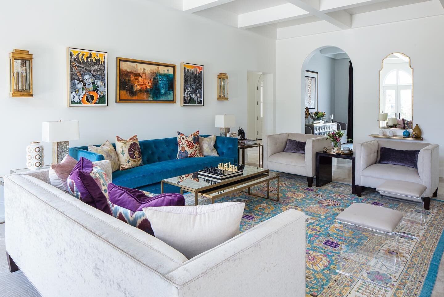
Game On!

Design by Jennifer Estes | Story by Terri Glazer | Photography by Annabella Charles

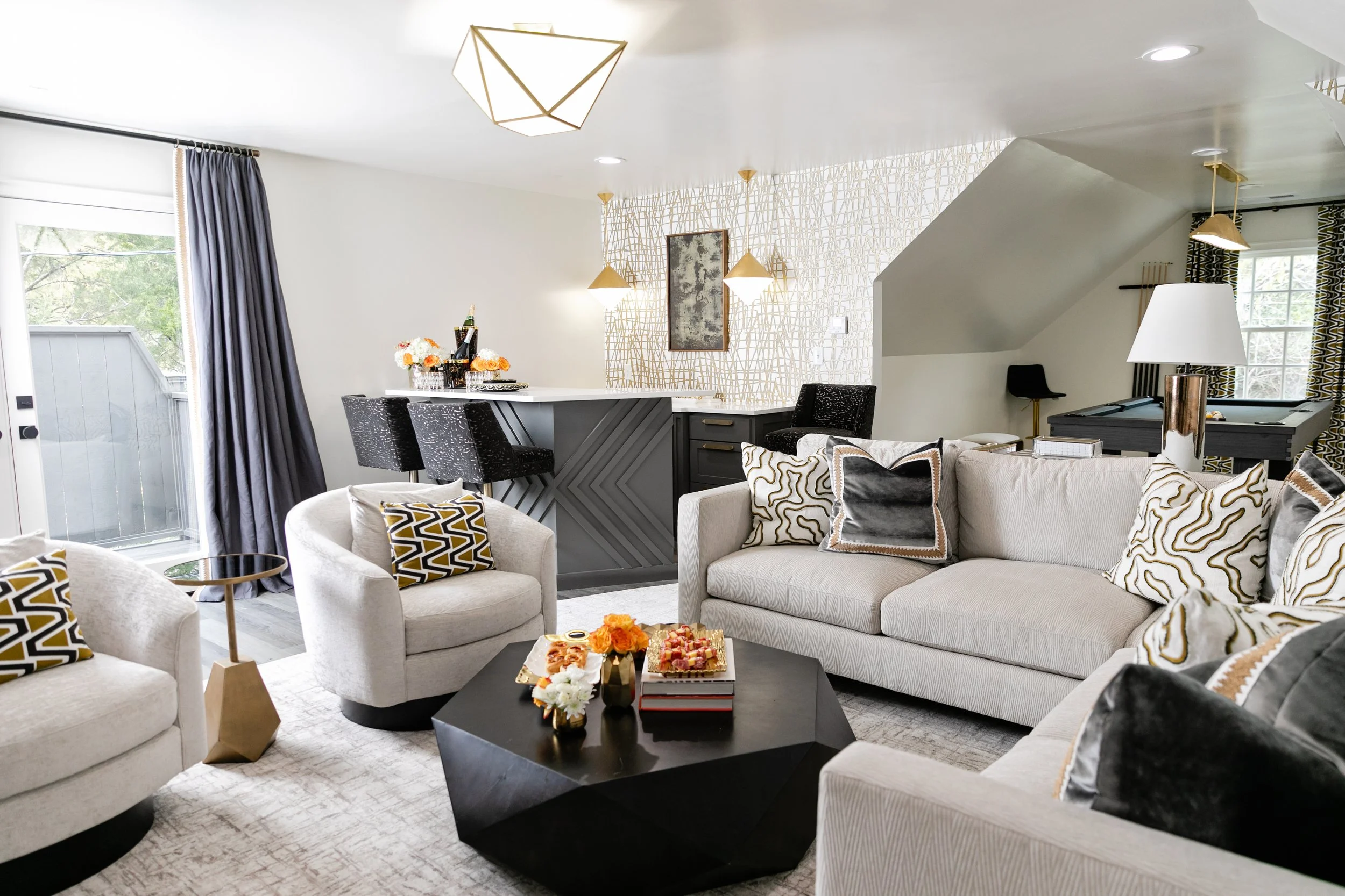
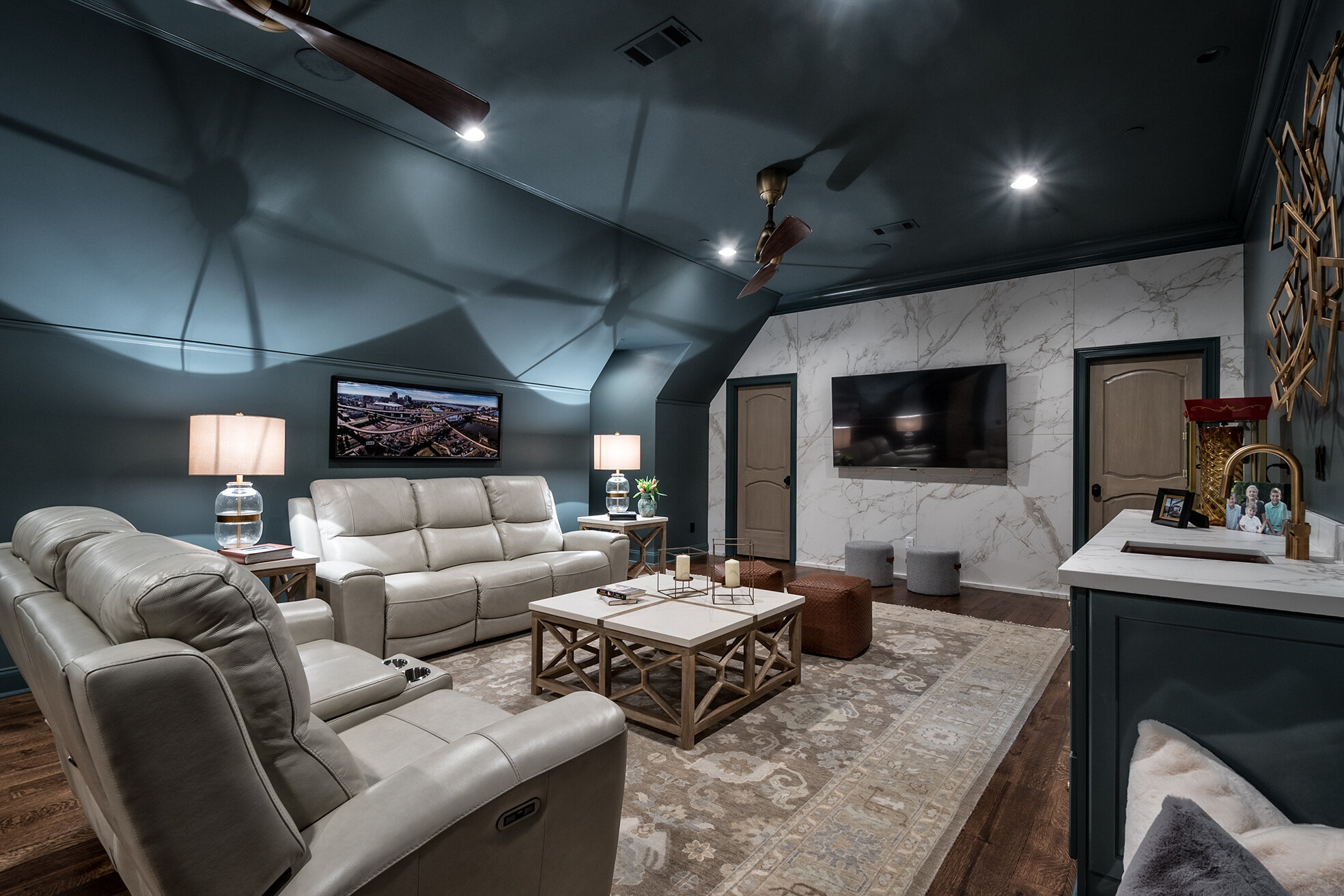
This East Memphis media room is all about the games! Whether that game is the upcoming Super Bowl, one of the Ole Miss baseball watch parties the homeowners love to host, a family billiards night or kids video gaming, the newly remodeled spot is the perfect place to watch or play. Jennifer Estes designed the space to suit her clients, a busy, professional couple and their three middle- and high-school aged sons. Jon Gambrell Construction completed the project.

Estes has worked with the family for about a decade, revamping almost every room of their main house. As the children grew older, mom and dad decided it was time to repurpose a seldom-used guest space over their detached garage to become a hangout place for the boys. 

But not just for the boys. Dad insisted on having amenities like a huge TV, a premium sound system, a custom bar and a pool table, and mom worked with Estes to make sure the design is elevated and has enough glamor to accommodate a girls’ night party. “She did not want it to be a ‘man cave,’” Estes recalls. “I presented her several concept boards, and she went with the sleeker, more modern look.

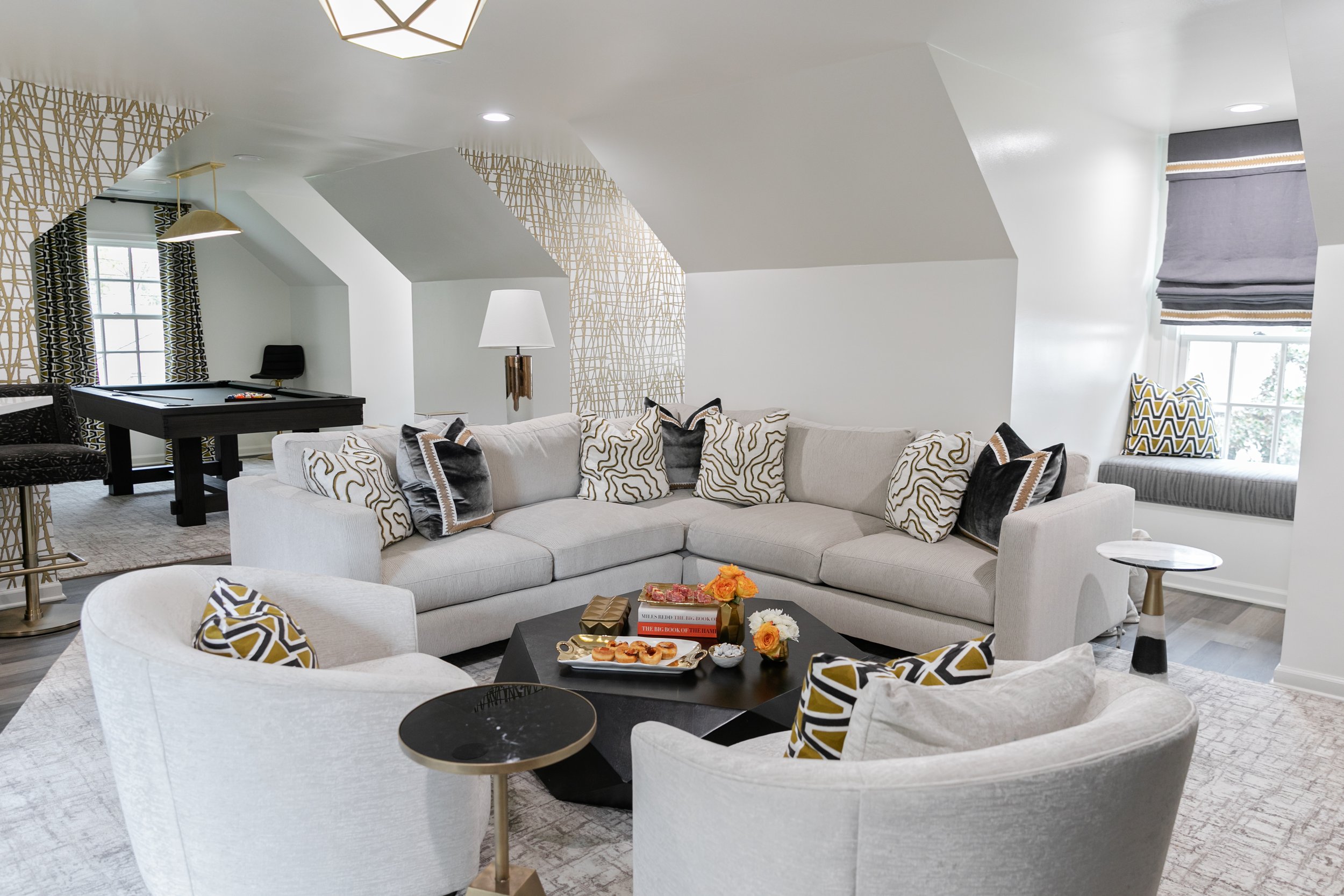
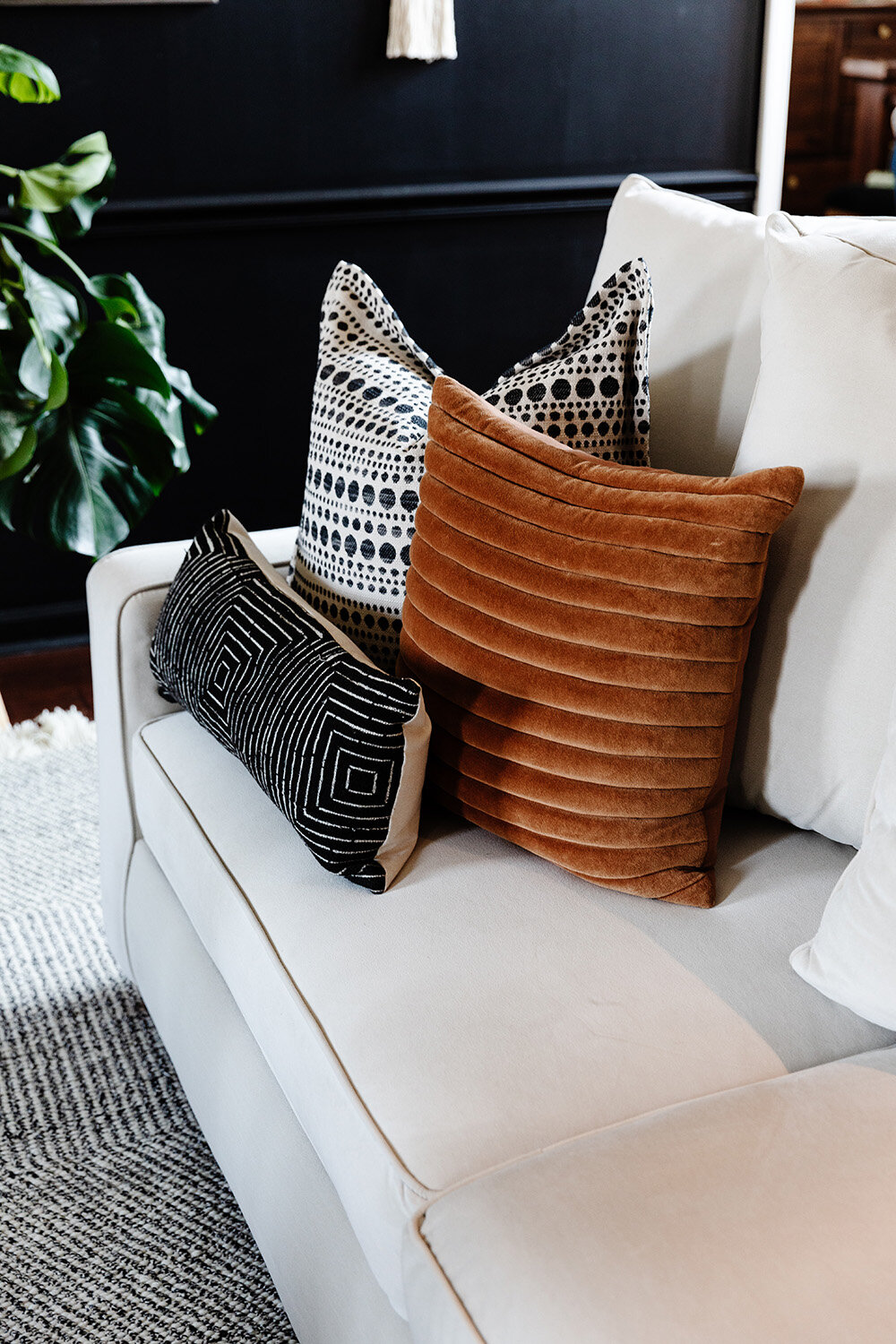
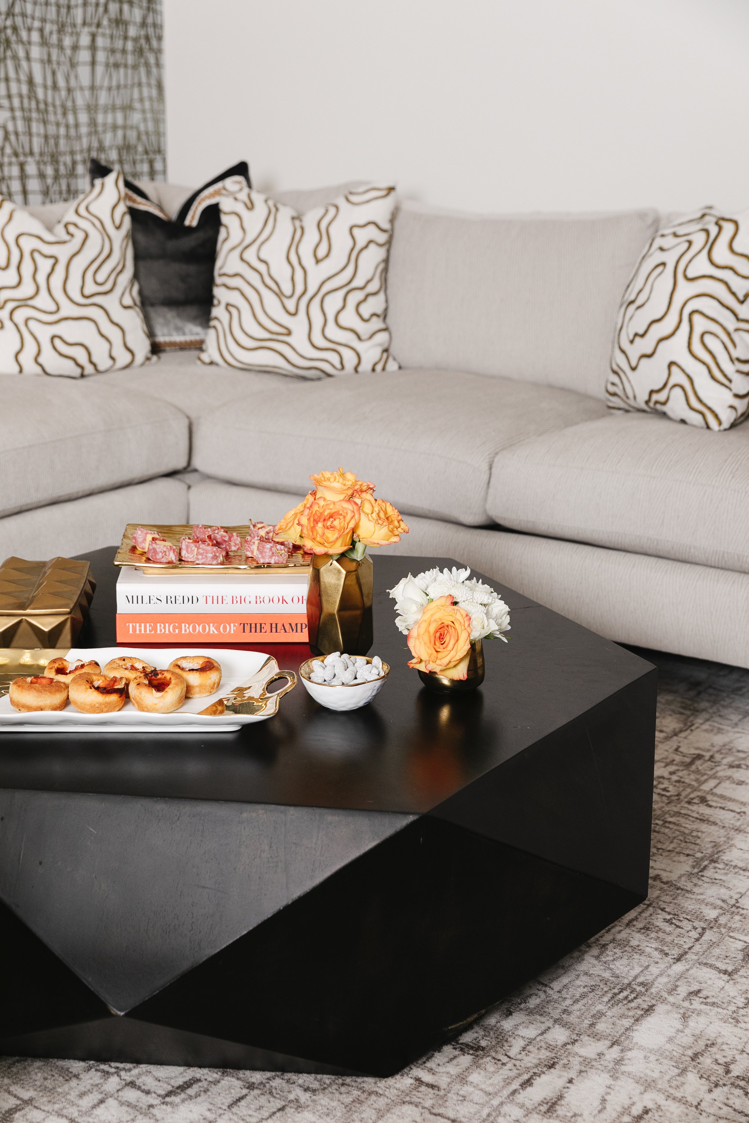
Sleek, indeed, but tough enough to withstand any kind of mess a group of tween and teen boys can dish out. “This is pretty much a bulletproof room. I think of it like glamorous camo,” says Estes. “I like to design everything very pretty. But everything in this room is also stain- and water-repellent. It’s a lot more livable than you would think.”

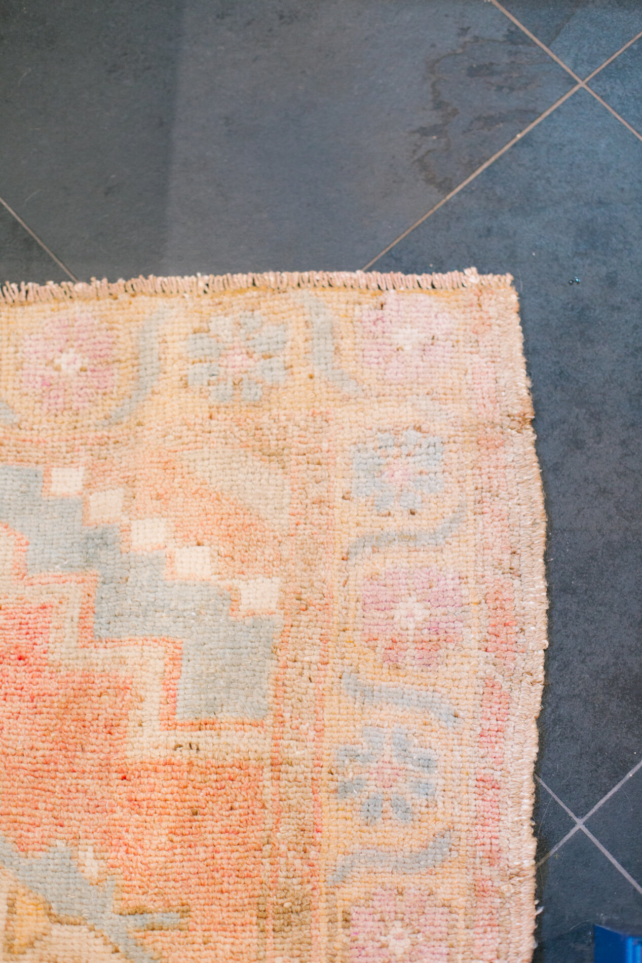
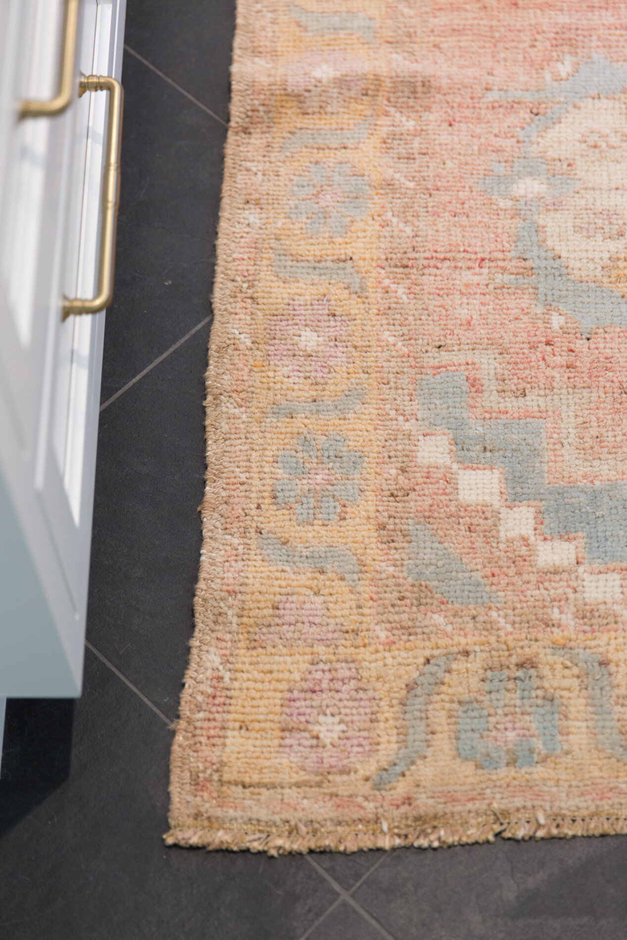
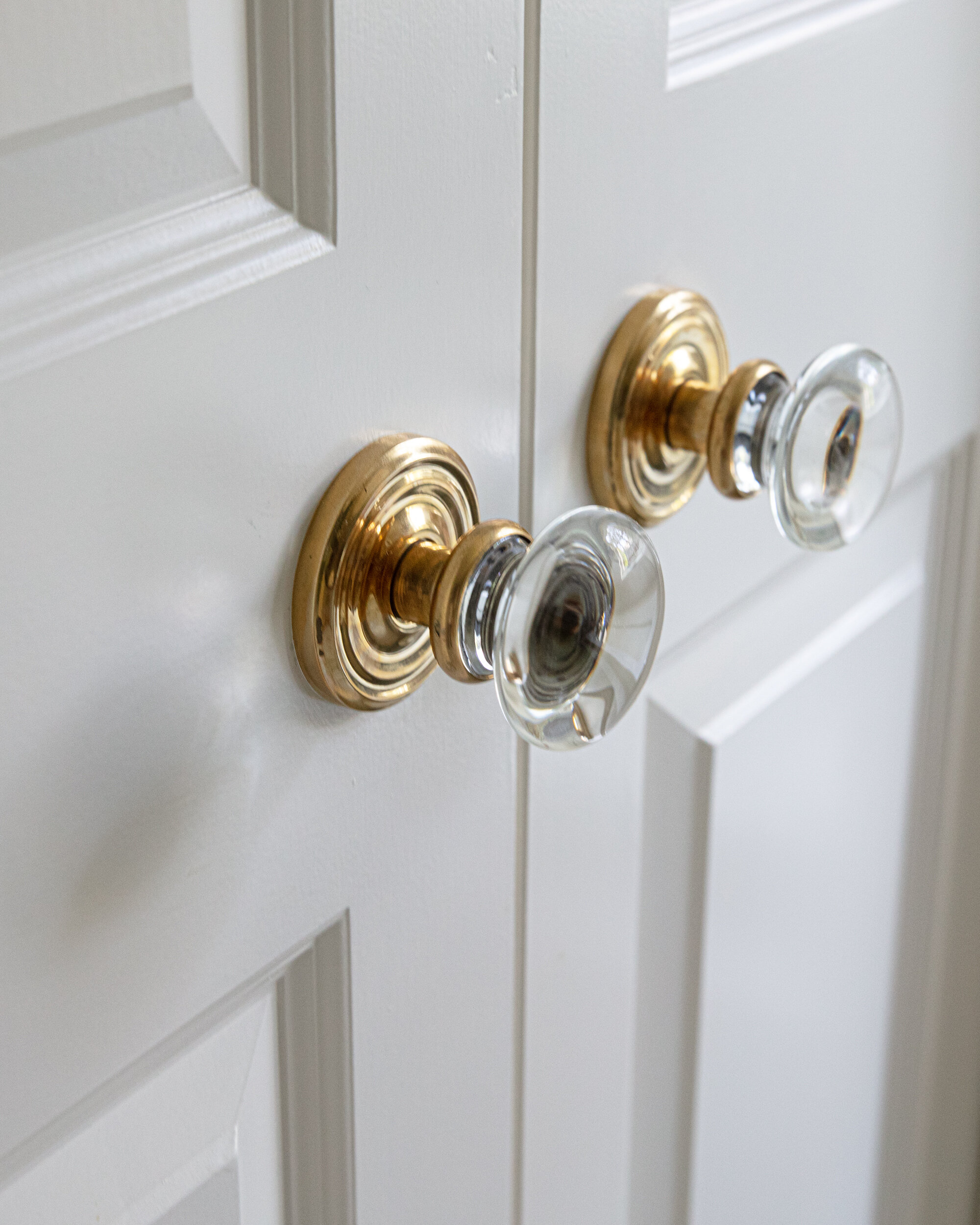
The room’s practical design began from the ground up. Sourced from Kiser’s Floor Fashions, the engineered wood flooring resists water and scratching. The custom rug, also from Kiser’s, is patterned to conceal crumbs, etc. Estes painted the walls and trim in high-gloss white. She loves the finish for a variety of reasons. “It’s bright and happy, so it’s great for an area like this that doesn’t get a ton of natural light,” she explains. “It’s wipeable, too, and durable. If they ding the wall with a lacrosse stick it’s pretty forgiving. Just a really cost-effective way to give walls a high-end finish without spending a ton of money.”

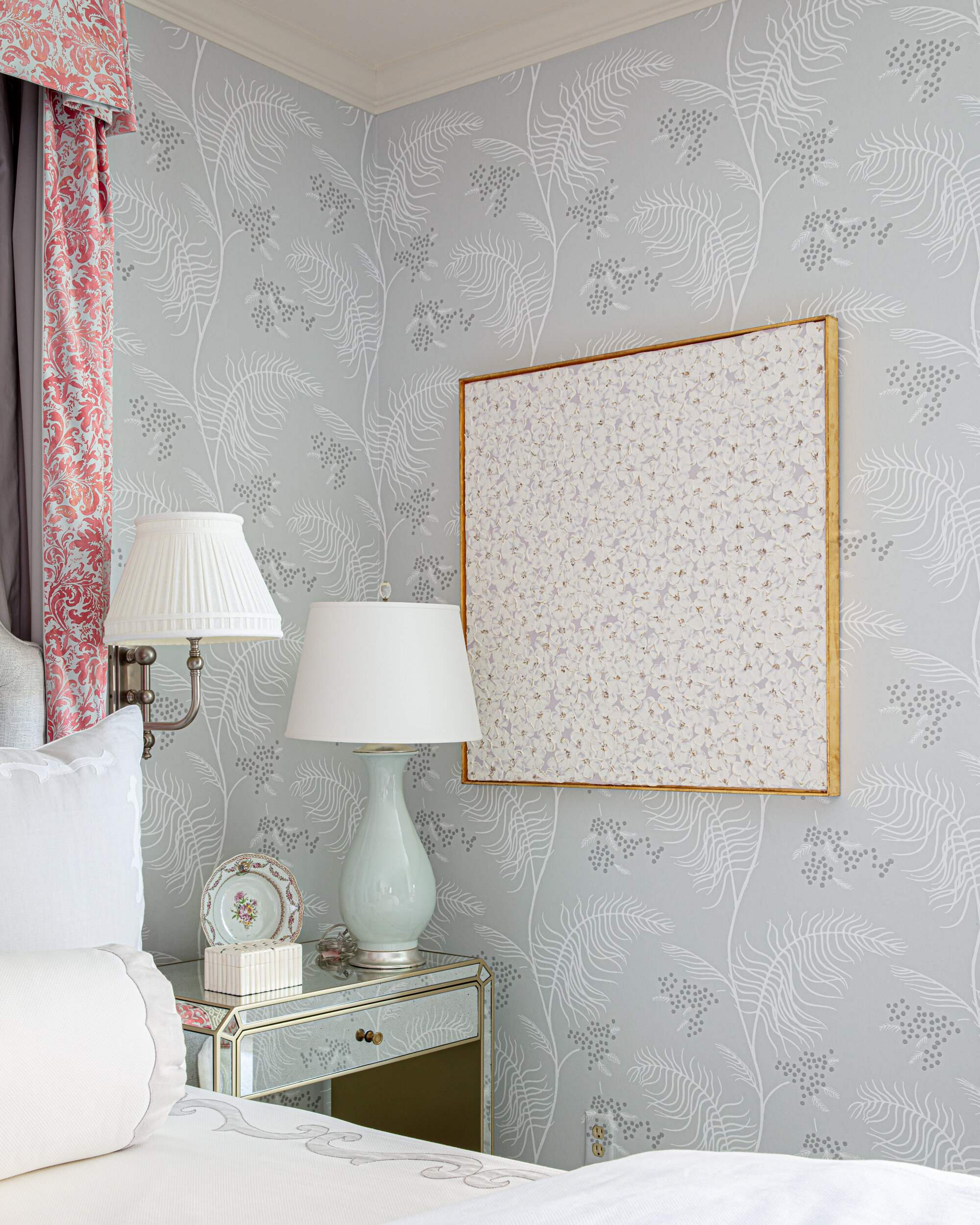
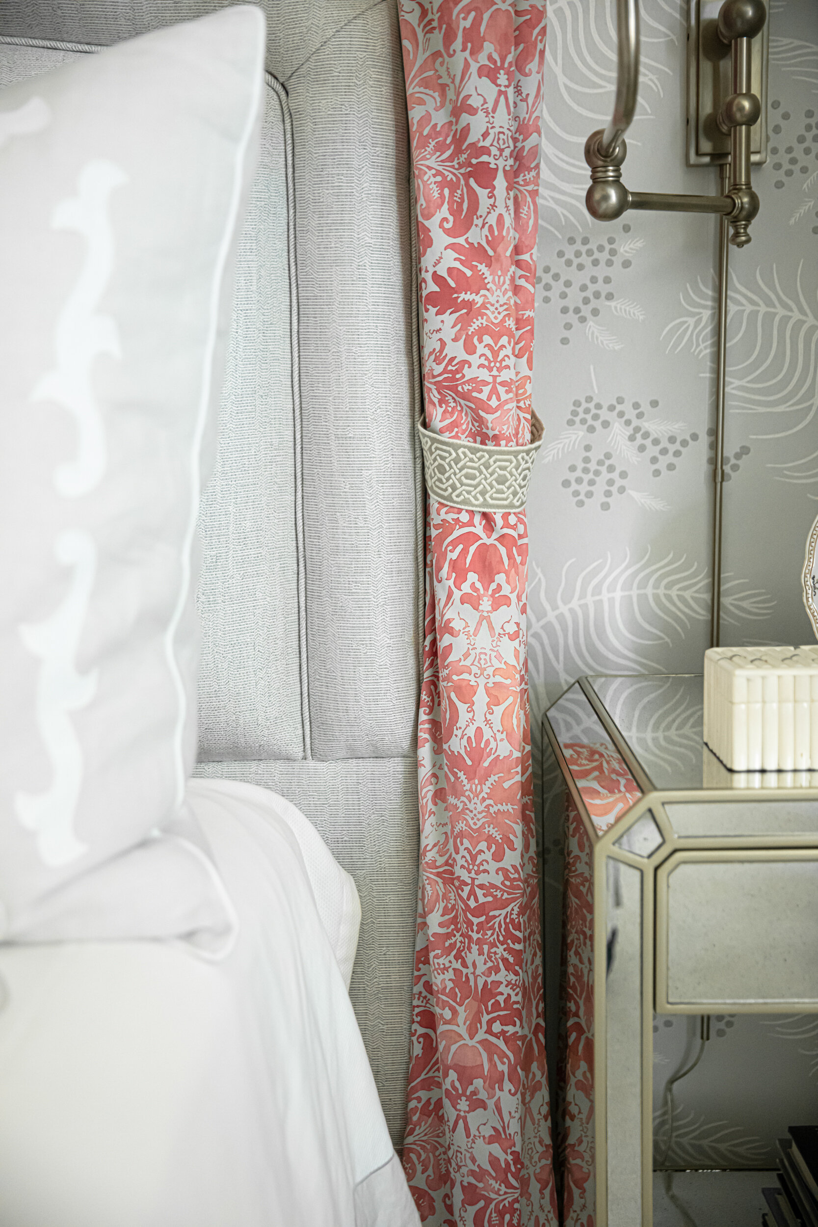
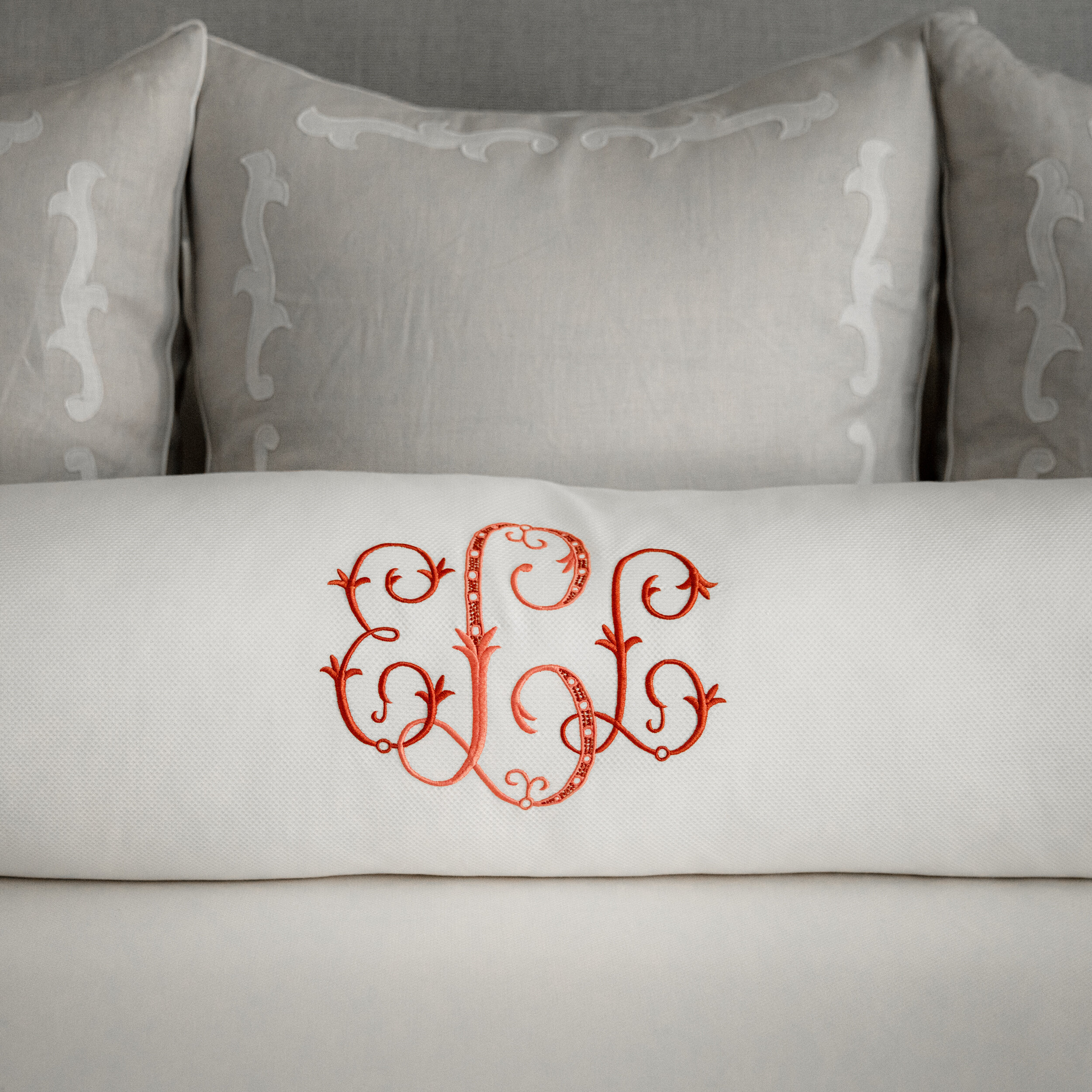
White upholstery, once considered a no go in high-use settings, is now family friendly, thanks to the advent of performance fabrics. “Liquids, stains, everything either rolls right off of this fabric or comes right up with just a little soap and water,” says Estes. She took advantage of that technology, choosing Nanotex textiles for the Bernhardt sectional and swiveling barrel chairs. Gold and white accent pillows made by Ann Smith Custom Draperies play off the Thibaut wallpaper. Smith’s workroom also created all new shades and draperies for the space.

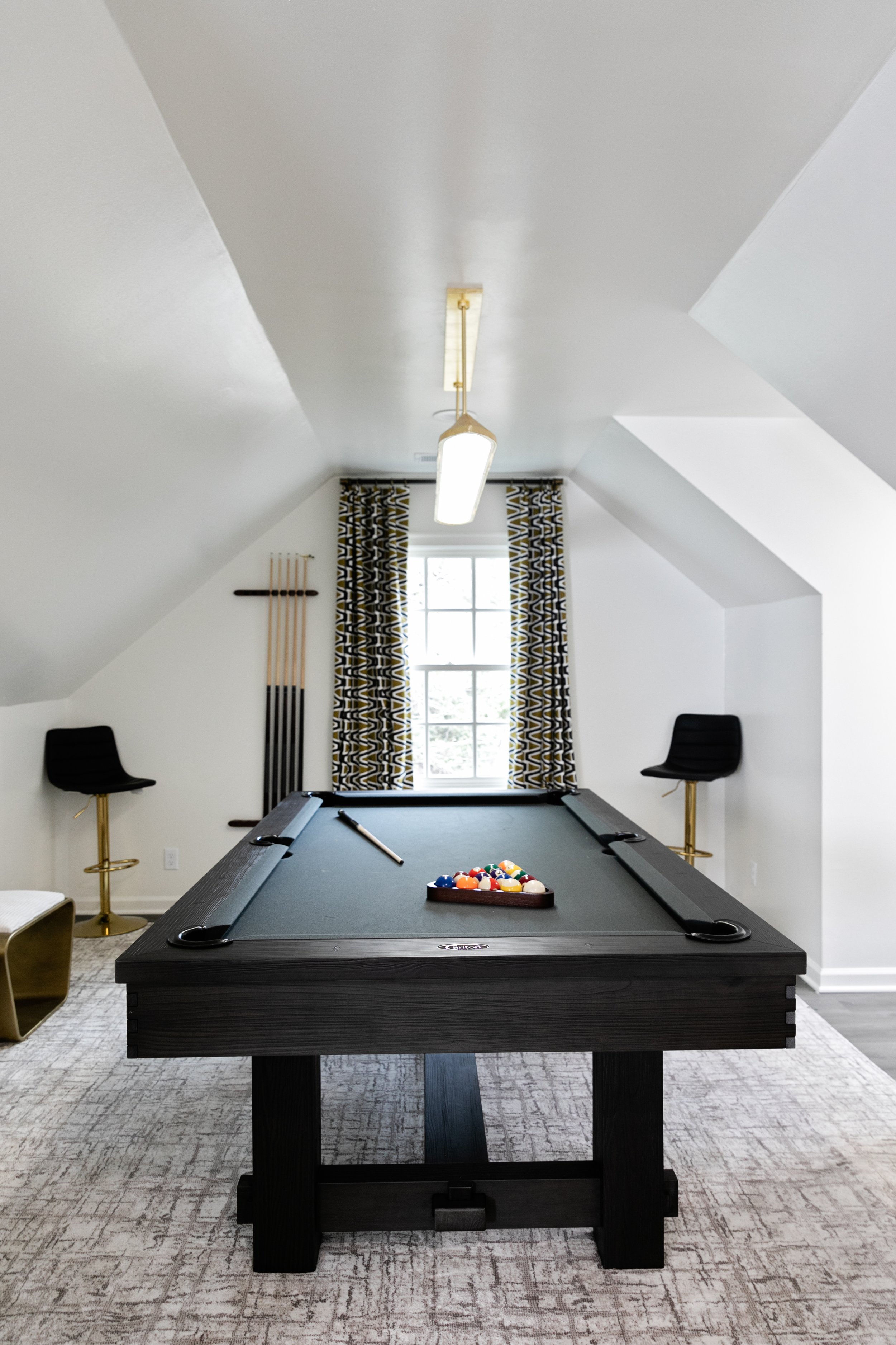
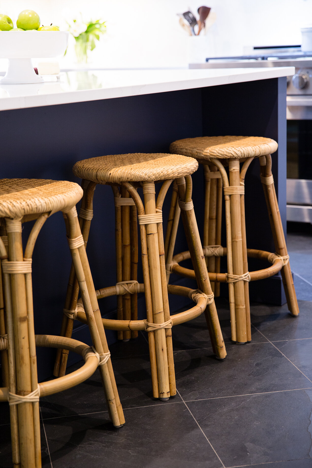
Estes designed the geometric-patterned bar and back bar with plenty of space for snacks and a beverage refrigerator. The clients requested maximum seating for the room, and the designer delivered. Fashionable stools that look great around the bar but can also be moved around, sleek ottomans near the pool table and window seats in the dormers give the family and their friends plenty of options to relax. Electronic Environments handled installation of the room’s large TV and integrated sound system.

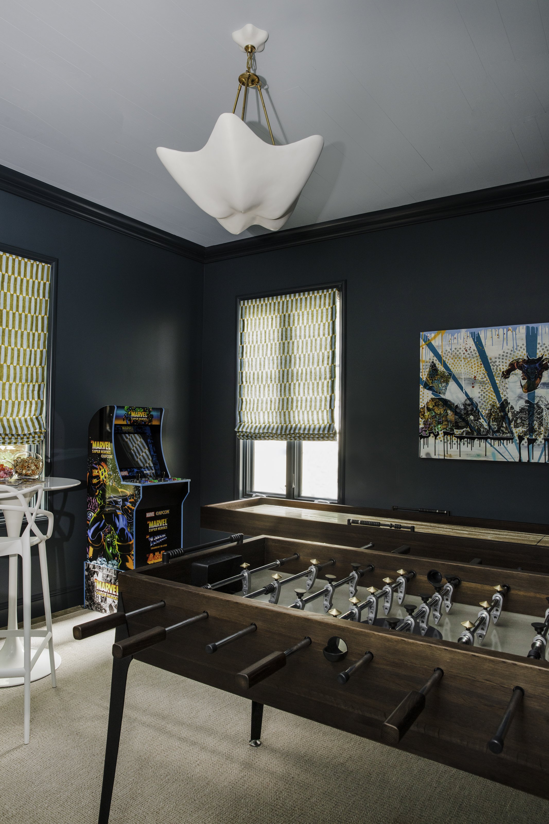
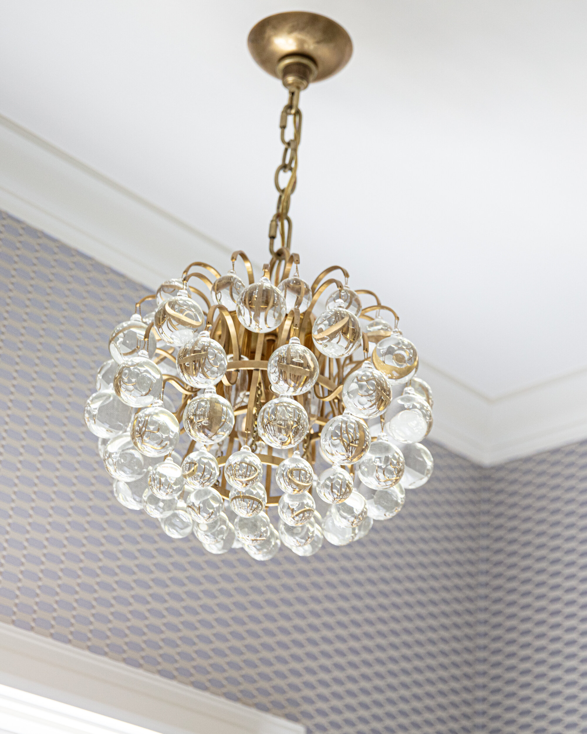
Nestled into a cozy nook, the billiards table is the perfect addition to a space made with games in mind. “Pool tables don’t have to be huge and clunky with leather and fringe any more. This one is bar sized, and we were able to pick the finish and the felt color. Plus, it converts into a ping pong table, too, so it gives them more options,” says Estes. Above the table a chic linear pennant from Visual Comfort’s Kelly Wearstler collection provides both light and sophistication. 


Whether they’re watching sports or playing pool or Xbox, this ultimate entertainment space allows the family and their friends to enjoy the game in comfort and style. With equal attention to design and practicality, Jennifer Estes made sure they can relax and focus on fun.

First Class Second Home

Design by HillCo Construction | Story by Terri Glazer | Photography by Ross Group Creative


“We knew we needed three bedrooms and two baths. It didn’t need to be anything extravagant, just simple and cozy. Someplace comfortable and with enough room if the owners and their grown children are all there together. And it didn’t need to be a million dollar house.”

Those were the marching orders Tracy and Bill Hill, owners of HillCo Construction, used as the jumping off point for the turnkey home project they recently finished on a large parcel of land in the southern part of Collierville. Their clients, a California couple, added one more must-have. Says Tracy, “The client said she wanted color. She likes very bright colors.” 

Past that, the owners let their contractors run with the project. From demolishing a rundown house on the property and preparing the lot, to finding and modifying the plans, to building the home, even designing and furnishing the interior, HillCo took care of every phase of the process. “That’s a pretty big level of trust on [the homeowners’] part,” Tracy says. Although they maintained constant contact, sending photos and information regularly for approval, the owners didn’t see the house in person until construction was about 75 percent finished.  

No doubt they were pleased, though. The Hills hit the design nail squarely on the head, creating a reasonably sized home that is loaded with style and filled with the kind of thoughtful and unique touches that Bill says go into every HillCo project.

The “wow factor” is evident from the first step inside the front door—an open living area and kitchen highlighted by a bright yellow feature wall. Tracy says the wall’s geometric trim accents came about through “a meeting of the minds” between her, Bill and Micah McCauley, Hillco’s senior project manager. “I originally wanted a circular pattern on the wall. Bill is very symmetrical, though, so we compromised. He and Micah built the trim and installed it themselves.”

They took the angular theme a step further by using right-angled lattice molding in place of quarter round or shoe molding. Explains McCauley, “All the door trim, all the baseboard, everything’s got a square look to it. It didn’t make sense to insert quarter round up against it.” 

The bold yellow of the wall sets the stage for the dark and dramatic feel of the kitchen, where Tracy paired fresh white cabinets with Cosmic Black quartzite countertops and backsplashes. She reprised the dark blue/black paint color from the living room TV enclosure on the kitchen island and dressed up everything, including the GE Cafe appliances, with French gold hardware. 

The stunning black-on-black tile wall behind the range is a showstopper, but Bill says future HillCo customers need not aspire to have it in their homes. “We try not to do anything twice in a house,” he says. “We did this custom kitchen just for this house and it wouldn’t be fair to these clients if we took the same thing and put it in someone else’s house,” adds Tracy. 


Careful planning and attention to detail allowed this home to have an array of special features not always found in a moderately priced new construction project. The hall bathroom is a prime example. Its deep soaking tub is a step up from the more shallow builder-grade steel variety that’s often used. The placement of the tub and shower controls on the opposite wall from the faucet and sprayer head didn’t happen by chance: McCauley modified the original plans. “It keeps you from getting wet when you’re turning the water on, and you don’t have to reach over the toilet,” he explains. Thanks to a white quartz waterfall counter, a full glass door and more goldtone in the fixtures and accent tile, this bath has an elevated style that proves a small space can make a big impact.

In the primary suite, Tracy designed a bedroom with a quiet, neutral palette, starting with textured wallpaper in shades of white and gray that lines one wall. It makes a perfect backdrop for a simple king-sized bed she decked out in solids of varying textures with a touch of sparkle and pattern on the accent pillows. She sourced the bed, nightstands and bench, along with almost all of the home’s furniture, from article.com, an online retailer of contemporary and mid-century furnishings.  

In the adjoining bathroom, black, white and gold combine to produce a modern and elegant feel. Here again, McCauley tweaked the blueprints to improve the room’s layout, removing a window on the front wall to create room for a sizeable second vanity. 

With a separate laundry room, a two-car garage, a cozy dining area and a back porch that takes full advantage of the 11-acre property’s pastoral views, the house is the complete package, a stylish, comfortable place to make the most of family visits.

Becoming Home

Design by Parker Design Studio | Story by Terri Glazer | Photography by Annabella Charles

When a well-known local blogger and her husband moved from a compact downtown condo to a spacious East Memphis residence, they teamed up with designer Ann Parker to “course out” their new home’s renovation. The young couple wanted to turn the house into a home for their growing family a room at a time.

Potential design options were limitless, as they brought only a few pieces with them in the move. “It was a really fun opportunity to start fresh; we could be intentional about it,” says homeowner Cara Greenstein. With Parker’s help, Greenstein and her husband Alex Shindler made a plan for the entire house and prioritized the order in which they’d focus on each space. 

First on the redo menu was the kitchen, naturally. More than just a place to prepare family meals, the space is essential to the operation of “Caramelized,” the award-winning food and lifestyle blog Greenstein began about a decade ago. Plans for the kitchen remodel were finalized as soon as the house went under contract and work was completed before the couple moved in just before Thanksgiving 2021.

With the kitchen checked off the list, Greenstein and Parker turned their attention to the areas of next highest priority, the living room and dining room. And since the couple’s first baby was on the way, a nursery came into the picture, as well.

Asked about the initial design vision she shared with Parker, Greenstein says, “I tend to go for a clean, somewhat minimalist palette. My townhome was very neutral. Ann pushed me to think bigger.”

Parker started nudging her client a bit past her comfort zone with the first items they selected for the living room, a pair of modern chairs in a deep merlot velvet. Although she loves them, Greenstein admits that, left to her own devices, she would have opted for neutral upholstery. 

“The two chairs were our catapult in the living room design,” Parker adds. “Then pieces evolved, like the rug. We worked through what would look good—it's very collected. We didn’t just sit down and figure it out all at once, it was over a period of time.” 

Greenstein was excited to have a fireplace in her new living room, and Parker viewed its redesign as “an opportunity to have some dramatic moments but still in Cara’s DNA.” She opted for a Cambria stone treatment from floor to ceiling. The bold veining in the stone makes a statement, and the subtle matching ledge mantel blends without breaking up the movement. 


Situated in the center of the home, the living room has few windows, so a large mirror on the wall opposite the fireplace was the logical choice to add luminosity. But not just any mirror. Leading her client to something out of the ordinary, Parker enlisted Chris Garner of Garner Framing Co. to create a piece that’s more work of art than looking glass. “It really just evolved with Chris and his skill and his thought process,” says Parker. Garner’s creation, a series of  wide antiqued glass strips in varying tones, creates impact with its clean lines.

Visual interest in the dining room comes from striking navy blue wallpaper with gold accents that covers the walls and the ceiling. “That’s something I would have never done on my own, but I just love these subtle examples that really make a difference,” says Greenstein.

The room is a prime illustration of the collected ambiance the homeowners and designer sought. The new dining table is surrounded by eight vintage chairs sourced from online consigner New to Me TN. An original oil painting dated 1965 that graces the wall came from the home of Greenstein’s grandparents. 


“It's such a mood in here. I love it with the gold accents. I've hosted some dinner parties so far and I'm really excited to do it more often. It's exciting to have really dedicated spaces for doing what I love.”

—Homeowner Cara Greenstein

“This is one of the rooms where Cara was definitely the design leader,” says Parker of the nursery. “I was her touch base.” Incorporating her love of all things edible into every aspect of her life, Greenstein chose mushrooms as the inspiration for her new baby boy’s room. “They’re one of my favorite foods!” she admits.

Adorable mushroom wallpaper found on Etsy lines one wall; Parker chose a coordinating stripe for the other three. With a nod to a woodland theme, the room’s palette leans to neutrals with sage and eucalyptus accents. Washed woods keep the look light and airy, and a white boucle glider and ottoman make a comfy spot for quality time with baby Hudson. Faux taxidermy heads of a longhorn and a razorback are a clever and cute nod to the alma maters of Greenstein and Shindler.

The new mom gushes over the nursery closet remake, done by local organization firm Trazo Design in collaboration with The Container Store. The pros at Trazo transformed every inch of the long, shallow closet into practical and accessible storage space with plenty of small containers just right for tiny baby items. 


Greenstein says it’s been a pleasure working with Parker on the master plan, and that she and Shindler are looking forward to adding their style to every part of the house. Parker echoes those sentiments, saying she enjoys helping the young family establish their home. That is the icing on the cake.

Traditionally Contemporary

Design by Maggie Clarke Interiors | Story by Terri Glazer | Photography by Ross Group Creative

“I love color. I know a lot of people are into whites, but I love the colors,” homeowner Julie Upchurch told Maggie Clarke very early on in the process of redesigning the East Memphis home Upchurch and her family had just purchased in late 2021.

Clarke, owner of a self-named local design firm, paired that idea with another concept she discovered early on in her professional relationship with her new client. “I always ask my clients to send me photos of their Pinterest boards or their Instagram saves. Looking at them I noticed Julie loves traditional spaces but with pops of contemporary, like through lighting and pieces of accent furniture. So that's really what we did here.”

The result breathed new life into the house, built in 2005, and gave it a personality that more closely reflects the young family that lives there. First on the agenda was a major kitchen refresh. Not a total gut job, but a rework of the original room. “I think people underestimate the power of paint, says Clarke, referring to the dramatic new look she achieved by painting the existing cabinets. She chose a bold green for the base cabinets and the island, offset by fresh white on the upper cabinets. A porcelain apron sink and a new backsplash of dimensional subway tile glazed in soft white, and new gold-tone hardware and fixtures provide a fresh take on traditional kitchen design elements. 

The original lighting scheme in the kitchen included only recessed can lights. Clarke replaced some of those utilitarian fixtures with pretty pendant lights over the sink and island to dress up the space and provide warmth as well as illumination. 


While the lighting and hardware can be considered the “jewelry” of the room, the window treatments may just steal the show here. The flora-and-fauna pattern fabric by Lee Jofa incorporates the saturated green of the cabinets along with a stunning peacock blue on a light background. It appears in a Roman shade covering the window over the main sink as well as on full-length panels flanking a double window.

The flooring in the kitchen and the adjacent keeping room proves that not every element has to be replaced for a project to be successful. The dark brick tile has a classic, tried-and-true feel and adds warmth to the space. It also provides the perfect backdrop for the traditional Oushak rug that anchors the room’s design. Handed down from her grandmother, the rug was a must-have for her new home, Upchurch says. 

The rug may be antique, but there isn’t a trace of stodginess in the room, thanks to the furnishings Clarke selected to pair with it. Four swivel chairs from Rowe Fine Furniture create an easy, relaxed vibe. She says, “Julie wanted this setup and I think it's great. It's so conversational. It's great for when you have the girls over for a glass of wine, but it's also good for family time and games.” To make sure the seating was comfortable and practical Clarke chose Rowe’s down fill option and performance upholstery. 

The chairs center around a round Noir Furniture coffee table—decidedly contemporary in its style and bright white color. It plays perfectly off the plaster look of the breakfast table the Upchurches already had, now nestled near a large window and surrounded by four simple Windsor-style chairs.

Casual portraits of the family’s two children grace the single full wall in the area. Upchurch says local photographer Rachel Scoggin perfectly captured each child’s personality in the black-and-white works. Clarke placed the photos on the wall on either side of a striking console from Gabby Home, topped by a scalloped Carvers’ Guild mirror. The wall still has plenty of open space, though, intentionally left in the design plan. “I like to leave space in a room for things that are yet to be collected. If Julie wants to find two stools or antique chairs to add, that would be awesome. I think that’s what creates a curated feel. I don’t want to pick out every single thing; this provides them with an opportunity to put the finishing touches on,” Clarke explains.

The living room also received major attention in the process. Unlike similar areas in many other homes, the Upchurches spend a lot of time in their living room, so it had to be comfortable and kid friendly. Mission accomplished with an inviting Rowe sectional covered in a white, almost boucle fabric that no one would ever guess is performance rated. Even the Schumacher velvet throw pillows are wear- and stain-resistant. A pair of spindle chairs in handsome charcoal complete the living room seating, along with a couple of stools from Serena & Lily. “I love stools in front of a fireplace,” says Clarke. “It feels so cozy, plus they’re extra seating when you need it.”

Another of the client’s oriental rugs had the right look for the living room, but not the right size. Clarke solved the dilemma by layering it over a jute rug, custom cut to size locally by Kiser’s Floor Fashions. Another design challenge came in the form of 20 linear feet of full-length windows in the living room. To dress them up without breaking the bank, Clarke sourced fabric from Tonic Living for custom drapes and had each panel’s leading edge embellished with beautiful Schumacher trim. 

Although Clarke and Upchurch, a local realtor with McWaters & Associates, were acquainted before this project, they hadn’t ever worked together. The process went so well, though, that the two plan to collaborate again on other areas of the home. Says Clarke, “People like Julie are my target clientele. Working moms with full-time jobs and kids. They know they have good taste, they just don’t have time to pull it all together.”

Functional and Fabulous

Story by Terri Glazer | Photography by Ross Group Creative

The “before” kitchen wasn’t bad. In fact, the homeowners used it as it was for several years after they bought their East Memphis home. Its layout, however, didn’t make the best use of the space, and it certainly didn’t reflect the lifestyle of the family of five. They wanted a functional and beautiful place where they could all gather for food preparation and cooking. A previous renovation by former owners had created a large dining area at one end of the kitchen, with the appliances and work space cramped on the other end of the room.

Enter Karen Kassen, owner and principal designer of Kitchens Unlimited, and a long-time friend of the homeowners. Her vision blended form and function in stunning fashion to transform the space to meet the wants and needs of her clients. 

The original floor plan had a wall with a standard-sized door between the family room and the kitchen, typical architecture for 1960s-era homes. Kassen removed a large portion of the wall, opening the kitchen to the light-filled den, and providing a more contemporary feel and better flow between the spaces. She also rearranged the entire footprint of the kitchen to make the most practical use of every part of the roomy space. 

Out came a built-in cabinet/shelf unit next to the dining area on the south side of the kitchen. In its place now are the main work spaces. The east wall is dressed up with cabinets in a very light blue gray. Kassen explains that their luxe look is due to the fact that they have a subtle glaze applied on top of the paint. The extra step adds depth to the finish. The alcove that houses the range top is the room’s most elegant focal point, thanks to several elements. The homeowner describes the stunning quartzite backsplash as her favorite choice from the renovation. The designer adds, “Because she loved it so much I wanted to use it more, but I felt like if we used it in other places it wouldn't be quite so spectacular. So I decided to take it up and wrap it around the sides.” The show-stopper custom vent hood cover was fabricated locally from antiqued zinc with brass edging. The large Wolf range top was a special request from the husband, who enjoys cooking and grilling. Kassen chose textured glass inserts for the cabinet doors on either side of the alcove. Not only does the back-painted glass add a touch of sparkle, it ensures easy clean up. A pair of wall ovens and additional cabinetry complete the wall.

Across the room, a dedicated grilling station is an homage to the man of the house. Its position by the back door makes it the most logical storage spot for the utensils he uses while grilling on the patio. The copper countertop speaks to his profession as an executive for a copper plumbing and fittings manufacturer and the custom faucet makes the perfect accompaniment. Its industrial feel and materials are another nod to his occupation.

Anchoring the room’s center, the striking island made of wire-brushed alder wood has seating for four and plenty of storage. Kassen’s plan cleverly placed storage space beneath the seating ledge of the countertop, the ideal spot for items that are necessary but not used on a daily basis. The island also holds a dishwasher and the main sink. For the faucet and the pair of pendant lights that hang above, the designer chose mixed metals—matte black and brass. 

On the other side of the room, previously the cramped location of the ovens, microwave, refrigerator and pantry, a cozy corner is now the home’s “beverage central.” Whether family members are thirsty for a canned drink from one of the two refrigerator drawers, craving an espresso from the built-in machine, or ready to choose a bottle from the full-height wine cooler, it’s all right at their fingertips. Metal mesh front wall cabinets with interior lighting show off elegant glassware.

Across the room Kassen placed a wall completely dedicated to food storage. Having the refrigerator, freezer and a lighted pantry cabinet all together makes sense and simplifies the chore of putting away groceries. The appliances and pantry are concealed beautifully with cabinet panels, giving the space an elegant flow. The family’s round breakfast table and upholstered Parsons chairs occupy the center of the area. A graceful chandelier overhead repeats the brass and black motif from the faucet and pendants.

To appreciate two of the project’s most stunning features it’s necessary to look up and down. Overhead, tongue-and-groove slats in warm wood bring a natural element into the design and mirror the ceiling in the screen porch just off the kitchen. As the rooms are separated only by a wall of windows, the look creates a sense of continuity.

Underfoot, tiles of tumbled blue limestone with an antiqued finish line the floor. More practical than hardwood in a kitchen that sees daily use, the flooring also provides a segue to the bluestone patio just outside the door. “The movement in the natural stone flooring is a beautiful foundation for every area of the kitchen. It’s also forgiving for any dirt that could be tracked in from the patio and for the family’s two large dogs who love to hang out there,” says Kassen.

The project was completed late in 2021, so the homeowner has had plenty of time to reflect on her new kitchen. She still gives it two solid thumbs up thanks to the expertise of designer Kassen and general contractor Jimmy Wittenberg. She says, “Even after a year I wouldn’t change a thing!”

Perfectly Placed with Goetze Art & Design

Story by Terri Glazer | Photography by Ross Group Creative

The right art, placed in the right spot, is an essential element of good design. Size, scale and color all must be considered to highlight the beauty of the art and to enhance the setting. Memphian Amanda Goetze, owner of Goetze Art and Design, is a master at connecting her clients with local, regional and global artists, helping them start or expand a collection of pieces that integrate with each other, and placing those works perfectly in their homes.

At Home sat down with Goetze recently to talk about the “art” of art placement and the importance of having art in a home.

After operating from the owner’s home and as a “gallery to go” since February 2019, Goetze Art & Design is going brick-and-mortar. A pop-up shop at 632 S. Perkins Rd. will be its home starting Sept. 8. Open by appointment and for special events, the shop will host New Orleans artist Ida Floreak for its first show. “The thought of having art shouldn't be intimidating,” says Amanda Goetze. “I want to create a space and an environment that makes art feel accessible and makes people feel comfortable to explore art.” For more information visit goetzeartanddesign.com.

“I love educating people about collecting art and realizing that it is a worthy investment—and one that you can enjoy in your home every day,” says Goetze. “I encourage clients to think about collecting art for the long term, that can be passed on to the next generation or sold if you want to go in a different direction. It will have value.”

One of Goetze’s favorite aspects of her work is introducing clients to artists she represents from outside the Mid South and sharing their background. “That’s a lot of fun for me, to educate the client about the artist, and why they’re looking at the product in front of them. How it came to be. There’s always a great story.”

Goetze placed these two very different paintings in adjacent rooms in the home of a young couple just starting their collection. Over the sofa an almost-abstract natural work by California-based painter Elise Morris evokes a soft, serene feel. Next door, however, a piece titled “Times Vines” by Queens, NY, street artist LeCrue Eyebrows sets a party tone. Says Goetze, “We thought that piece would be a lot of fun in their bar area because it depicts food and gathering, community, celebration. It’s a really interesting piece and certainly a talking point.”

An innovative solution for a family with an extensive art collection. Homes with open floor plans and fewer walls can present a challenge when it comes to art placement. Goetze hung this Kurt Meer oil and silver leaf work on a glass wall in a sunroom. “The lighting in the room changes throughout the day and it makes the cranes really glow. And I love the movement they have across that space.”

“Art doesn’t always have to be on a wall,” says Goetze. “It can be a great way to add layers and texture to other places in a home, as well. This Ida Floreak piece creates a pretty vignette and a cozy little place to be with your art.”

Also by Memphis native Kurt Meer, this piece speaks to the versatility of the artist. Goetze placed the atmospheric oil on canvas work, inspired by the Mississippi River,  in a room with a masculine vibe and black accents. “The size and scale are perfect for the spot and the softness adds contrast to the room,” she points out.

“It has great energy, it works with her fun style and it’s sophisticated at the same time,” says Goetze of the painting by New Orleans artist Mary Singleton that she placed in the home of Memphis designer Lana Zepponi Meyers. “It’s perfect with the blue and red geometrics of the pillows.”

Goetze often collaborates with other professionals. For this dining room, interior designer Caroline Smith selected a pair of Elise Morris acrylics provided by Goetze. “Works on paper, like these, are often a good entry point for a beginning art collector, and they look fabulous in this well-appointed room!” says Goetze.

A Dream of a Home

Story by Terri Glazer | Photography by Annabella Charles

2022 Memphis St. Jude Dream Home

The winner of the 2022 Memphis St. Jude Dream Home Giveaway will truly receive a dream of a home—a charming cottage with a lake view and all the character of a classic home, newly built with today’s best amenities.

At Home Memphis & Mid South, a sponsor of the annual fundraiser for St. Jude Children’s Research Hospital, recently toured the home, set to be given away on June 26. Now in its 23rd year, the project has raised over $ 26 million to assist St. Jude in its mission to eradicate childhood cancer.

The 2,100-square-foot house may be moderate in size, but it packs a big design punch with its smart use of space and loads of extra features often found only in larger custom homes. Kim Loudenbeck, whose design firm Warehouse 67 is staging the Dream Home, says that’s what sets it apart. “Trends are to give the spaces that you do have character no matter what size the home is. What working with a home this size allows you to do is upgrade the finishes. I was impressed with the amount and level of trim work, the beautiful detail. The barrel vault in the living room with the brick, I honestly have never seen this application in the Mid South before and it's just beautiful.” 

Katie Yokie has been associated with the construction of the St. Jude Dream Home for 12 years and has steered its design for the past four. She says her job is easy, thanks to the wide array of product choices available from the many national and local sponsors. From the General Shale brick to the Shaw floors to the Kichler lighting fixtures, the materials are high-quality and in today’s most up-to-date styles and finishes.

The home’s front entry faces a serene lake, creating a peaceful ambiance. The front door welcomes guests into a stunning living room with a brick-lined, barrel-vaulted ceiling. Anchoring the room is a natural stone fireplace with a cedar mantel. Built-in cabinets on both sides play up the cottage charm and echo the style of the cabinetry in the adjoining open kitchen. Every square inch of that kitchen is well-thought-out, including room for a stainless steel gas range, a separate oven/microwave combo and plenty of storage. The island, topped with Silestone quartz counters, holds the sink and dishwasher, in addition to well-lit prep room and seating space.

Yokie chose Sherwin Williams Breakwater for the color of the custom cabinetry from Southern Cabinets, with a slightly distressed finish and furniture-style trim to up the cottage kitchen style.

Wide plank engineered hardwood flooring from Shaw has plenty of traditional appeal, but with both warm and cool tones in its stain it’s neutral enough to work with whatever style of furnishings the future owner chooses.

The downstairs primary suite includes features usually found in grand homes. The trayed ceiling in the bedroom immediately draws the eye up to the elegant Kichler chandelier and on to a unique wood trim detail. Shiplap lines one wall for an extra dose of architectural interest and large windows allow natural light to bathe the room.

The attached bath, separated by the cutest paneled French doors, is a study in effective use of space. An elegant double vanity with plenty of drawer space is opposite a freestanding soaking tub. Just past the oversized shower, a fully fitted owner’s closet from Inspired Closets would be the envy of any fashionista.

An adorable second bedroom, another full bath and a separate laundry room complete the downstairs, and no detail was left out in any of these spaces. Yokie is especially fond of the three-quarter board and batten paneling that surrounds the guest bedroom. “I love the height. It reminds me of a house with age and character. We’re trying to bring that into every room.”

Loudenbeck echoes her fondness for the trimwork. “When you think ultimate cottage style, this is it. Because they did such a great job adding those special details that make a traditional cottage home, we went the extra mile with the antique-look iron bed layered with beautiful textiles—prints and patterns. The trim work is the perfect backdrop.” 

Yokie says she tries to include a new or unique product or material, “something that people haven’t seen before to dress up a space,” when she makes selections for the Dream Home each year. For 2022 that highlight comes from Shaw Tile. The hall bath features wall tile in a graceful arabesque pattern with further interest coming in its variety of textures, including smooth, linear and slightly rocky quartz. 

Even the laundry room got special design attention through the addition of a gray and marble-look basketweave tile floor that Loudenbeck says is squarely on trend. “The small-scale stone mosaics are so popular for bathrooms or laundry rooms now. People are tending to go with those more unique patterns because they provide texture and allow an area to have a little pop.”

The home’s upstairs holds a third bedroom or multipurpose room and another full bath. The generous bedroom, dressed up with decorative trim and a large window, could serve a multitude of purposes. Loudenbeck envisions it as “a place for the family to have down time to hang out and watch TV. But it’s large enough to hold a pullout sleeper sofa, so guests could have a separate wing with their own bath, living area and a place to sleep.”

Loudenbeck says she was thrilled to come on board to stage her first St. Jude Dream Home. While the mission of the hospital holds a special place in the native Memphian’s heart, the project gives her a chance to explore a design style not commonly found in the Mid South. She hopes those who tour the house will enjoy the change of pace. “We don't get to do cottage style very much here in Memphis. If we were more in a coastal area, the Carolinas or Florida or the Hamptons, you would see more cottage but I think that people will enjoy something different, something unique and a little bit out of the box. We hope they will come in and see how they could see themselves in a space like this.”

To achieve that goal Warehouse 67 is staging the home completely, from furniture to linens, drapes and rugs, plus accessories and artwork. Yokie says the significance of that is tremendous. “It's important when someone walks in here that they feel at home and it’s impossible to do that without great furnishings.”

Although the furnishings are the ultimate finishing touch, Loudenbeck admits that the house is the true star of the show. “What's great is that no matter what we add, the home itself is absolutely stunning. We're not having to make the home have character or charm; it's already there.”

Out of the Blue

Design by Lindsey Black Interiors | Story by Terri Glazer | Photography by Sélavie Photography

With a unique, cocktail lounge vibe, this retro chic pool house is ready for fun.

The phrase “pool house” might not usually evoke images of a space described as “lounge-y” or “cool,” but those words kept popping up on a recent visit to this East Memphis pool/guest house. Renovated by Lindsey Black of Lindsey Black Interiors, the structure has a style that’s a bit unexpected, but a perfect fit for the homeowners and their young teenage children.

The owners renovated the main residence when they moved in a few years ago, but they had yet to give the pool house the same attention. They brought Black on board in early 2020 to put their stamp on the space. Before she and her team started the creative work, she met with the couple, as she does with every client at the outset of one of the large-scale projects in which her firm specializes, to get to know them and understand their needs. During the session she learned a few things. The wife wanted to use the pool house for year-round entertaining and for overnight guests. She wanted it to be a spot where kids could hang out, and one that adults could also enjoy. And it had to be cool, with a cocktail lounge vibe. 

The designer recalls that the initial meeting happened just before one of her semi-annual buying trips; fortunate timing because it allowed her to select items at market specifically with the pool house in mind. Every project starts with a jumping off point. For this one, Black says, it was the large color photograph of a swimming tiger that now hangs in the living area. “The water tied into the pool nicely,” she says, and the animal’s deep orange color influenced other design choices. Next came the fabric for pillows on the sofa and the dining banquette. The retro print in bold colors has just the right degree of old Havana flair.

Pillow fabric might seem a minor detail in a full-scale redesign project, but Black says each feature is important to making a room, and a whole house, come together with a cohesive look. “We really do put thought into every little detail we choose in a room and how it all works together,” she says. “Even though a pillow is a small element, it inspired most of the color choices in the room.”

And, thanks to the introduction of a wealth of new high-performance textiles and fabric treatments, Black had plenty of choices when selecting upholstery. Gone are the days when pool houses had to be furnished in vinyl and hard plastic. Today’s advanced materials come in a myriad of options and can stand up to catastrophes from wet swimsuits to spilled drinks, no worse for the wear. Everything from the clean-lined living area sofa to the dramatic tete-a-tete chaise by Ray Booth for Hickory Chair to the stunning blue/green velvet banquette is covered in fabric that is as durable as it is beautiful.

In the dining area Black removed a large round dining table at the homeowners’ request. The family tends to entertain more informally, however, if a larger group wants to gather, the new game table, with an extra leaf installed, can accommodate.

Nestled under a handsome work by West African artist Kader Boly, the banquette, paired with a trio of small round cocktail tables and wood/woven leather chairs makes a perfect spot for a group conversation, an intimate drink—or for kids’ post-swim snacks and sodas.

Black enlisted Greg Hampton of Hampton Fine Finishes to paint the kitchen cabinets in the same saturated gray/green as the living area. The existing copper vent hood is perfectly warm, juxtaposed against the cool-toned cabinetry. Poster-sized photos of iconic Memphis neon signs jazz up the kitchen and provide a funky home-town touch when the space is used as a guest house for out-of-town visitors. “It’s fun to put things like that in here that you might not place in the main house,” says Black.

It’s a toss-up as to who loves the new game room more, the teenagers or their father. During the initial conversation, Black learned that the man of the house is a huge Marvel Comics fan, so she turned to local artist Daniel Tacker to create a custom multimedia work featuring the superheroes. The art seems to fly off the wall, with Wolverine, dad’s favorite character, leading the way. The designer commissioned the painting and chose all the art for the project with deliberate care and with local talent in mind. A figure painting by Memphis artist Heather Howle hangs in the dining area.

The pool house has a lot of wall space, so Black was tasked with finding multiple pieces. She explains, “You have to be careful about how you mix artwork. I think it can make or break a space so you have to consider the style of the art, who the artist is, color versus black and white, media, but also scale is so important. These are all statement pieces. They stand on their own, but they complement instead of competing with one another.”

It’s clear that Black loves the way her concept came to completion for these clients, but she stresses that it’s not all about appearances. “As important as it is that a space looks good, for me it is critical that it works for the client, that it meets all their needs and it checks all the boxes they give us.” This chic backyard cocktail lounge/teen hangout with the unexpected ambiance checks those boxes perfectly for the homeowners, their children and their guests.

Colors, Textures, Layers

Design by LaQuita Tate | Story by Terri Glazer | Photography by Annabella Charles

Designer and influencer LaQuita Tate incorporated all her decor go-to’s and transformed her home—without a major remodel.

“Must have art. Must have greenery, texture and layers,” says LaQuita Tate, owner of LaQuita Tate Interior Styling and Design. She has incorporated her mantra into her own home of over 15 years, taking the house from “all beige and boring” to a bold showplace for the items and looks she loves.

Cindy-McCord-Windstone-Outdoor-Living-09.jpg

Tate’s signature style is evident from the first step inside the front door. In fact, the door itself foreshadows the home’s interior; it’s painted Sherwin Williams Tricorn Black, Tate’s favorite bold hue. The color appears throughout the house on walls, trim, even a floor, and sets the stage beautifully. The designer says she considers black a neutral, albeit a strong one. “It makes everything you put against it stand out. You can’t go wrong with black,” she explains.

The numerous houseplants Tate nurtures, her large collection of modern art, and the plethora of colorful accessories she has curated all pop against the dramatic yet monochromatic background. Wall shelves seem to disappear, allowing items placed on them to take center stage.

Tate recalls that when she initially took the plunge to paint the room black, she had the painters leave the trim white for contrast. It didn’t take long for her to realize, however, that the look would make a much stronger impact carried throughout. Back came the painters to add Tricorn Black to the woodwork and the fireplace. Contrast now comes through the room’s white sofa, light rug and blonde wood cane chairs.

She carried the theme into the home’s primary bedroom just off the living room with precisely the right amount of black. An accent wall behind the bed is the perfect backdrop for an original painting by Quelly Rue, and a wide strip highlighting the room’s tray ceiling draws the eye up and creates the illusion of height. To finish off the room Tate created several vignettes layering art, plants, coffee table books and even jewelry. She says she loves the original pieces local designer David Quarles, a personal friend, made for her too much to hide them away in a box. “Even when I’m not wearing them, I can still enjoy his beautiful artwork.”

The adjoining bathroom’s bold beauty came to be last year during the COVID lockdown. She took on the redo in June 2020 as part of the popular online series One Room Challenge. Stunning black wallpaper with prowling leopards and jungle flora makes a definitive statement, punctuated by a mid-century style chandelier from West Elm. Tate went out on a limb and painted the bathroom floor, tile and grout alike, with her beloved Tricorn Black. She recalls, “At the time it was going to just be too much to take the tile out, so I thought I’d try paint. I just took a chance; I love it and it’s held up so well!”

The real jewel of the bathroom renovation is the water closet. Tate enlisted the help of her friend and design mentor Carmeon Hamilton to embellish the tiny space, and Hamilton, recent winner of HGTV’s Design Star: Next Gen, hit the mark painting black-on-white geometric patterns from floor to ceiling.

WEBhome-102.jpg
Cindy-McCord-Windstone-Outdoor-Living-04.jpg
Cindy-McCord-Windstone-Outdoor-Living-13.jpg

Tate’s kitchen remodel also supports the notion that a space can gain a whole new life without being torn out and replaced. The floorplan stayed the same, the cabinets got a fresh coat of white paint and new hardware, and Tate brought in a natural element with the addition of butcher block countertops in dark walnut. “I love how the wood warms up the white in this space and adds texture,” she says.

Gray and white hex tiles on the backsplash bring artistic flair to the room, and the new deep, black sink from Elkay is one of Tate’s favorite additions. The open plan leads to a breakfast area that also received a pop of color recently, but here the designer/homeowner veered away from the black that graces so much of her home. The nook’s ceiling is encircled by a unique round molding that she fell in love with the moment she toured the house as a potential homebuyer years ago. That molding now stands out in a bright green tone that mirrors the green of the backyard view out the windows that line the nook’s rear wall.

WEBhome-106.jpg

Tate, who holds a Ph.D. in education and serves as an elementary school principal, makes time for her design business in the early mornings, evenings and on weekends. What started as an interest in beautifying her own space has blossomed into a growing phenomenon with a sizable client list and over 11,000 social media followers who look forward to her frequent posts, including Field Trip Sundays, during which she introduces fans to local design oases like Stock&Belle, Mbabazi, City & State and others.

WEBhome-43.jpg
Cindy-McCord-Windstone-Outdoor-Living-18.jpg
WEBhome-143.jpg

Well Loved, Once Again

Interior Design by M.Steffens Interiors | Story by Terri Glazer | Photography by Ross Group Creative

1O6A5679 edit layers-web.jpg
1O6A5689 edit-web.jpg

When a young couple with four small children was house shopping 33 years ago, the kitchen was one of the main selling points that drew them to the East Memphis house they’ve called home ever since. It was all brand new and spiffed up.

Years go by, though, needs and styles change, and the kitchen that originally wowed the homeowners was in need of a refresh after constant use by a busy family. Local designer Missy Steffens stepped in, along with architect Charles Shipp, to give the couple an updated space without the hassle or expense of a major addition.

The couple couldn’t be happier with their new kitchen. Both Steffens’ design and Shipp’s guidance score high marks with the homeowner. “Charles is wise and he believes in not overdoing where it’s not necessary. We trusted him; everything he does is always in proportion,” she says, adding that Shipp dissuaded them from the idea to do away with their breakfast room in favor of a major kitchen expansion. Instead Steffens spruced it up, adding both flair and practicality.

We sat down with Steffens, owner of M. Steffens Interiors, to hear her thoughts about the key elements she employed in this stunning kitchen transformation. 

1. Efficient Floor Plan: “They have an efficient layout, so we kept the appliances in their current locations. Smaller kitchens can be a challenge to design, though.” she says, “to find a place for everything. For me it's always about fine tuning and getting the cabinetry really symmetrical. Getting those lines of sight and vignettes right makes the day-to-day feel nice and buttoned up.”

2. Moved Microwave: Formerly placed over the range, the microwave is now undercounter, making way for a custom vent hood built by Posey Hedges of Old City Millwork, who also constructed the custom cabinets.

3. Tall Cabinets: Steffens removed soffits and opted for full-height upper cabinets to increase storage and create a more streamlined visual effect. To further simplify the lines, she chose integrated panels that match the cabinets to cover the dishwasher and built-in refrigerator.

01-missy-steffens-greenbriar-revised-athome_01 crop2-web.jpg

4. Classical Color: “We went with a really soft color of paint for the cabinets; we tried to move into almost a putty color to match the countertops, not crisp white. I wanted a hint of gray in it to keep it fresh.”

28-Mike-Murphy-Selberg-1O6A9489-web.jpg

5. Window that Wows: The new plan removed a wooden valance over the top of the window and replaced the original 16-pane window with an updated six-pane model. Although Steffens would have liked to increase the size of the window, a roof gable above prevented that. Instead she cleverly placed a Roman shade to give the illusion of a taller window. Decorative sconces mounted on the cabinets’ side faces give the work station symmetry and style.

6. Farmhouse Sink: Steffens replaced the double-bowl stainless sink with a porcelain farmhouse model. The homeowner loves how large and deep it is.

7. Mixed Metals: The decorator chose unlacquered brass cabinet knobs and handles. “I love the patina of them,” she says, noting that they were bright and shiny when they were installed, but with use they’ve aged to a mellow finish. Alongside, polished nickel sink fixtures blend perfectly, adding interest to the palette.

8. Minimized Materials: Taj Mahal quartzite countertops have movement without busyness. Steffens opted for the same stone for the backsplash and carried it to full height for simplicity’s sake. “Since it’s a smaller kitchen I used fewer materials to keep the look clean,” she explains.

9. Without Worry: While some kitchen renovators shy away from hardwood, Steffens encourages her clients to use the classic floor covering, with a condition. The finish must be polyurethaned to protect from spills and scratches.

08-Mike-Murphy-Selberg-1O6A8824-web.jpg


10. Form and Function: In the space that formerly housed the laundry closet Steffens designed a breakfast server that’s as practical as it is beautiful. “I felt like that area really takes the pressure off her kitchen. It gives her more storage and it’s great to set up a bar or serve there, too,” Steffens says. 

11. New Heights: Homes built in this era usually don’t have ceilings as high as those often found in newer residences, but Shipp suggested a way to give this house the illusion of height. He raised all the cased openings as high as possible and replaced a window in the breakfast area with French doors that extend to the full height of the wall.

12, Wallpaper for the Win: Steffens warmed up the breakfast room walls with wallpaper in a just-right color. “I wanted a pattern, but also wanted it to be saturated enough to come off the family room, where the walls are paneled in original dark wood. I also wanted it to kind of seem like it had texture. The scale of this pattern and how it’s printed feel a little bit Old World and I thought it fit in nicely.”

13. Appealing Art: “The homeowner collects portraits,” says Steffens. She saw this piece at David Lusk Gallery and she loved it. It’s by Anne Siems, an artist from Seattle. I love it, too. With portraits, you always have to be drawn to the faces. This one is anonymous, yet with a soft, inviting expression.” 

Timeless Design

Interior Design by Kimberly Bacon Interiors | Story and Photography by Ross Group Creative

It was time for a change. After raising their family in their home of 15 years, Mike and Bobbi Landreth considered their next steps. With children now grown and out of the house, the Landreths considered the cost of renovating and updating their over 4,500-square-foot home to give it the more open and timeless quality that they desired. However, as homebuilders, they knew their own dilemma well and realized that such a renovation would cost more than they were willing to invest. After further consideration, they concluded that they wanted a smaller home with less maintenance. They decided that it was time to sell and move. 

1O6A5679 edit layers-web.jpg

Realizing that they needed to make a few cosmetic changes to their house before listing it, Mike and Bobbi sought the help of interior designer Kimberly Bacon to assist in changing some paint colors and in staging their home for sale. This new relationship clicked; Bobbi recalls how well they connected with Kimberly and trusted her to make the necessary changes to put their home on the market. With the update complete, they got an offer the first day.

The couple had drawn up preliminary plans for their new house and engaged a long-time associate, architect Mike Trexler, to assist them. And after seeing the success of Kimberly’s design work in staging their prior home, they brought her in to lead the design process for the new house. Bobbi notes that Kimberly chose everything from “driveway to door knobs.” “We put our trust in her and turned her loose,” she recalls.

1O6A5715 crop color-web.jpg

The Landreths chose Derek Eller of Eller Construction to build their new home in the Piperton Preserve neighborhood just east of Collierville. This development offered a relaxed, country feel only seven minutes away from their previous neighborhood, and still near to the city of Collierville. The location was also convenient for them to travel to Pickwick Lake where they like to spend time. Another attraction was the modern farmhouse feel of the homes; their previous house had a French country influence, and they were ready for a change. Also, Piperton Preserve has plans for integrating walkable retail and restaurants into future development, and the couple really liked the idea of having these amenities.

At the top of Mike and Bobbi’s wishlist for the new house was an open floor plan with traditional, timeless design and finishes. They wanted a home that could change with them and that could be updated easily over time at little cost as trends change. Bacon suggested a classic backdrop with neutral finishes; colors and textures would be introduced through fabrics and furnishings. And for the open plan, the hub of the house became a U-shaped kitchen with a freestanding island overlooking the main living area. These rooms are also open to the dining area and overlook the patio and backyard. 

In the kitchen, white Shaker cabinets and stainless steel appliances provide the timeless backdrop. Trimmed with a cove molding, the cabinets rise to the ceiling and are stacked back-to-back in the island to provide ample storage. Adding to the neutral hard surfaces are a white and gray stone countertop and a white ceramic tile backsplash laid in a herringbone pattern running to the ceiling on the kitchen walls. Even the pendant lights over the island are neutral—their clear glass construction and stainless steel trim coordinates perfectly with the appliances and the cabinet hardware.

In contrast to this backdrop, a pair of windows flanks the vent hood and provides an opportunity to introduce Roman shades in a bold blue, green and purple fabric with a floral watercolor pattern. This fabric, along with the colors in the new living area rug, provided the color inspiration for the rest of the design. Since the rooms are open to each other, Bacon used the same watercolor fabric in the dining area drapery and on accent pillows in the adjacent family room, lending to her cohesive design plan. The blue upholstery on the island barstools and the blue-green watery tones of three ceramic platters mounted above the cooktop complete the colorful accents in the kitchen.

28-Mike-Murphy-Selberg-1O6A9489-web.jpg

In adjacent rooms, the walls are painted an off-white, buff color one shade darker than the white of the trim and the built-in bookcases of the main living area. As in the kitchen, the floors are a medium-dark wood tone with a contoured, scraped finish. In the dining area, the table, chairs and buffet came from the family’s previous home. Bacon added color with the watercolor drapery as well as a rug and artwork in blue tones. In the living area, the neutral tones of the sectional sofa and the hard surfaces contrast with colorful accent pillows, newly upholstered chairs from the old house, and new blue and white drapery. In this room Bacon also implemented a fireplace accent wall in a blue tone. This is a colorful design element that could be changed easily in the future at little cost checked off another item on the homeowners’ wishlist. Bacon’s focus on future design flexibility is also evident in the items on display in the wall of bookcases in the main living area. These include sentimental family heirlooms like Bobbi’s grandfather’s binoculars as well as mementos from the couple’s travels.

08-Mike-Murphy-Selberg-1O6A8824-web.jpg


In the primary bedroom, Bacon maintained the neutral color palette by using browns, beiges, blacks and grays. Incorporating the sofa from the previous house, she brought in new pillow fabric to tie the sofa and new custom-made bed together, and she used another easily changeable accent wall in the bedroom to highlight the bed. In the primary bathroom, the same neutral tones are on display. White Shaker vanity cabinetry topped with white and gray stone sits on a dark gray tile floor. This same tile lines the wall surrounding the soaking tub for more interest. The room is calming, clean-lined and transitional in feel.


In describing Bacon’s style, Bobbi observes that there is an “elegance about her work” but it is “still down to earth.” It’s clear that the designer/client relationship on this new project has been a success. The couple has built a timeless home that can change with them into the future and has gained a good friend in the process. Bobbi describes how much she trusts her work and her style and mentions she’s looking forward to another project. Turning the conversation for a moment to her Pickwick house, she wonders, “When can I get Kimberly here?”

Outdoor Oasis

Design by Cindy McCord | Story by Terri Glazer | Photography by Ross Group Creative

Outdoor living is a trend that has steadily gained popularity recently, but the unique situation of the past year, with its stay-at-home mandates and the lower risk of disease transmission outdoors, has placed more emphasis than ever on the importance of beautiful, practical alfresco areas.

We sat down with Cindy McCord, owner of Cindy McCord Design, and her client, a Germantown homeowner whose backyard has been her family’s haven, to talk about what takes an outdoor space from routine to remarkable.

Cindy-McCord-Windstone-Outdoor-Living-09.jpg

At Home Memphis & Mid South: When you built this house in 2018 did you have a plan for the backyard?

Homeowner: Yes! The architecture of the house is U-shaped around the courtyard so lots of windows face the backyard. We wanted to take advantage of the views of what we thought was a beautiful lot with lots of trees. 

Cindy McCord: The backdrop is fabulous with all those trees!

Homeowner: We wanted different areas to gather—sunny areas by the pool and also more shaded areas for dining. And we loved the concept of a screen porch that we could use three or even four seasons of the year, depending on the weather. Our thought was that we wanted to be able to get together with family and friends in different areas at different times of year, and during COVID we really did. We moved furniture out of the screened area and we moved our outdoor dining table into the porch at different times so we could accommodate larger groups safely. We’ll do that beyond COVID because it’s a fun way to use that space; we’re able to adapt it easily by just moving some things around.

Cindy-McCord-Windstone-Outdoor-Living-20.jpg

AHMMS: What features maximize the screened-in porch’s flexibility of use?

Cindy McCord: We installed heaters and fans on the screen porch ceiling and gave the outdoor room a beautiful fireplace covered in the same stone we used on the fireplace inside the house. We also had retractable screens put in so the homeowners can raise or lower them as the weather dictates.

AHMMS: What drove your design choices for the outdoor room?

Cindy McCord: Definitely nature. We went more neutral to enhance the green of the surroundings. We didn’t want to put a lot of color in the room; we kept everything natural to keep the emphasis on the beauty of the landscape. We chose a light fixture with a fabric drum shade to make the room warm and inviting. The big square coffee table is actually two rectangular table grouped together. It’s practical because if you need to separate them and use them in other ways you have that option. 

Cindy-McCord-Windstone-Outdoor-Living-04.jpg
Cindy-McCord-Windstone-Outdoor-Living-13.jpg

AHMMS: Was the pool on your original list of backyard must-haves?

Homeowner: We definitely wanted the pool and a water feature as part of the pool. Jay R. West Pools did the pool. While the house was under construction Jay and I walked the lot many times to get an idea of exactly where the pool should be placed. Jay also had great ideas about the finishes. We chose ice blue flagstone for the decking so it wouldn’t get too hot in the summer, but the water feature has sandstone, so it’s a nice blend of cool and warm tone

AHMMS: Was a firepit a feature you knew you wanted from the start?

Homeowner: Absolutely. The idea of having a natural wood pit with a gas starter really appealed to us. And we knew we wanted it in a position where it was further back so smoke wouldn’t be coming towards the house. We ended up putting it in a back corner area, which I think is fun. Our homebuilder, Thomas Wirth, gave us the idea to build benches around it, which made it a fun conversation area to have fires by.

“I love the outdoors. I grew up camping; that’s how we vacationed. The outdoors was our playground and I feel the same way about our home. It’s God’s beautiful playground and we get to enjoy and take in the beauty of His creation. To be outside to me is just the biggest blessing.” —Homeowner

Cindy-McCord-Windstone-Outdoor-Living-02.jpg
Cindy-McCord-Windstone-Outdoor-Living-07.jpg

 AHMMS: What part of the backyard do you and your family use the most?

Homeowner: We congregate according to the number we have and shade or sun or temperature. If it’s just the two of us having a glass of wine we may be seated in the two chairs that face the pool. If there’s four of us we might be around the round table having a meal. Thanksgiving evening we sat in the screen porch and watched a movie with the fireplace going

AHMMS: Who else had a hand in making your backyard such a showplace?

Homeowner: Johnny Deniston and his company, Agriscapes, designed and installed the landscaping. They did such a great job. I especially love the area between the back door and the pool, where he placed stone pads surrounded by grass borders. It combines two elements, organic and stone, and keeps the area from being just a huge expanse of concrete. 

Audio Video Artistry (AVA) installed speakers in the screen porch and all around the yard. It’s so relaxing to be able to sit anywhere and enjoy music.

Michelle Bolton and Margaux Bartosch of June Wren Flowers are responsible for the beautiful color that we have in the backyard and also in the front of our home. Michelle has a great eye for color and flowers. She loves to walk the property with me and talk about colors. I look to her for inspiration; she just has such a knack for bringing out beauty in flowers and plants.

Cindy-McCord-Windstone-Outdoor-Living-18.jpg

AHMMS: If you had to sum up the appeal of this backyard in a sentence what would you say?

Cindy McCord: They have so many conversation areas—it’s great for entertaining.

Homeowner: It’s nice to have a spot for everything.

Well Thought Out

Design by Hyde Design & Renovation | Story by Terri Glazer | Photography by Steve Roberts

When it came to renovating their High Point Terrace home, Catherine and Ian Hyde were as focused on the process as much as the end result. The couple undertook the project as a personal journey that was to be relished.

ReKSLM5A.jpg

To say that the classic 1940s-era cottage was neglected when they bought it would be an understatement. The front yard was so overgrown that the house was barely visible from the street, and the structure itself was “borderline uninhabitable,” as Catherine recalls. The young husband and wife went to work immediately to restore the home and add their personal stamp. While some might find such a large-scale restoration daunting, it was right in Catherine’s wheelhouse as the owner of Hyde Design & Renovation, a design-and-build company that delivers turnkey projects.

REVISED KENWOOD KITCHEN SHOT.jpg
BEFORE

BEFORE

The order in which they renovated was a bit unconventional, but, like every aspect of the journey, it was intentional. Soon after they closed on the property Catherine decided to paint the exterior shutters, a task most contractors would wait to do until much later. It was important to her, though, to have a cheerful element to see in the midst of the disarray of demolition/construction, a preview of the finished product. She applies this concept to Hyde Design projects regularly now. “You need something that gives you that immediate satisfaction, that feeling that it’s all going to be okay,” she says, recalling how, when she felt bogged down during the remodel, all it took to reassure her was a look at the freshly painted shutters.

The couple wanted to bring the house into the modern era while retaining its vintage character. To that end, they decided to leave the wall between the kitchen and living room intact rather than completely opening the floor plan. “I like the journey when you come in and you have a surprise,” Catherine says. And the completely reimagined kitchen is a lovely surprise. Changing the layout was a must-do, explains Ian, as the floor plan before necessitated moving the refrigerator before the dishwasher door could fully open. Every inch of the space is functional now, with clean, simple style and plenty of space for work and storage—much sought-after features in the small-scale kitchens found in older homes.

sr1_7190-2.jpg
pnJsqfQw.jpeg
PqK27CFg.jpeg

Part of the redo involved relocating the washer and dryer out of the kitchen, and the space the Hydes added to accommodate laundry is a perfect fit for their lifestyle. Both Catherine and Ian are marathon runners, and when they come home from a run, they can access both laundry and a shower directly inside the back door. The roomy walk-in shower also comes in handy when their best friend, a goldendoodle named Addie, needs a quick bath. 

Just off the kitchen and back entrance, Catherine’s office is an efficient and personal workspace. She replaced two awkward closet doors with sliding barn-style closures to maximize usable area and furnished the room with a mix of locally sourced furniture, refinished pieces from family, and items she and Ian made themselves. Ian is an accomplished woodworker whose creations grace the entire house, from the headboard in the master bedroom to the custom bench and sofa table in the living room to the handsome built-in corner cabinets in the dining room.

While the Hydes’ decor includes a variety of natural wooden elements, their love for organic materials in design goes beyond the use of wood. The house is filled with plants that function not only as decorative accents; the greenery serves a practical purpose, as well. Catherine has placed huge fiddle-leaf figs, many of which she grew from seedlings, strategically near windows to provide privacy. Outside a guest bedroom a window box is planted with jasmine trained to grow straight up. The natural green screen still allows light to fill the room and eliminates the need for heavy curtains. 

 The home’s dated bathroom received a major facelift. Catherine achieved that by taking out impractical storage bins and replacing them with custom built-in cabinets. Classic white subway tile walls pair perfectly with gray hex tiles on the floor and fixtures that are modern with a nod to the home’s original era. She even specified the location of the mix valves for the showers after careful thought. Because she wanted the shower or bath experience to be an enjoyable way to start or wind down a day, she specified that the controls be put on the wall away from the shower head so they can be adjusted without having to step into cold spray. 

SR1_6863.jpg

That level of thought goes into every project Catherine undertakes in her business, as well. She starts the design process by trying to understand each client’s personal taste and lifestyle. “We need to know how our clients function day to day,” she says, noting that this sometimes surprises customers who are anxious to get right down to the business of selecting paint colors and furnishings. Taking a slower, more thoughtful approach pays off ultimately, though, with a uniquely personalized finished product. “The more I get to know a client and what they need and their spaces, that will bring the finishes naturally.”

IMG_3601.jpg

“We really do strive to create holistic, natural spaces and make it less about what you see on Pinterest or Instagram, because that can be discouraging, overwhelming,” she says. “It’s more about how your space is going to make you feel as opposed to what somebody else is doing. Well-designed spaces don’t rely on things or brands to make them beautiful or complete.”

Catherine adds that she not only tries to create homes that will lift clients up, she also seeks to make the actual construction process a positive experience. “It's easy [for clients] to get bogged down, so we have a very particular way that we construct and it's different from a lot of other contractors in the area,” she says. “We try to make it a calm and easily understandable process so that when it's done they don’t feel like they've just been worn out, worn down, and that their bank account has been worn down. We want them to look back on the journey as a positive experience and to feel that the end result is the space they desired.”

Well thought out, indeed. 

New Year, New Looks

Design by First Fruit Collection, Sensational Sofas and Kim Williams Interiors | Story by Terri Glazer | Photography by Annabella Charles

THE PENNINGTON

THE PENNINGTON

There’s nothing like turning the calendar page to a new year to spark the urge to update with the latest and greatest in home design trends. And there’s nowhere better to view up-to-the-moment ideas on display than the annual Vesta Home Show. 

We sat down with the creative minds behind two of the stunning residences from the latest installment of the Vesta to talk about the show homes and the newest ideas in architecture and design. We’re sure to see more of these trends in new construction and remodels in 2021 and beyond.

Ashley Toney, owner of First Fruit Collection in Collierville, along with her lead designer, Patty Michaelis, masterminded the design and decor of the Mandeville, built by the Dave Moore Companies. Toney describes the home as a “modern farmhouse” that appealed to show attendees due to its warm and inviting feel. “It flows well and it’s very liveable,” she says.

The Pennington was constructed by Griffin Elkington. Alexandra Quinn, owner of Sensational Sofas & Interiors, and staff designer Steven Ennis created the interior design and furnished the home. “When designing the custom furnishings for the Pennington, we thought of comfort, style and trend. We wanted to give it a fresh, updated feel,” says Quinn. Kim Williams, owner of KSW Interiors, provided design assistance for the homeowners.

The highlights of these two custom homes include features and looks that are fast becoming must haves in Mid South construction and design. 

THE PENNINGTON

THE PENNINGTON

THE PENNINGTON

THE PENNINGTON

BOLD COLOR

Gone are the days when everything in the house had to be light and neutral. Today’s home designers and owners aren’t afraid to make a dramatic statement with color. As Ennis says, “We love using neutrals, but pops of color really make a statement. Color always adds personality and a distinct mood to a space.”


The Mandeville’s kitchen features cabinets painted in Sherwin Williams Oak Moss, a bold green. The hue might be unexpected, but it works perfectly in the house, playing well with gold and brass hardware and fixtures. Setting off the colorful cabinets, a backsplash that extends to the ceiling (another current design trend) features square tiles in four slightly varied neutral shades, installed in a random pattern. 

The sitting room off the master bedroom in the Pennington is decked out in saturated color literally from head to toe. Its ceiling, walls and trim are all painted in a handsome charcoal that adds a wow factor, especially when paired with the room’s limestone fireplace. Williams notes that despite such a deep, rich color, the room doesn’t seem dark. “It gets plenty of natural light, so it works,” she explains.

THE MANDEVILLE


BONUS KITCHENS

Whether they’re known as butler’s pantries or sculleries, extra rooms off the kitchen are all the rage, and both these Vesta homes have shining examples. It’s no wonder homeowners are clamoring for the bonus spaces—they offer extra storage, room for appliances, a prep spot that can be closed off from view when entertaining, and perhaps most importantly, a way to keep counters in the main kitchen clear and uncluttered. In fact, the family that now calls the Pennington home uses the scullery as the primary kitchen; the dishwasher and the main sink are located there. Thanks to that, the kitchen has an elegant, almost gallery-like feel. Art, rather than cabinets, graces the walls that flank the range, and the twin islands seem more like tables in a fine-dining restaurant.

In the Mandeville’s butler’s pantry, to-the-ceiling cabinets provide storage galore, while under-cabinet lighting illuminates extra countertop workspace any chef would envy. 


THE PENNINGTON

THE PENNINGTON

GOURMET APPLIANCES

The pandemic and quarantine turned many a homeowner into a would-be culinary star, whether by desire or necessity, and kitchen trends are reflecting that. These custom kitchens feature more than the standard range-refrigerator-sink triangle. The centerpiece of the Pennington is a stunning Hallman Professional Range. The perfect marriage of elegant design and cooking performance, Hallman’s feature brass burners and accents and come in an array of colors.

A restaurant-style pizza oven and a built-in coffee station are the stars of the kitchen show in the Mandeville. Such features make staying in for the evening appealing and eliminate the need for drive-through caffeine on the morning commute.

KIDS LOUNGES

Both these homes have upstairs areas dedicated to the younger set that go above and beyond the rec rooms of years gone by. Built-in bunk beds in play areas or media rooms are the ideal setting for sleep-overs. Williams points out that these clever additions continue to deliver even after the days of Friday night slumber parties are past. “This is such a fun trend that can also be a great spot when grandchildren come to visit. The Pennington has a guest room downstairs, but if the family has a lot of company, they could put the kids up there.”

THE PENNINGTON

THE PENNINGTON

Other leading-edge home design ideas include simpler vent hoods in kitchens. The Mandeville’s is clean white shiplap and the Pennington’s blends with the surrounding white walls. “We’re not seeing a lot of scrolling and detail like we used to, and that goes for cabinet style, too,” Toney says. Mixing metals throughout the home is quite popular for 2021, as well. Michaelis says some clients are hesitant to use a variety of finishes, but it definitely “pops” in design. “We think stainless steel and gold are great together. Everything doesn’t have to match.” 

Ditto for warm and cool tones in paint colors and furnishings. The Mandeville’s palette doesn’t tend as heavily to gray as that of some homes on which Toney and Michaelis have collaborated. Warm tones are experiencing a comeback, blending with cooler grays and whites for a varied look.

In keeping with that, wood elements are making appearances all over home design. These two homes are no exception. The Pennington features pecky cedar ceilings in the dining room and the stair hallway, while the Mandeville’s kitchen has open wooden shelving in place of wall cabinets and handsome beams in a warm honey finish in the family room.

Floating bathroom vanities and a wet room, a glass-enclosed area that holds the shower and bathtub, reflect current trends and make the Pennington’s master bath a luxurious retreat that would rival any spa.

THE PENNINGTON

THE PENNINGTON

For 2021, outdoor living areas continue to be in demand, while pools with extra features are more popular than ever. The Pennington’s pool is embellished with a series of fountain streams meeting in the center, as well as a pair of fire features that bring all the drama. At the Mandeville, a fieldstone combination waterfall and hot tub adds a focal point to the pool and the entire back yard. 

THE MANDEVILLE

THE MANDEVILLE

Holiday Entryways

Styling by Lindley Martens | Story by Terri Glazer | Photography by Ross Group Creative

Three different styles, each sure to make big impact

Our holiday gatherings may be a bit smaller and more subdued in 2020, but there’s no reason they can’t look merry. Lindley Martens, owner of Lindley Martens Design and Laurel Rd. Antiques and Modern, created three seasonal entryway vignettes exclusively for At Home. Whether your style is traditional, minimalist or glam, they will inspire you to create a warm welcome for guests from the moment they walk through the front door.

1O6A2561 edit crop 4x5-web.jpg

Modern Elegance

Festive yet understated

A Korean secretary chest provides the base for this minimalist look. Martens paired a mid-century lamp and a green Empoli glass vase filled with magnolia branches from the yard to anchor the piece, accented by more vintage classics: a pair of banana peel candle holders and a brass sculpture. “This handsome guy could live there all year round and don a bow at Christmas time to make him more festive,” she says. A Paul Schneider Ceramics geode glazed tray adds to the cool factor.

“Fragrance adds another memorable layer to your home, whether it’s fresh pine from your yard or spicy, clove-pierced oranges.”

cindy-mccord-design-1o6a1860b-web.jpg


Time-Honored Classic

Traditional with a little spunk

Here Martens paired tried-and-true Christmas decor elements with the unexpected for an unforgettable look. The Empire-style chest with bronze ormolu details sports a colorful topper doing double duty. “That’s actually a scarf that I wear,” Martens says. “I love using scarves to add an extra layer of color and texture. Walking in the door to this color would be so festive!” The opaline glass and bronze lamps are from the estate of 80s design superstar Mario Buatta. Martens added Indian ikat fabric shades for an unexpected touch of drama. The white compote filled with pine cones is a simple way to add height to any tableau.

“The new faux greenery, like this wreath, looks incredible. I added some holly from a bush in the yard and lots of loppy ribbon is really cheerful.”

1O6A2572 edit crop 4x5-web.jpg


Masterful Mingling

Glamor meets holiday

What a stately look this Empire-style chest would bring to an entryway. Topped by a grand antique directoire mirror embellished with pine garland, it is decked out for the holidays. Martens brought together a diverse group of pieces to create the look, including a pair of glossy lamps and two original works of art by Haley

“Put a collection of antique Christmas tree ornaments in a bright, mid-century bowl. This is a great and easy way to add a shiny touch.”

Laurel Rd. Antiques & Modern, located at 680 S. Perkins Rd., is open Monday through Friday, 10:30 a.m. to 4:30 p.m. Call 901.581.2000 to set up an evening or weekend appointment during December. Visit lindleymartens.com to join the mailing list and stay up to date with all things Lindley Martens including her new online shop.

1O6A2583 edit square-web.jpg

Classic Combination

Kitchen Design by Kitchens Unlimited | Story by Terri Glazer | Photos by Annabella Charles

The look of this recently renovated Collierville kitchen suggests a collection of found furniture pieces, but the effort it took to achieve the final result was anything but hodgepodge. Careful planning with a talented professional produced the flawless blend of beauty and practicality. Since the homeowners bought the house in 2002, little had been done to update the original 1996 kitchen. Its Formica countertops, Mexican tile floors and pickled cabinets were past their prime and its layout was cramped. 

july-28.jpg

After a false start with an unreliable contractor in September of 2019, the couple connected with Jacquelyn Cummins, a kitchen and bath designer at Kitchens Unlimited. They were frustrated, but ready to trust Cummins to make their dream kitchen a reality. They were also prepared. “I had been collecting pictures of kitchens that I loved, and I took them with me when I met with Jacquelyn for the first time,” recalls the homeowner. “One of the pictures had cabinets that had more of a furniture-style look, with the covered refrigerator. It looked so pretty.”

The homeowners knew they wanted to remove a peninsula that cut the kitchen off from the adjacent keeping room. Cummins concurred, and went a step further to improve the flow. “There was only one way through the [old] kitchen. Originally, their refrigerator was all the way at the end and it stuck out. There were cabinets on the other wall, so the passthrough was really crowded,” says Cummins. “The goal was to open the space up and allow for people to move around more easily. Centering the refrigerator on the wall helped get rid of the bottleneck and allowed me to play with the cabinetry and make it look like a piece of furniture the client could use to display her china. Also, with that wall being the first thing that you see when you come in the back friends entrance, it was important to make it really pretty and not just have a big refrigerator there.”

In fact, Cummins’ entire design focused on highlighting aesthetic details and drawing the eye away from the more utilitarian elements necessary in any kitchen. The same wall that holds the refrigerator also has an undercounter drawer microwave. The designer says she purposely placed it below counter level, out of the line of sight, so it appears integrated and fades from focus, allowing the more graceful features to shine. Glass-front cabinets on either side of the new cabinet-depth covered refrigerator display the homeowner’s collection of flow blue china.

Cummins created a secondary focal point with the placement of a custom hood on the range wall. Styled in shiplap wood and painted the same linen white as the surrounding cabinetry, the hood’s design is fresh and timeless. “We didn’t do any of the ornate details that you often see in big, grand hoods like that, but it needed to be big enough to capture all the heat and smoke from the 48-inch gas range below it. It has a really nice presence on that wall,” she says. 

july-39.jpg

The only ornamental lighting in the kitchen, Hinkley sconces on either side of the hood add a touch of warmth through their brass finish and the soft light they emit. According to Cummins, the decision to forgo lighting over the island goes against the trend in a lot of new homes, but she omitted the feature for a good reason. “I felt like it might take away from the back wall,” she explains. “This was a different approach to adding decorative lighting, and I think it turned out really nicely.”

The homeowner wanted color somewhere in her new kitchen, and Cummins knew just which shade to pick and where to put it. She chose indigo blue, playing off the classic color combination in her client’s china collection. “The island was the perfect place to introduce that color,” she says, adding that the contrasting shade gives the impression that the island is “a furniture piece that we happened to find.”

Color also comes in the dark hues of the natural slate floors. Oversized 18-inch square tiles set on the diagonal anchor Cummins’s clean and classic overall design aesthetic.

Silestone quartz in Eternal Calacatta Gold tops the base cabinets and the island and also serves as the full-height backsplash behind the range. The homeowner couldn’t be happier with the material, sourced from American Granite and Marble in Oakland, TN. She loves that it’s  durable and easy to clean, perfect for a kitchen which gets constant use. “My husband is the cook in the family, and I am the cleaner,” she laughs.

july-17.jpg

Having enjoyed cooking since his college days, the homeowner couldn’t be happier with his new gourmet kitchen, filled with Dacor Heritage collection appliances. One of his favorite features, and one that came as a happy surprise he discovered after the refrigerator was installed, is that its freezer makes two different types of ice—large cubes perfect for use in cocktails as well as standard sized crescent cubes.

The family chef’s other favorite feature is the new pot filler faucet installed over the range. His wife recalls that he wasn’t sure he needed the “splurge item” during the planning stage, but she convinced him that they should include it in their kitchen redo. “I knew he would love it and I’m so glad he got it,” she says. 

Cummins often urges clients not to pass on optional additions when remodeling. “My advice would be to think about how many times you have thought to yourself that it would be really nice to have something like a pot filler. Since you’re taking the time to improve your kitchen and make it more functional for your needs, choosing something that you think might be an extra really will make a huge difference to you once the project is complete.”

Now that her dream renovation has received its finishing touches, the homeowner refers to the project, started in early February, as the quarantine kitchen. “We were home so we were here every step of the way and we really got to see it come together. I took pictures of every phase. It’s everything we wanted and we love it!” 

A hand-woven Turkish runner from local dealer Elle Woven adds texture and color to the kitchen floor. Elle owner Julie Reardon personally selects each textile in the collection with beauty and individuality in mind.

A hand-woven Turkish runner from local dealer Elle Woven adds texture and color to the kitchen floor. Elle owner Julie Reardon personally selects each textile in the collection with beauty and individuality in mind.

Sources:

Cabinets – Mouser Cabinetry, inset construction, perimeter in “Linen” paint and island in “Indigo” paint

Hardware – Top Knobs Grace collection in Honey Bronze finish

Countertops & splash – Silestone “Eternal Calacatta Gold” quartz

Plumbing Fixtures – Delta Cassidy collection in Champagne Bronze

Floor – 16” x 16” Black Blizzard Slate

Appliances – Dacor Heritage collection

Pool Perfection

Design by Cindy McCord | Story by Terri Glazer | Photography by Ross Group Creative

When adding a pool, bigger isn’t always better and waiting pays off.

cindy-mccord-design-1o6a1661crop-web.jpg

On a hot July day, a Mid Southerner’s thoughts can easily turn to daydreams of floating in a peaceful backyard pool. If you’re considering adding a pool to your property, pay attention to these tips from a local design pro who recently took the plunge and transformed her backyard into an enviable oasis.

Interior designer Cindy McCord and her husband Fred McCord built their Collierville home with Thomas Wirth of Germantown Homebuilders in 2015. During the initial construction Cindy designed a pool, but the couple decided not to build it at the time. She now says she’s happy they hesitated, having waited until last summer to put it in. “I’m glad we didn’t build the pool when we moved in, even though it would have been less expensive and less hassle,” Cindy admits. With time, she realized the pool would be better placed in a completely different spot than she initially thought, and she was able to fine tune its design.

cindy-mccord-design-1o6a1663crop3-web.jpg

“Some people ask why we put it so close to the house,” Cindy says. “I really wanted it to be right here because this [adjacent outdoor living area] is where we spend a lot of time. We can be on the porch and talk to someone in the pool. And we were able to keep the pretty back area untouched.” 

The McCords had prior experience with a backyard pool. “We bought a house and lived in it for about five years that had a really big older pool,” she explains. This time, she knew a smaller version would better suit her family’s lifestyle. “We just wanted something to jump into when it gets really hot or to float in.”

She was also certain about what she didn’t want—a lot of hardscape surrounding the pool. “I wanted no concrete around it except a couple of little pads; I liked the look of it butting up to grass and having the limestone coping. When there’s more green around it, it’s not so sterile,” she says. 

What were the McCords’ other must-haves for her new pool? A sundeck that could accommodate lounging chairs, and a water feature of some kind. She credits Johnny Deniston of AgriScapes Landscape and Irrigation with bringing her vision to life, and Jim Phillips of Pools Unlimited, who did the construction, for making it a reality. “Johnny came out one day and we drew [the design] on a napkin. He knew I wanted something simple; nothing too big. In two minutes we decided what we were doing. He even drew in the little pads: it was almost exactly like what you see now.” 

With a graceful curve, the shallow sundeck Deniston conceived holds a pair of Ledge Lounger chaises. With a sleek, one-piece design they are eye-catching and practical—ideal for relaxing in the sun or shade, thanks to detachable shades. Around the pool, an inviting outdoor daybed and more chaises from the Kolo Collection provide room for all the McCords to relax together poolside.  

Ann-Prince-Lombardy-RossGroupCreative-03-003A3857-2500x2500px.jpg
cindy-mccord-design-1o6a1860b-web.jpg

For the pool’s focal-point wall with water feature, Phillips called on the services of Christie Cut Stone to create and place the large limestone spheres. Cindy had seen a similar design in a magazine and was adamant that hers would be every bit as striking. “They tried to talk me into using smaller balls, but I really wanted the big ones,” she laughs. “It was crazy getting them in place. They had to build a ramp and roll them up!”

Once the pool itself was completed, the AgriScapes crew handled the landscape plan and installation. Deniston and McCord have worked together in the past, so she trusted him to complete the project in keeping with her design aesthetic. “I told him to landscape it however he thought it would be best and he did a great job,” she says. “He knows my style so I was able to say, ‘Surprise me!’” Deniston’s design scheme includes classic elements like a formal hedgerow, a diamond-patterned vine trellis on the exterior wall opposite the pool, a topiary feature and a garden bench flanked by matching boxwoods in decorative urns.

cindy-mccord-design-1o6a1739flat-web.jpg
cindy-mccord-design-1o6a1711flat-web.jpg
cindy-mccord-design-1o6a1805flat2-web.jpg


To complete the backyard renovation project Cindy called on Jeff Bramlett, the architect who designed the house, to reimagine the outdoor kitchen. She says she couldn’t be happier with his vision for the grill area, as well as the adjacent porch he included in the original home plan. “We really live on our porch. We’ve had it set up like this since we moved in,” says Cindy. “We were limited on size for the porch, but we love the coziness of it. We also love that you can see it from just about every room in our house and access it from several doors. When we have people over we just open all the doors and we have great circulation.”

The timing for adding the pool couldn’t have been better. Since the project was finished in early September of 2019, this is the first full summer the McCords have had full use of their new outdoor oasis. And with their two young adult daughters home from school early due to COVID-19 closures, the whole family has really enjoyed it. Of all the McCords, it may be Cindy who uses the pool the most on the weekends. The hard-working designer, who has owned her own business for over 26 years, admits, “Part of the reason we added it was to keep me from being upstairs in my home office working every weekend, and it has worked! I love being out there!”

Five- Star Redo

Interior Design by Ann Prince Interiors | Story by Terri Glazer | Photography by Ross Group Creative

Memphis designer Ann Prince gives clients the luxury of a fine hotel at home.

Ann-Prince-Lombardy-RossGroupCreative-04-003A3857 copy 2-2500x2500px.jpg

“This couple travels all the time; it’s their favorite thing to do. They love to stay in fine hotels and so they decided it was time for their own master suite to feel like one of those hotels. They wanted it to be something that is timeless and unique,” recalls local interior designer Ann Prince. 

Once Prince had her marching orders, she went about planning a complete redo of the master bedroom and bath in the Chickasaw Gardens home. The suite had been redecorated about a decade ago and was beginning to look dated and tired. Prince set out to give the spaces a look that would better stand the test of time. It’s a concept she feels should be the bedrock of any remodeling project. She shares, “My number one tip is that a bathroom should be timeless and classic. Kitchens and bathrooms are what sell a house, but they can also date a house. Choose the hard elements, the tile and fixtures, that will translate through anything else you do in the room.”

L1080590 cropped.jpg

The time-honored beauty of Prince’s design is a testament to this idea. The master suite, with its elegant lines, seems on one hand as though it could have been original to the 1950s-era home, however, it’s just as fresh and relevant today as it would have been then.

“It’s really easy to get into the tile store when you’ve been looking at magazines and you want to pick that latest, greatest thing. I say, proceed with caution! Choose something that’s pretty and will stand the test of time,” she advises, noting that a bathroom redo is a major undertaking that most homeowners aren’t likely to do more than once. Getting it right the first time is crucial.

That’s not to say a look can’t be revised in the future. “You can change the wallpaper and art, but it’s still going to have that classic foundation,” says Prince. In fact, she admits to being a big fan of wallpaper. “It’s instant gratification; it can transform a space in a day!”

This project shows just how transformative wallpaper can be. The large master bedroom, formerly painted yellow, was somewhat nondescript, according to Prince. She and the client fell in love with an elegant gray-patterned wallpaper from Cole and Son. They chose it and paired it with coral tones found in the artwork used as inspiration in the room. The paper gives the room depth, while a bed hanging placed behind the upholstered headboard create structure, a focal point on a blank wall to anchor the bed. 

Prince turned to Leontine Linens in New Orleans for luxurious bedding to rival that in any world-class hotel. “This company only does full custom bedding, so you work with one of their representatives and you select all the material, all the threading, the specific colors, the monogram style–everything is custom,” she explains. The soft gray and white palette of the walls and linens get a bright accent from cheerful coral tones in bedside drapes and the monogrammed bolster pillow.

Ann-Prince-Lombardy-RossGroupCreative-03-003A3857-2500x2500px.jpg

The clients wanted to be able to read in bed, so Prince chose a pair of swing-arm lamps. She completed the bedside lighting with a graceful table lamp on each nightstand, though, because the scale of the room called for something more substantial. The tall ceramic lamps provide a warm glow to the room, while the swing-arms are more task oriented. 

A window-front nook gives the homeowners another cozy spot for reading or relaxing. A pair of wing chairs, a pedestal table and a skirted ottoman fill the alcove. The chairs prove the point that even a total redo doesn't have to mean everything has to be purchased new. “The client had those chairs; they were inherited from a family member,” says the designer. “We had local decorative artist Jeniffer Church paint the wood and we reupholstered them with a fabulous velvet from Galbraith and Paul.” The upholstered headboard was also an existing piece Prince had redone. 

Ann-Prince-Lombardy-RossGroupCreative-10-003A3865 copy-2500x2500px.jpg
Ann-Prince-Lombardy-RossGroupCreative-17-003A3885-2500x2500px.jpg

Adjacent to the bedroom, the master bath retains its original L-shaped layout. “The clients loved the footprint of the bathroom. They didn’t feel like they needed to add on or reconfigure it in any way, so we truly just took everything down to the studs and then put new finishes on,” says Prince. 

Here, it was the sophisticated marble floor tile that inspired the rest of the design choices. Primarily carrara marble, the crema marfil accents influenced Prince’s selection of hardware in brassy tones. Even small details like doorknobs and cabinet handles received thoughtful attention; styled in glass and brass, the accents add a little sparkle to the room’s refined air. 

Prince used wallpaper again in the master bath, and the results are stunning. With a lavender background and gold flecks, the pattern adds instant interest and a bit of reflectivity. 

The room features his-and-hers vanities; “his” is topped with a round mirror that repeats the circle pattern of the floor tile. “The clients already had that mirror—it was stored in a closet so we resurrected it,” Prince says. “It was a happy find!” 

Next to “her” vanity Prince created an elegant dressing table. “We couldn’t find a table the size that we wanted so we had one built and Jeniffer Church also painted it, playing off the mirrored finish of the bedside tables in the master bedroom,” she says. A freestanding mirror mounted close to the tabletop gives the illusion that the two pieces are one, while a cute stool reprises the bedroom’s colors with its cheery coral fabric. “The client sits there every day and puts on her makeup, so it’s a nice place for her to be able to have a moment,” Prince says.

Thanks to the vision of a talented designer, these homeowners who love to travel no longer need to board a plane to experience the five-star luxury of a top hotel. Prince’s inspired work ensures there’s no place like home for the comfort and beauty they so love. 

A Cook’s Kitchen

Written by Terri Glazer | Photography by Darren Lykes Photography

At Home’s culinary guru shares the making of his dream workspace

WEB_DSC_8285.jpg

To say that Jim Norton’s kitchen has come a long way would be a massive understatement. The original portion of the historic Oakmont estate in Jackson, TN, was built in 1860 as a log cabin. Even 15 years ago, when Norton and his partner Robert Walden purchased the much-expanded home, it didn’t have a fully functioning kitchen.

He recalls, “The lady who lived in the home previously didn’t cook. She really didn’t have a kitchen. It was like a caterer’s kitchen; there was no stove. The only stove was in the master bedroom behind two folding doors. There was a 1950s-era unit with a tiny cooktop, a very small oven and a sink.”

.

.

Out of necessity, the homeowners created a galley-style kitchen with an adjacent eat-in area. It served its purpose, but they soon realized it could be better. Norton and Walden love to entertain and have parties often, from intimate get-togethers for close friends to the annual Patrons Party for the West Tennessee Healthcare Foundation, a soiree for 250 they’ve hosted for the last decade. Norton realized that large gatherings always seem to produce a bottleneck around the kitchen, so when they were having some other home-improvement projects done, it seemed the perfect time to reimagine the kitchen and remedy the situation.

“To expand the kitchen we knocked out a couple of walls from an adjacent bedroom. We got rid of the bedroom and made it part of the kitchen. Now there are four ways in and out of the kitchen,” says Norton. “This year was the first Patrons Party we’ve had with the new kitchen, and it made all the difference.”

Norton masterminded the extensive kitchen redo, using his combined talents for a stunning finished product. In addition to being a renowned master of entertaining who has hosted celebrities and appeared on national TV cooking programs, Norton is an interior decorator by trade. Three major elements drove his design process. The new kitchen had to be large enough to accommodate crowds and the layout had to facilitate conversations. “When we have dinner parties everyone always wants to come in the kitchen and talk to me and watch while I’m cooking. The old kitchen wasn’t conducive to that at all. So I wanted a nice large island where people could sit on the other side. My cooktop is in the island so I can cook and have people sitting at the barstools and we can look eye to eye.”

The overall aesthetic was also important. Norton explains, “I wanted something that was fresh, that was current, but it also had to match and flow with the rest of the house, which is very traditional. We tried to bring in elements like the cabinet color, which is very current, but the actual cabinets are traditional with raised panels. The countertops are carrara marble, which is timeless to me. But to make it a little more edgy, we did the backsplash in a herringbone pattern with gold accent bars running through it. That gave it more of a contemporary vibe. That kind of goes with our house. We’ll have a piece of 18th-century furniture with a very contemporary abstract painting hanging above it. So I wanted the kitchen to reflect that, as well—the new blending well with the old.” 

WEB_DSC_8228.jpg

One of the room’s most notable features is the large built-in refrigerator. It’s the product of one of Norton’s favorite tricks of the kitchen design trade, a gem he graciously shares with At Home readers. “You can get a large refrigerator without spending $12,000 or more. We purchased two single-door refrigerators; one is a right open and one a left open. We put them together and built the cabinets around it. It ends up looking like a massive commercial refrigerator at a fraction of the cost. The trick is the trim kit that you put around the two refrigerators. You can purchase the Subzero trim kit for around $300. It adds six to seven inches in height so it gives not only the large appearance, but also the tall appearance that Subzeros have.” 

From marginally functional to a cook’s dream, Oakmont’s new kitchen is a masterpiece only a true expert could envision.

WEB_DSC_8284.jpg
WEB_DSC_8267.jpg

Worth the Wait

Written by Terri Glazer | Photography by Steve Roberts | Interior Design by Nabers Interiors

Karen Garner’s dream home was a long time coming. Although she’s been making her Magnolia Homes customers’ residential dreams come true since 1987, she built her own “forever” home only about a year ago.

Garner, the founder and president of Magnolia Homes, lived in her previous residence for 17 years. That fact makes her somewhat of an anomaly in the construction world, as home builders usually move regularly. In the process of raising two children and building over 1,000 Magnolia Homes around the Mid South, Garner’s own new home kept moving farther and farther down on her “to-do” list.

The eye-catching hues blend seamlessly with an overall design aesthetic Nabers describes as “eased elegance.” He says, “It’s classic European; elegant, but very livable.” Garner says that her own home checks all the boxes of her “four Ts”—the design…

The eye-catching hues blend seamlessly with an overall design aesthetic Nabers describes as “eased elegance.” He says, “It’s classic European; elegant, but very livable.” Garner says that her own home checks all the boxes of her “four Ts”—the design elements she seeks in every home Magnolia builds.

It was only after Garner’s husband, Steve Davitt, recovered from a major health scare that the couple decided to make a new home a priority. Garner called on architect Jeff Bramlett to design a floor plan with her large, blended family in mind. Bramlett delivered a layout that flows gracefully to accommodate crowds, whether the couple is entertaining relatives or hosting one of the frequent parties Garner loves to throw. 

She turned to a long-time friend and business associate, Steve Nabers of Nabers Interiors, to come up with the perfect interior furnishings to complete the design of the home. The two have worked together to stage Magnolia homes for years. “I love selecting everything, but he has my taste. I told him I wanted to start at the very beginning of the home working with him so that we could make everything work together,” Garner says.

No ordinary client, Garner is well-versed in design and has definite ideas about what she wants. “Steve (Nabers) and I worked together and he let me use some bold colors because he knows that’s my personality. I had to push him a little to get that!” she recalls with a laugh. In fact, Garner brought a peacock feather with her to the initial design meeting with Nabers and told him she wanted its colors for her new home’s palette. The designer indulged his client; vibrant blues appear throughout the home, from cabinets to wall colors to accent pieces.

It has to be Timeless, Traditional, Transitional and withstand the Test of Time.
— Karen Garner

One of the first design decisions Garner and Nabers made was to use cut bluestone in both interior and exterior spaces. “It’s definitely a peacock color,” she says. Paired with handsome hardwood beams and floors, slurried brick accent walls, decorative iron work and a custom limestone mantel and vent hood, the details create an Old World feel.

WEB_SR1_9438.jpg
WEB_SR1_9360.jpg

The sophisticated dining room design evolved from drapes Garner noticed on a visit to the Gray Canary in downtown Memphis. Nabers found similar fabric for the drapes and used the gold trellis theme to inspire the rest of the room. Local artist Judy Vandergrift gave the walls and light fixture a custom finish to complete the ambiance. Garner commissioned local artist Jesse Nabers Alston, who also happens to be Nabers’ daughter and a member of his design team, to create original artwork. The abstracted impressionist-style works feature the peacock tones the homeowner so loves.

The Nabers team also includes Mickie Nabers, who is Steve’s wife and Jesse’s mother. She recalls Garner’s wish for her dream home’s master suite. “She wanted anybody who saw her bedroom to say, ‘Wow!’” It’s clear that the designers delivered on her request. Multiple windows give easy views of the home’s parklike backyard. Sumptuous furnishings, anchored by an ornate bed, are showstopping.

In the master bath, elegance combines with technological innovation to create indulgence. Inside the spacious shower stall, a Moen U Smart Shower unit replaces valves; over the two sinks, sleek mirrors with built-in LEDs provide task lighting that’s often hard to arrange below vaulted ceilings.

WEB_SR1_9419.jpg

Nabers guided Garner in choosing all new furniture and accessories for the new home she’d waited so long to complete, but he also incorporated meaningful pieces from her mother, who lived with her for 22 years before she passed away. Lighting up the bar area is a neon “Sue’s Bakery” sign. “My parents opened a bakery on Beale Street about the time I was born,” Garner explains. “My middle name is Sue, and they named it after me.” The sign brings back memories of Garner’s childhood growing up in the business, especially of one frequent customer who loved Sue’s jelly donuts and later went on to become the King of Rock and Roll.

After years of dreaming, eight months of planning and a year of construction, Garner is thrilled with the home that she so often back-burnered to tend to Magnolia customers’ needs. With her experience in the industry, she assembled an all-star cast of professionals to design and construct the home and it shows. She says, “I think that’s really what this home is all about—all of this talent brought together.”